The Forgotten Showman
The story of the race to invent cinema
The Forgotten Showman
Exhibition Identity
Exhibition Design
Illustration
Animation
Campaign Creation
Client: Science + Media Museum
Comic book illustrations: ILYA
The Forgotten Showman invited audiences to discover the beginnings of cinema in 1894 through the magic of the music hall and celebrated the forgotten hero of cinema, Robert Paul, 150 years after his birth. The exhibition was based on the graphic novel by ILYA, produced in collaboration with Professor Ian Christie.
Robert Paul was a pioneer, from the Theatrograph to building the first film studio in England – he was a multi-talented engineer and film producer. There was a sense of magic in his early films and we wanted to capture this excitement within the exhibition and marketing design.
“Instruct Studio’s care for both museum stories and the visitors we welcome means they are always striving to create something useful, beautiful and inspiring. Their research and attention to detail mean we always feel safe to take risks an try new things when working together.”
– Alice Parsons,
Science + Media Museum
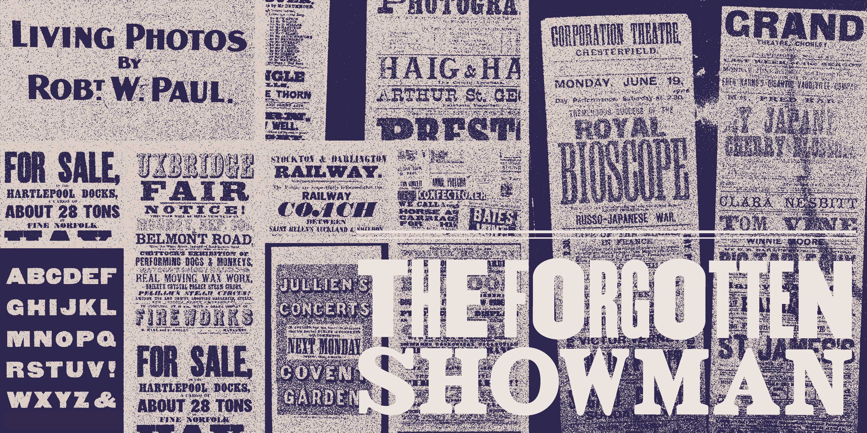
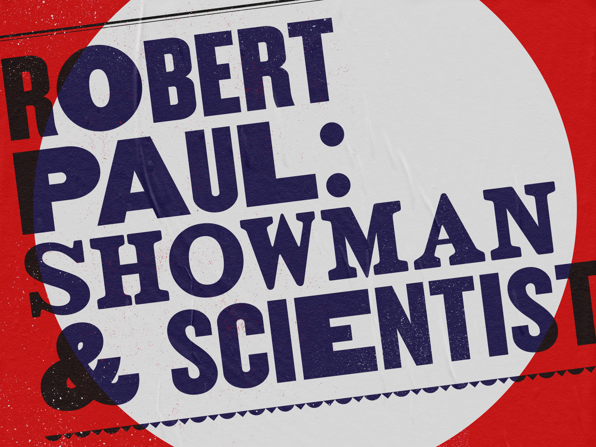
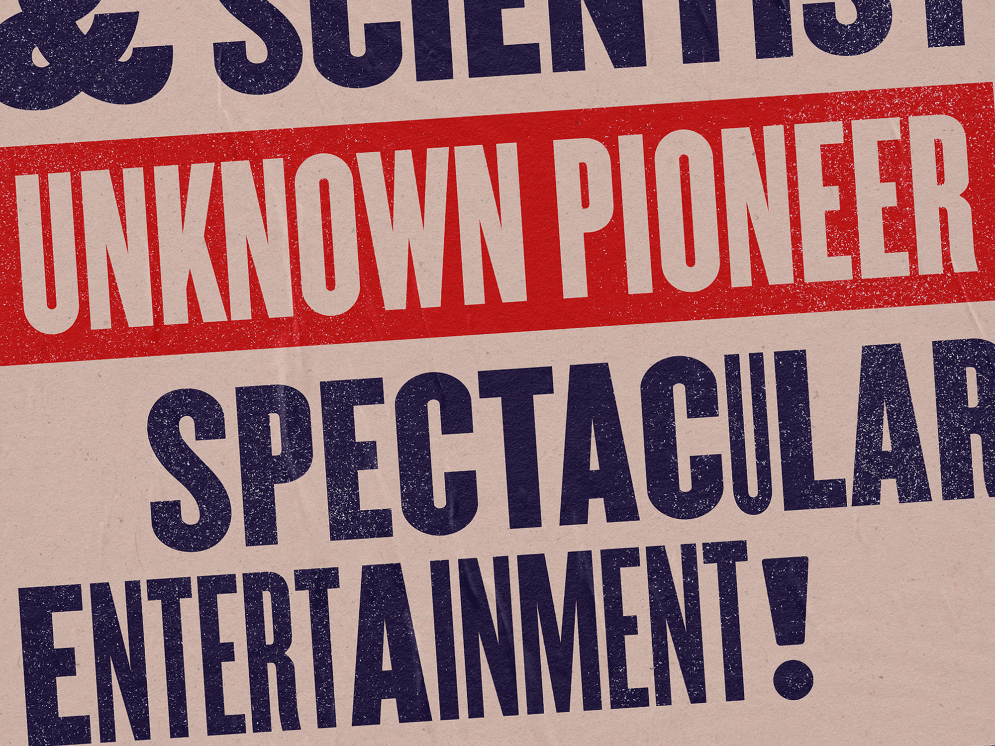
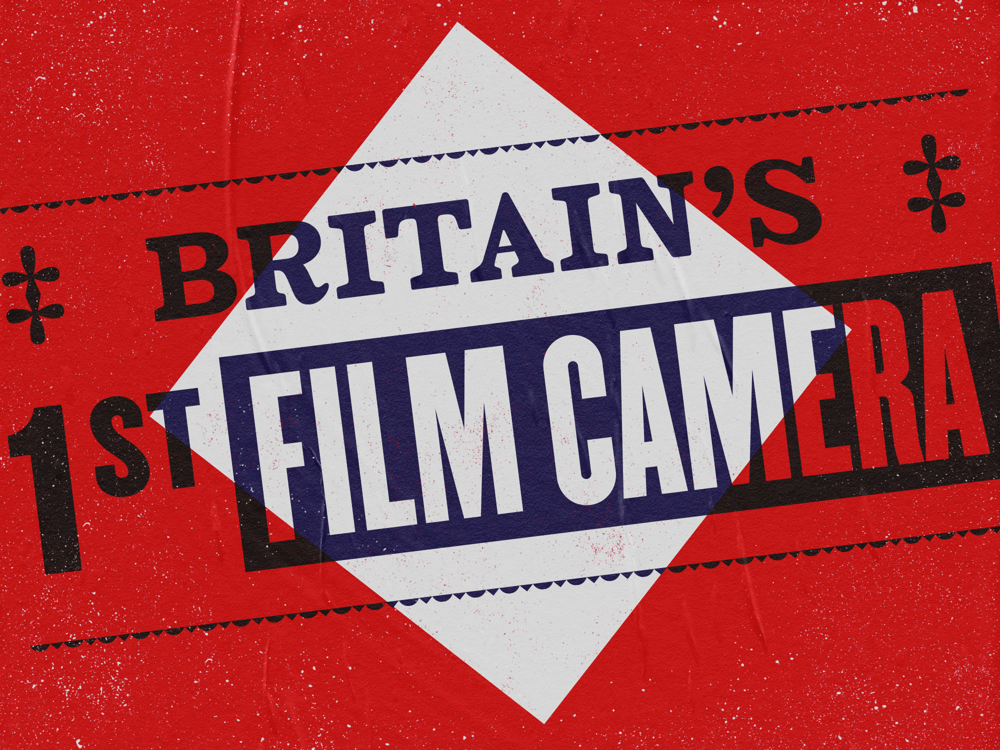
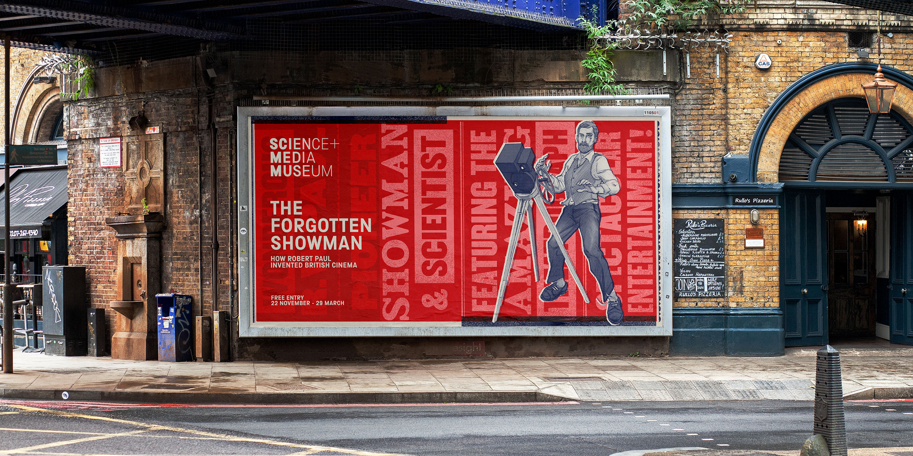
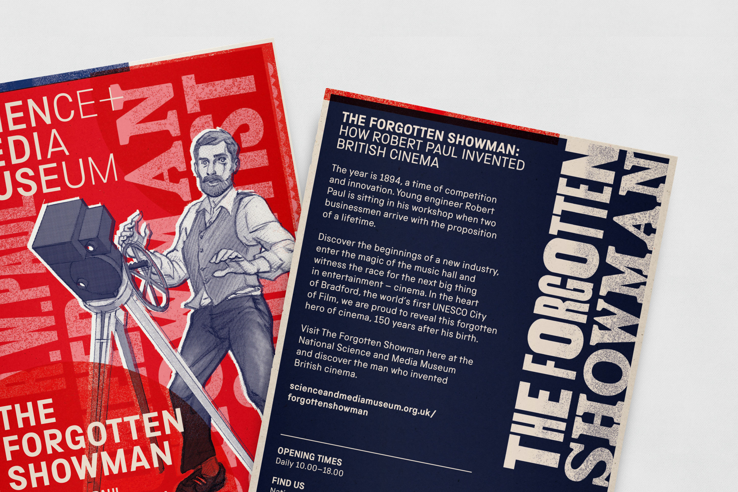
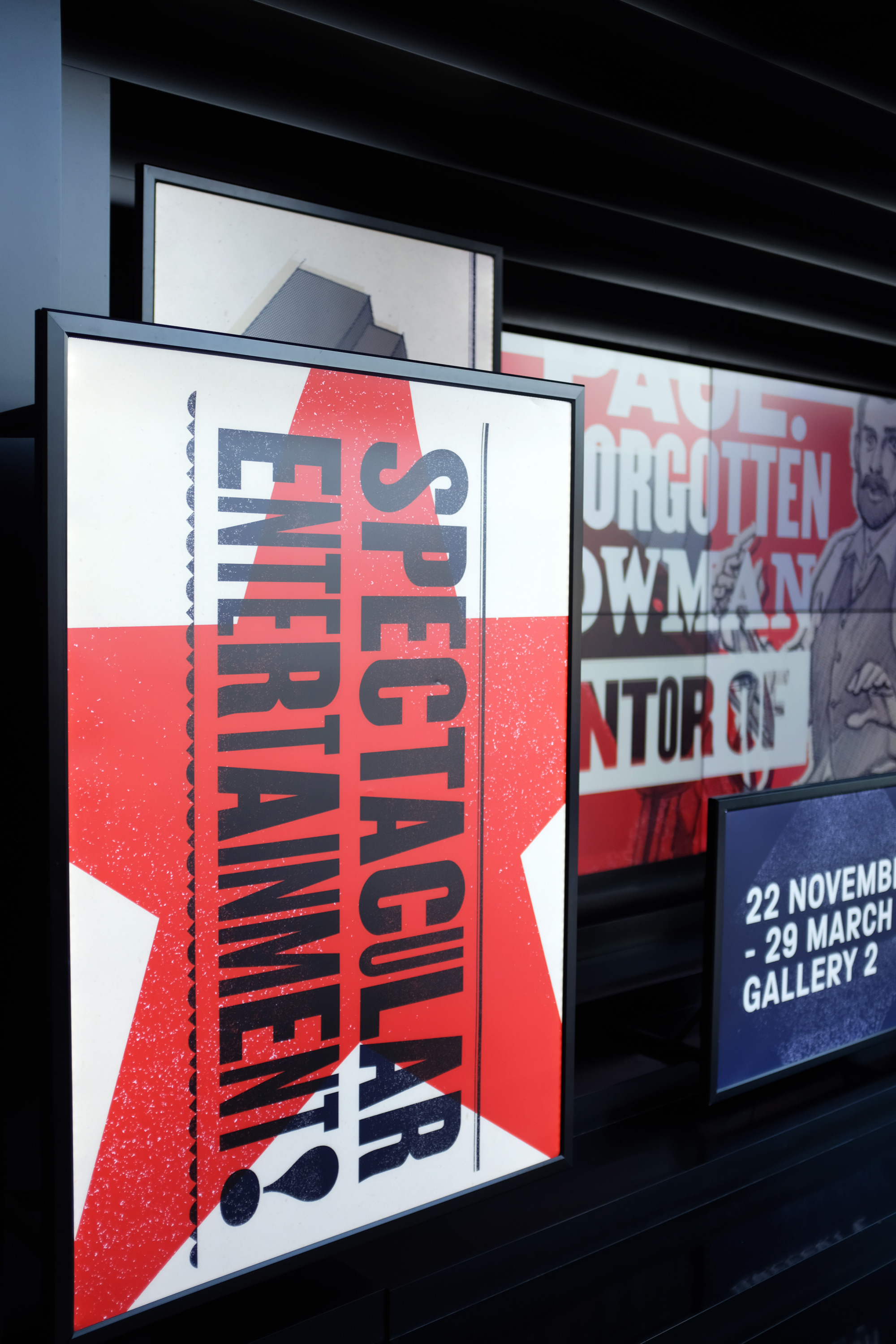
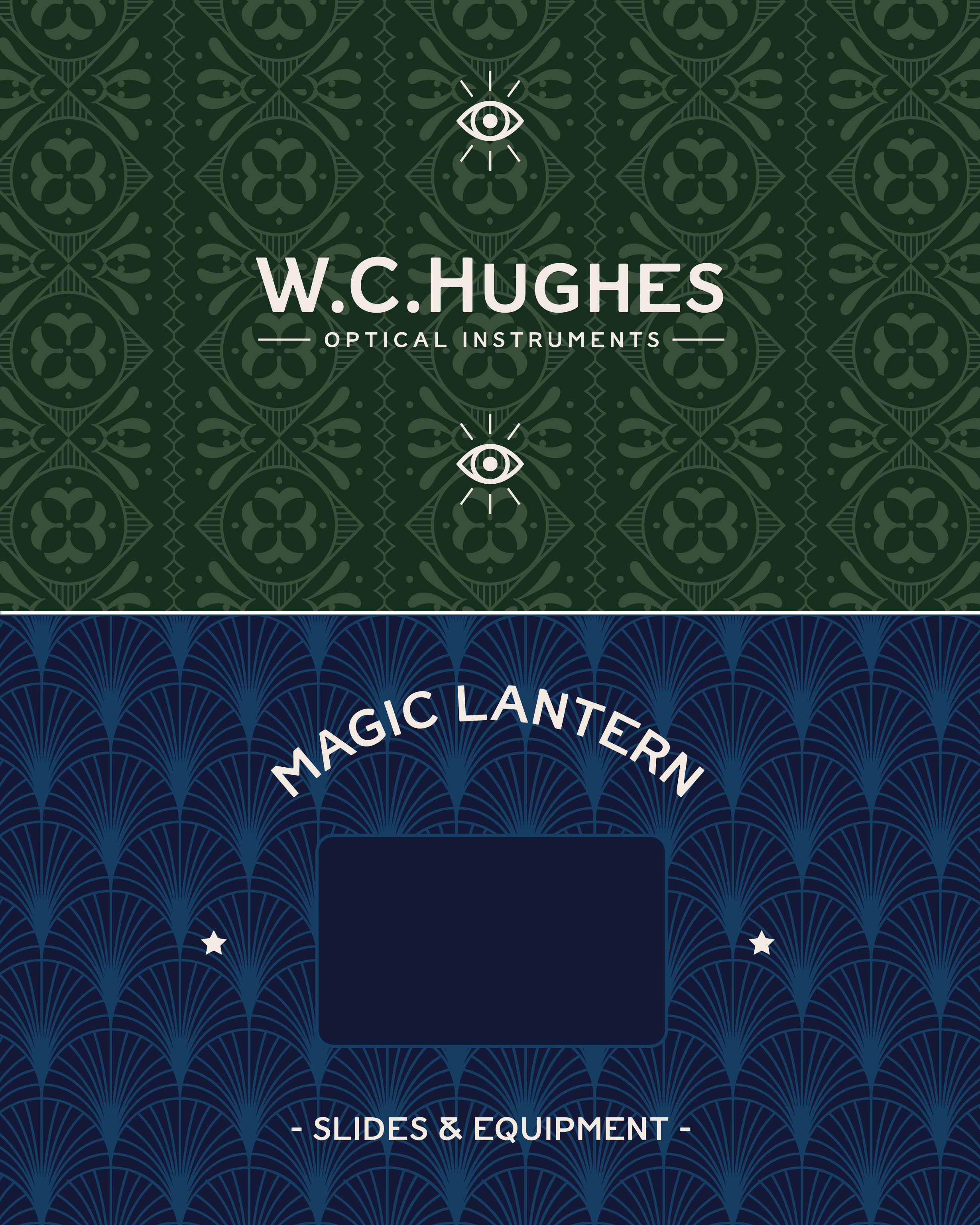
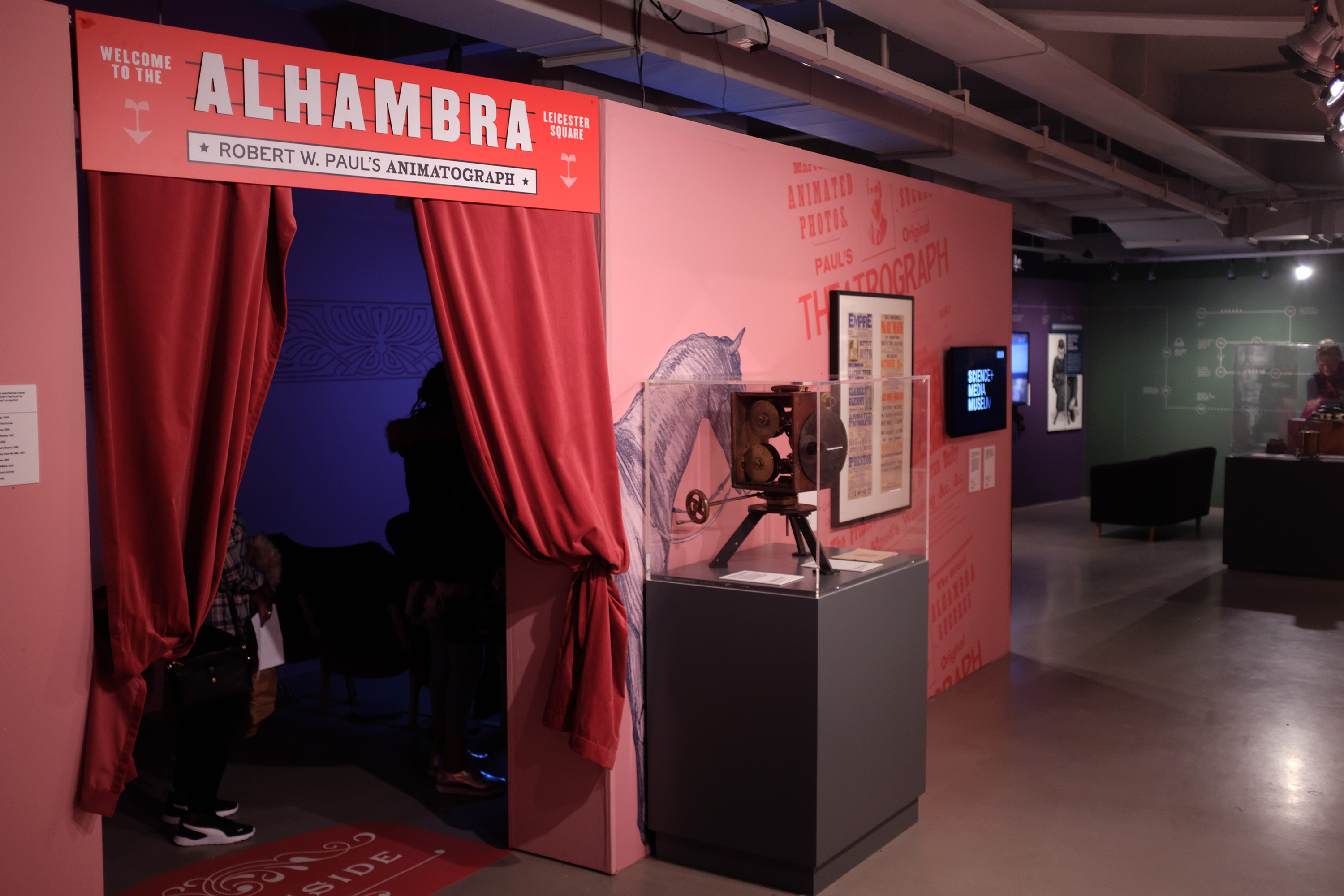
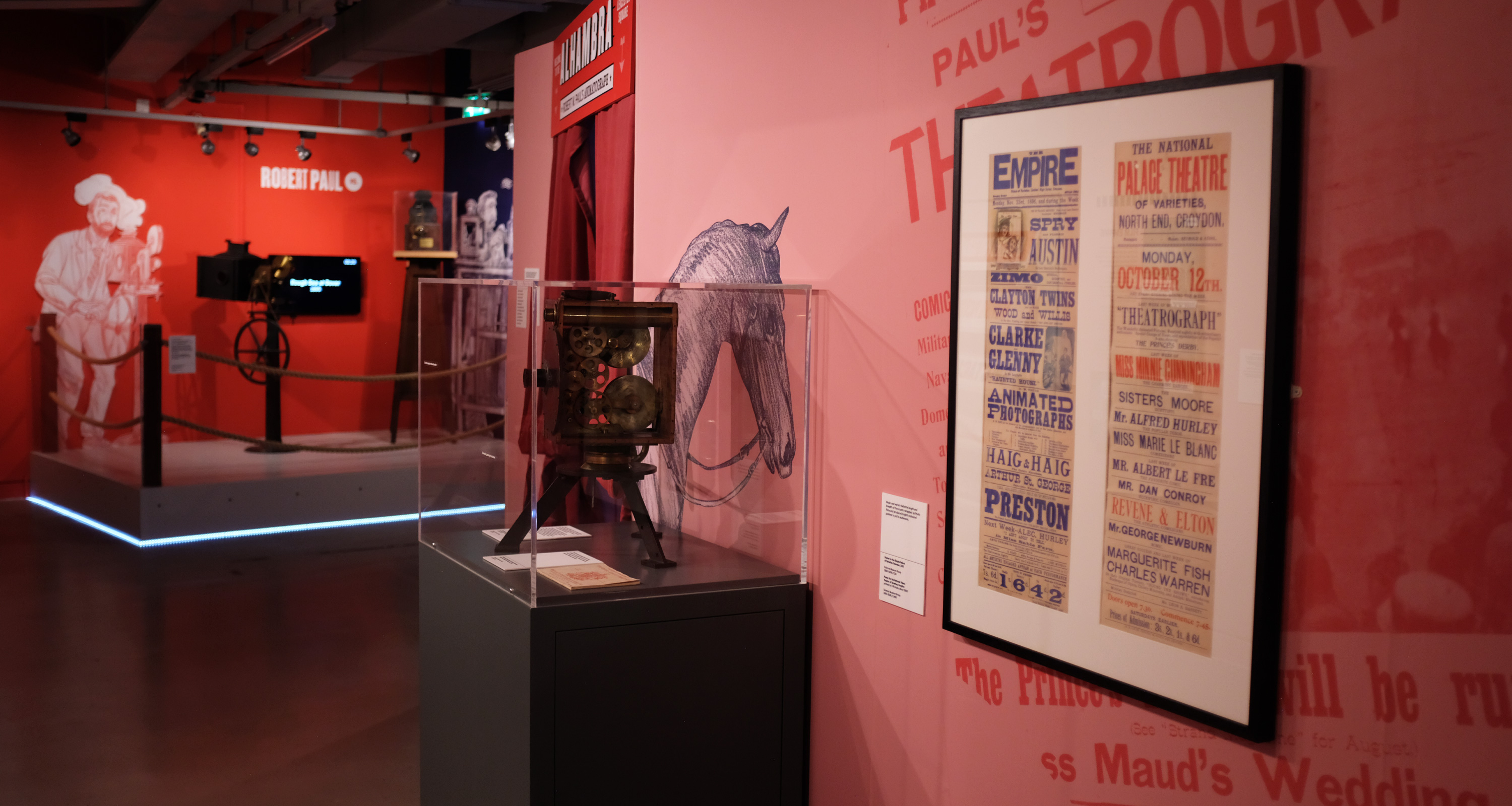
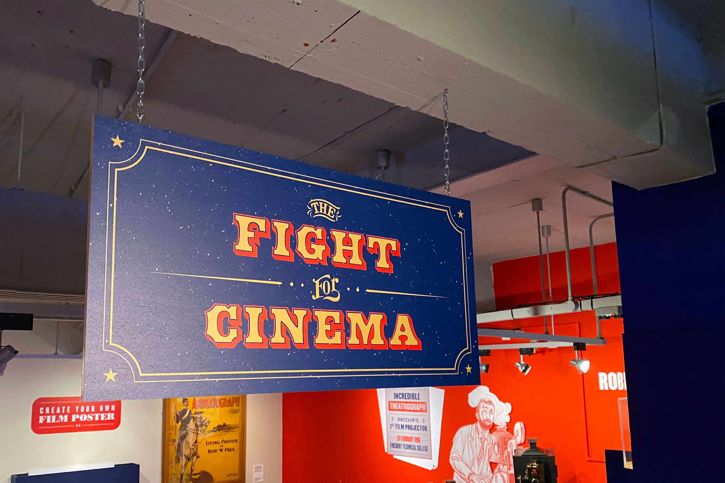
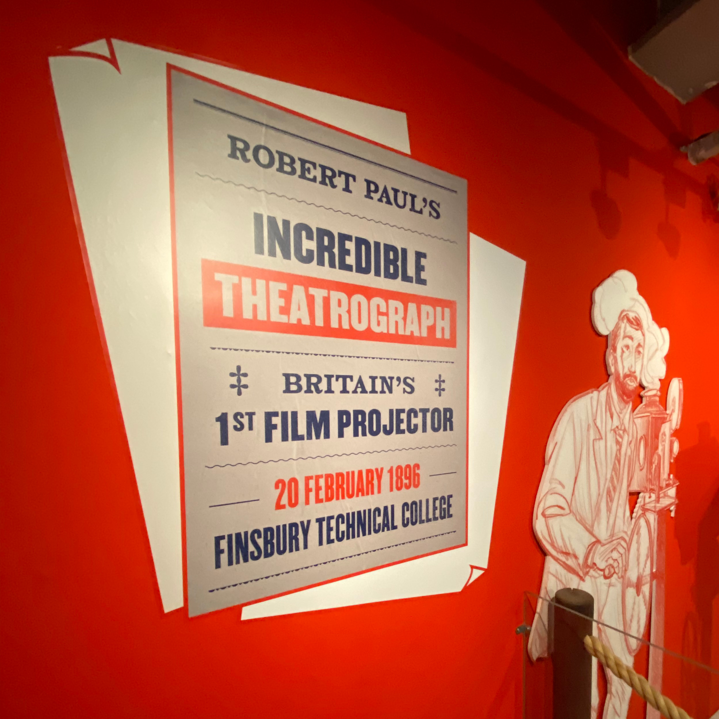
We wanted to create a strong sense of time and place, transporting visitors to the exhibition’s historic setting while maintaining a contemporary design aesthetic. We took reference points from the museum’s collections to build a visual style around Victorian era playbills and letterpress typography.
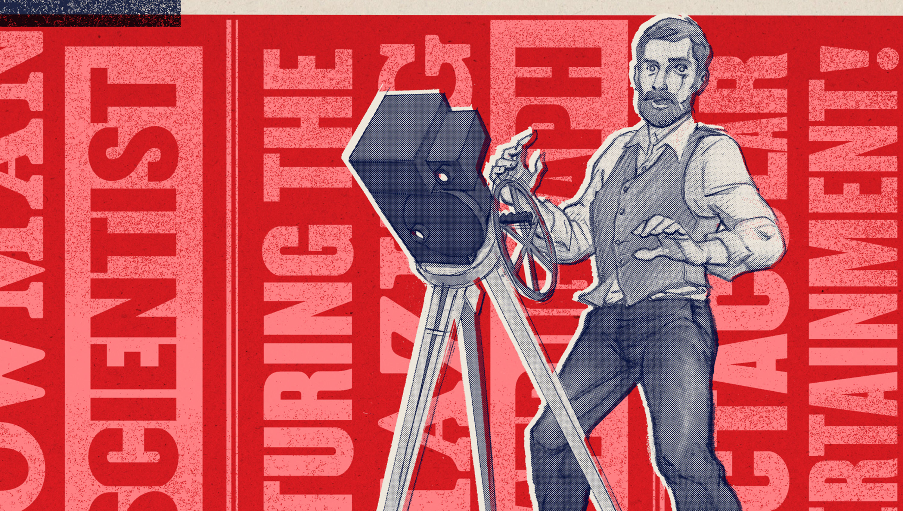
This typographic-led approach complimented ILYA’s graphic novel and new illustrations commissioned for the exhibition, creating a strong look and feel which carried through both the exhibition design and the marketing campaign.
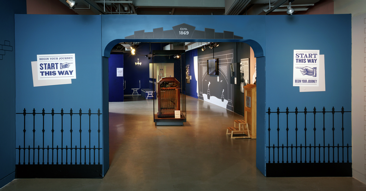
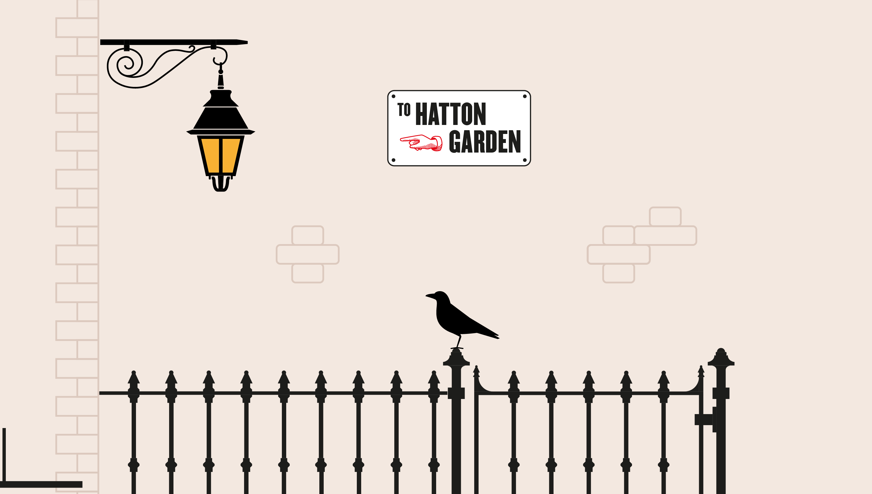
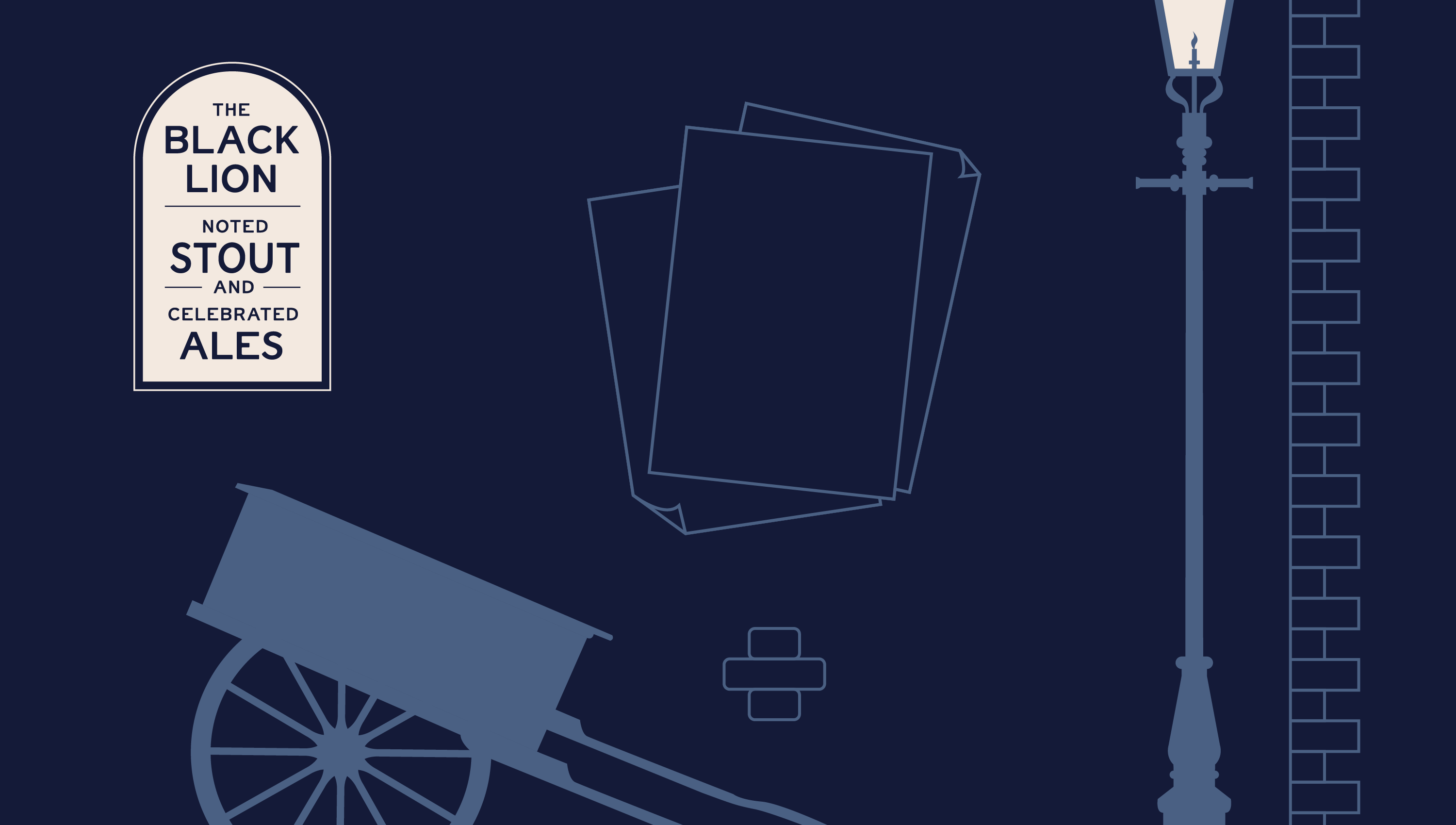


Our key role was to assist in planning the use of space, creating clear zones for each ‘chapter’ of the book and taking the linear narrative of the graphic novel and adapting it to the physical gallery space. Each zone had a slightly different look and feel to reflect the changing time period and theme, helping the visitor to engage with the objects within the context of their use.
To bring these different colour palettes and subject matters together, we developed a distinctive and paired back line-work illustration style to help us create immersive settings for each time period and location, while keeping the general look and feel consistent.
“The designers at Instruct developed a playful and immersive environment that respected the objects and simultaneously invited fun and play from visitors. Working with the team brought tons of visual references and influences we hadn’t thought of and allowed us to test ideas with one another.”
– Alice Parsons,
Science + Media Museum
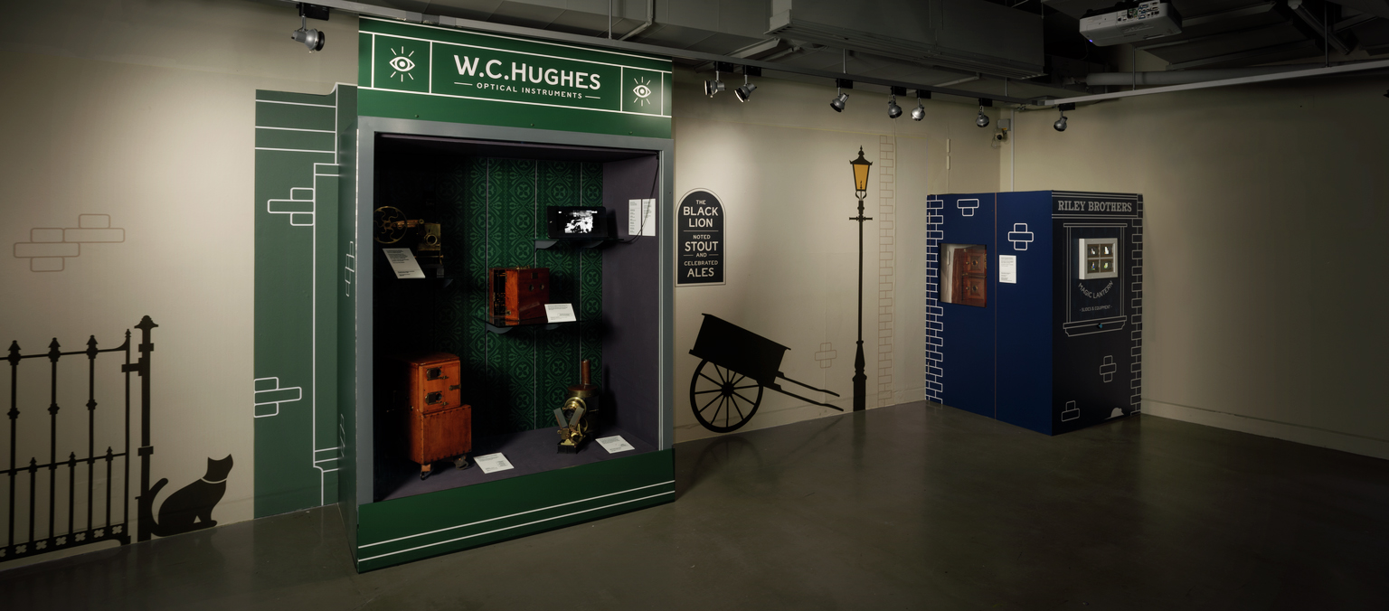
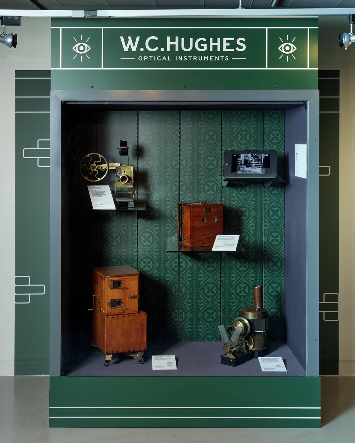

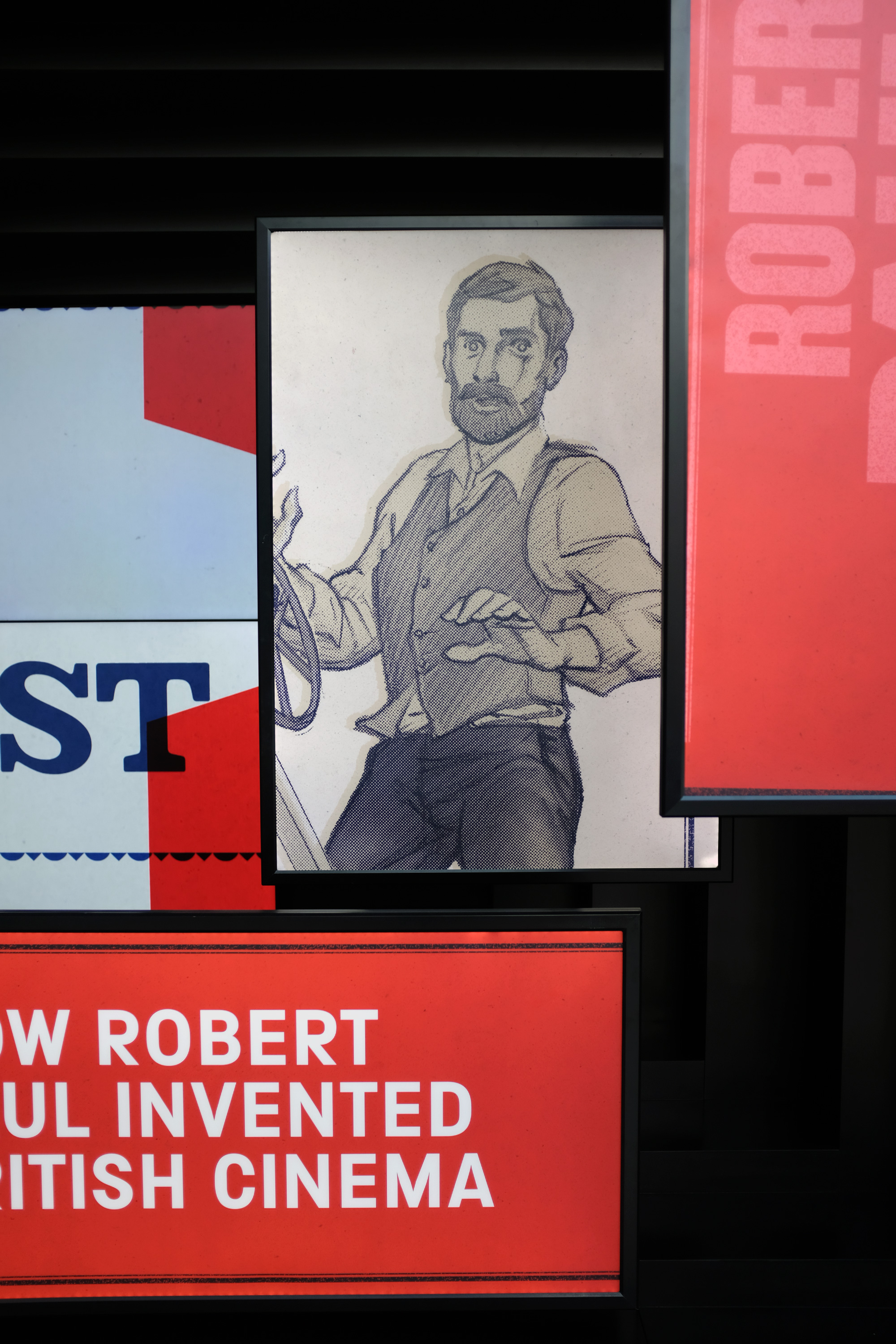
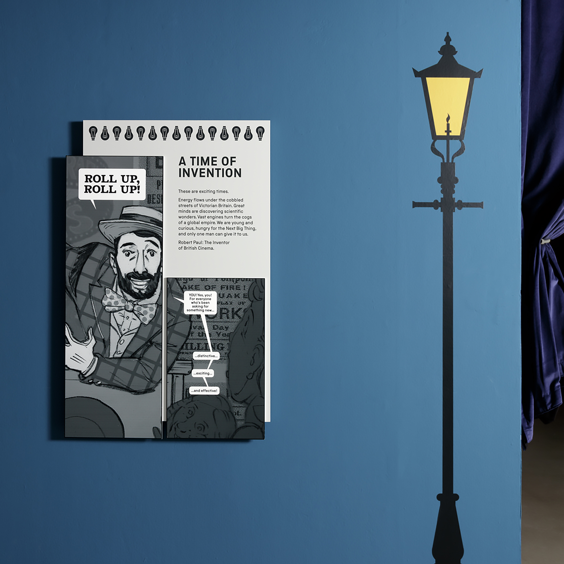
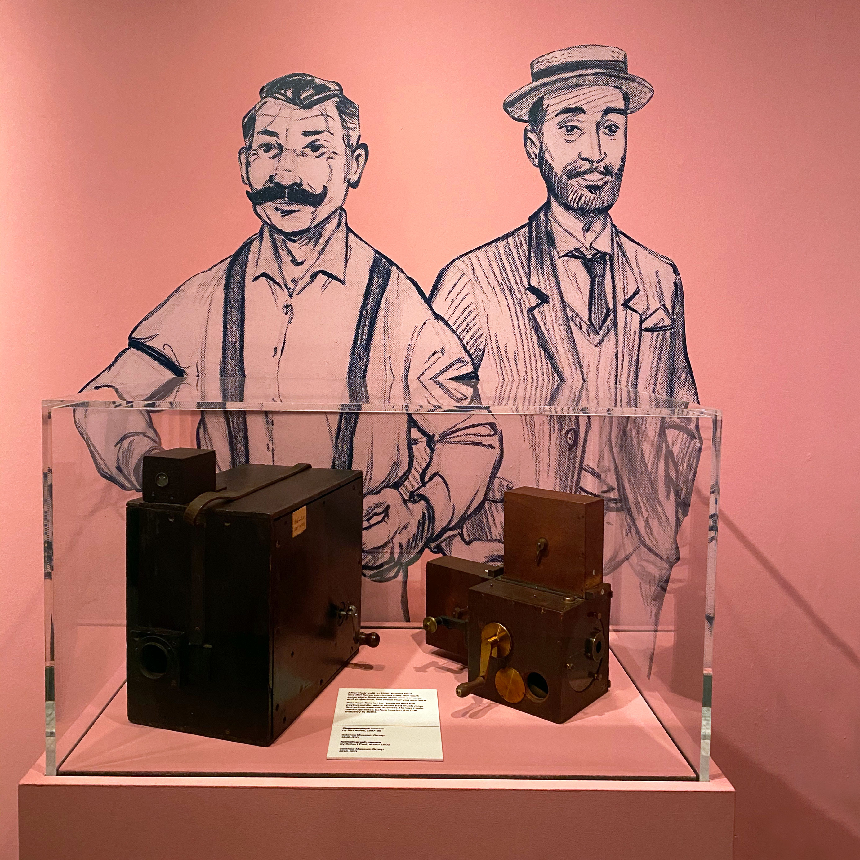
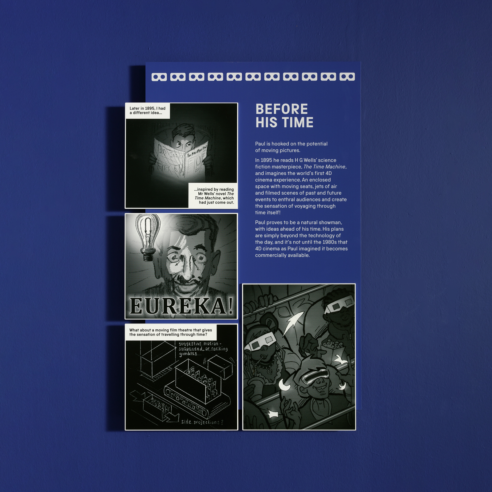
ILYA’s graphic novel features heavily throughout the exhibition, with the comic narrative forming a large part of the written interpretation. Each chapter panel included 3D comic panels to help tell the story to visitors of all ages. We also utilised ILYA’s work throughout the exhibition as life-sized characters and interactive displays.
“We were already working with an illustrator whose work needed to be incorporated into the design, Instruct were able to lift these illustrations off the page, introducing them into interpretation and graphics as well as using them to inspire further design in the space to create a cohesive environment that resulted in extremely high dwell time, enhanced interpretation and a striking visual experience.”
– Alice Parsons,
Science + Media Museum


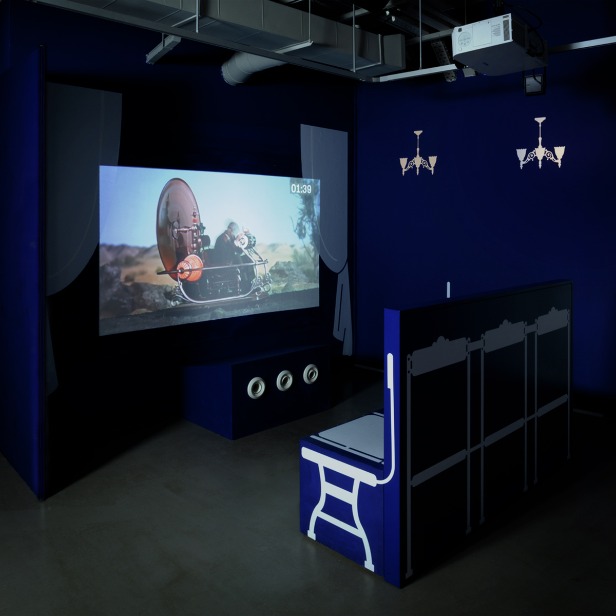
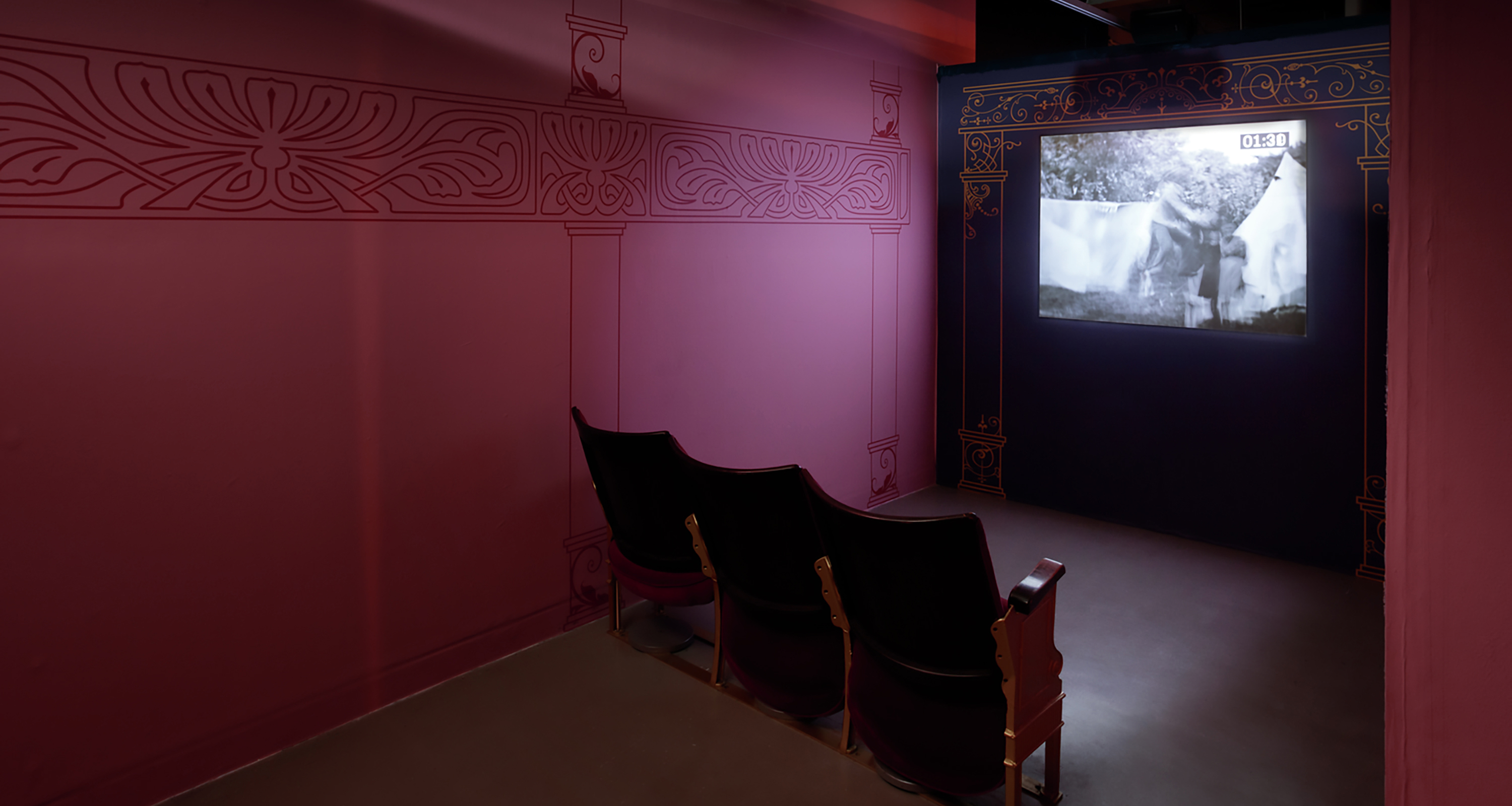
The exhibition included a lot of AV, including two purpose-built cinema areas playing Robert Paul’s films. The ‘Cinema 4D’ experience draws from blue screen with silhouetted Victorian elements presented in a more futuristic style and uses fans, movement and sound to enhance the 4D experience, including custom-made furniture with speakers installed inside.
The second cinema space is based on historic Victorian cinema spaces, with red velvet curtains, embossed signage and an ornate line drawing facade.


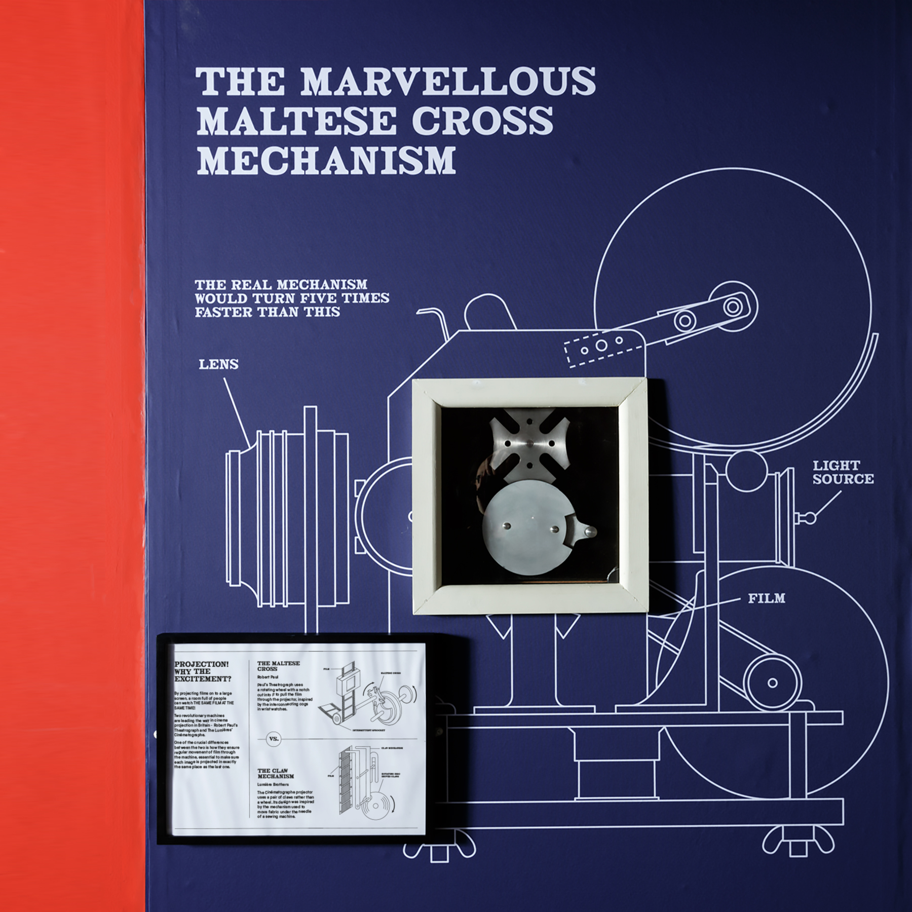
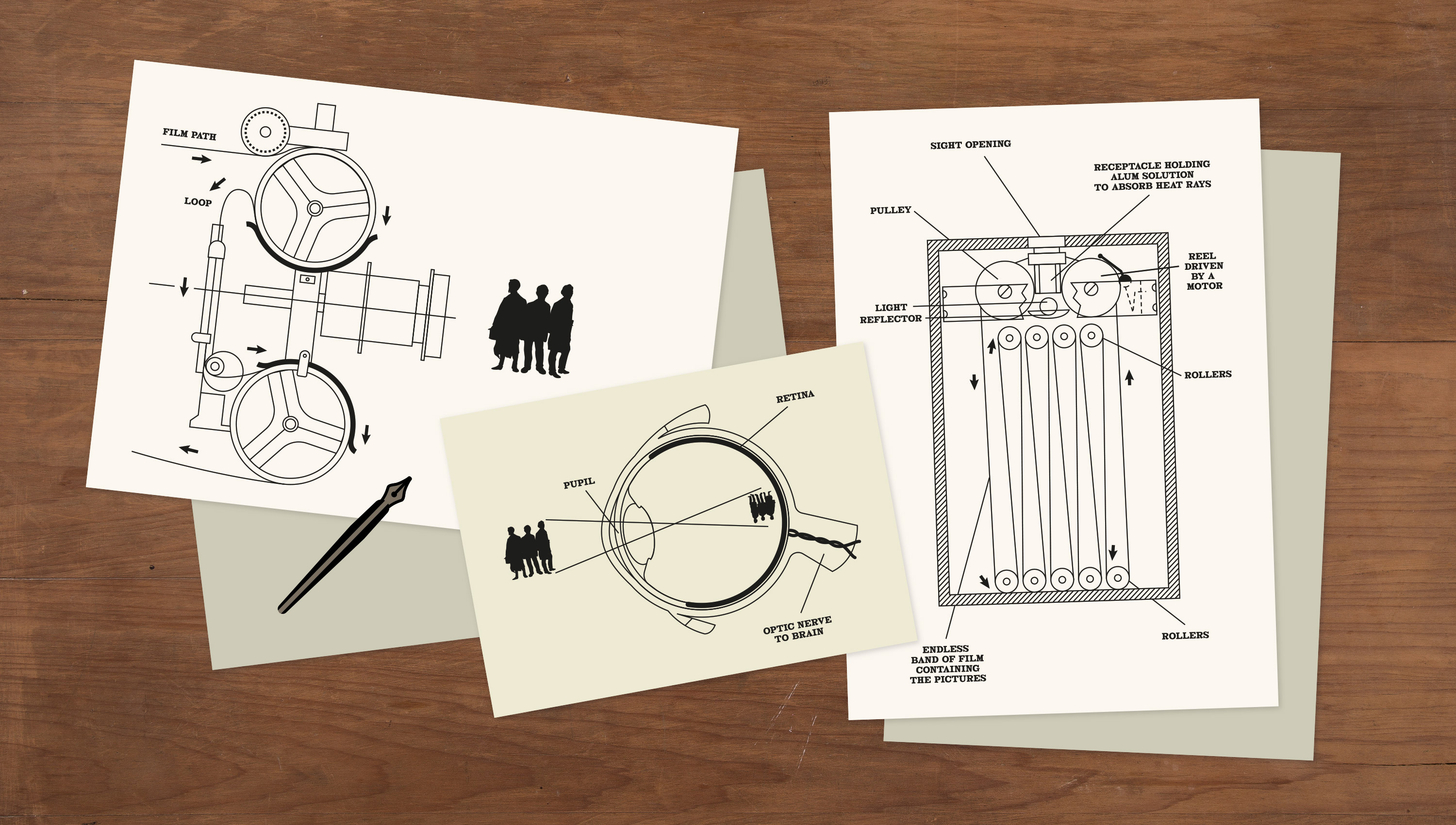
An additional layer of educational diagrams were developed for the exhibition. These were used to help to explain the science behind Robert Paul’s innovations – such as the Maltese cross mechanism which embedded a working interactive machine into the illustration. They also helped to further immerse visitors into the time period when scattered around Paul’s workshop and studio desk.
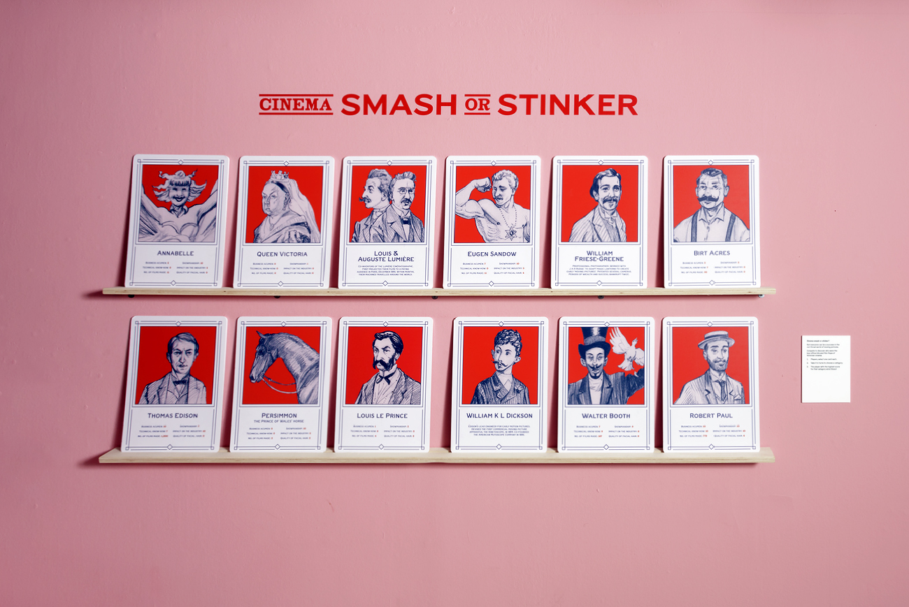

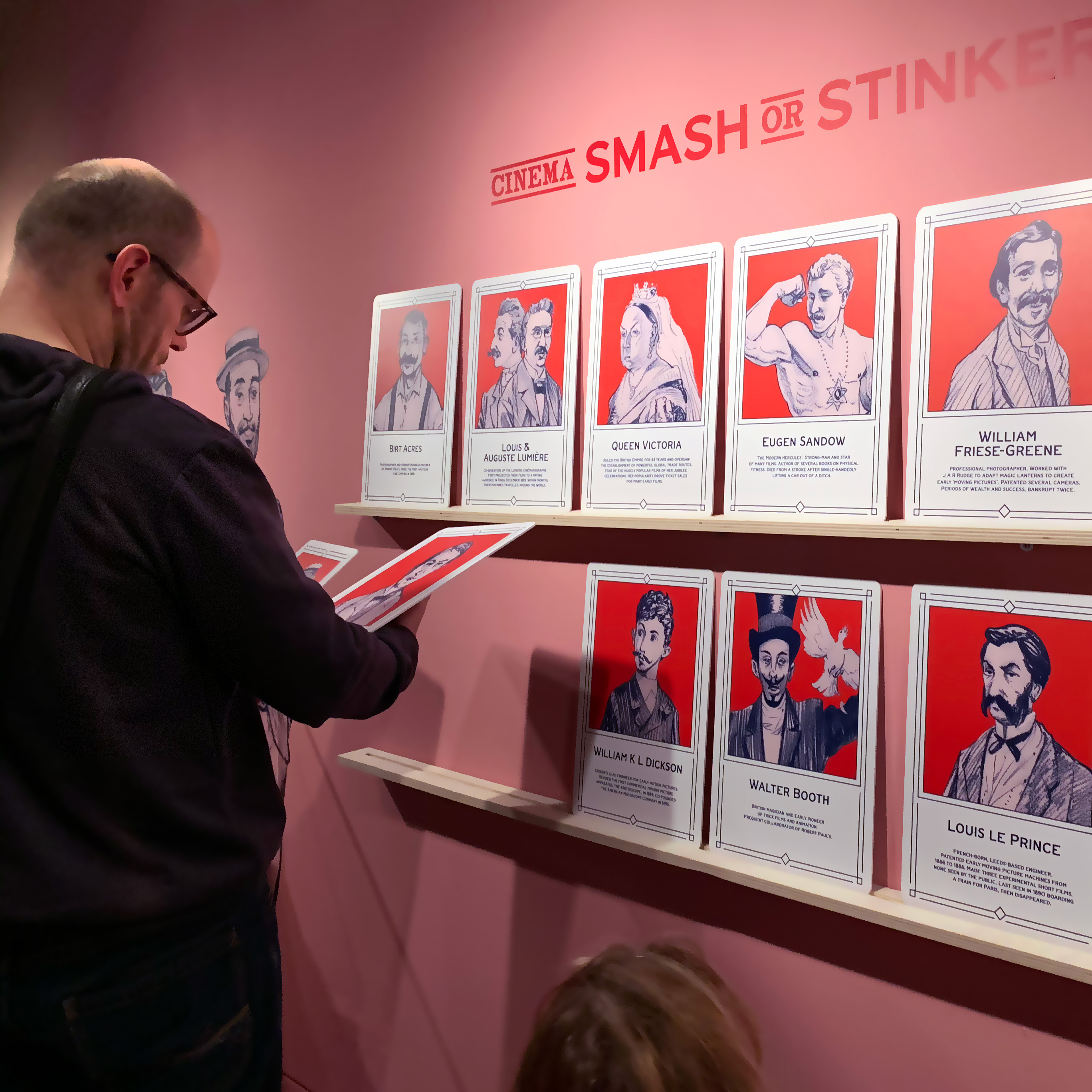
There were many interactive elements, including a wall mounted ‘Top Trumps’ style game to illustrate all the major figures in the development of cinema, ranking them against each other to illustrate how difficult it is to pinpoint one single ‘true inventor’ of cinema.
Another interactive used the typographic style of the exhibition to allow visitors to create their own personalised playbill poster in the Victorian style.


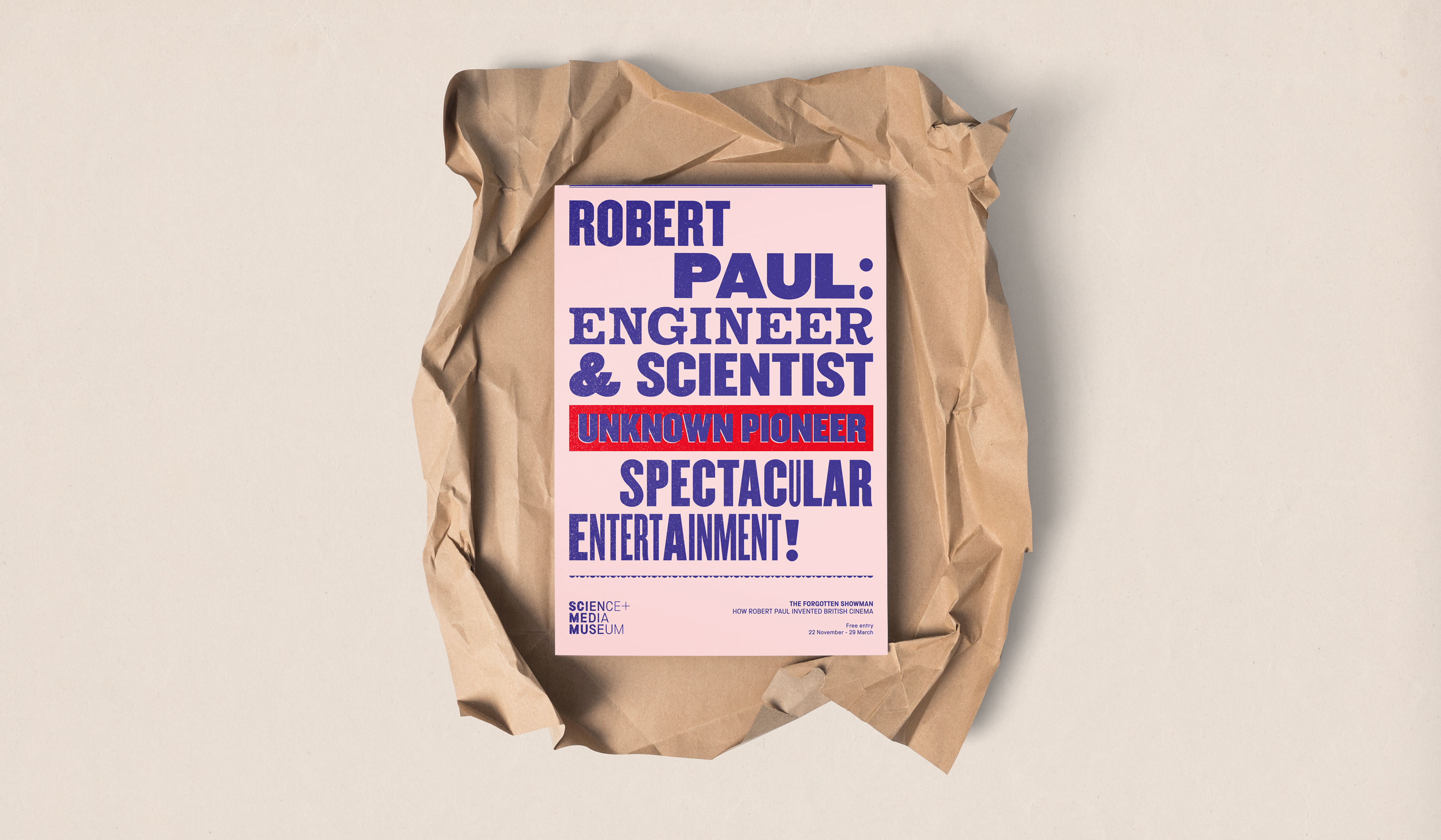
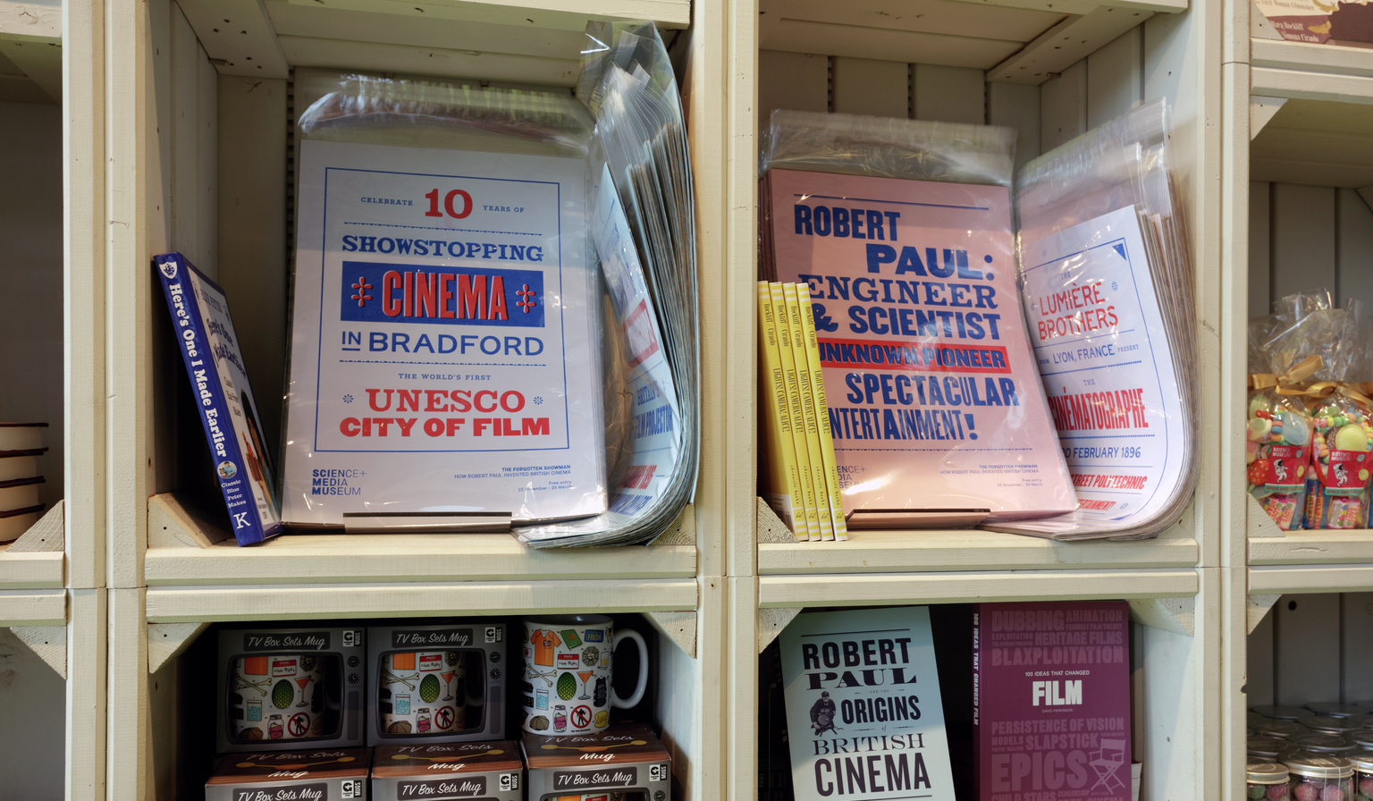
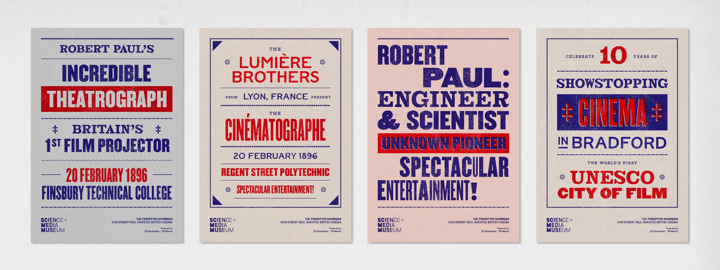
We developed the typographic style further to create art prints celebrating the exhibition and Bradford’s 10 year anniversary as a UNESCO City of Film. These risograph printed posters we sold in the museum shop and given to supporters as gifts.
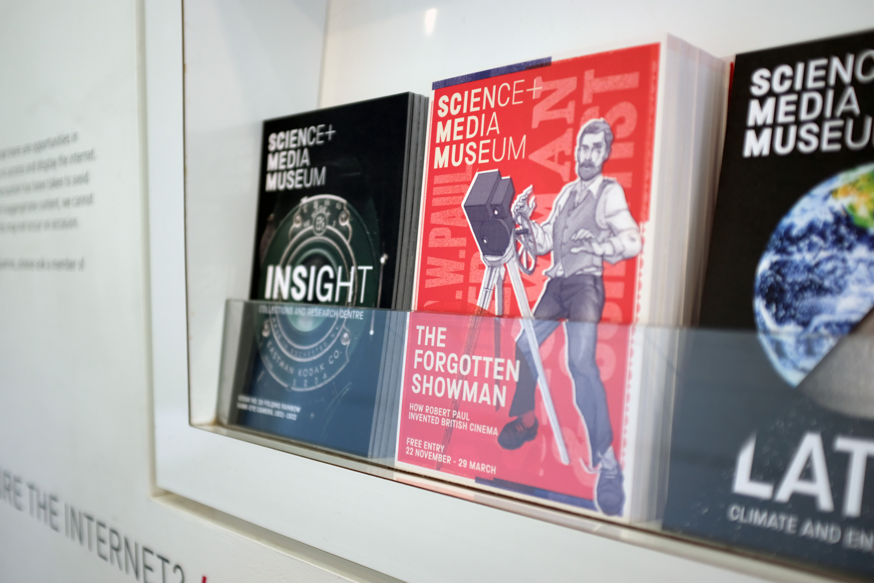
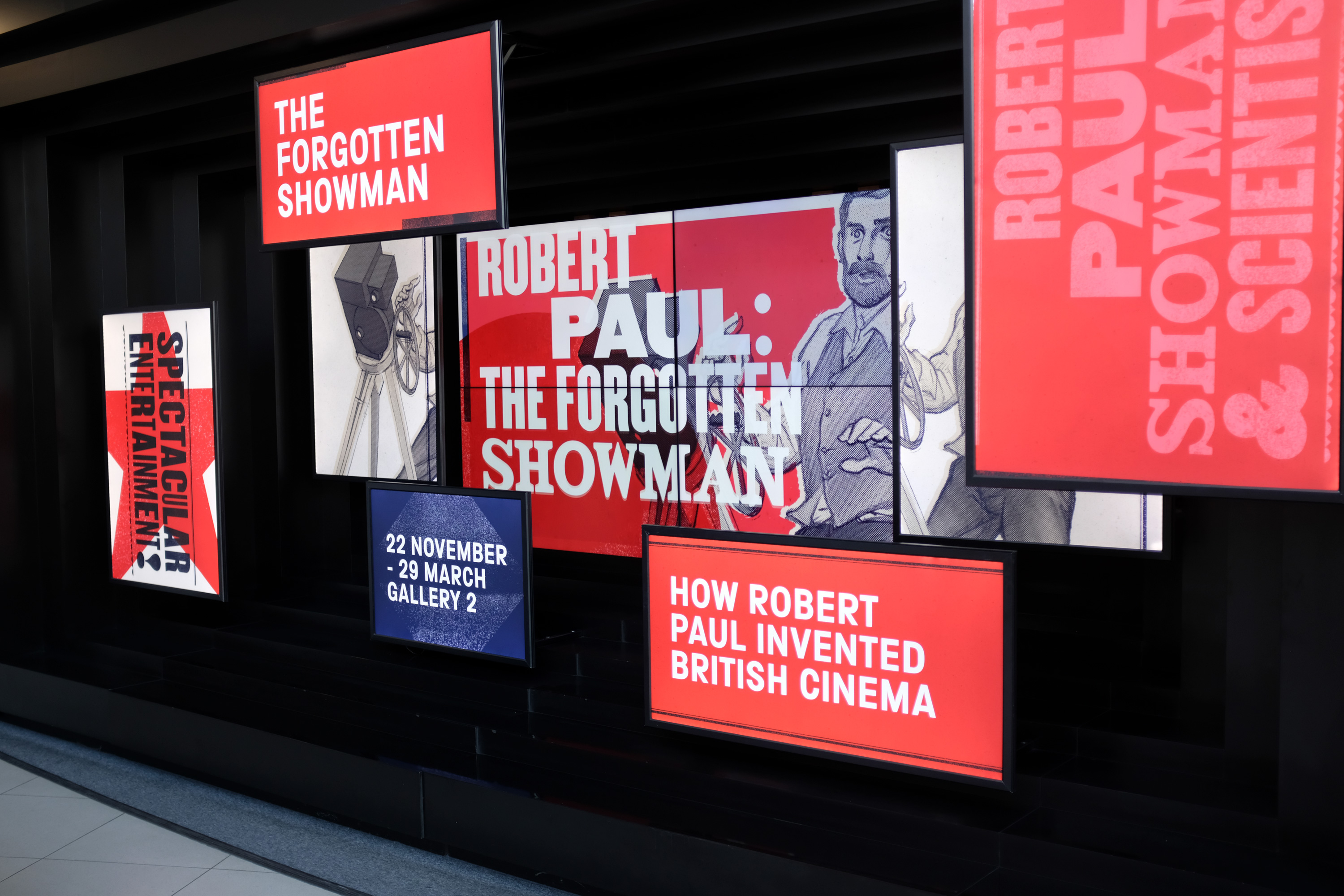
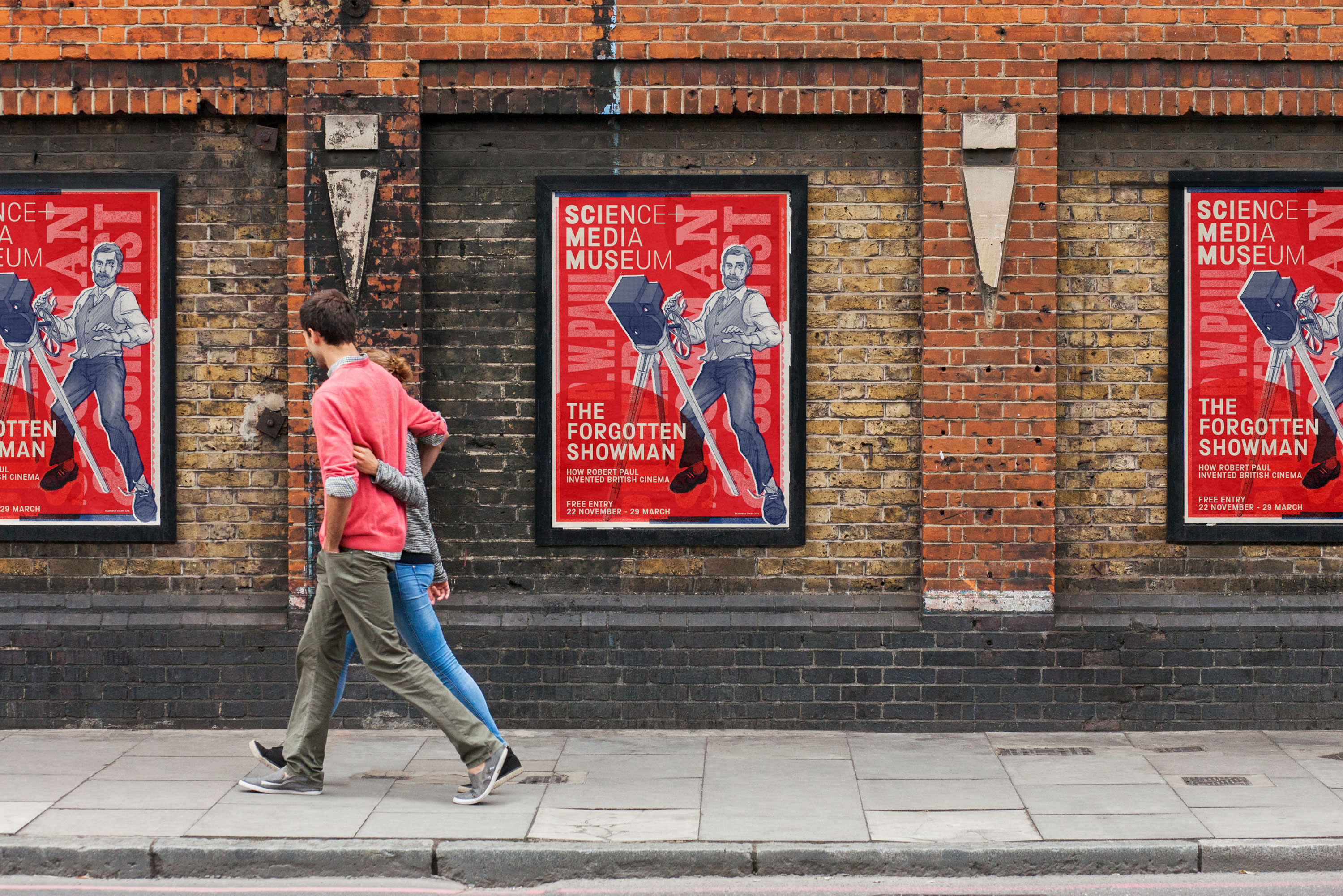
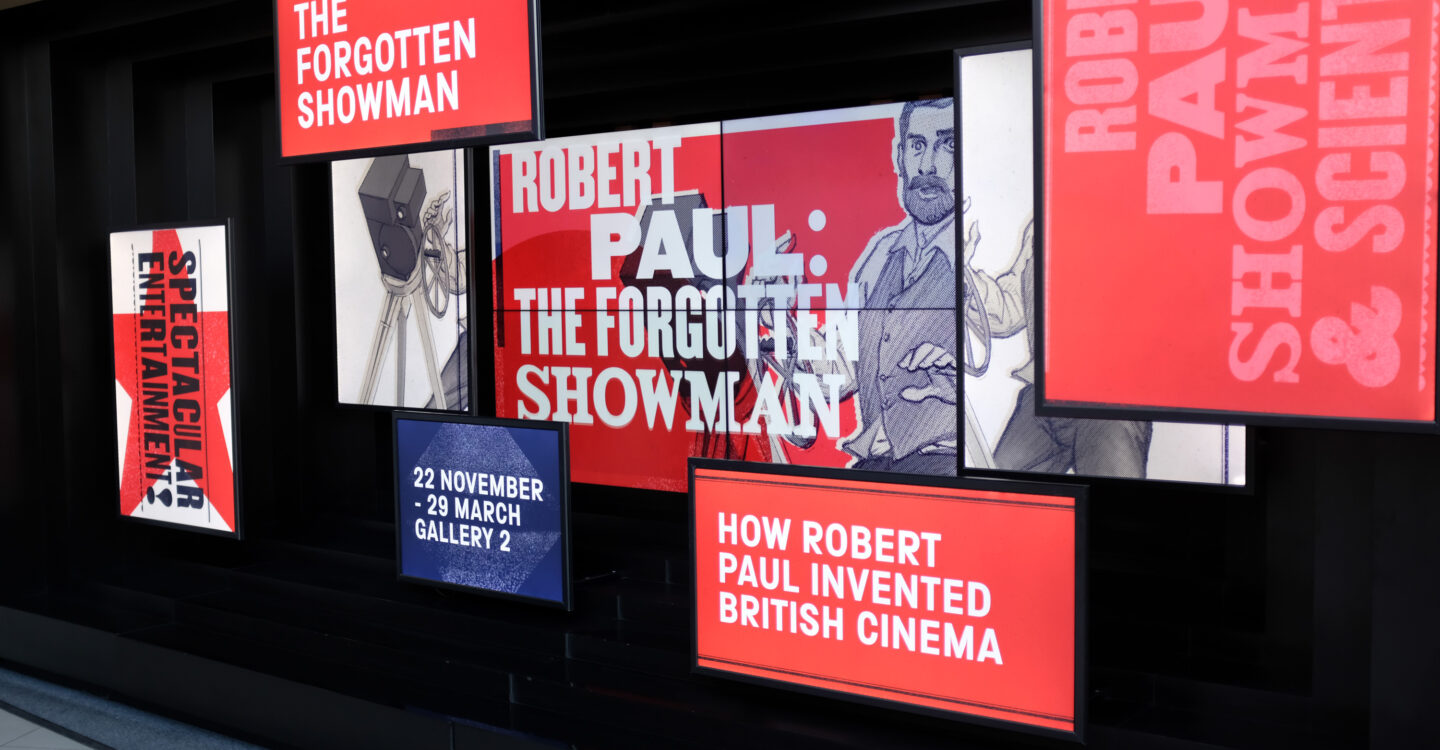
The rest of the exhibition marketing was more image led, pulling from ILYA’s work and the typographic approach to create a more family-friendly look and feel. The campaign included outdoor advertising, animation, flyers and social advertising, along with in-museum posters and a large animated media wall.
