Spinningfields
Creating a sense of place in Manchester’s financial heart
Spinningfields
Brand Strategy
Brand Identity
Signage & Wayfinding
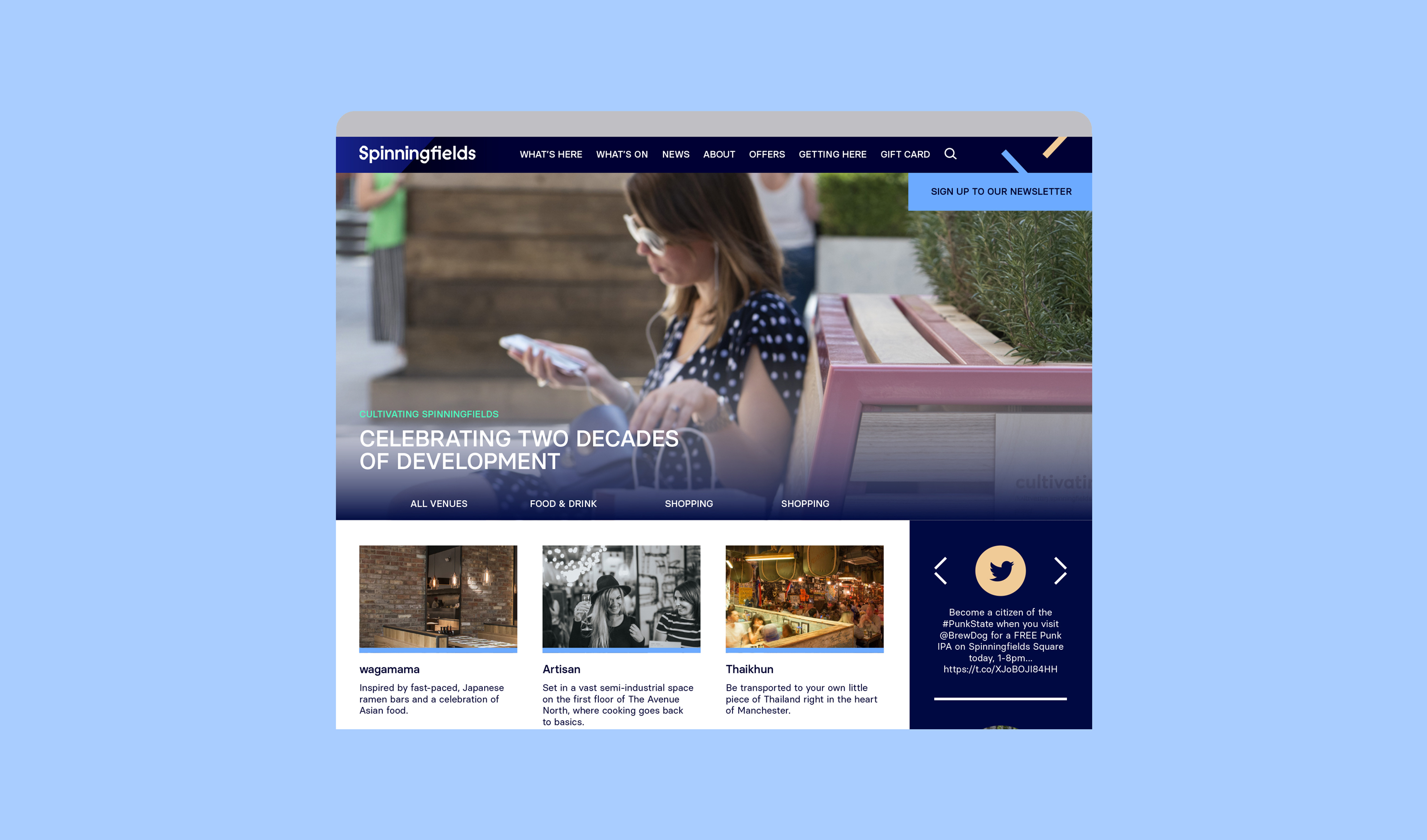
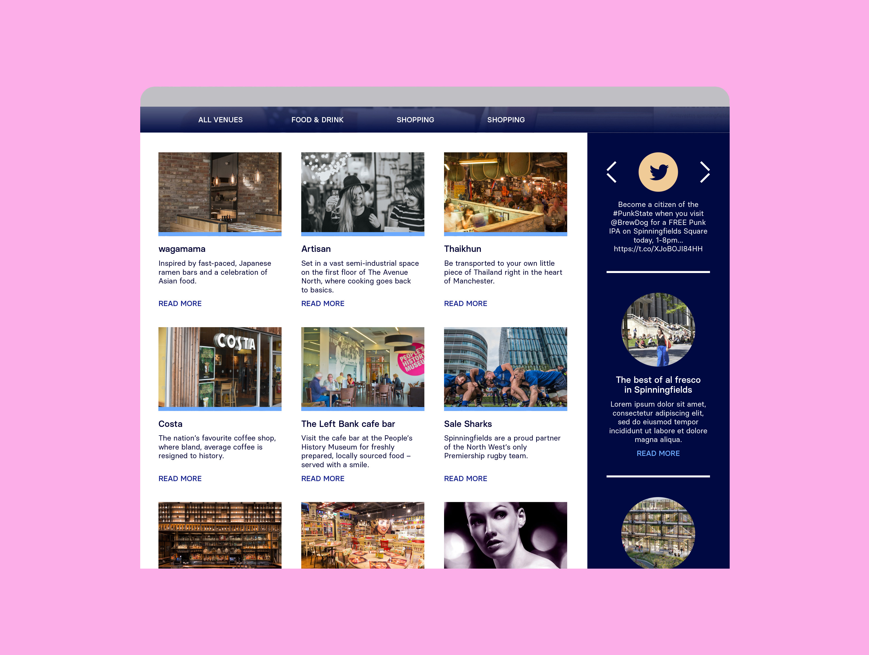
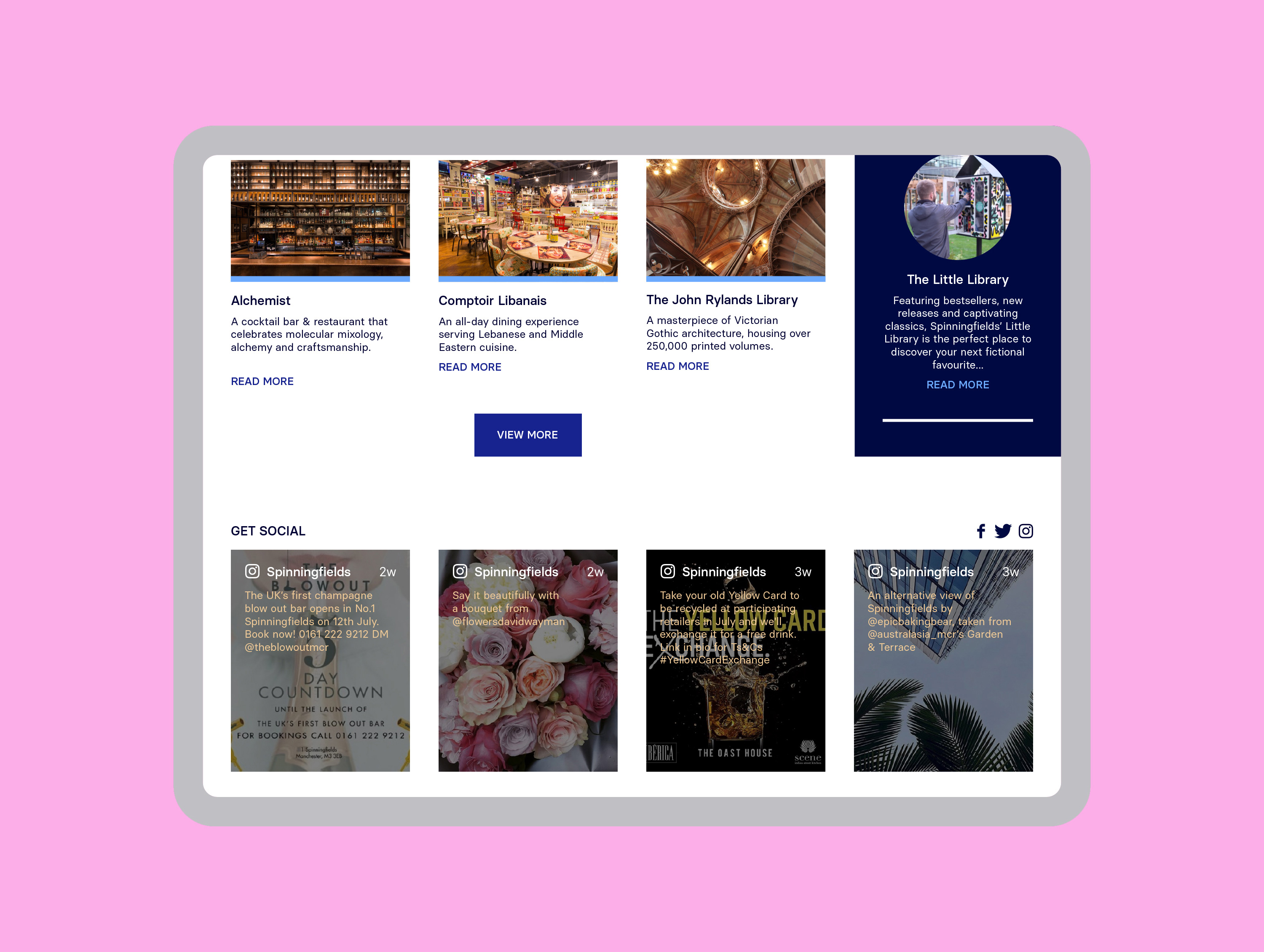
Website Design
Client: Allied London
Website: spinningfieldsonline.com

Situated in the heart of Manchester, Spinningfields is one of Europe’s most successful urban regeneration projects, often referred to as the ‘Canary Wharf of the North’. The previous Spinningfields brand had not changed since the regeneration project had been branded in the 2000s and so the area needed a new brand and placemaking strategy to reflect its position as an established urban neighbourhood, rather than a future development.
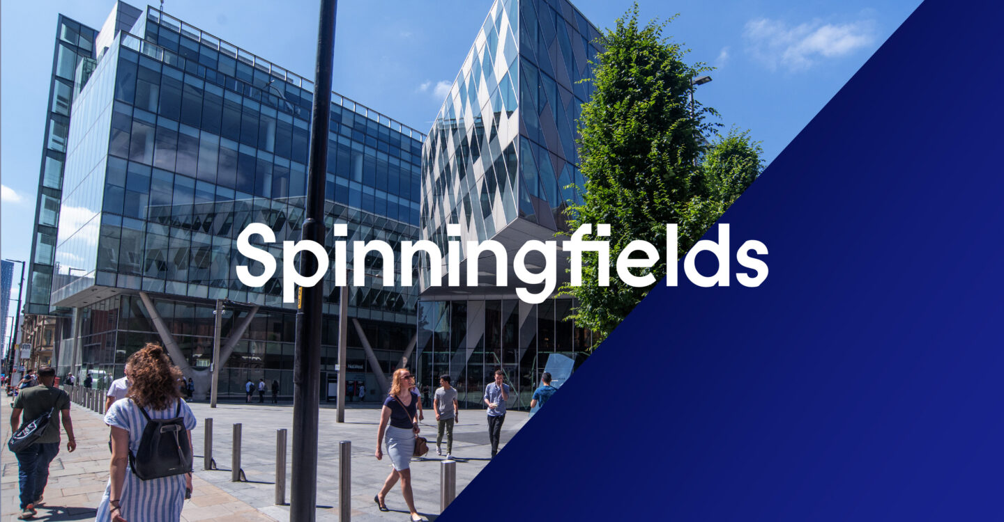
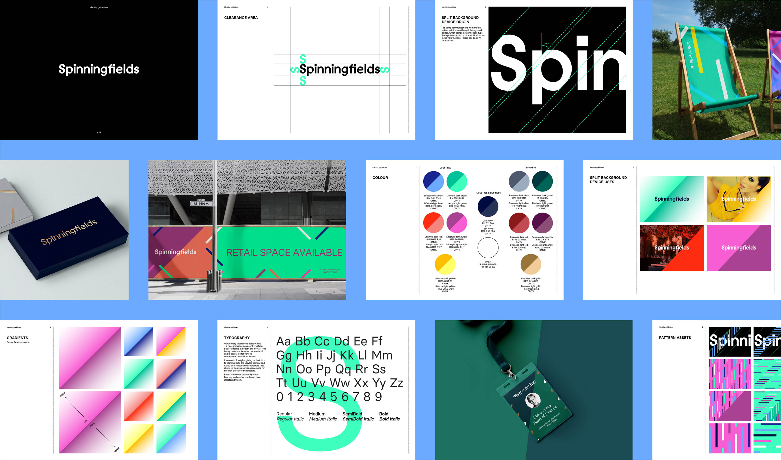
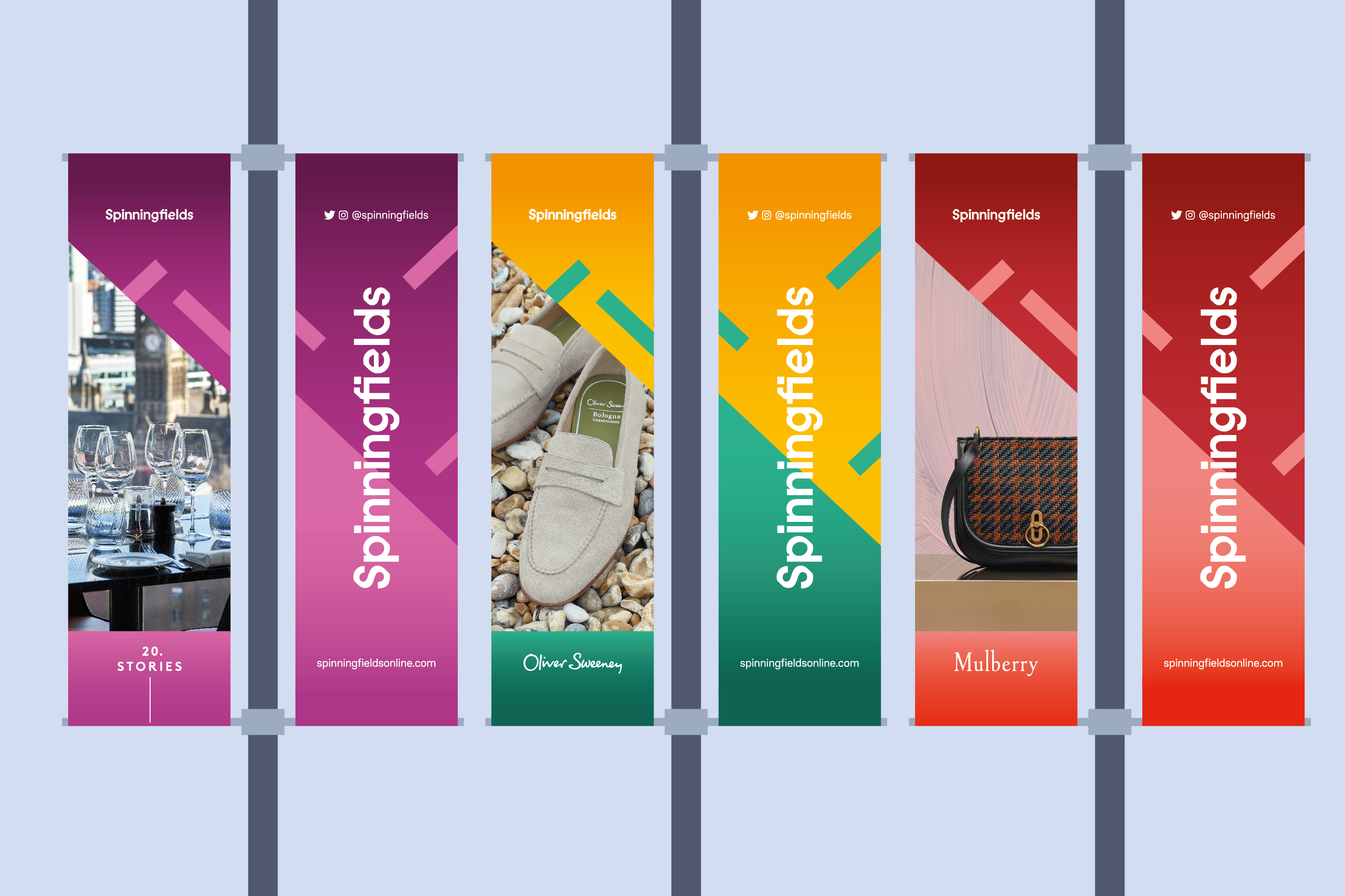
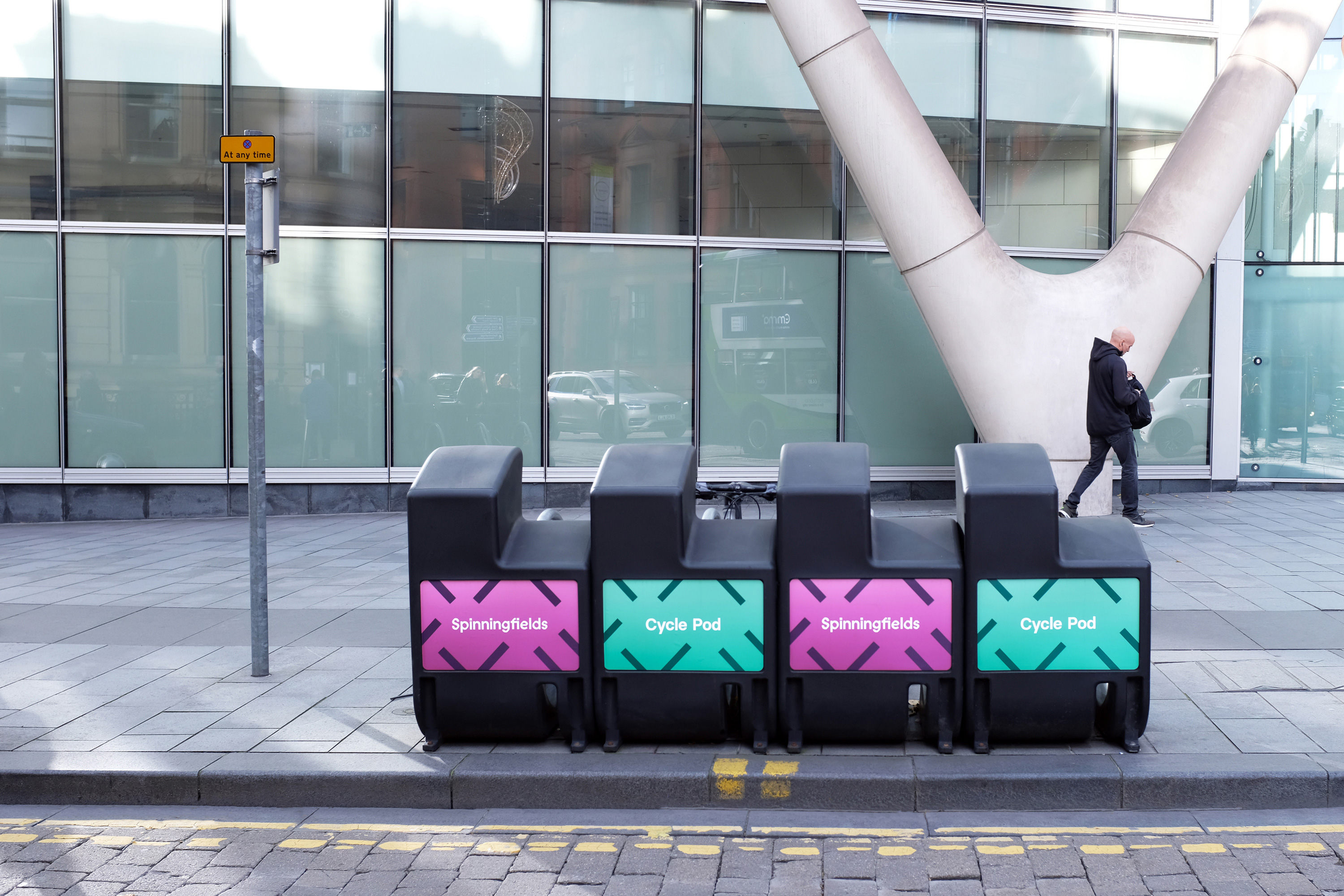
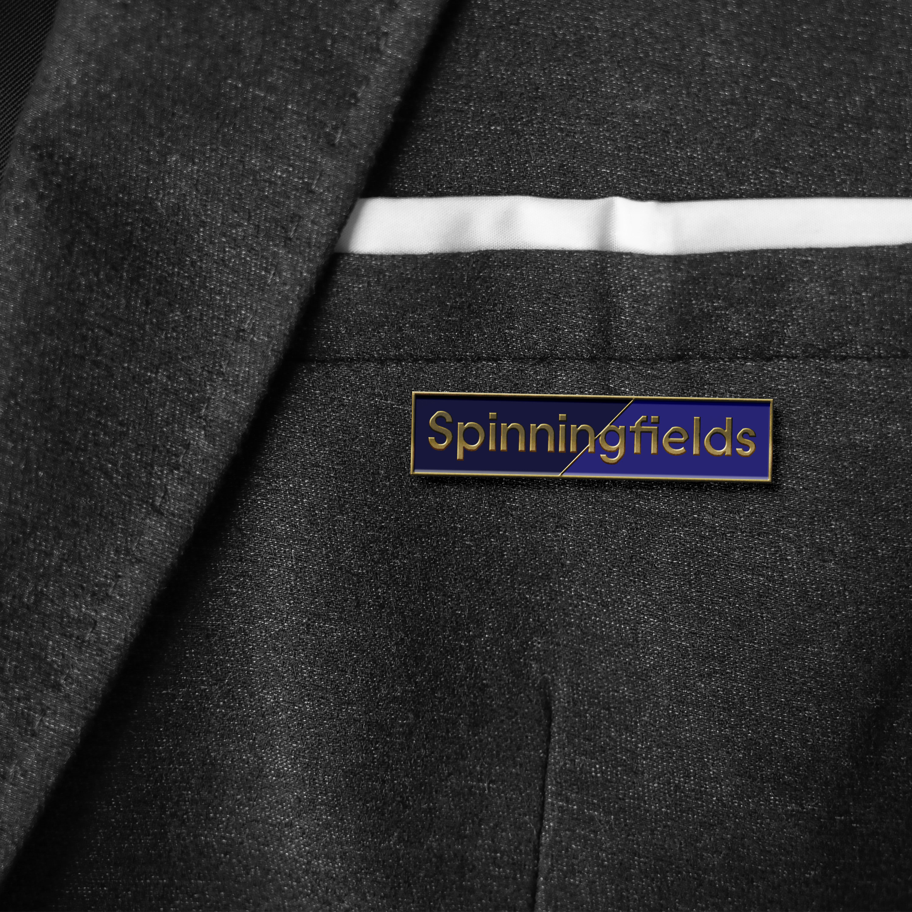
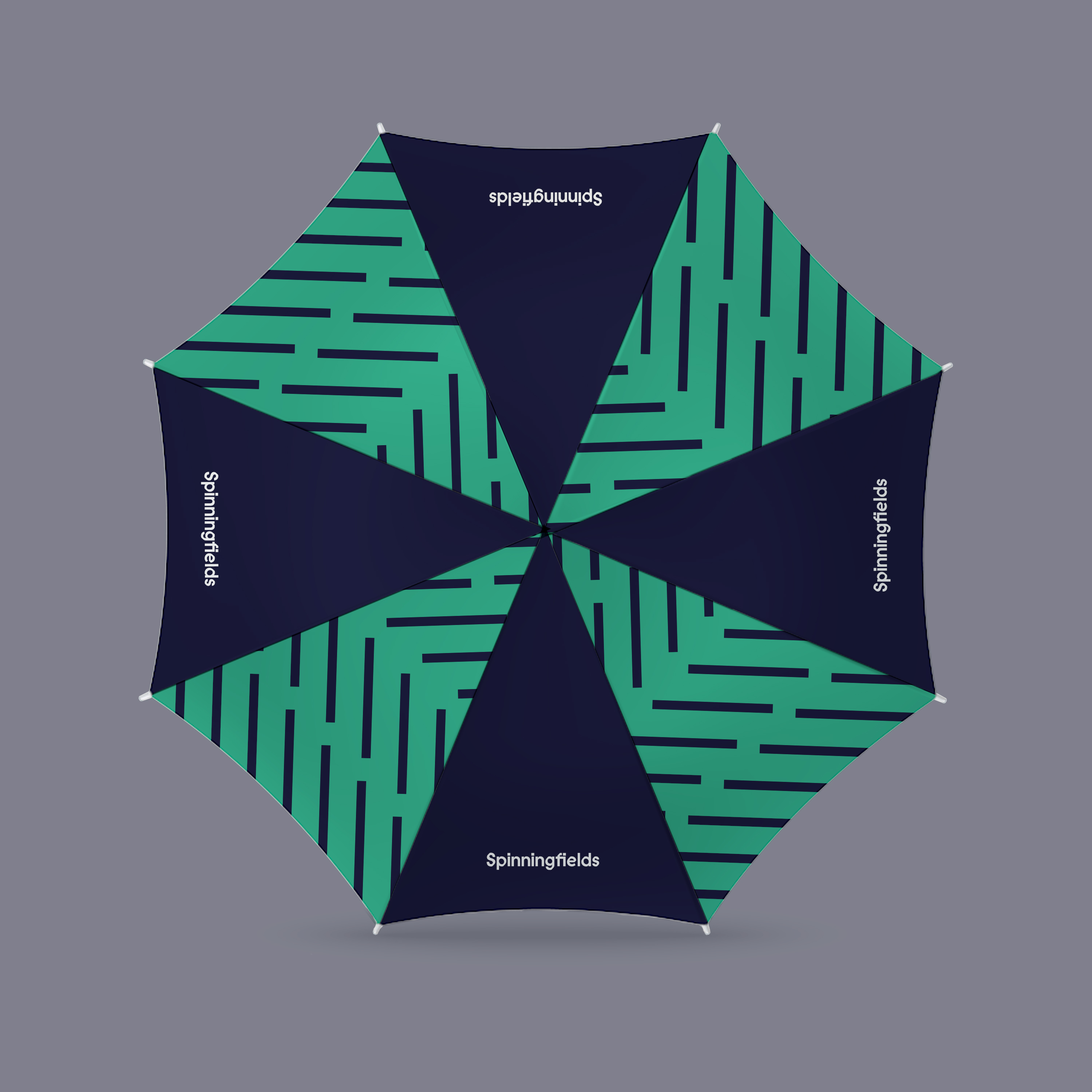
Balancing the high-end and exclusive nature of the area with the need to attract a young and visually literate audience, we developed a simple wordmark using modern, refined typography. The calligraphic angle of the characters became the skeleton for the brand, creating a diagonal device to contain imagery and patterns. The brand’s broad range of contemporary colours allows the identity to work flexibly, with muted, professional colours for business communications and brighter colours for B2C marketing and events.


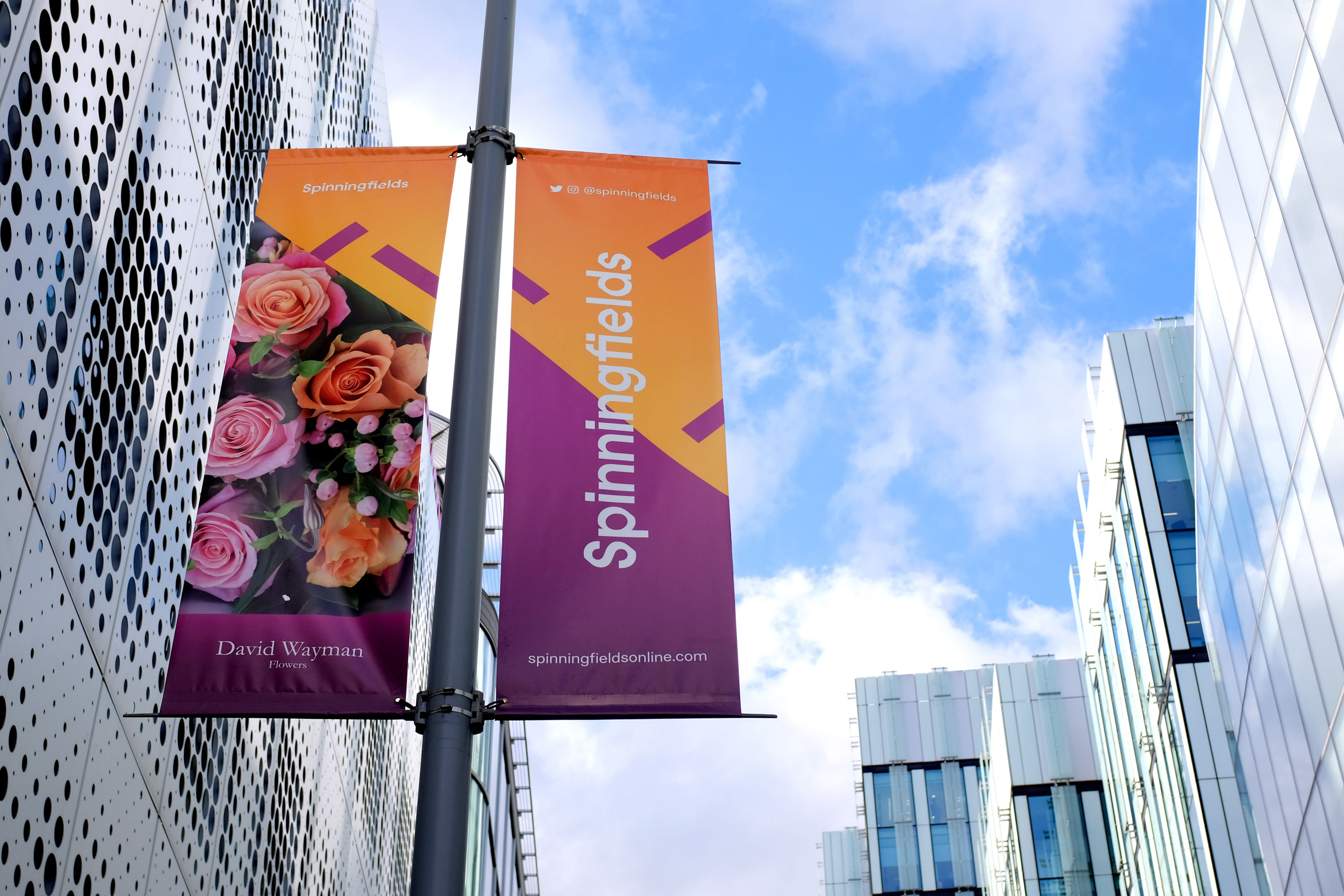
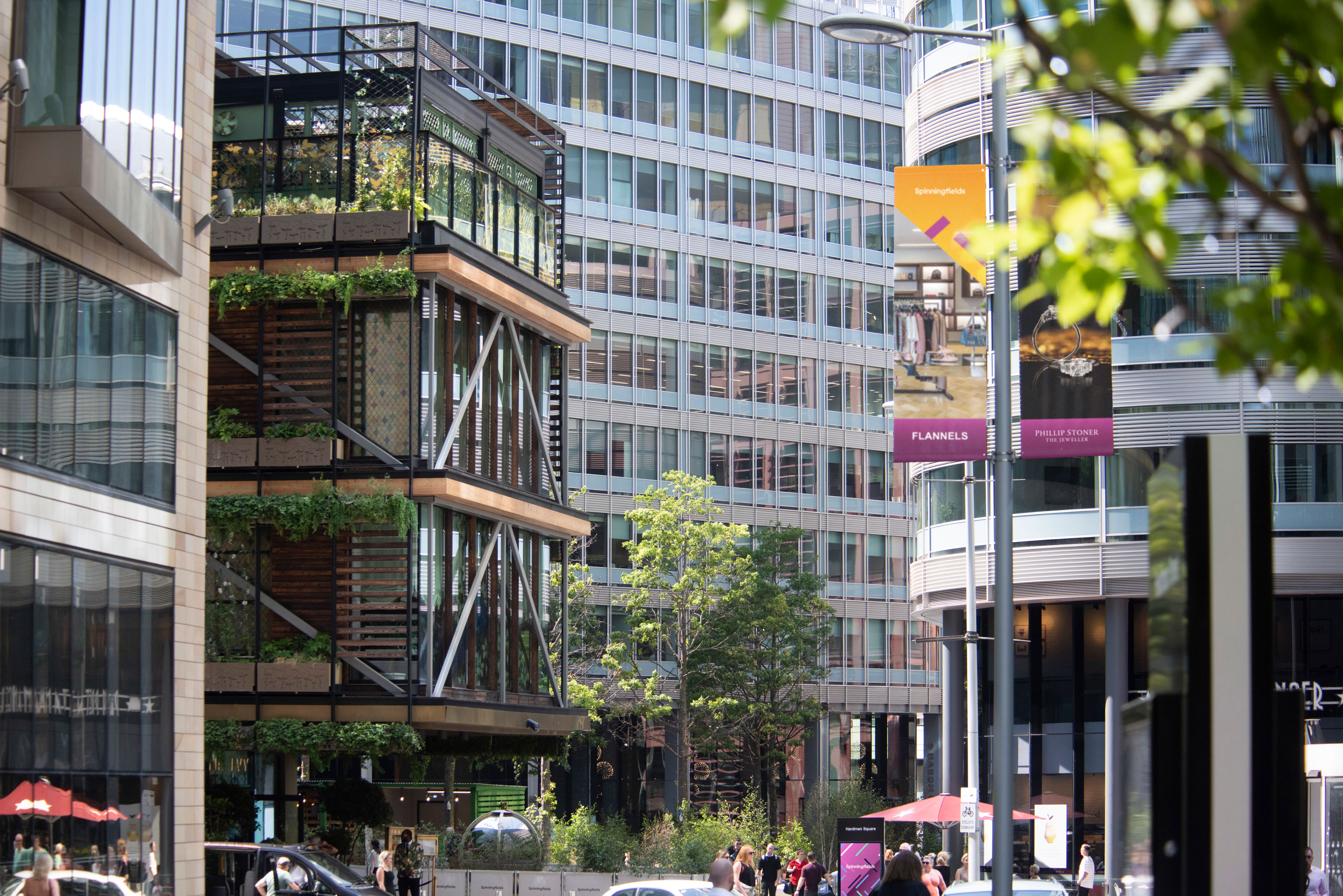
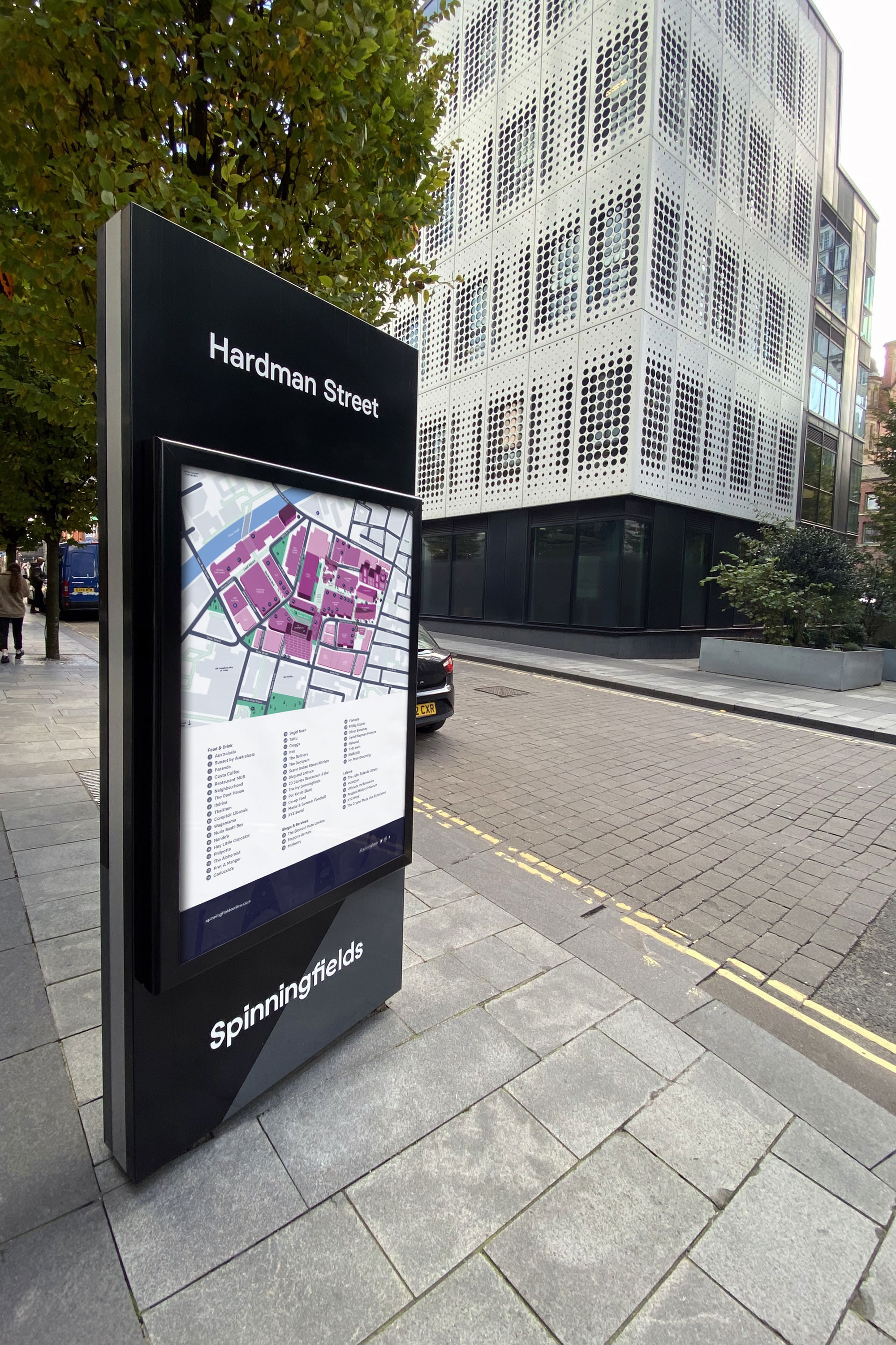
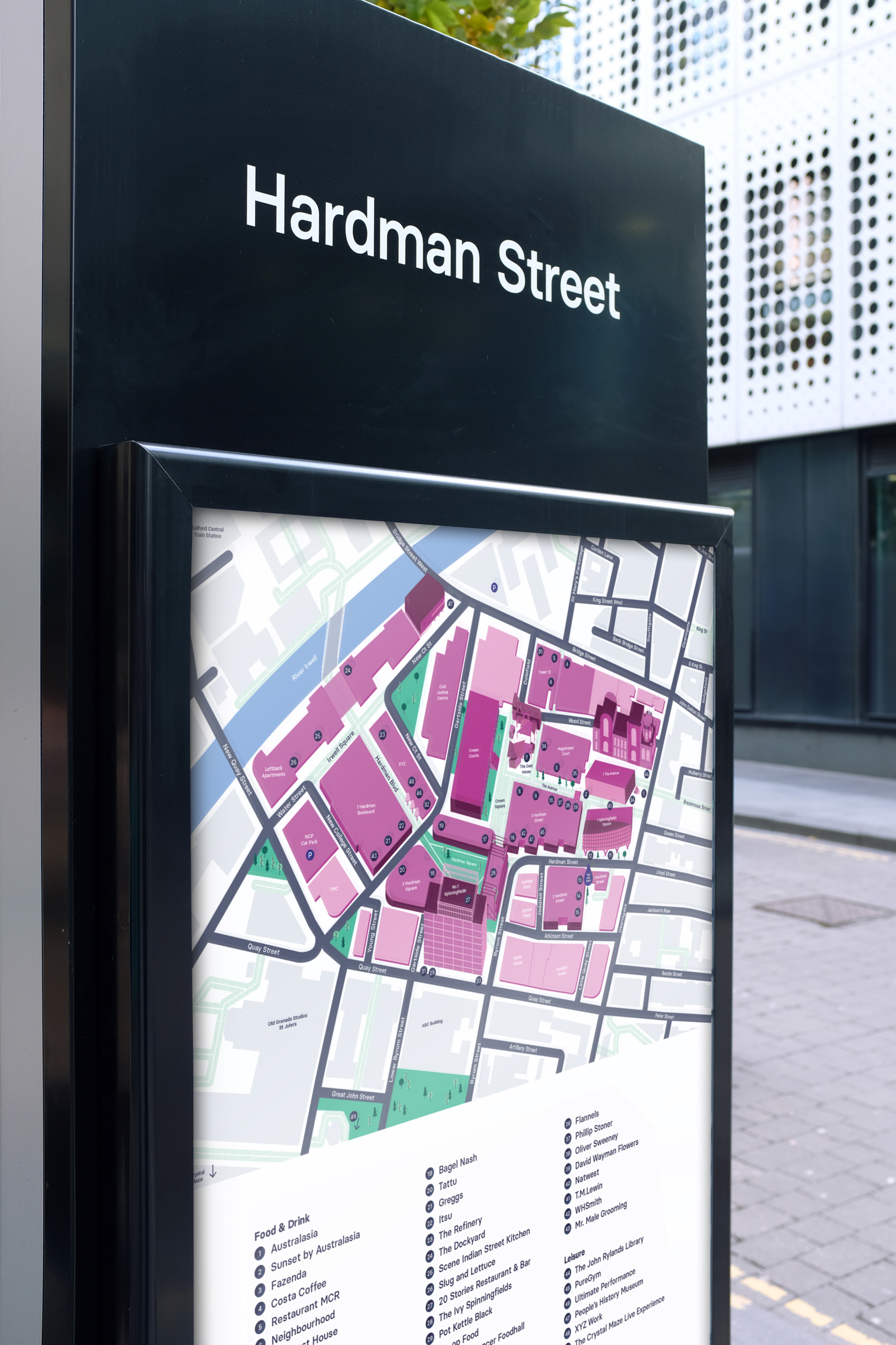
Due to the phased nature of the development, there was lots of variation in signage with no consistency between newer parts of the site and older areas. We developed a new signage and wayfinding system for the estate, bringing all of these areas together and to create a clear sense of place when entering the neighbourhood.

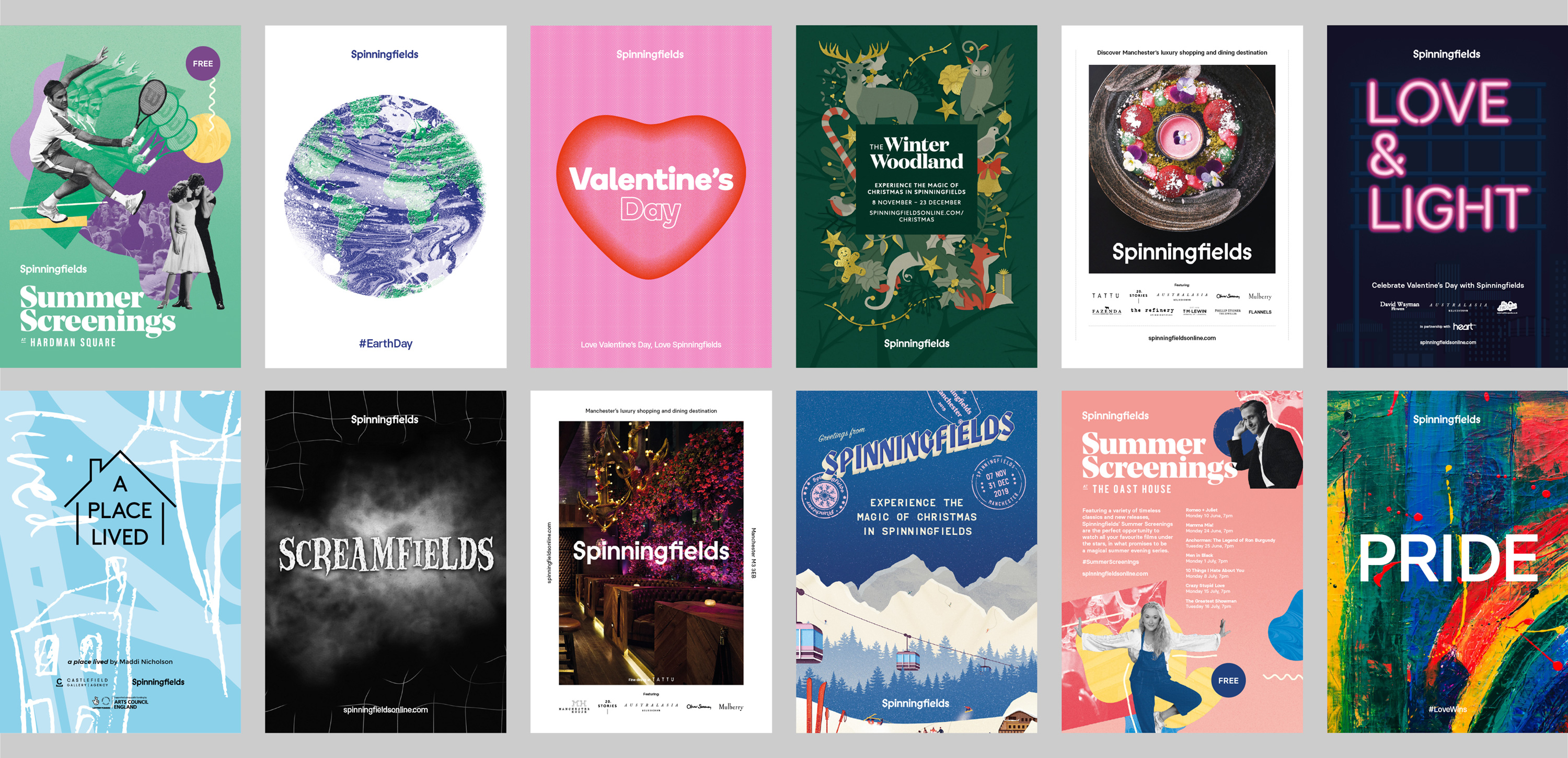
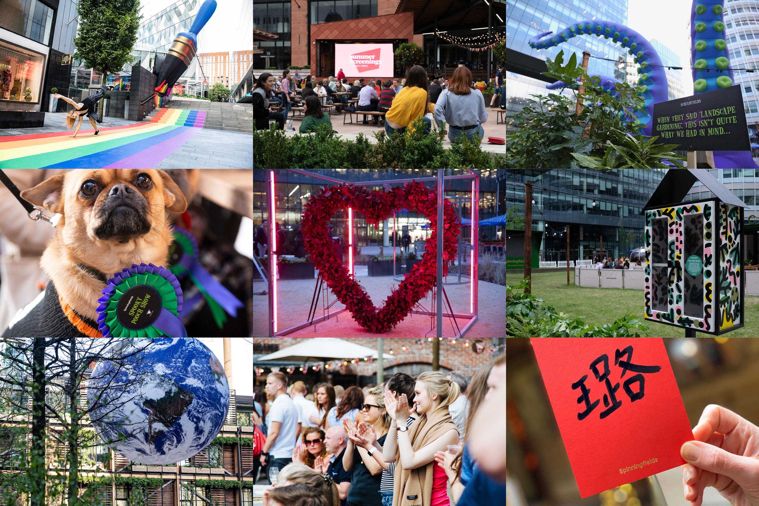
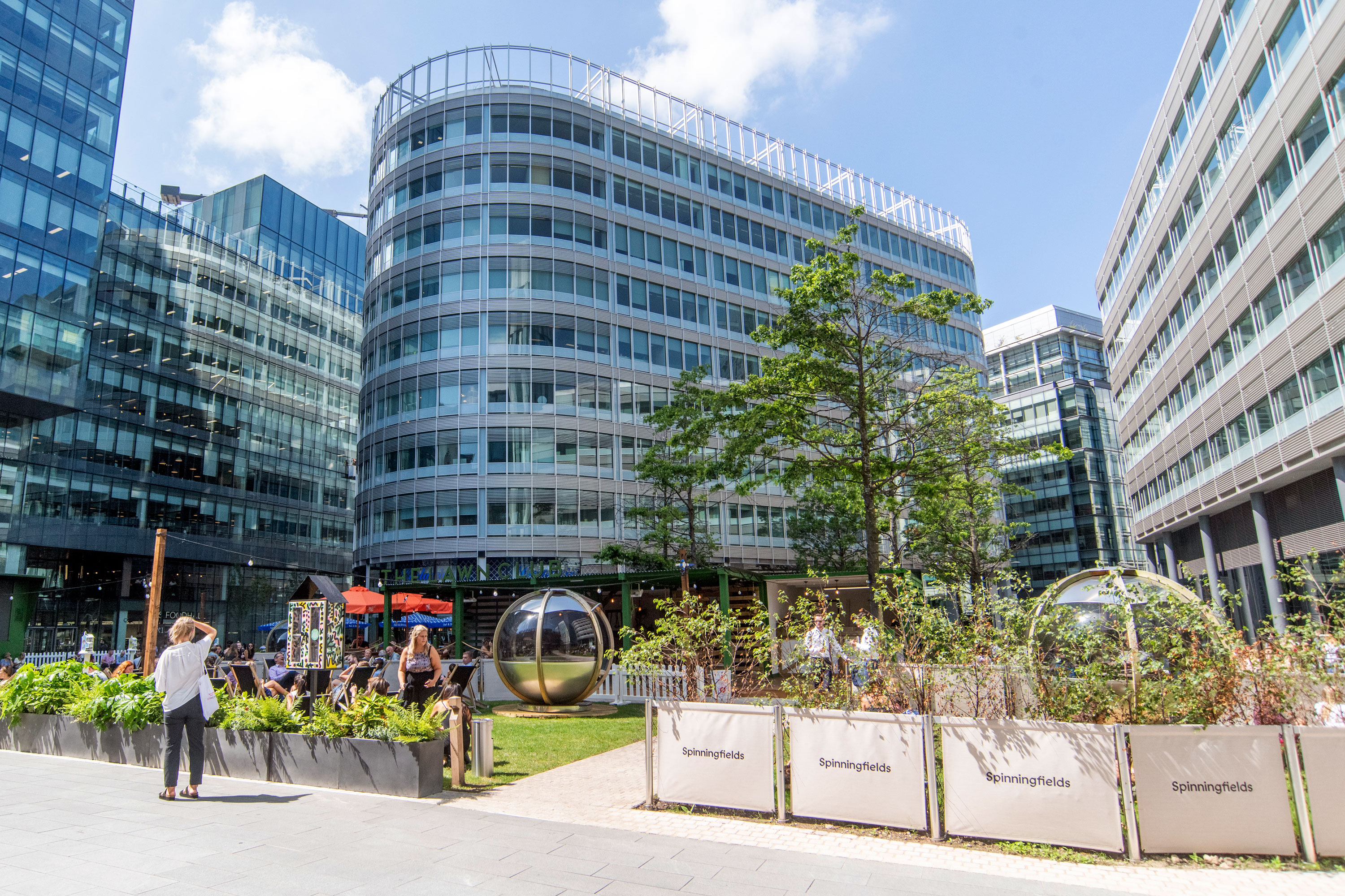
Alongside the brand, we have worked alongside Spinningfields to market series of placemaking activities and public events including pop up bars, markets, outdoor screenings and a series of art installations. These activities have cemented Spinningfield’s reputation as a destination not only for business and hospitality but also arts, culture and community.