National Trust – Quarry Bank
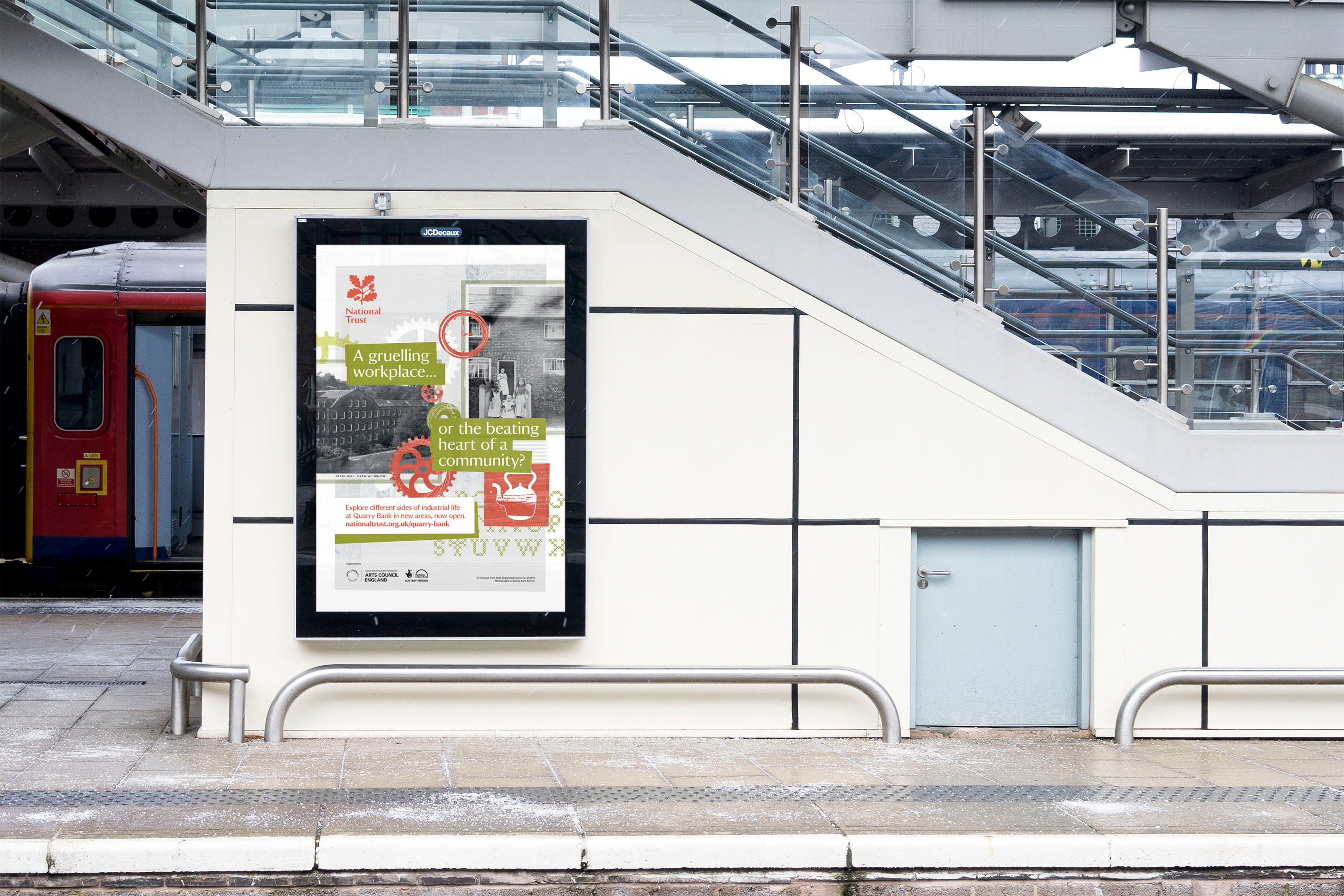
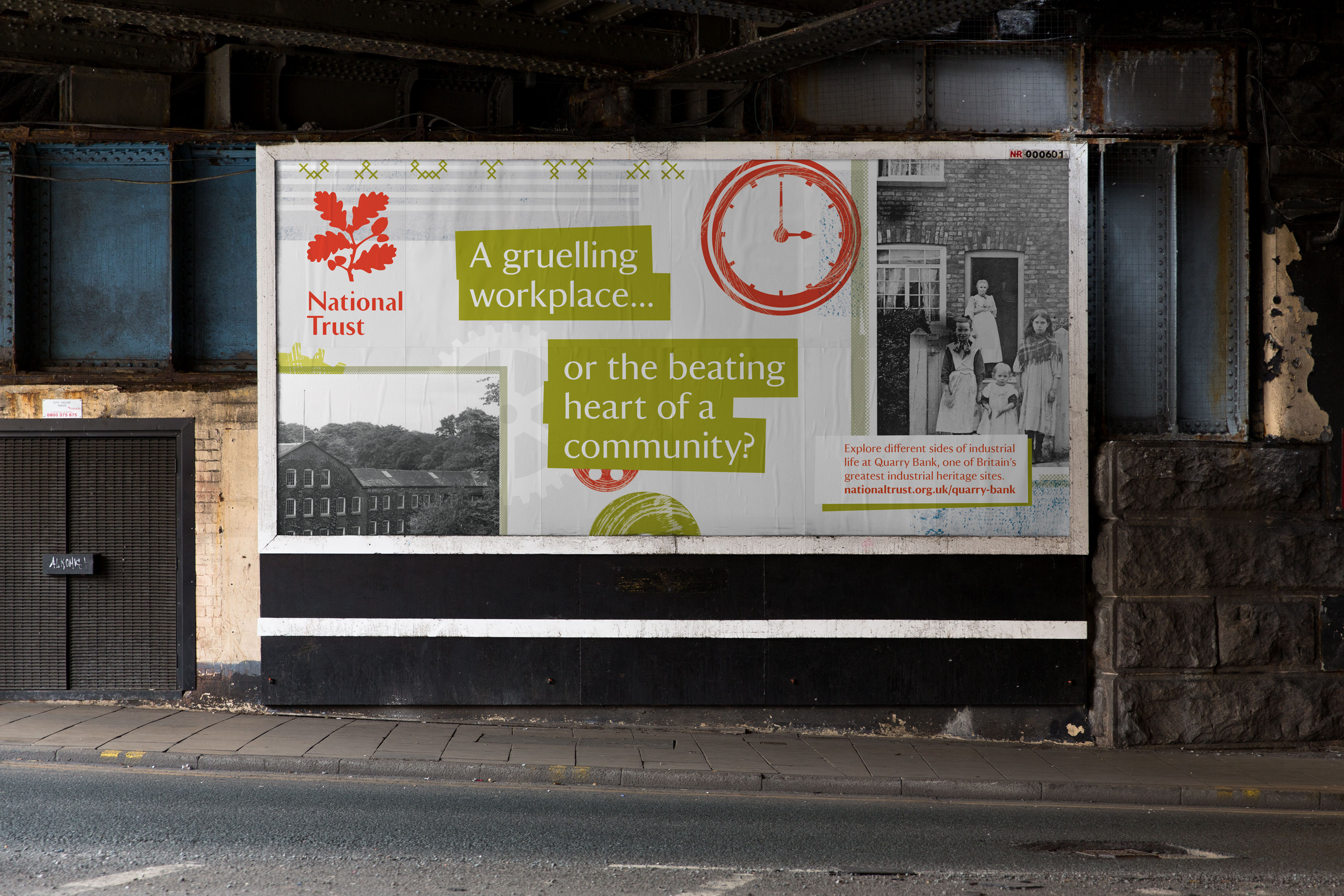
A gruelling workplace, or beating heart of the community?
Quarry Bank relaunch
Campaign
Illustration
Print Design
Client: National Trust
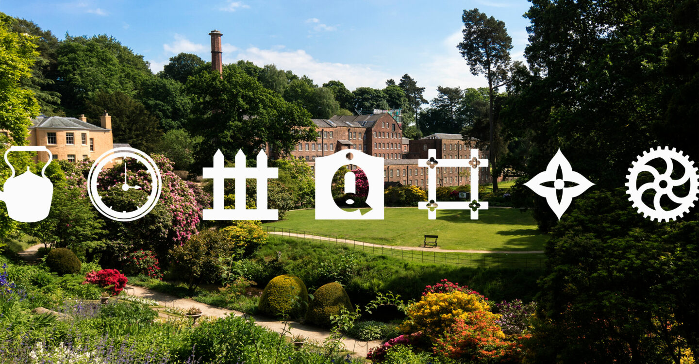
Primarily known for its cotton mill built in 1784, Quarry Bank is in fact the most complete designed industrial revolution community in the world. It comprises the homes and workplaces of the owner, manager, workers and apprentices, a farm, village, school and two chapels.
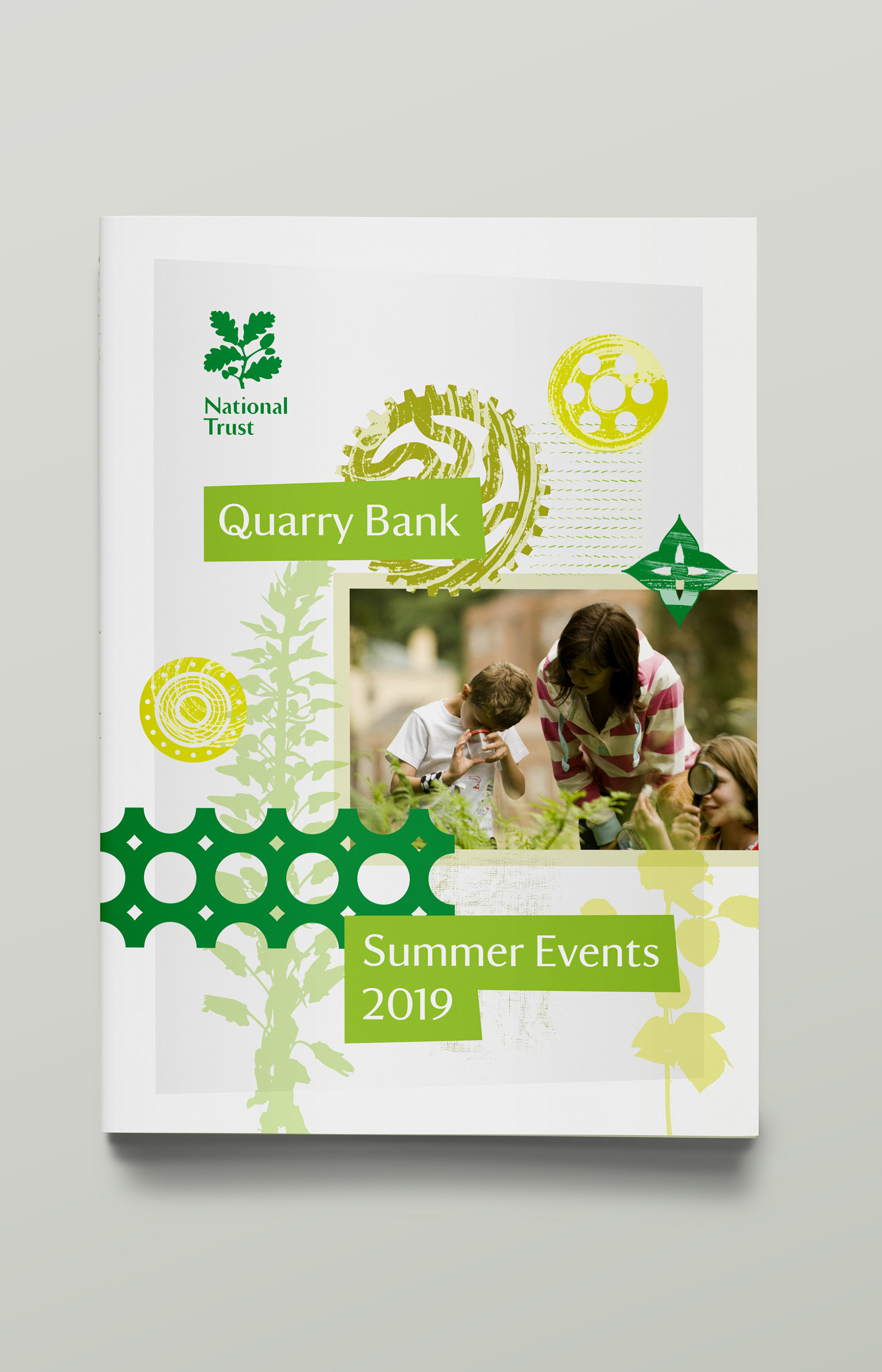
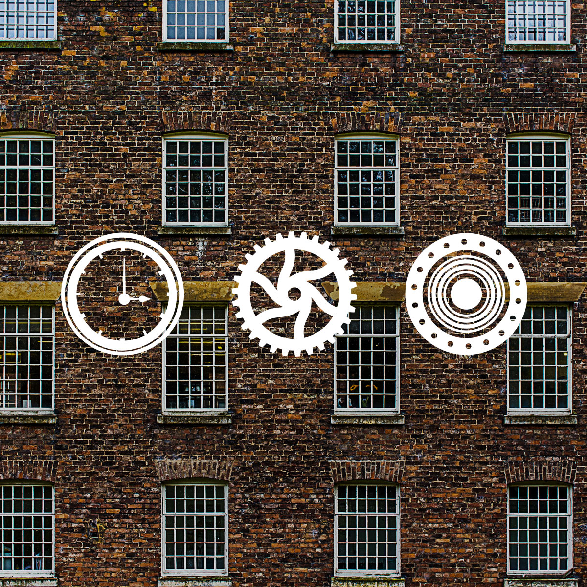
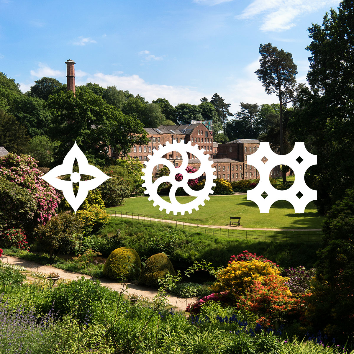
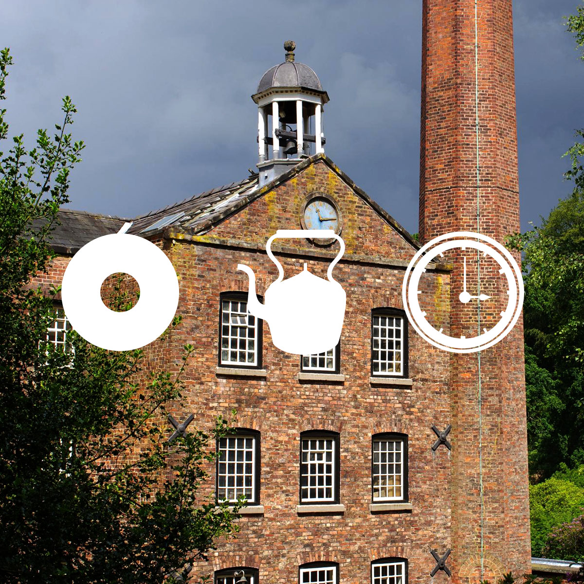
Our brief was to re-launch Quarry Bank after a £9m refurbishment, carrying the message of community and work with elements then going into their core area brand and merchandise. The National Trust team wanted to focus on the contrasts and contradictions explored through the mill and the collections on show. We worked with the team to develop a series of copy lines bringing these contrasts into focus.
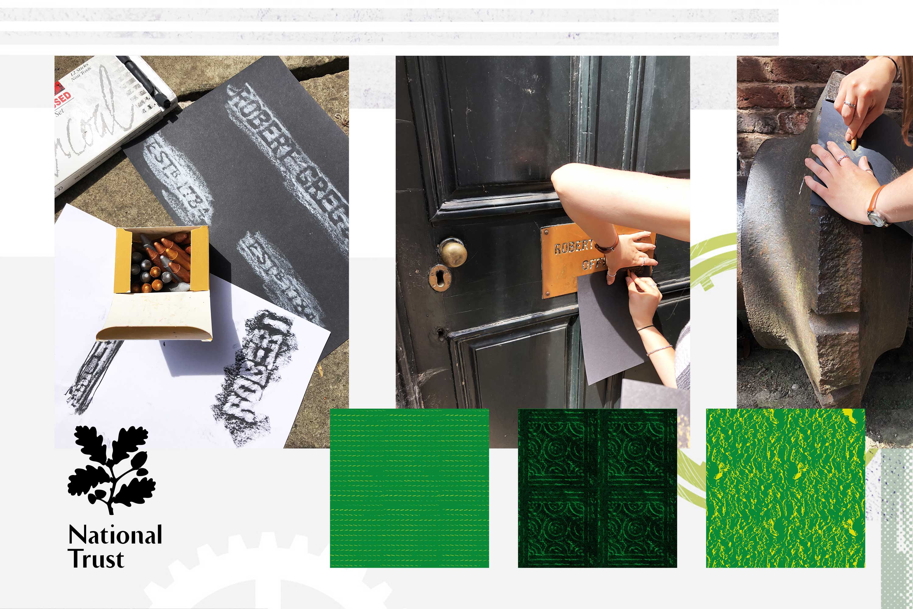
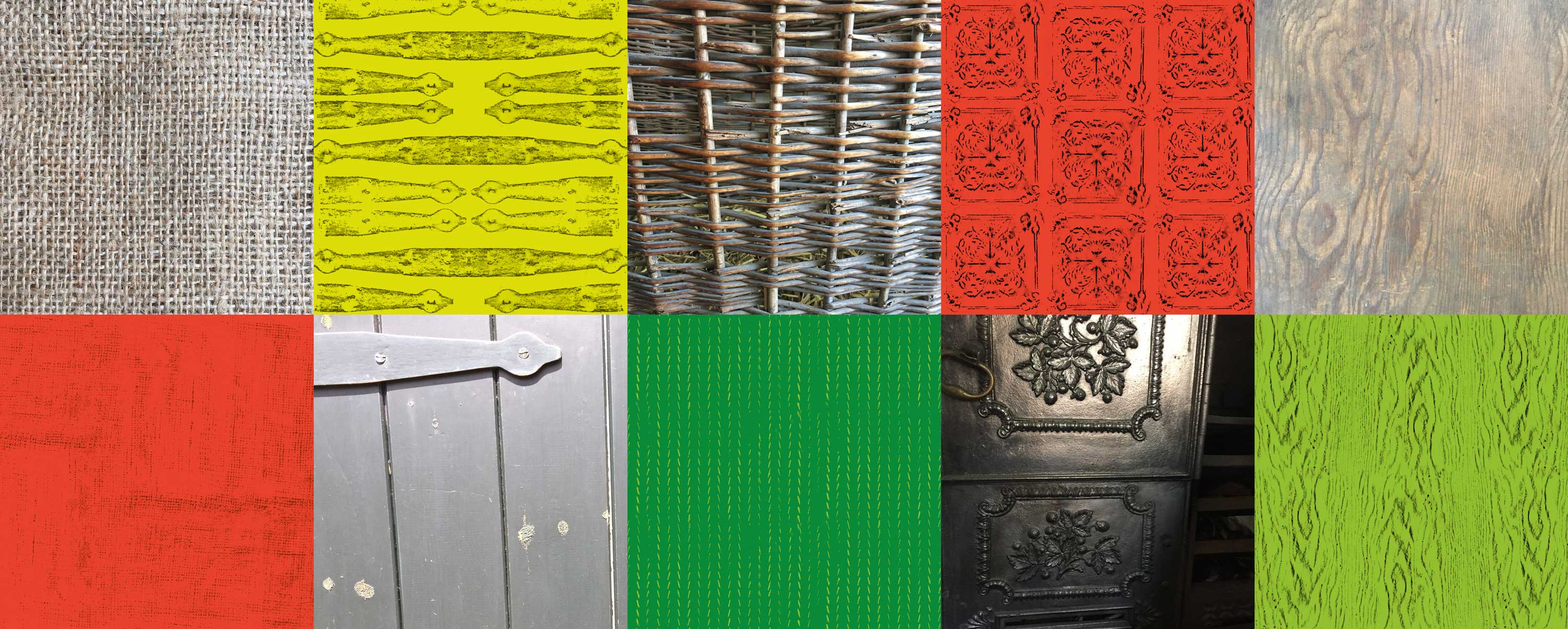
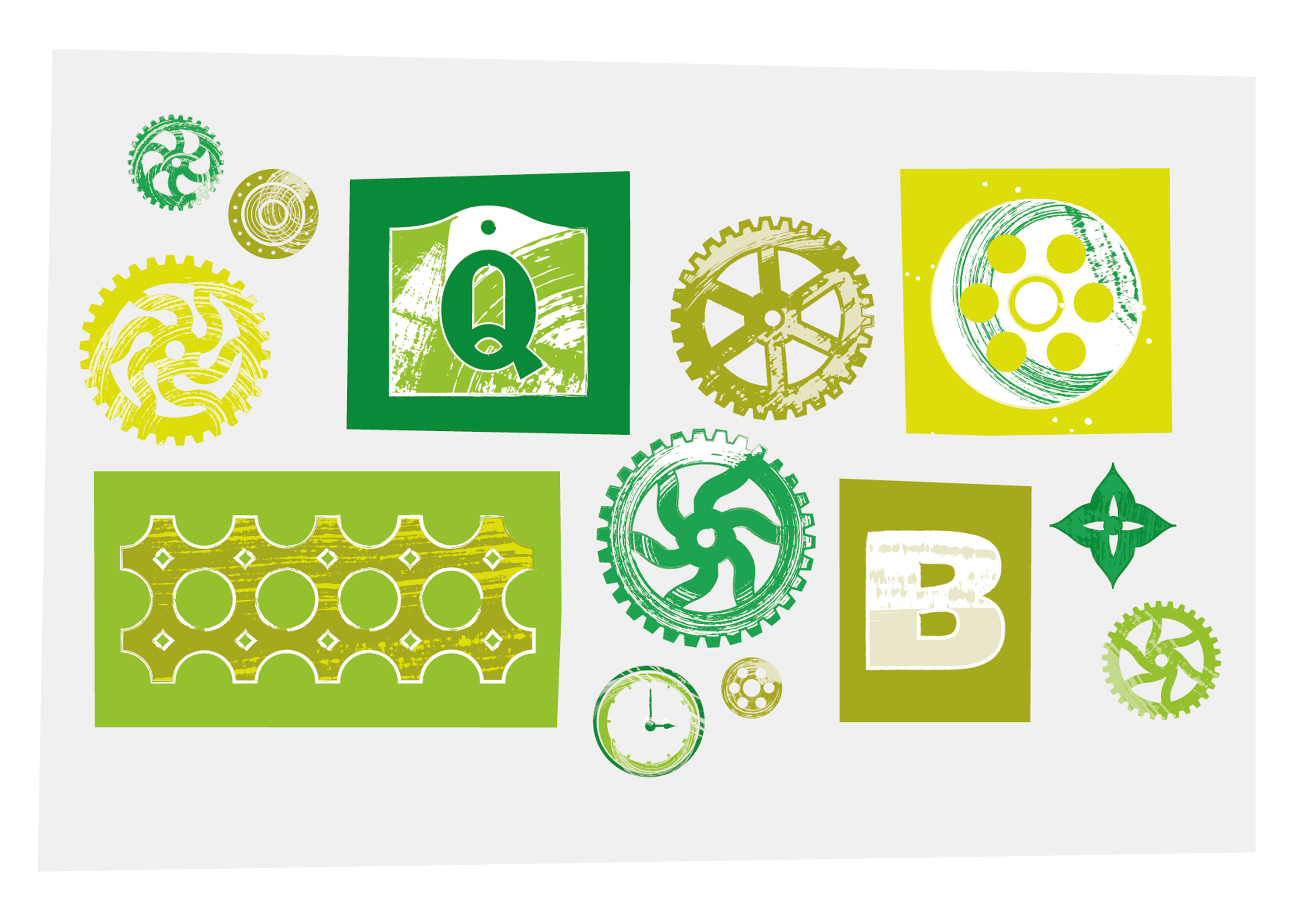
To fully immerse ourselves into the location and surroundings, we went on a full day site visit to Quarry Bank and collected references materials for the campaign. This included photography and rubbings of textures around the site. This gave us a wide range of assets ranging from original iron fittings in the kitchens to stone paths in the gardens.
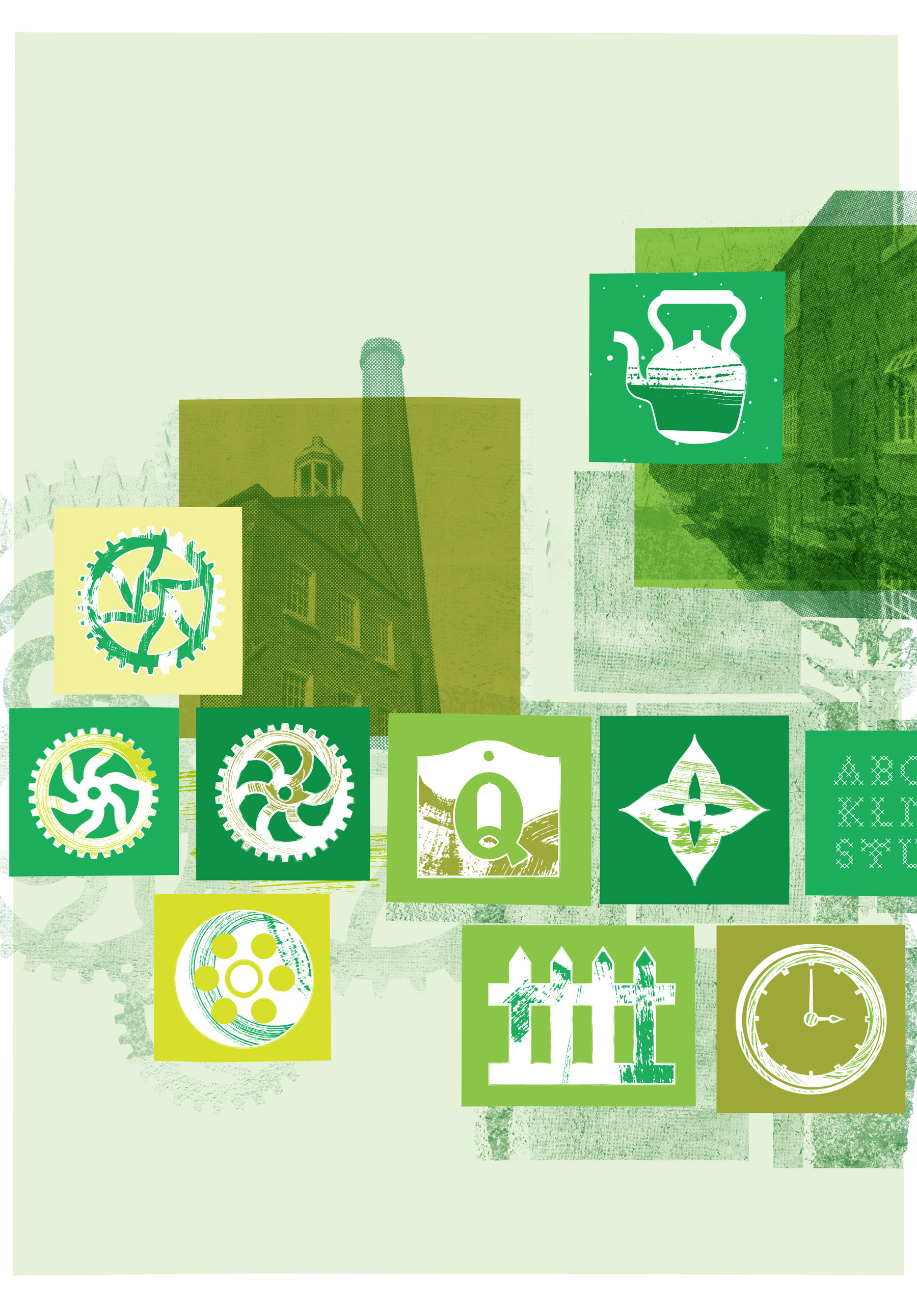
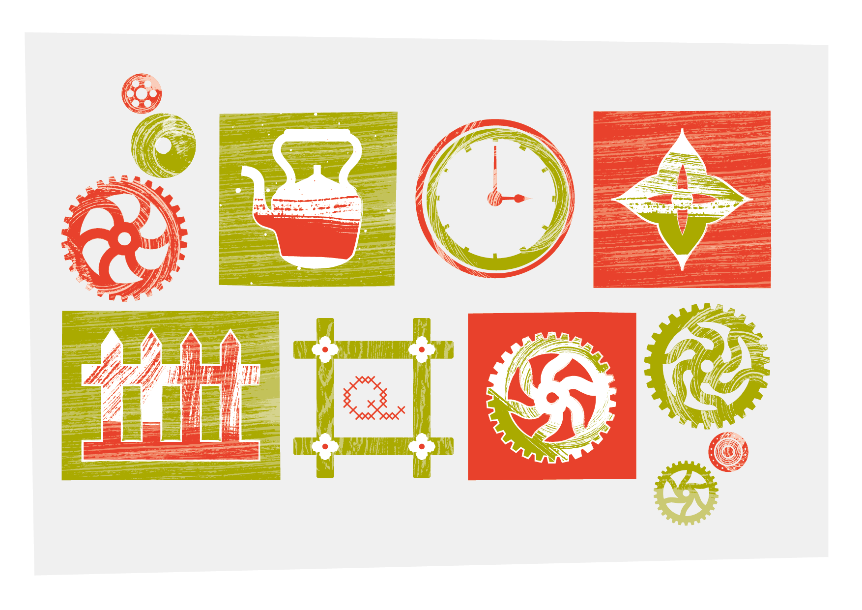
We combined our Quarry Bank textures with illustrative elements, archive photography and custom typography to create a dynamic, collage approach. These contrasting elements played off the contrasts in the campaign copywriting and allowed us to create a wide range of artwork that all felt visually linked to the same concept.


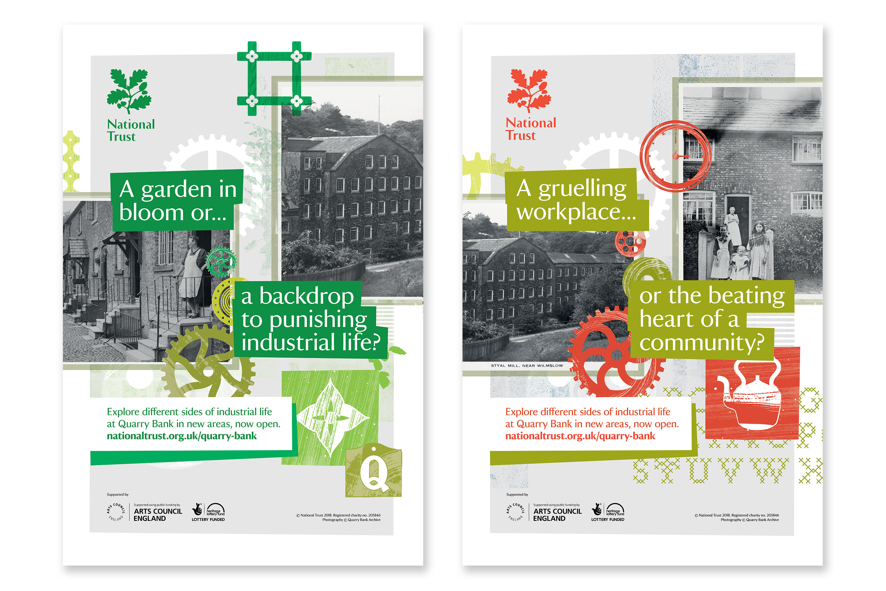
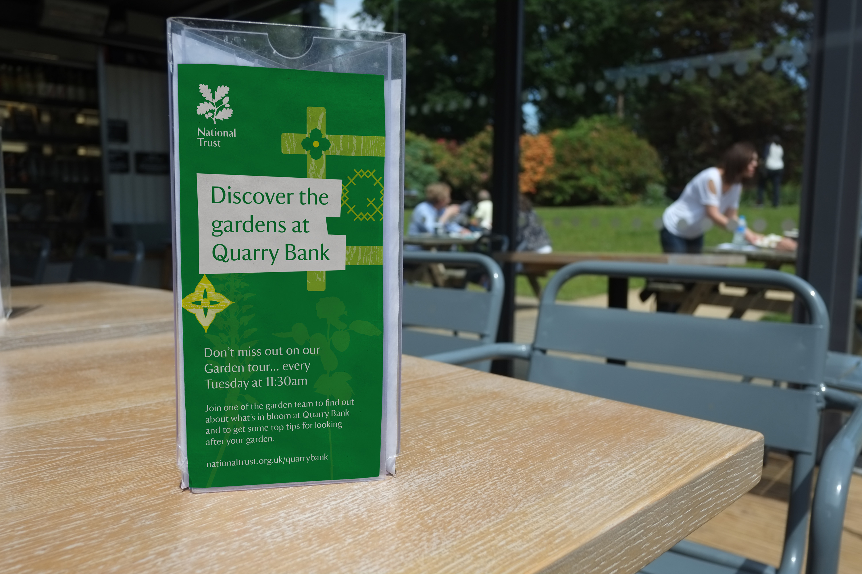
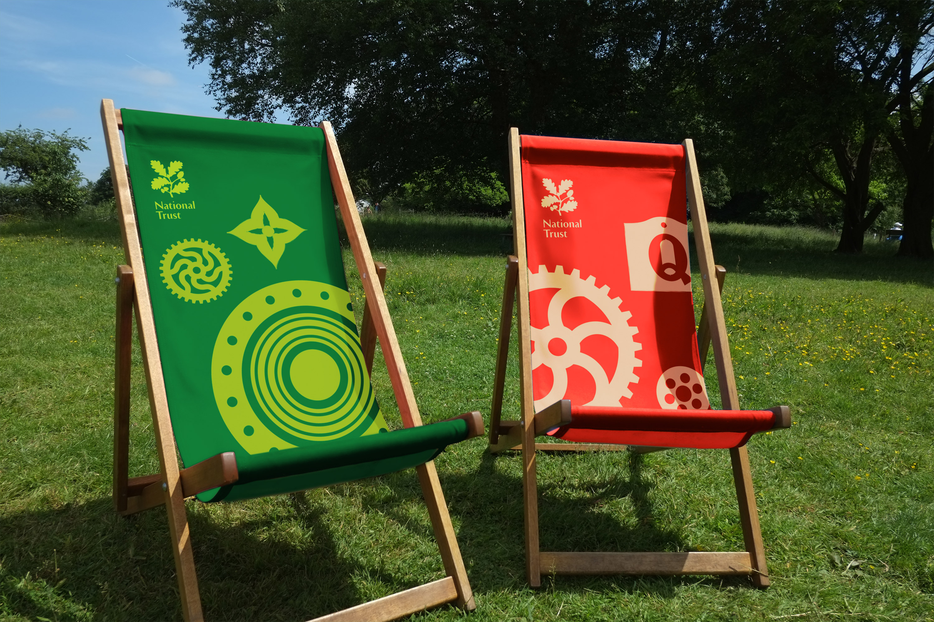
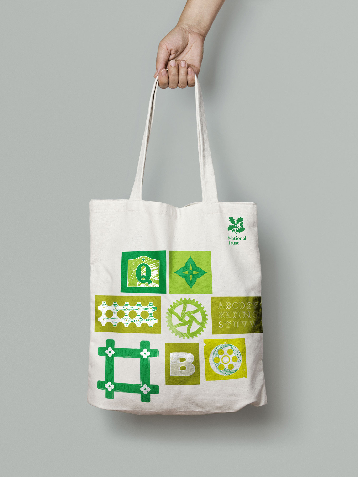
We developed this style further to allow for other applications of the campaign artwork including on-site visitor information and merchandise.
