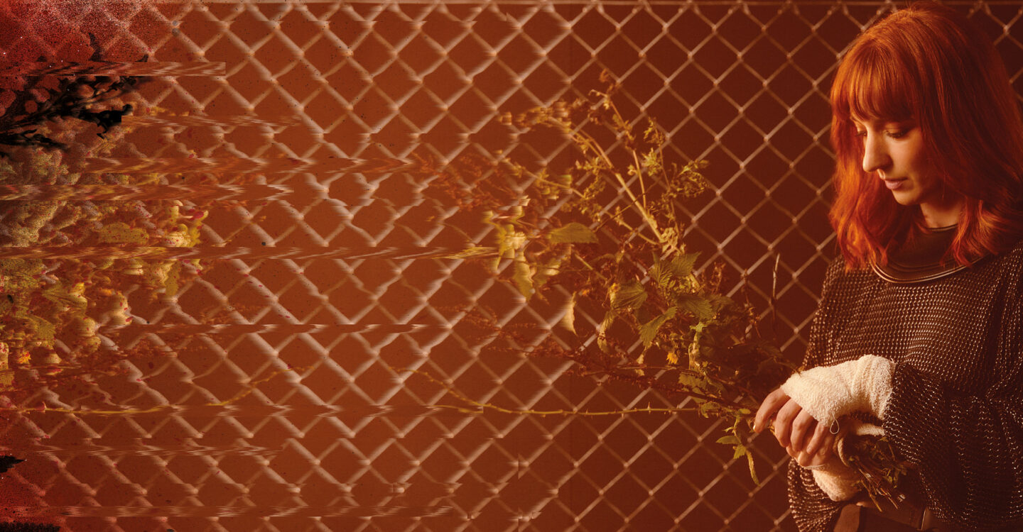
Lonelady
There is no logic
Former Things Album
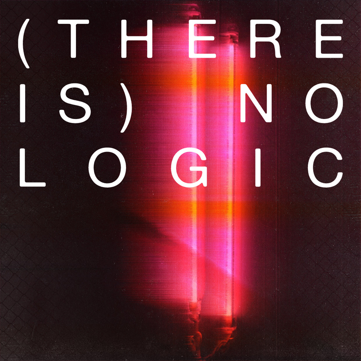
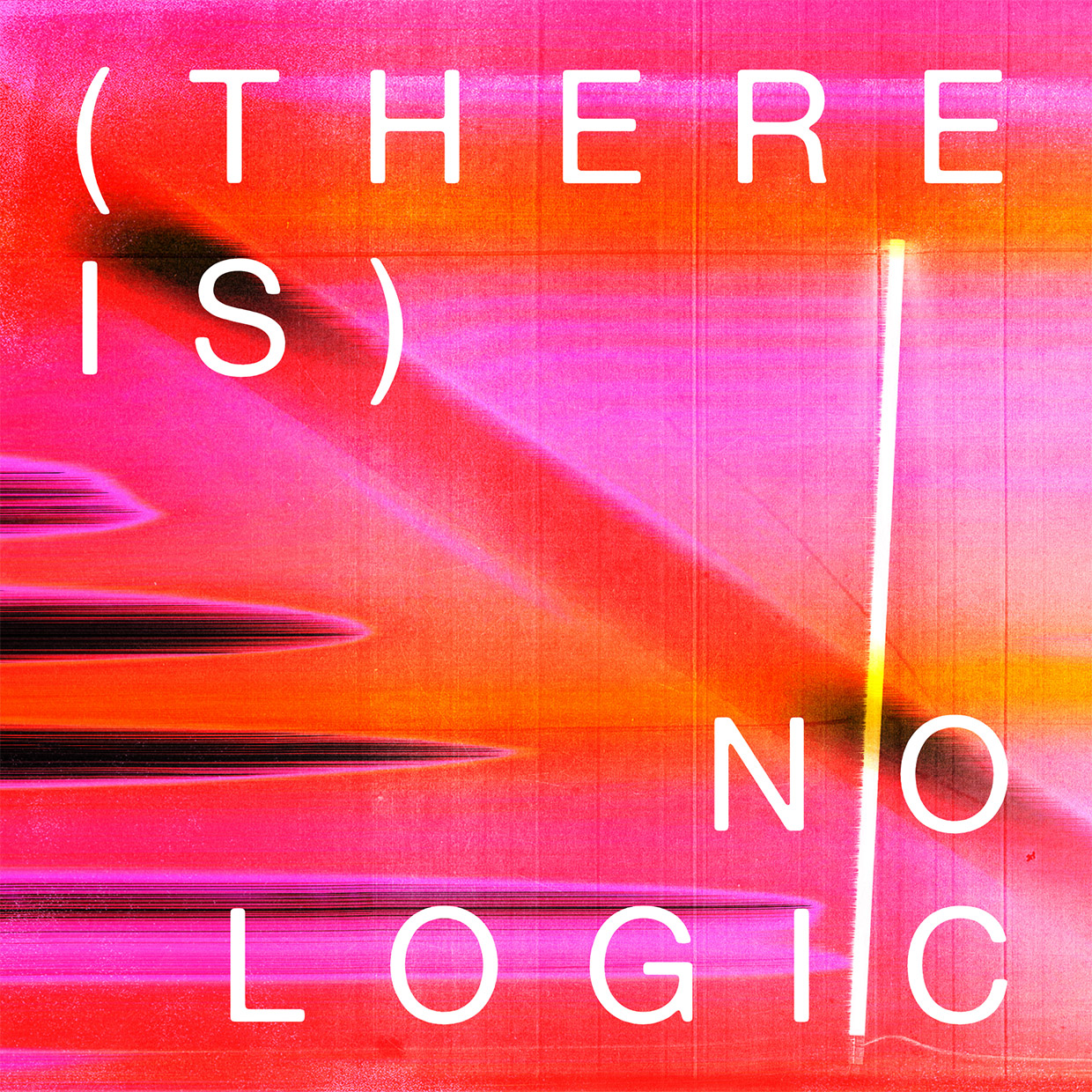
Key art
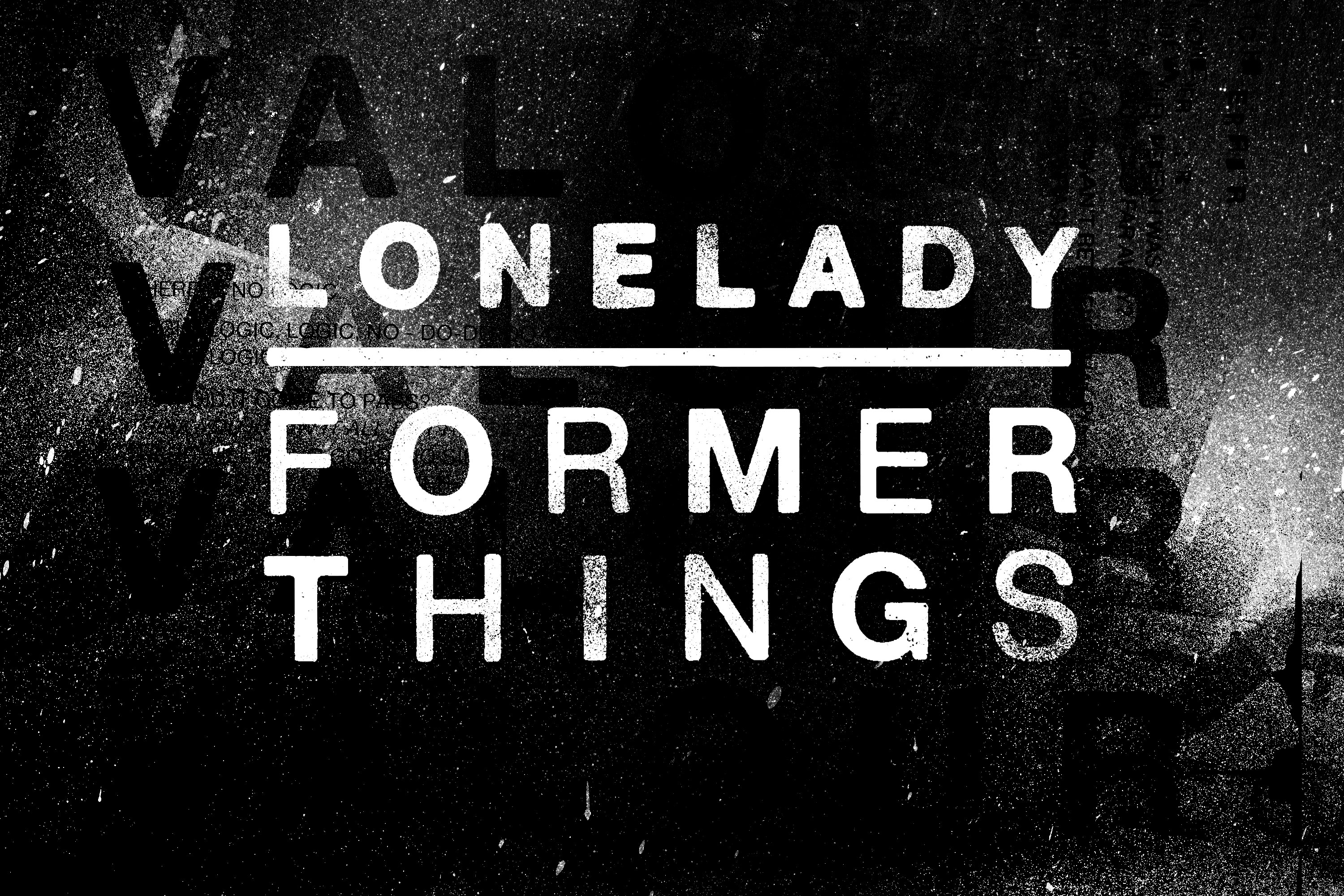
Typeface design
Sleeve design
Campaign
Animation
Merchandise
Client: Warp Records
Art Direction: Julie Campbell
Creative Direction: Matthew Boone
Photography: Jay Mawson

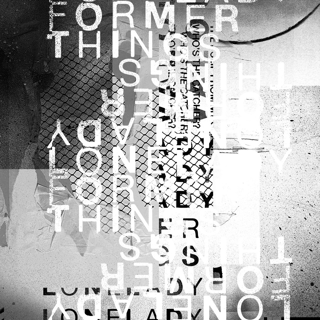
Former Things is the third album from Lonelady, inspired by a seismic move leaving her native Manchester and decamping to London’s Somerset House Studios in search of a new cityscape.
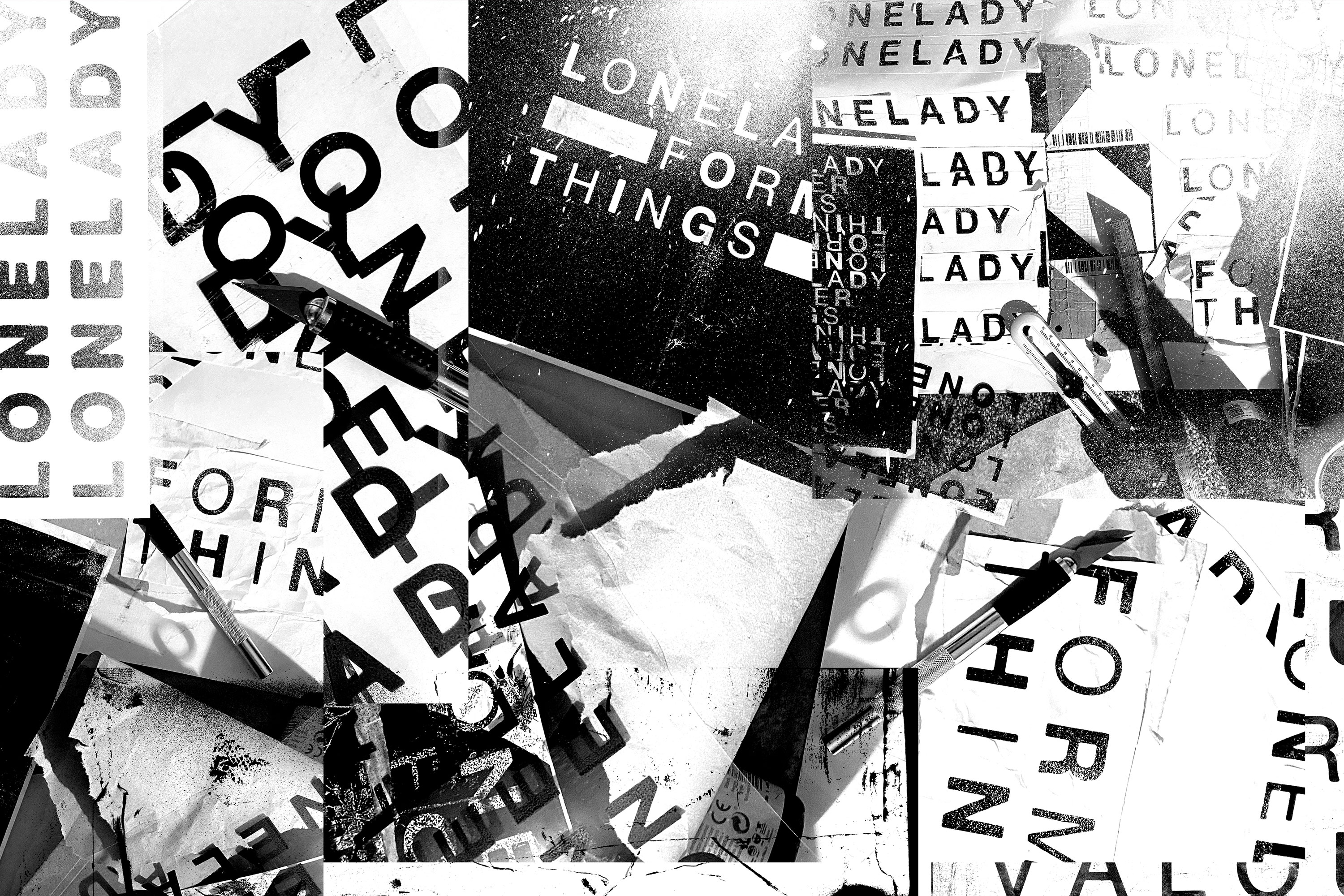
We connected over a shared love of analogue, collecting ephemera, cutting and scanning and using our hands to layer and build textures inspired by design heroes Vaughan Oliver, Chris Ashworth and Tomato.
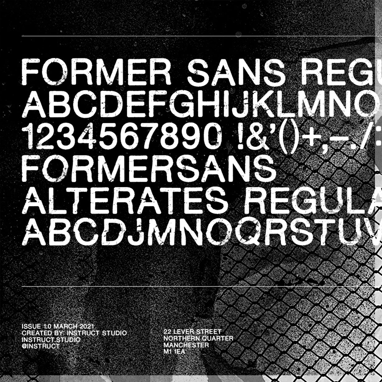
We started work on her new identity, using letraset, photocopies and scalpels which morphed into a fully working typeface to use across the whole campaign.

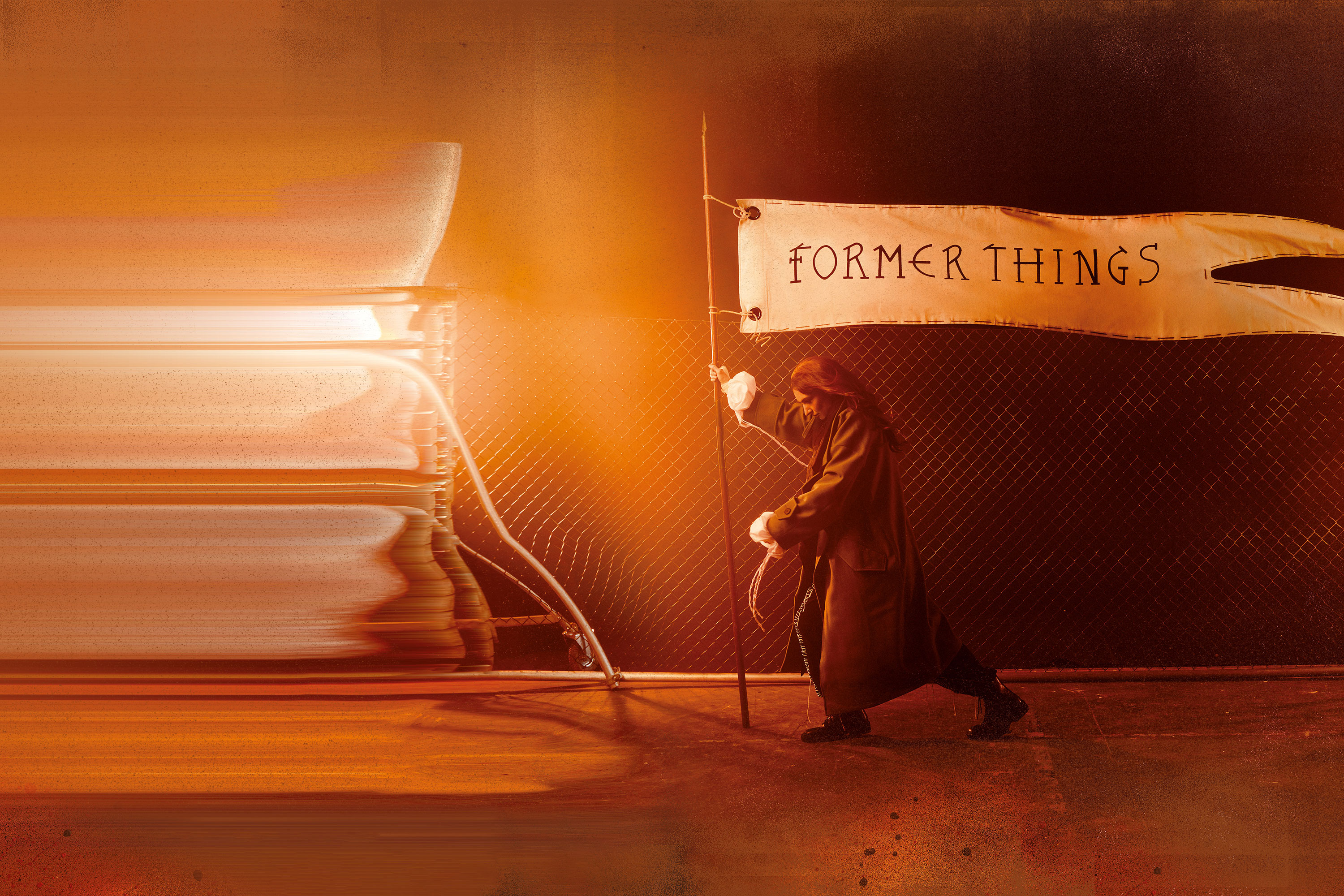
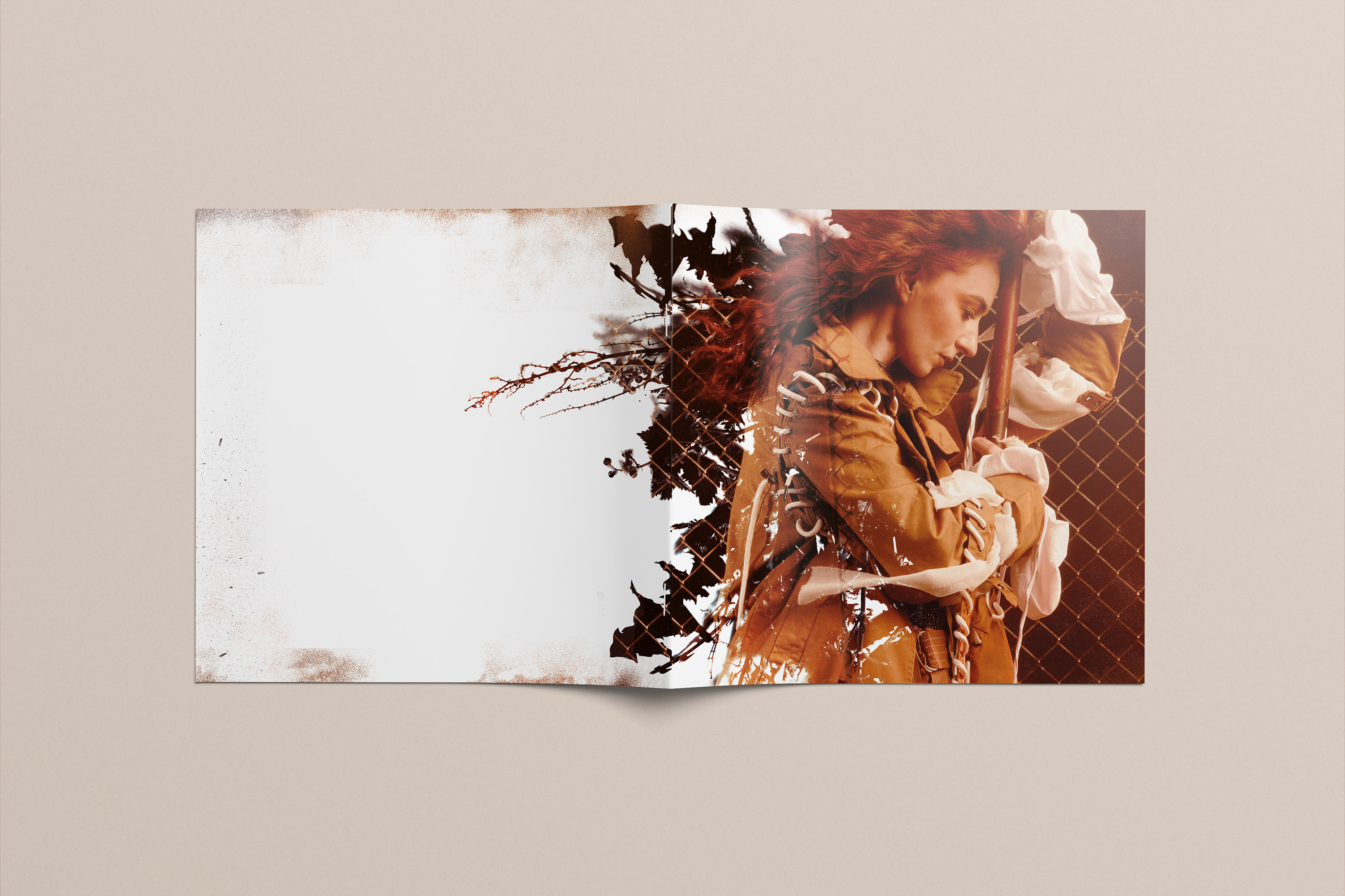
Working with stunning photography from Jay Mawson we started to manipulate and layer our work into the imagery, stretching and bending elements to show tension and movement.
It’s important to note at this point, we hadn’t heard any of the record and all the design work was done with lots of conversations and understanding of lyrics and context.
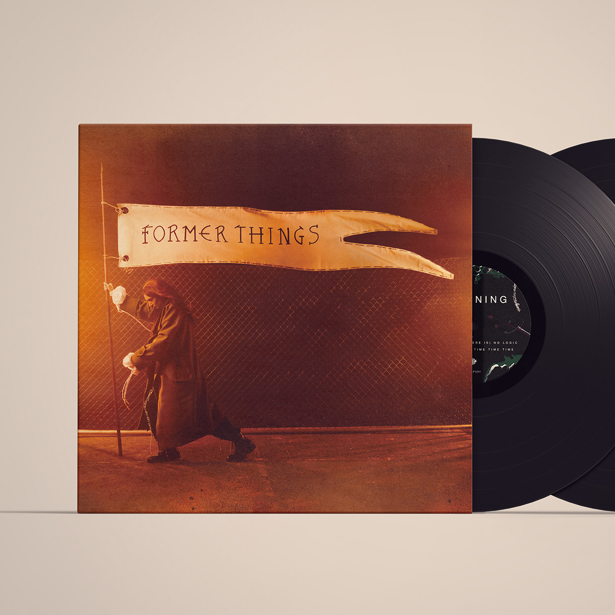
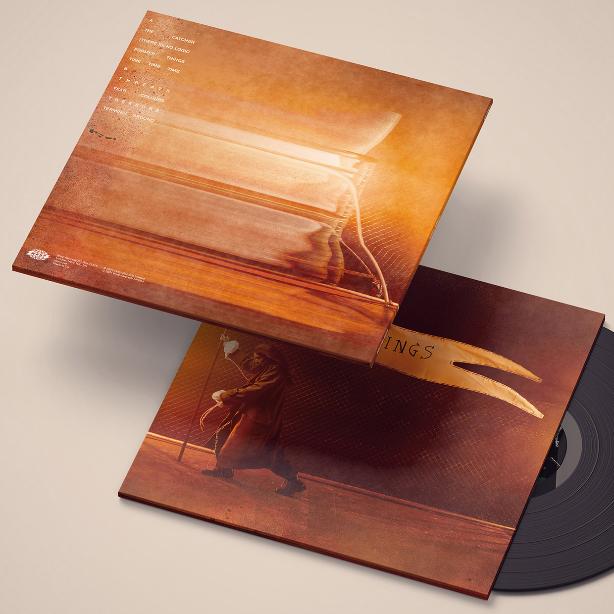
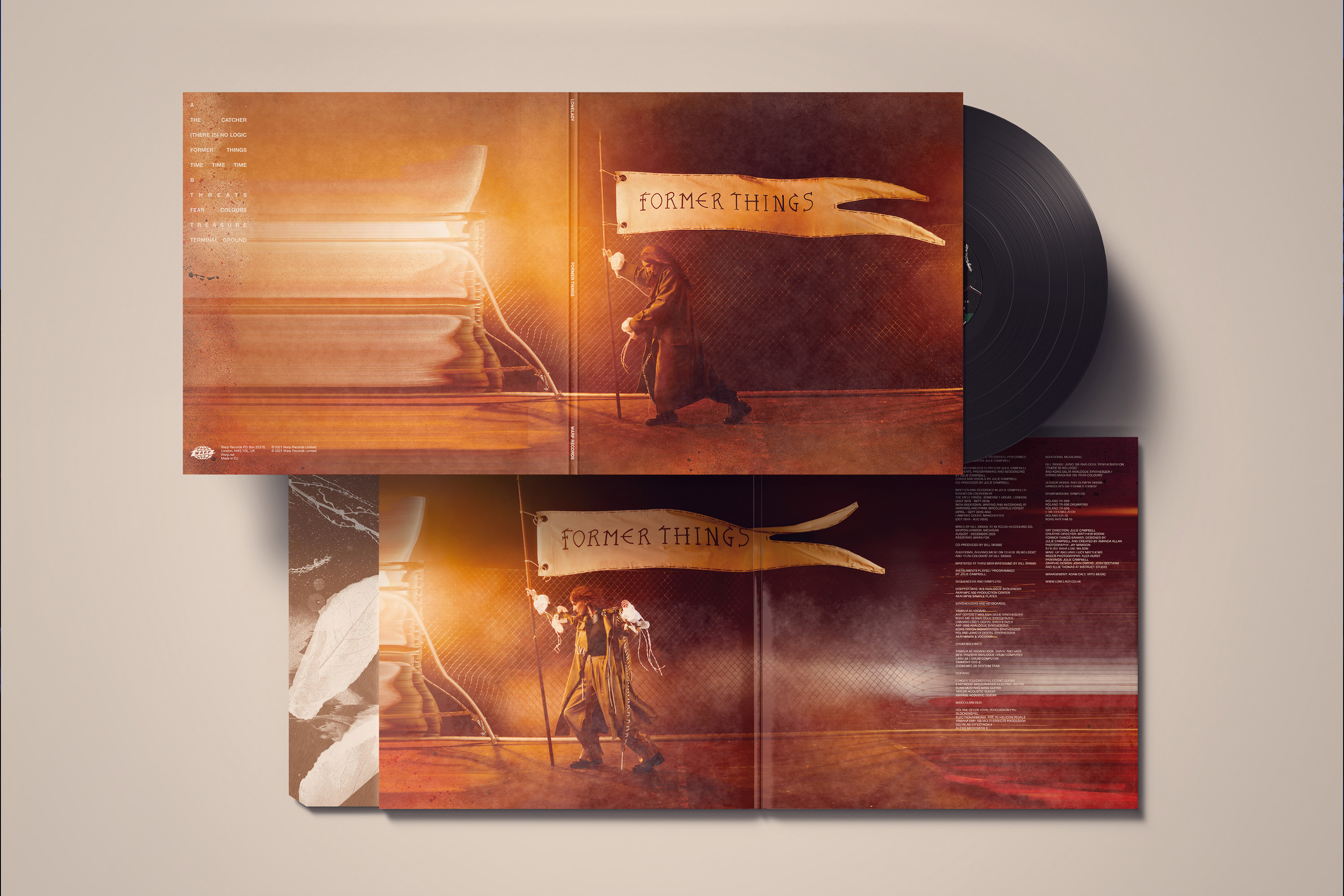
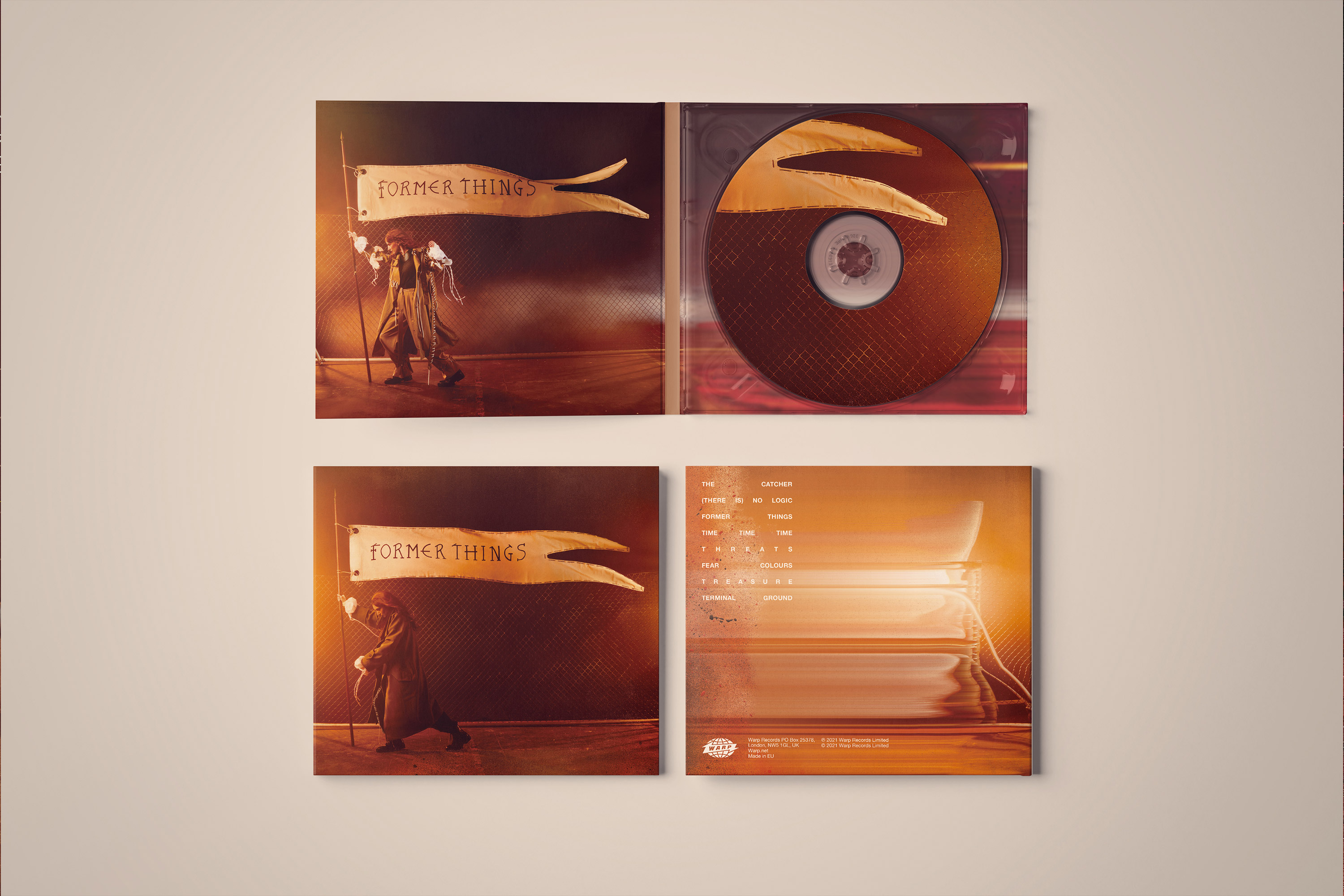
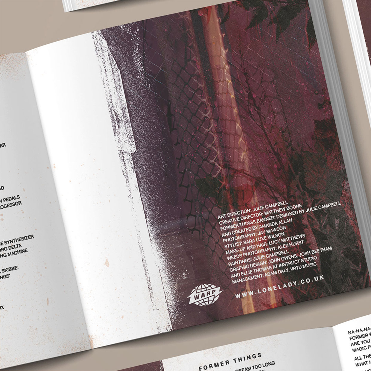
A large part of our work was creating a rich palette of scanned items, carefully collected by Julie (LoneLady) which were arranged inside the album sleeves and the inner labels as well as masking parts of the key imagery.

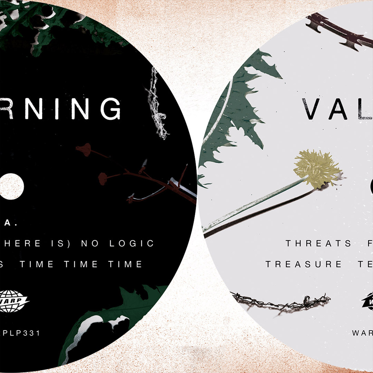

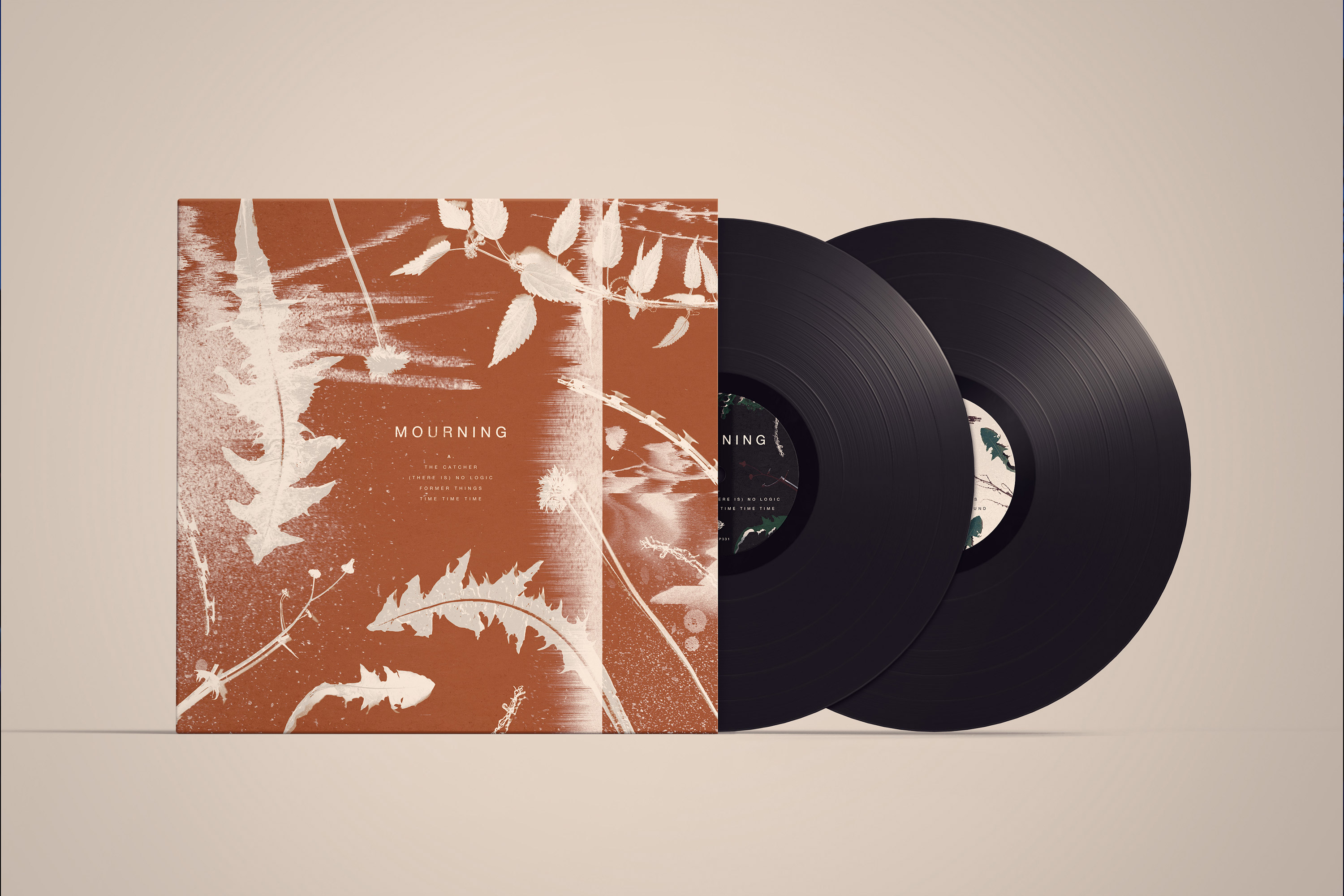
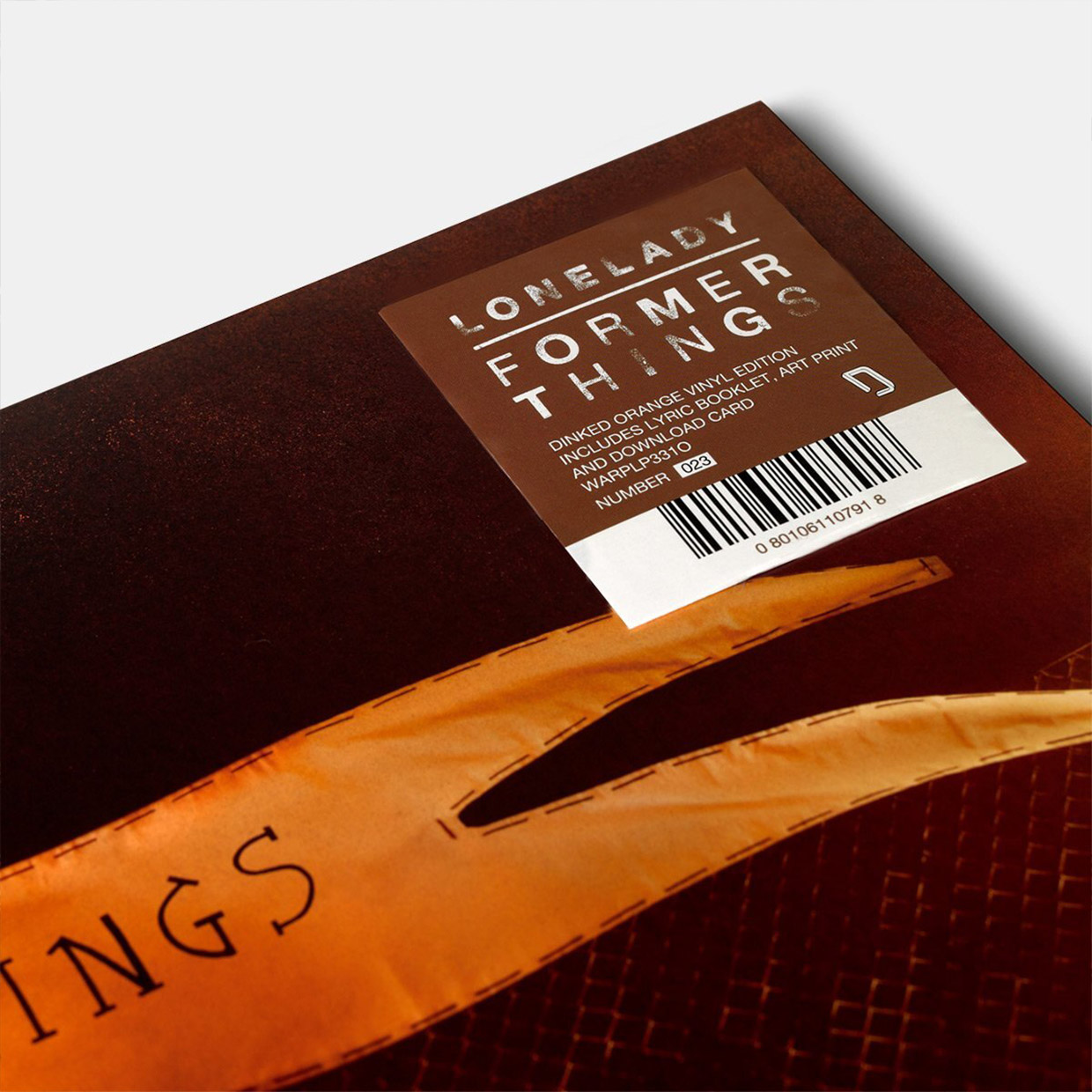
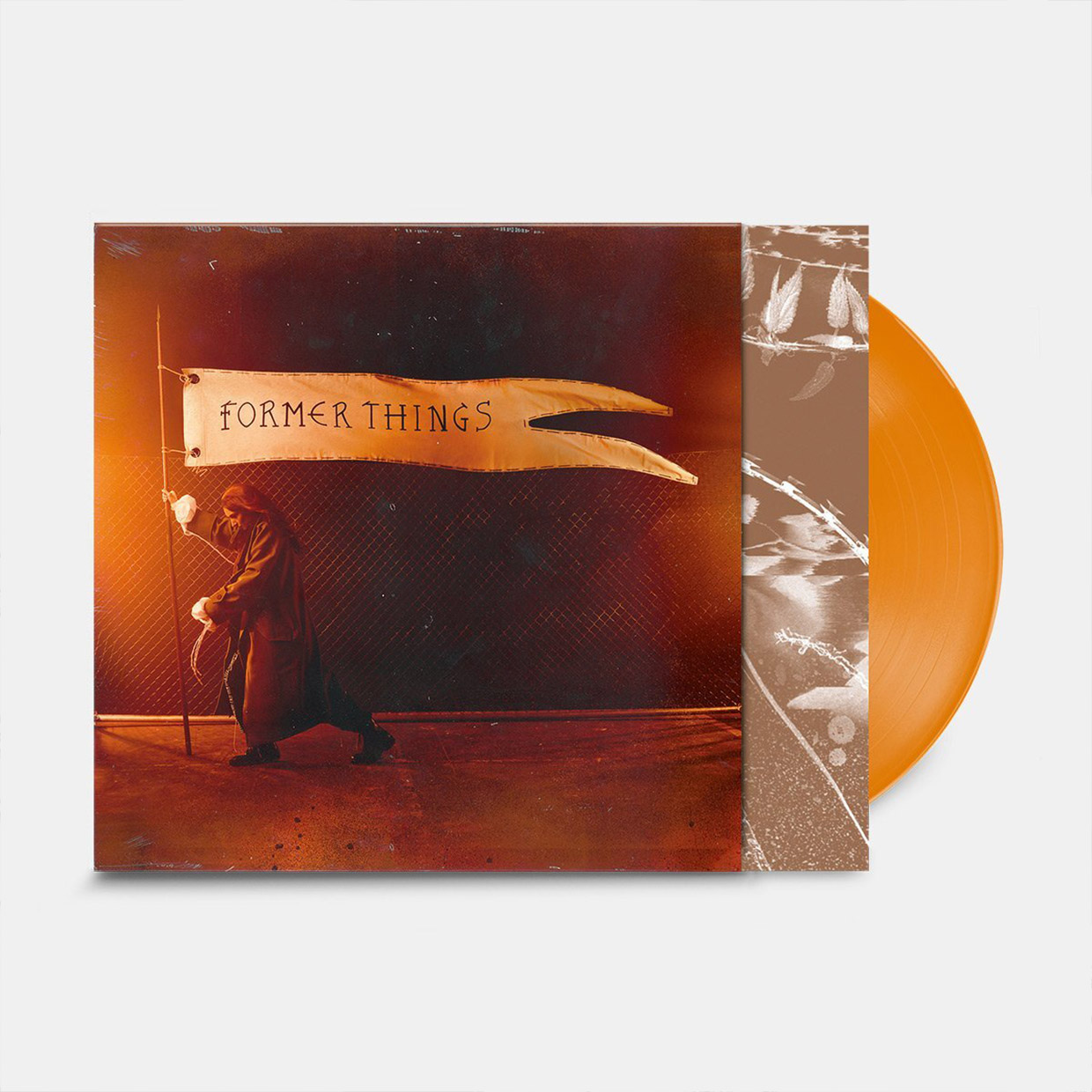
The album was released as a ‘Dinked’ edition with orange vinyl and additional poster alongside other formats.
The opportunity to work on a Warp Record release was a studio highlight and our first listen of any of the music was on the radio, then it felt the album was a constant on 6 Music that summer.
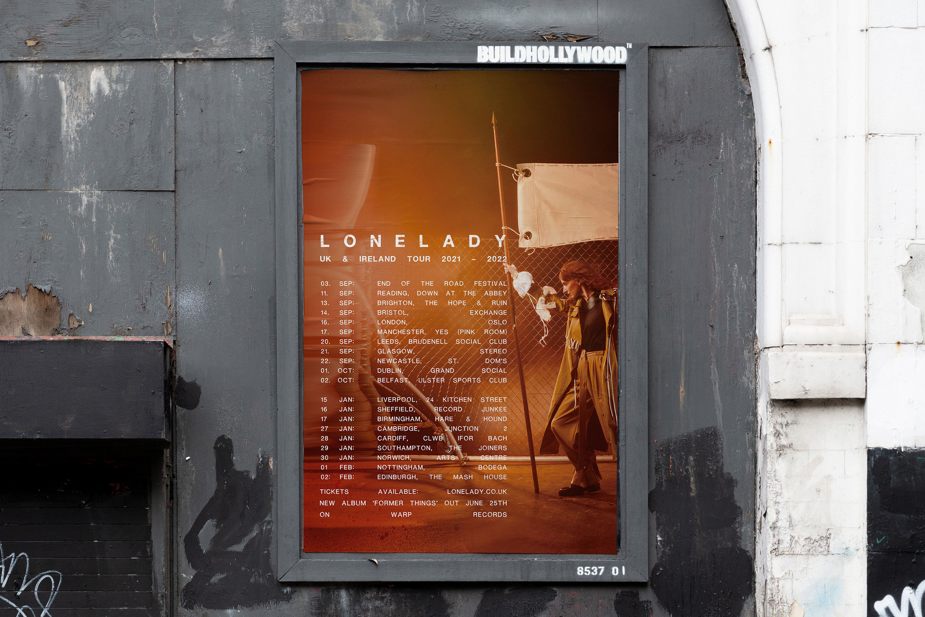


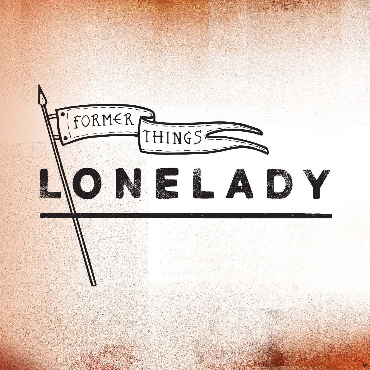
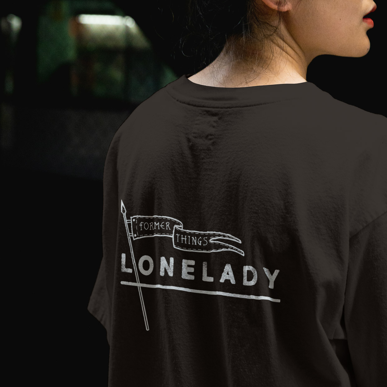
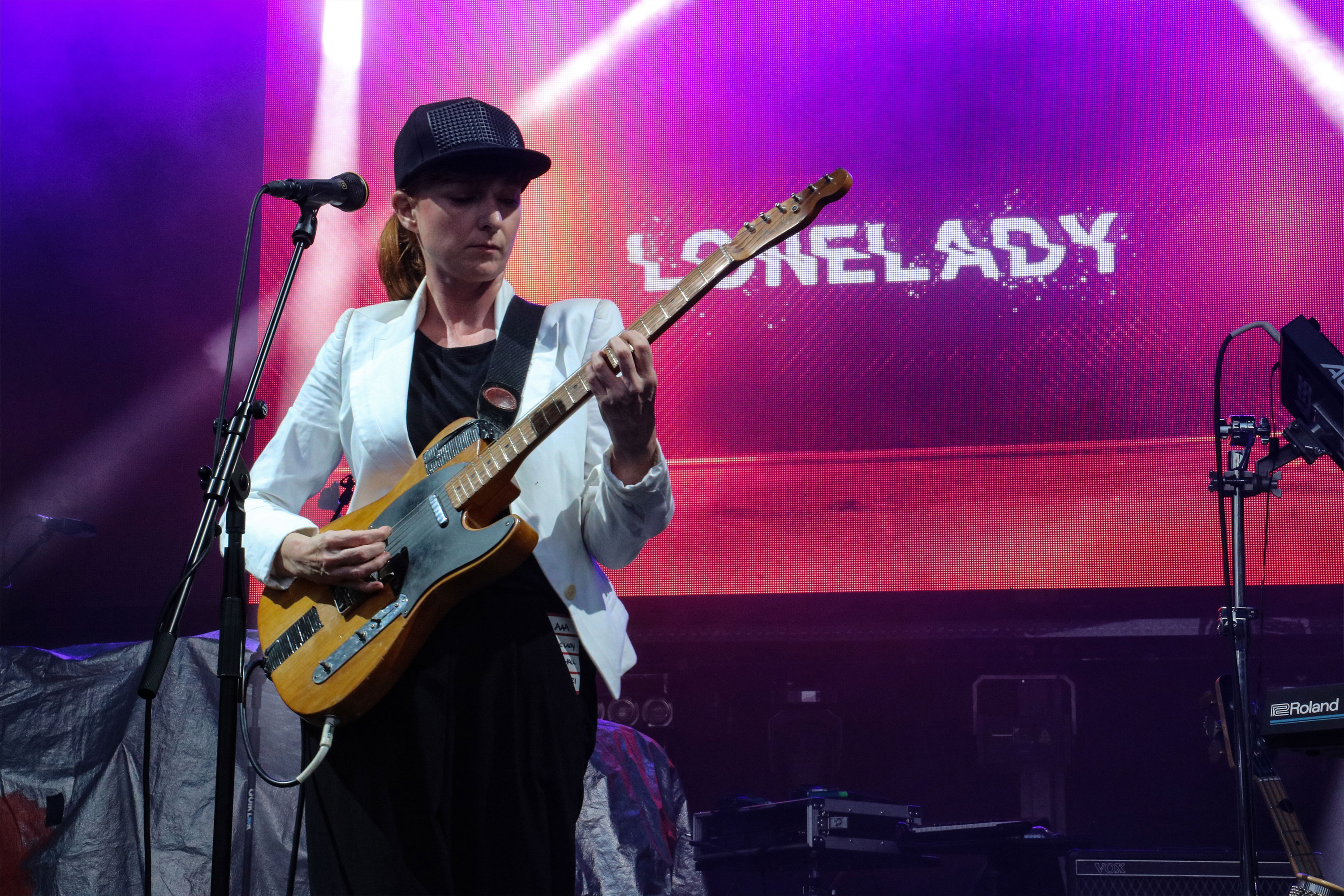
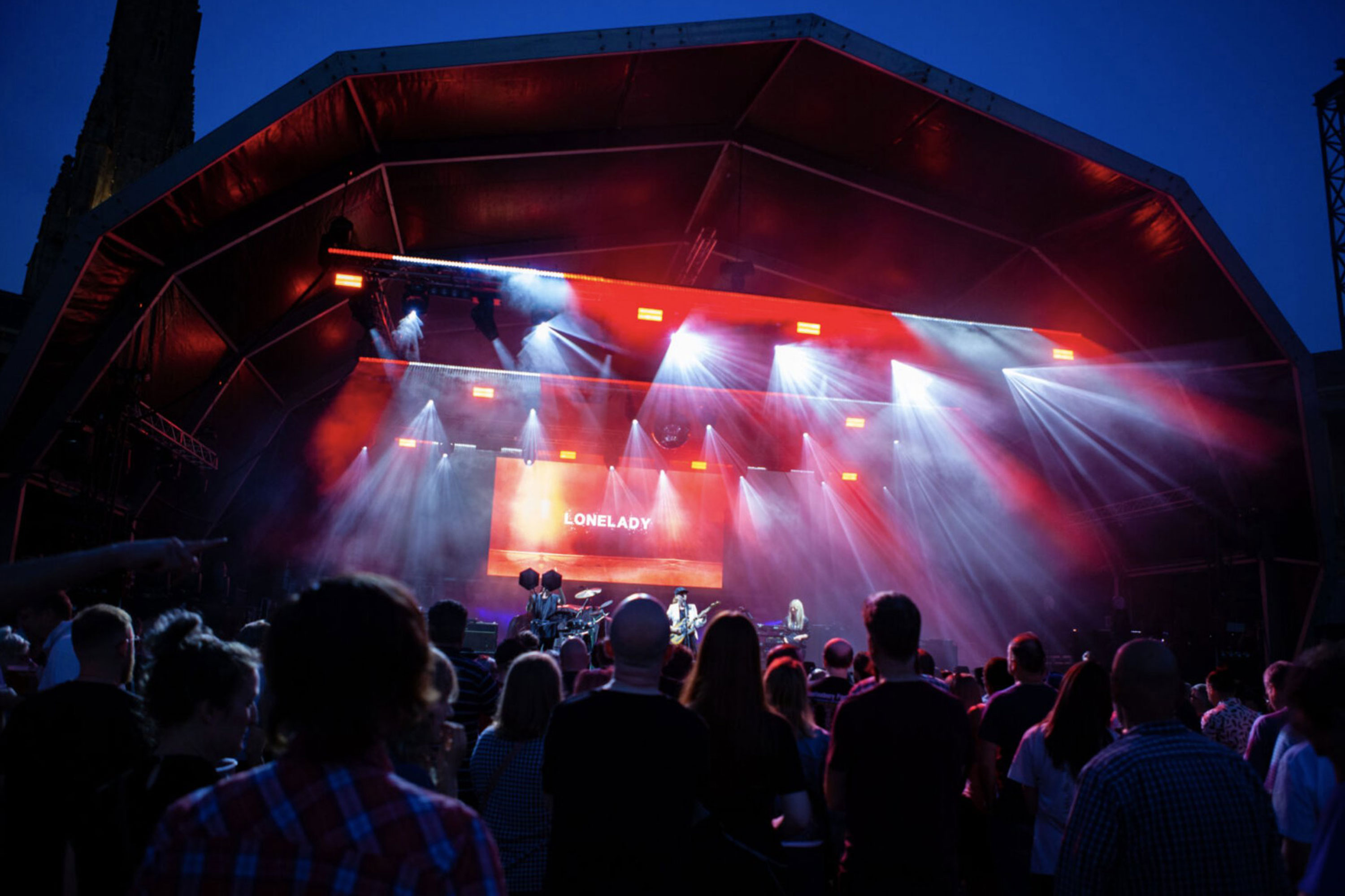
Pushing the concept further into tour merchandise we also looked at concepts for future singles whilst creating backdrops for LoneLady’s live tour.
