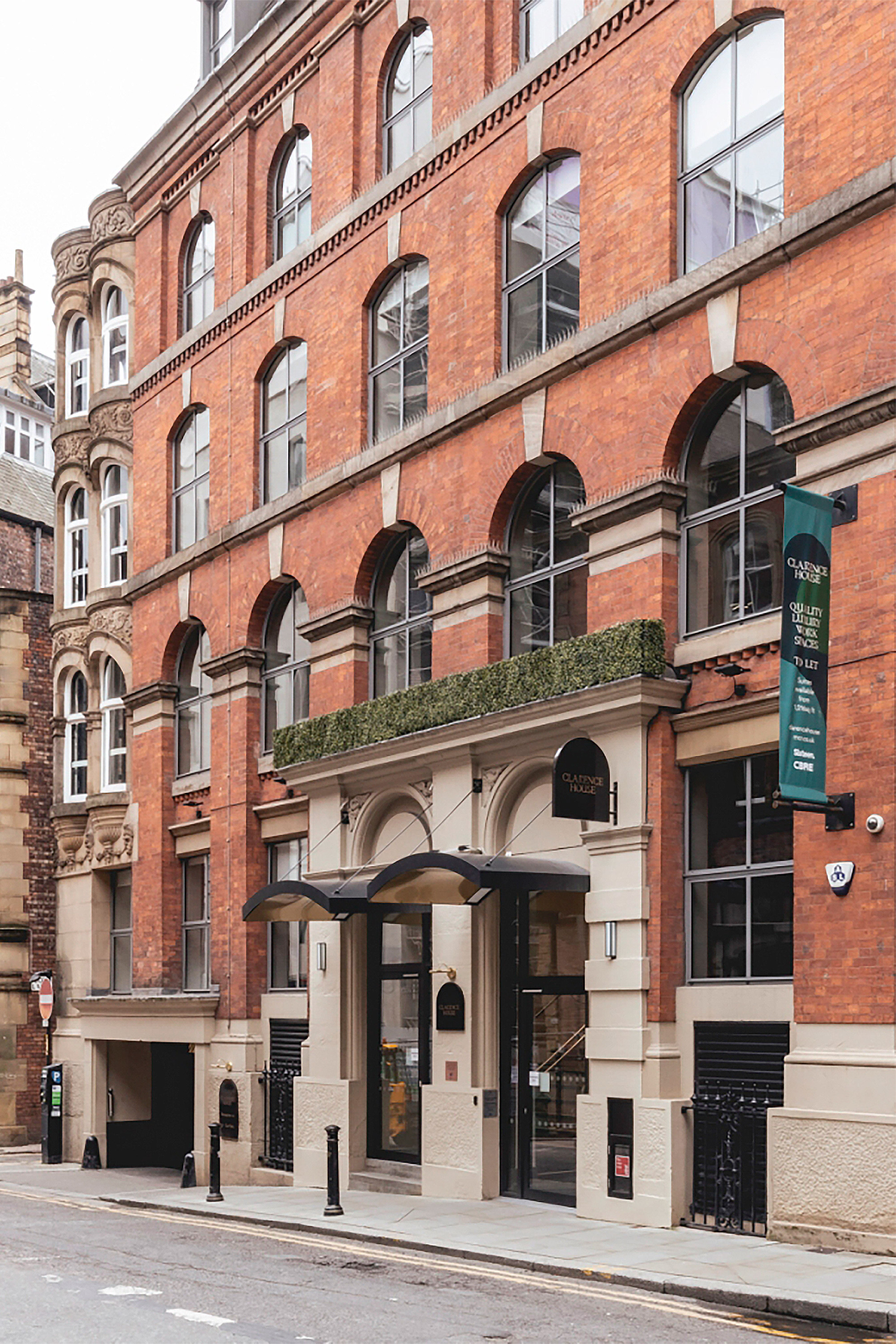
Clarence House
Creating the new home of work
Clarence House
Branding
Signage & Wayfinding
Illustration
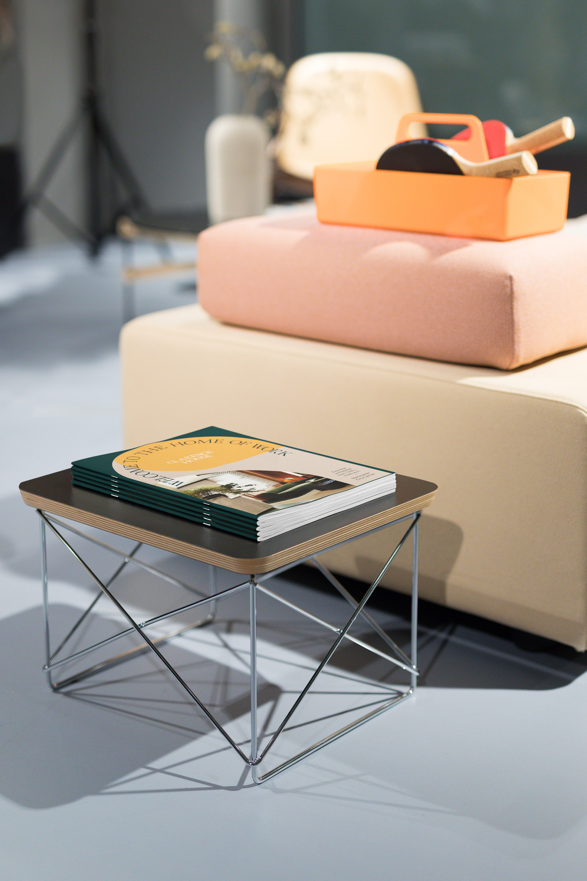
Print
Copywriting
Web design & build
Client: Sixteen
Website: clarencehousemcr.co.uk
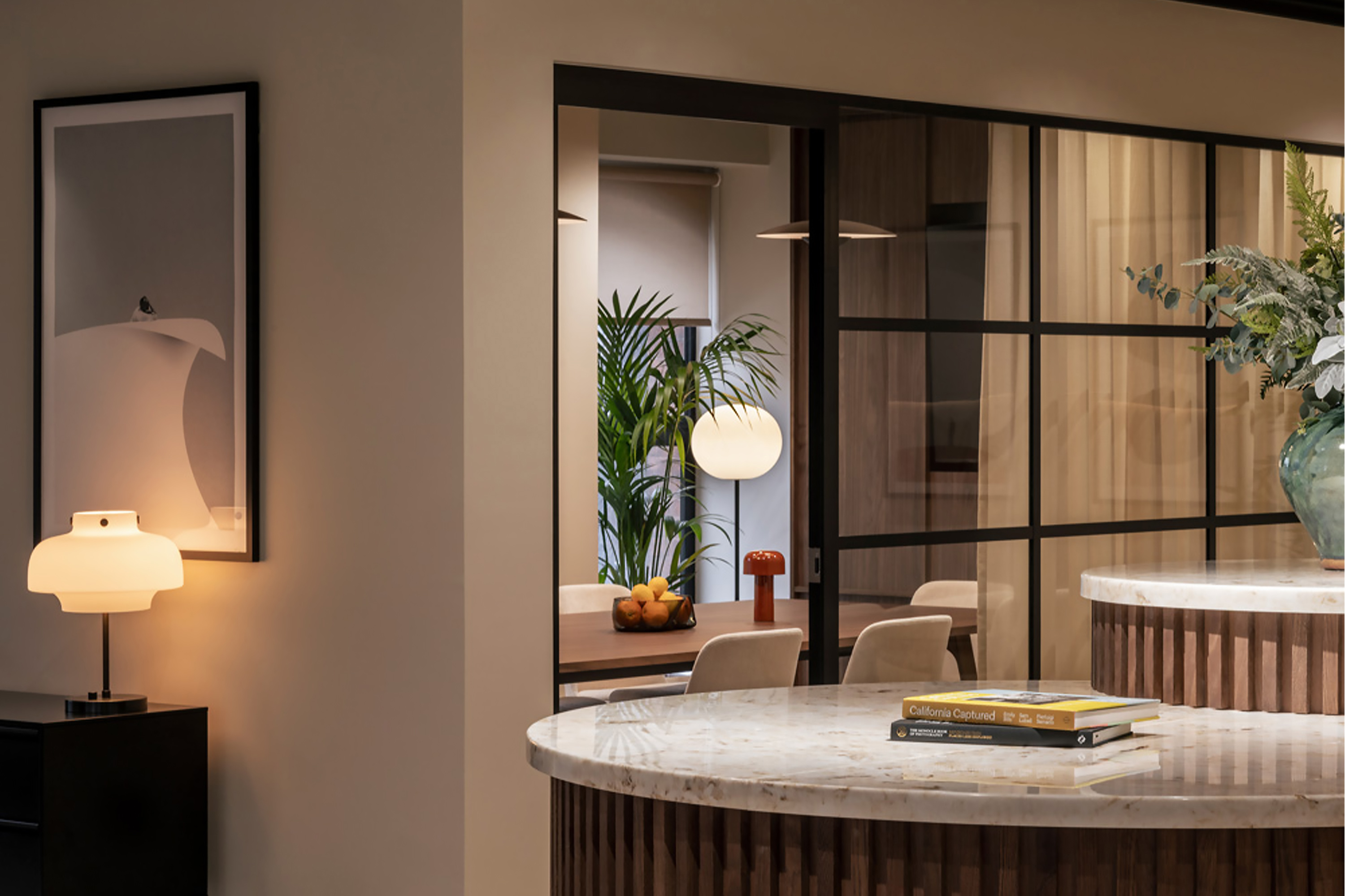
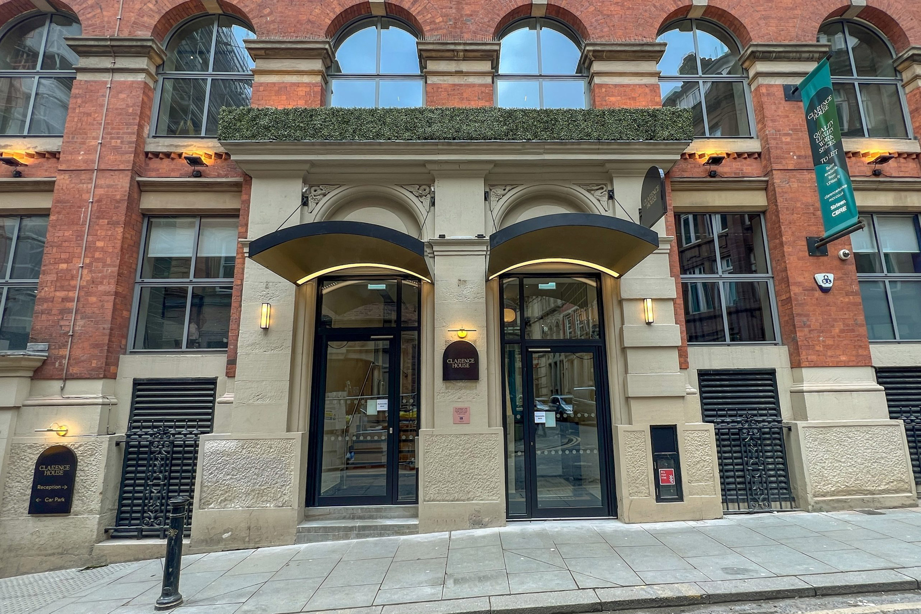
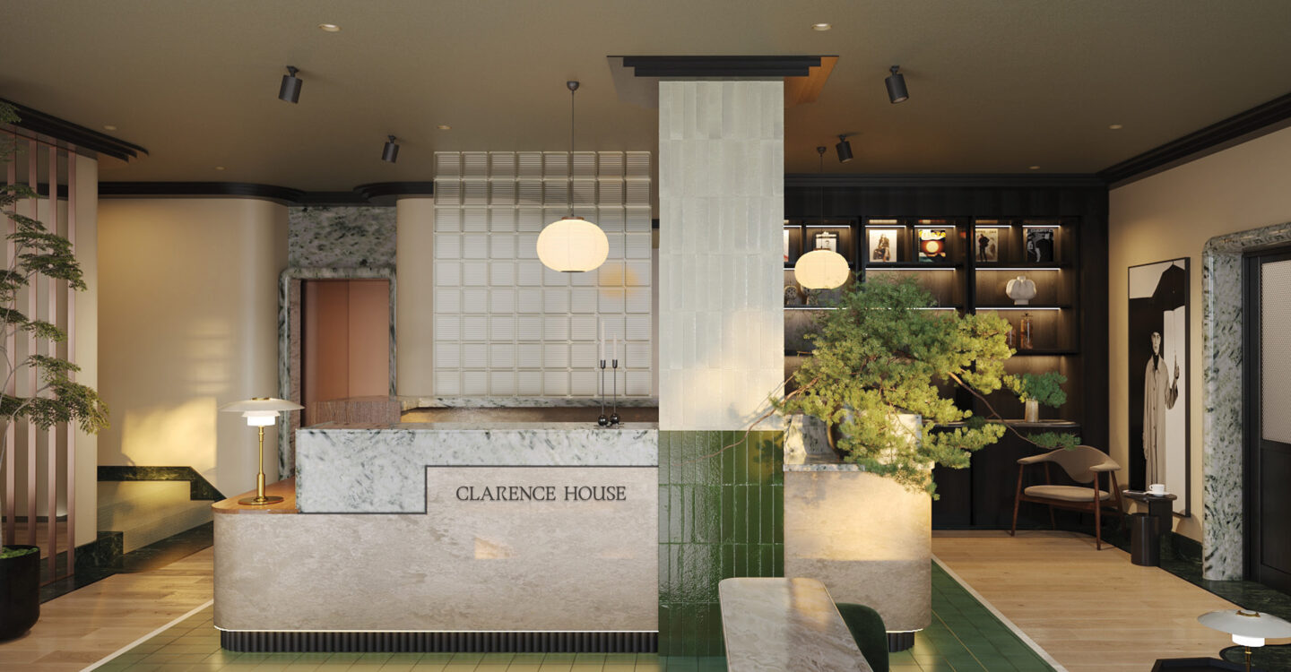
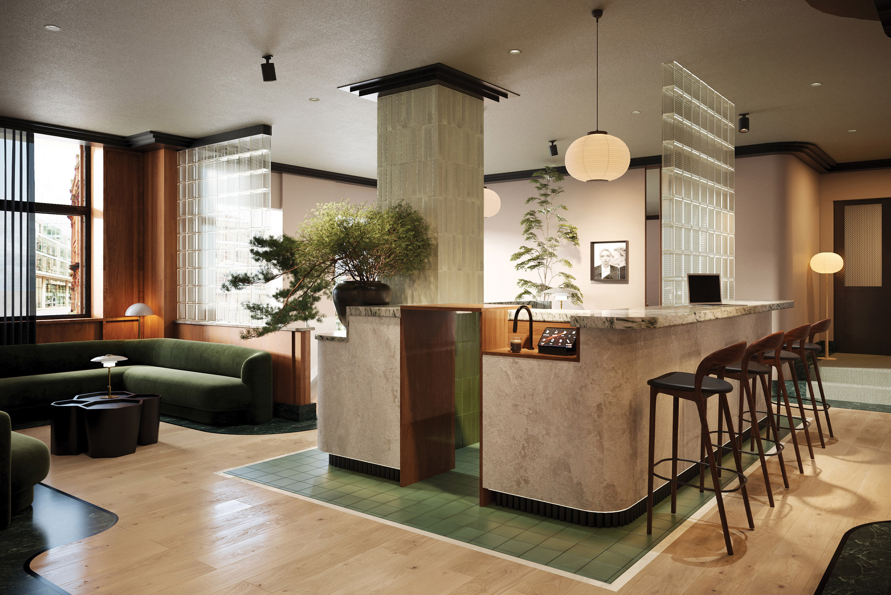
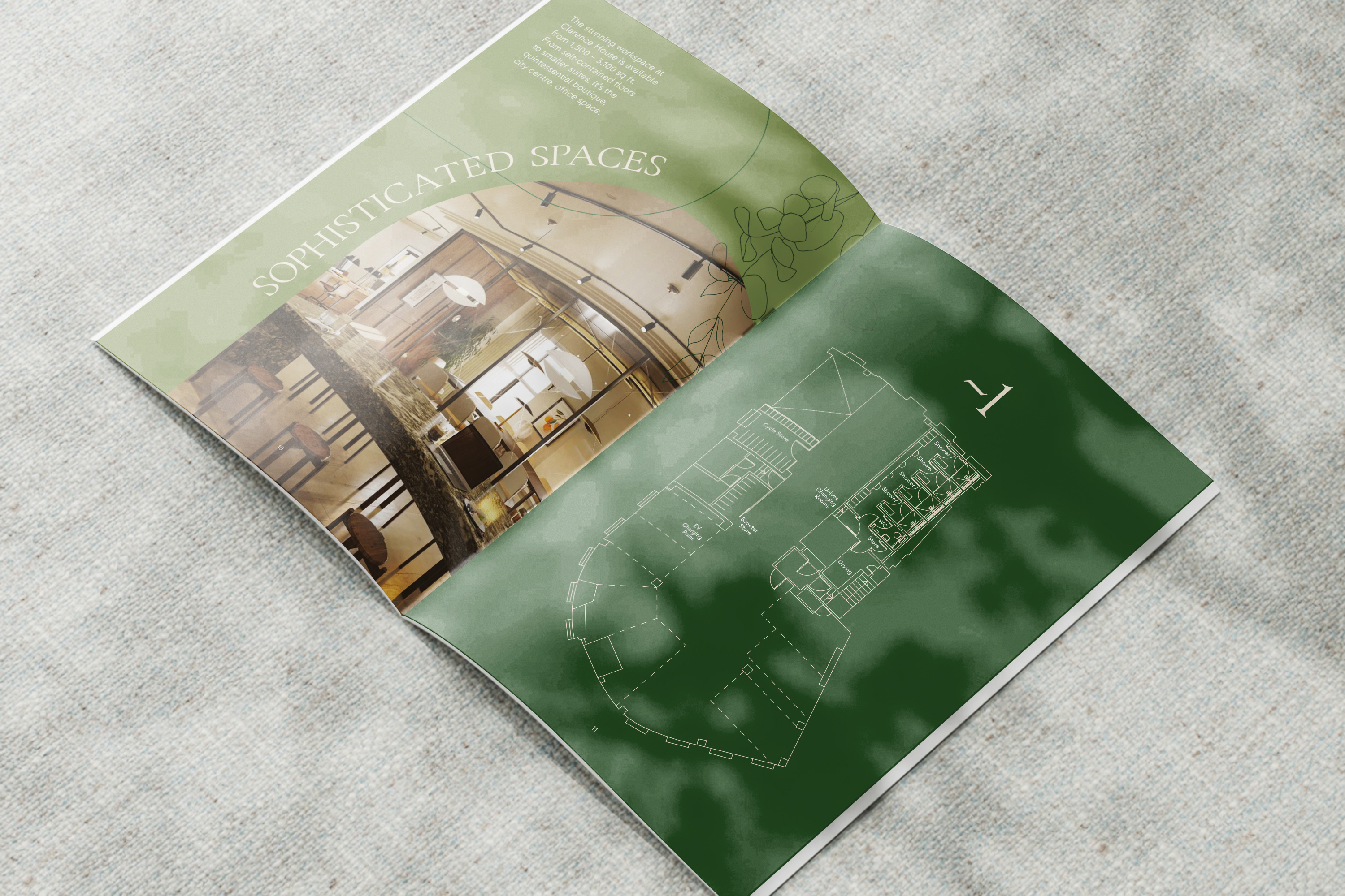
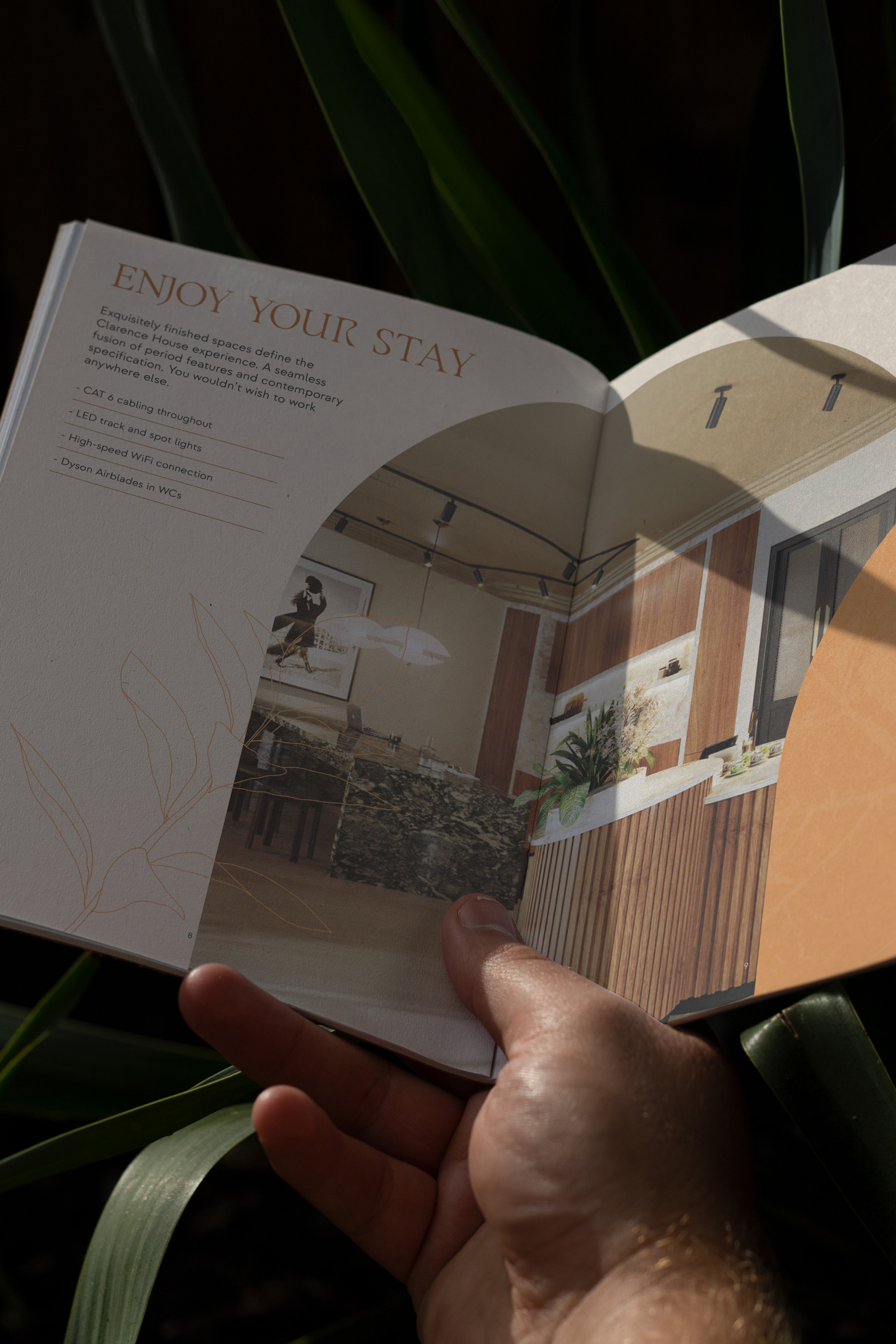
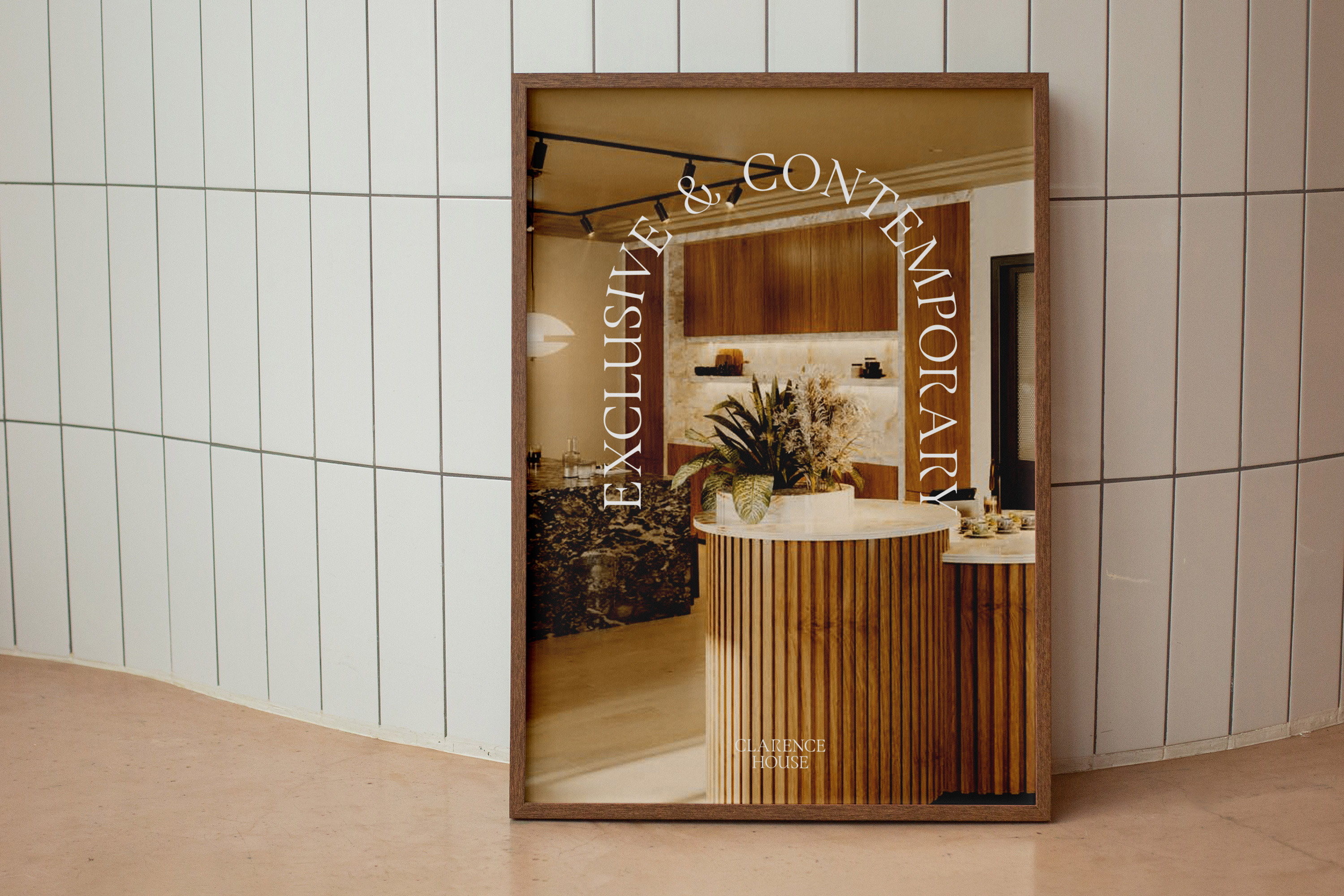
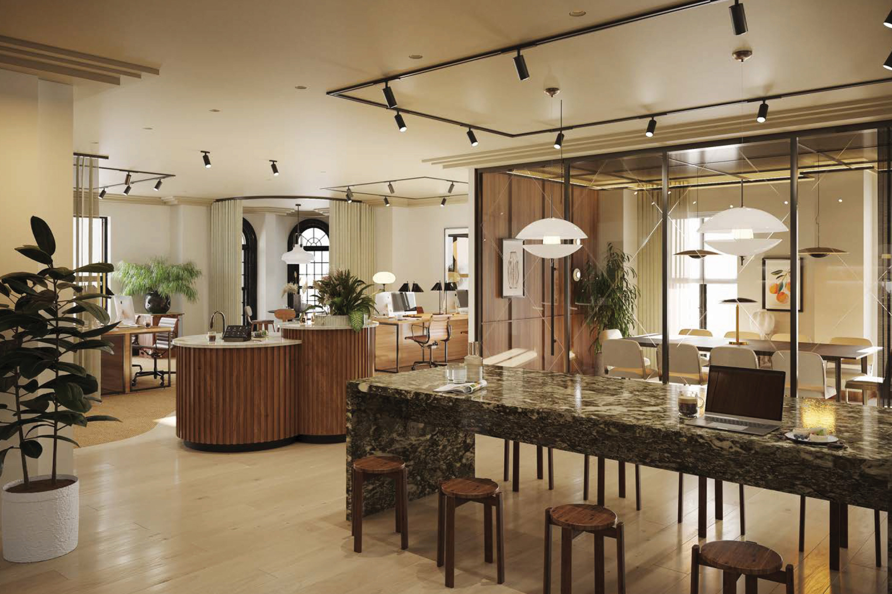
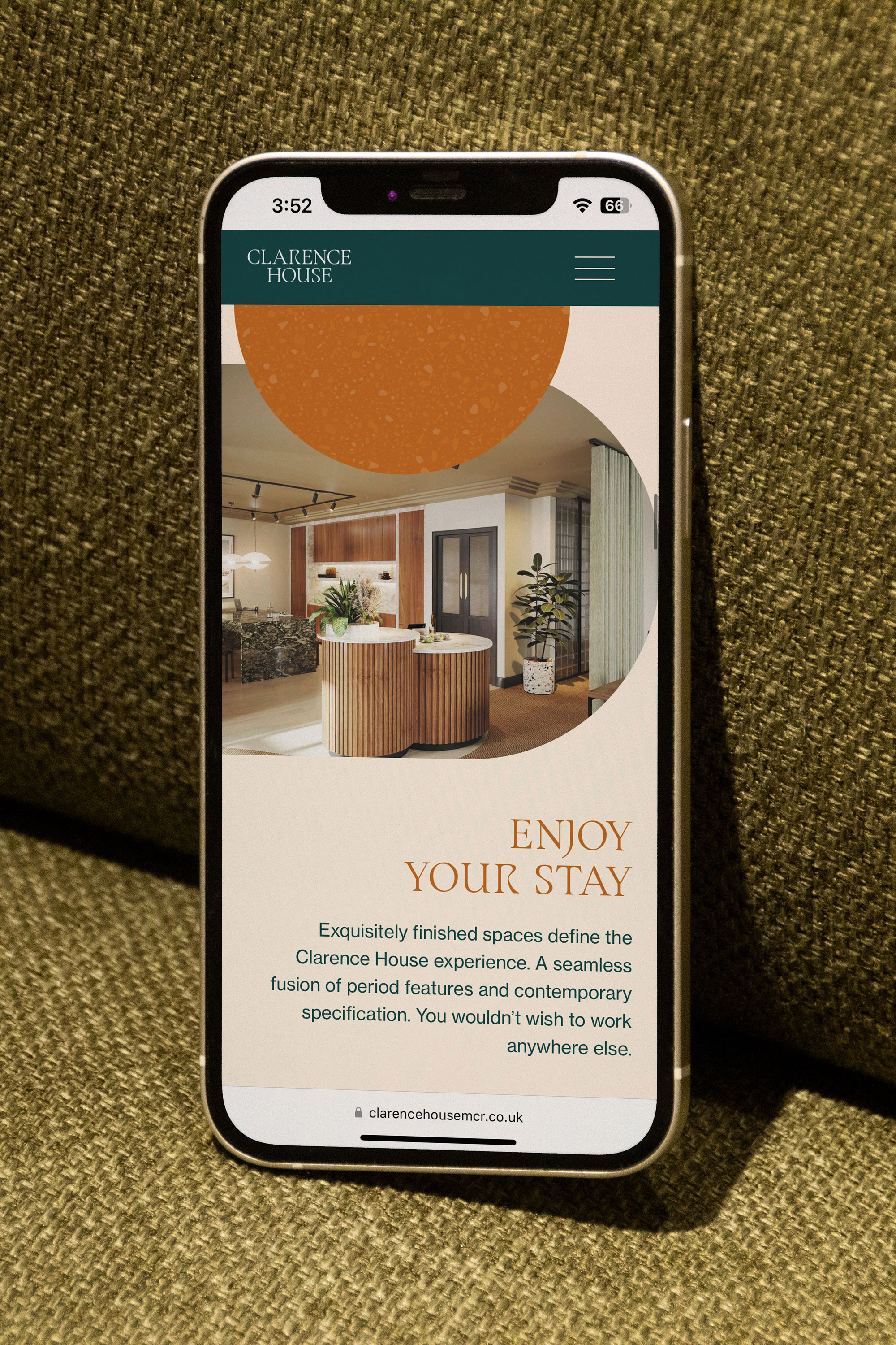
Clarence House is no ordinary workspace. Lovingly refurbished, this is where 19th century poise meets 21st century chic. It’s now the perfect home for your work, with a beautifully elegant reception lounge offers the warmest welcome. Exquisitely finished spaces define the Clarence House experience. A seamless fusion of period features and contemporary specification, positioned in a prime city centre location.
Instruct were tasked to create a new brand reflective of the new refurbishments of Clarence House whilst complimenting the historic value of the building. This new brand was then applied to internal & external signage and way finding, iconography, digital and print marketing and a website.
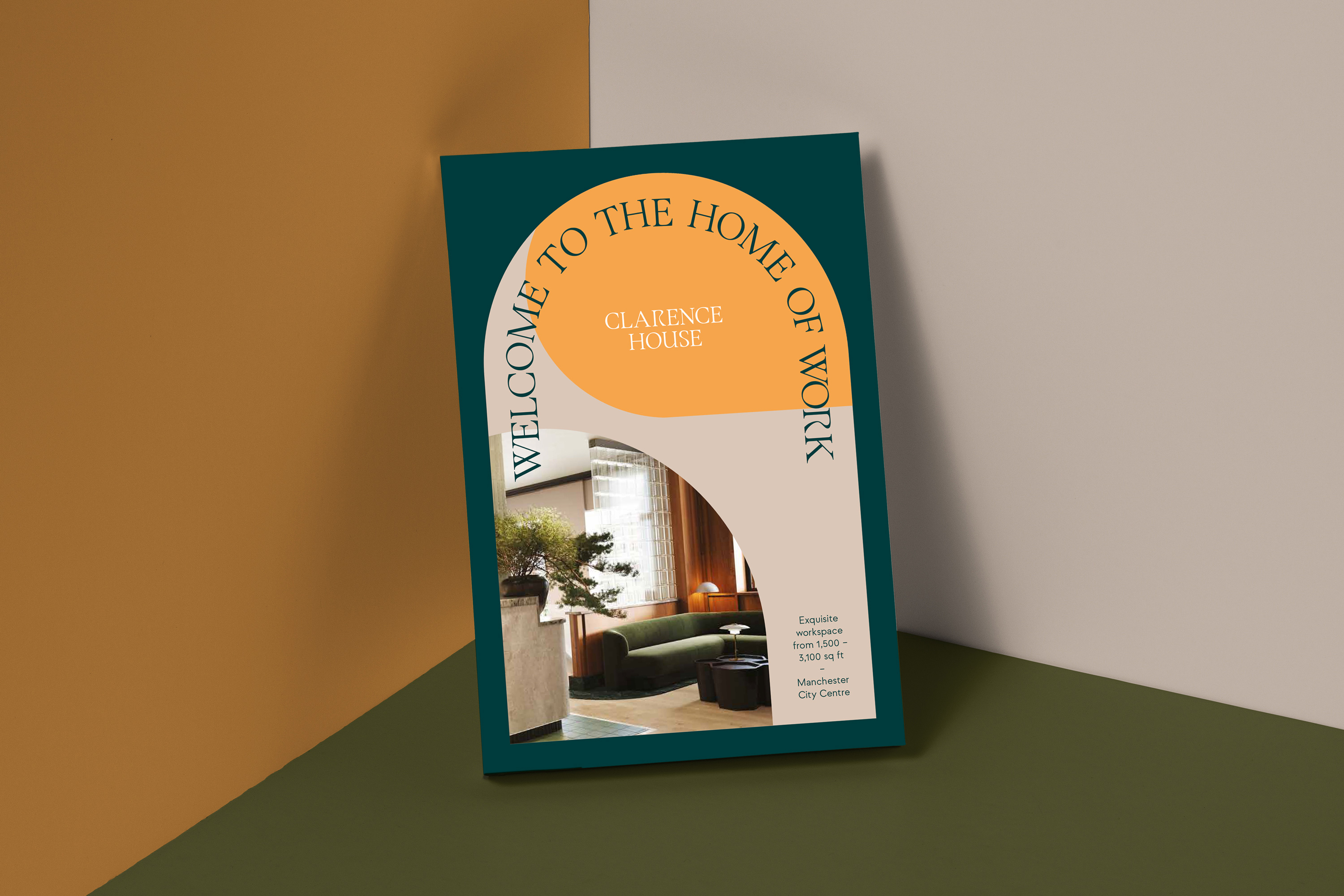
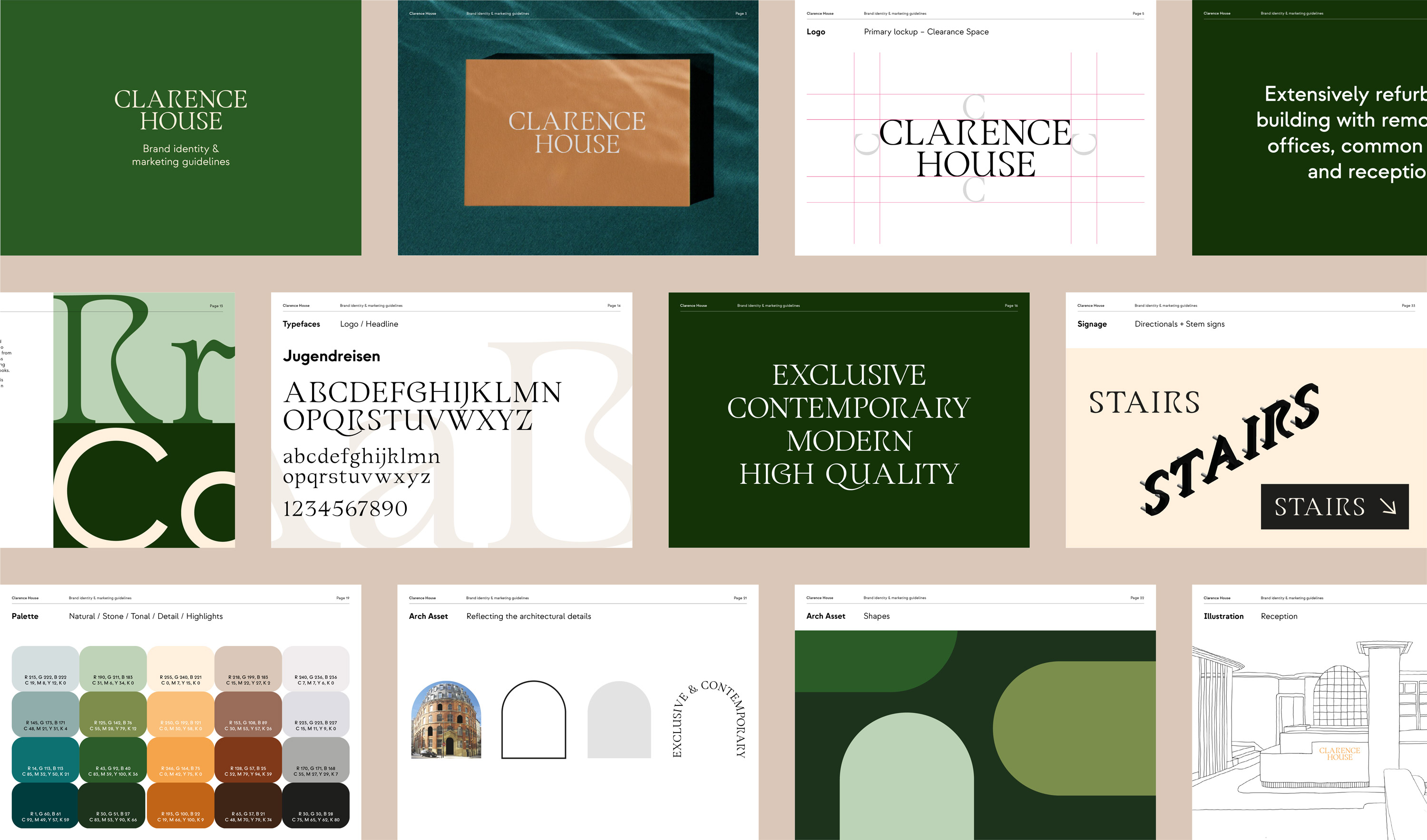
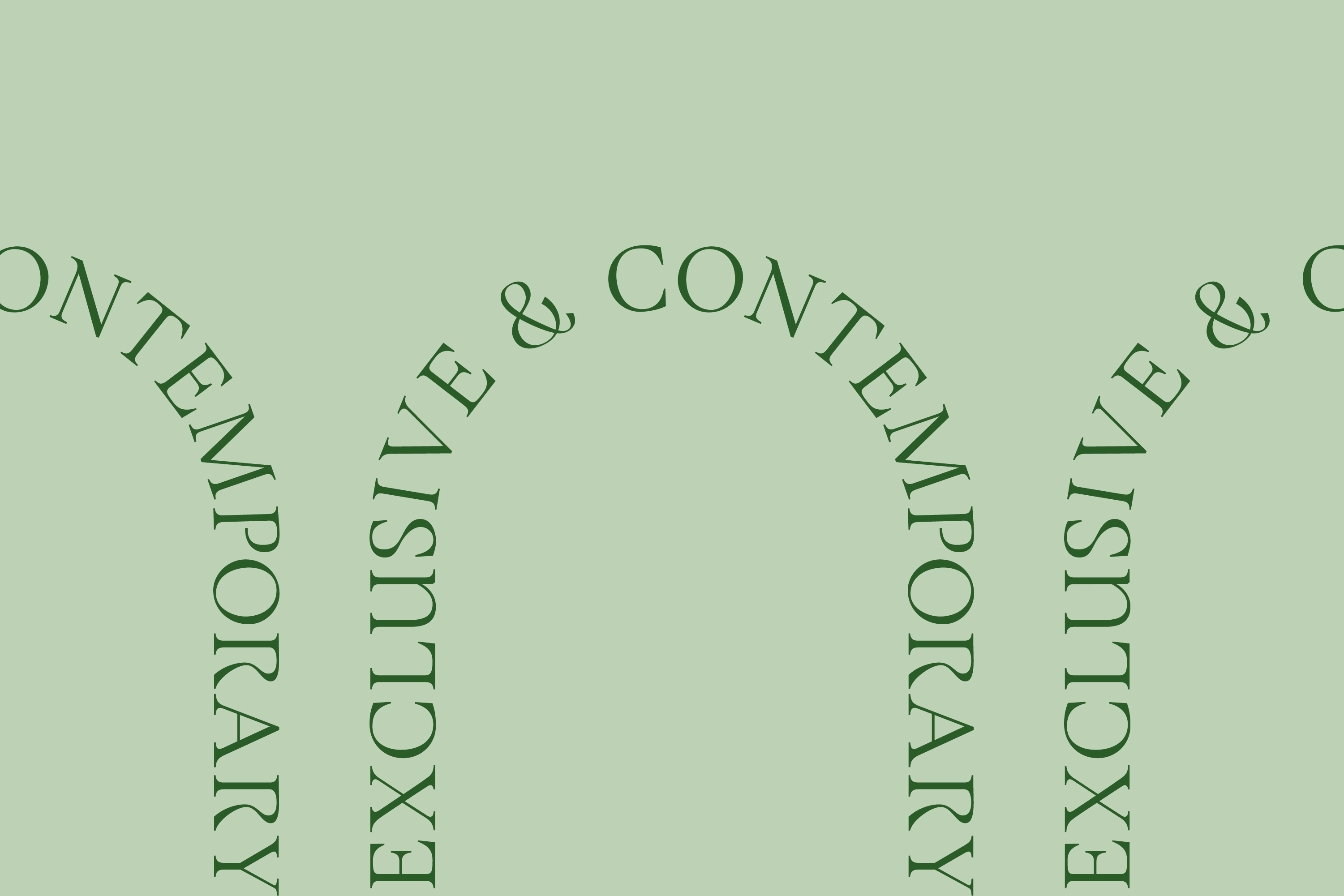
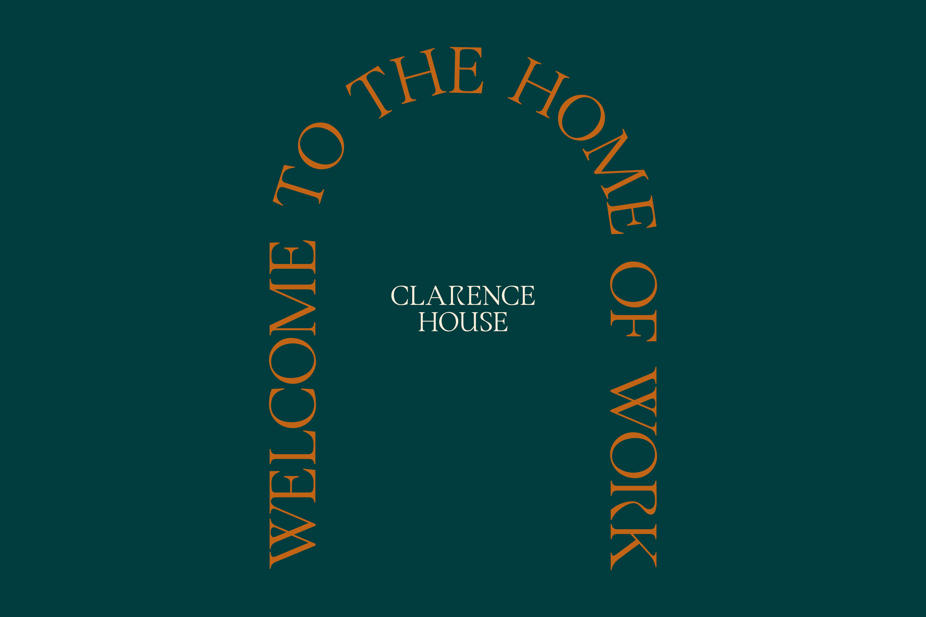
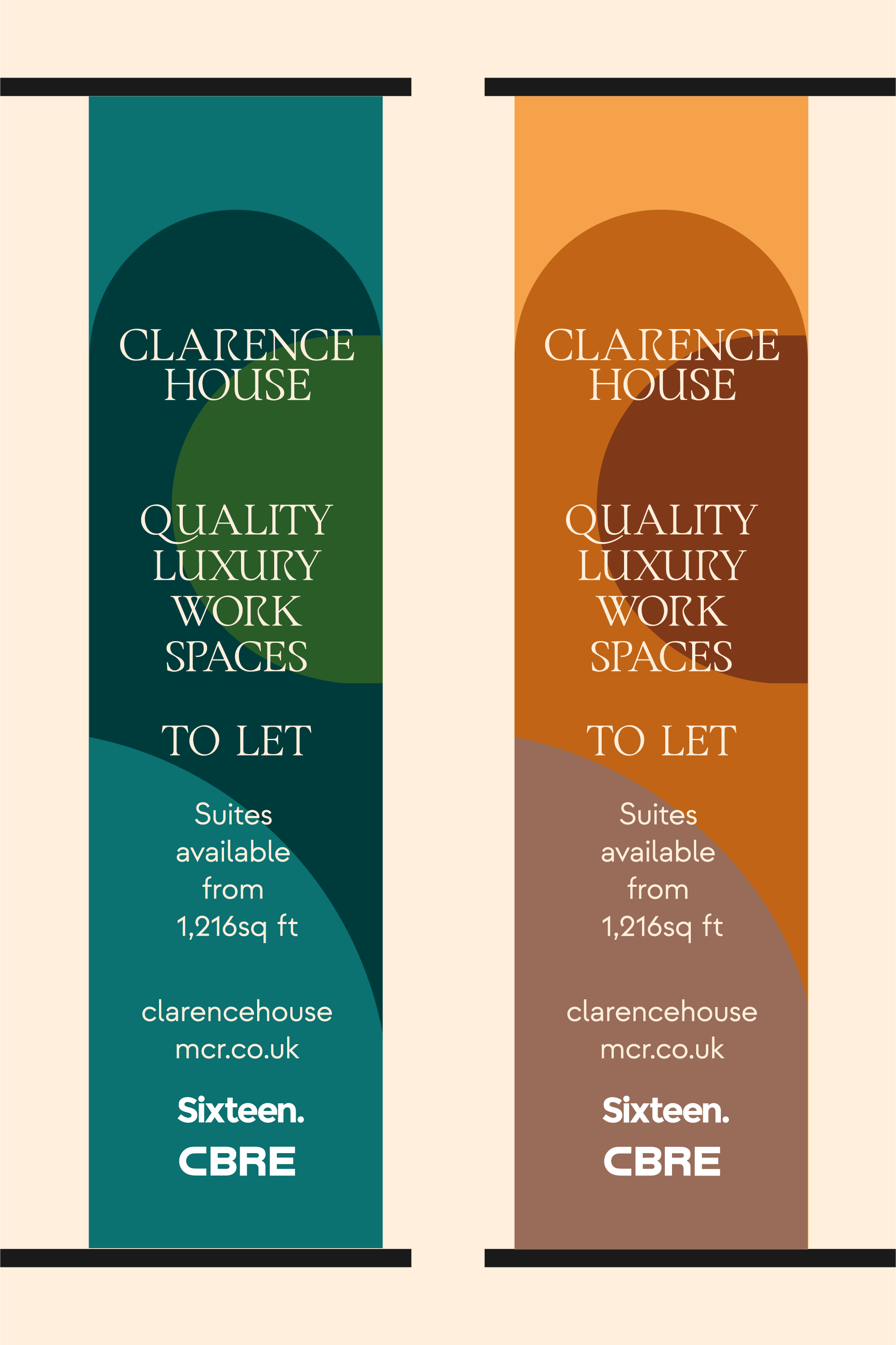
We developed an arch motif playing on the original architecture of the building and paired this with a unique typeface which has a blend of old & refreshing features and quirks within the letter forms. This arch motif also allowed us to use as a device for large type, shapes, patterns and image containers.
Collaborating with Matt Leigh on copywriting, we created a set of bold brand statements and body content to use across all marketing assets, connecting the classic with the contemporary through our messaging as well as the branded look and feel.
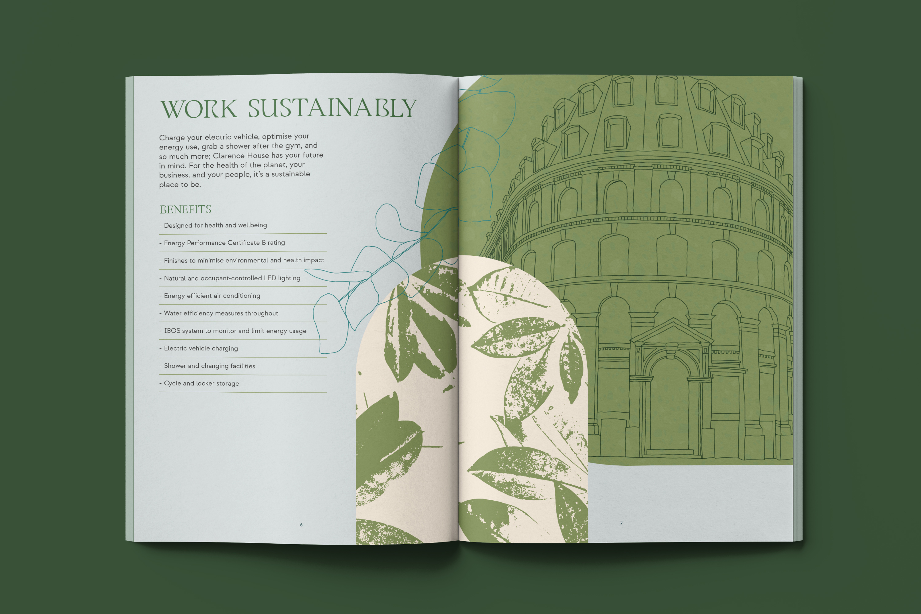
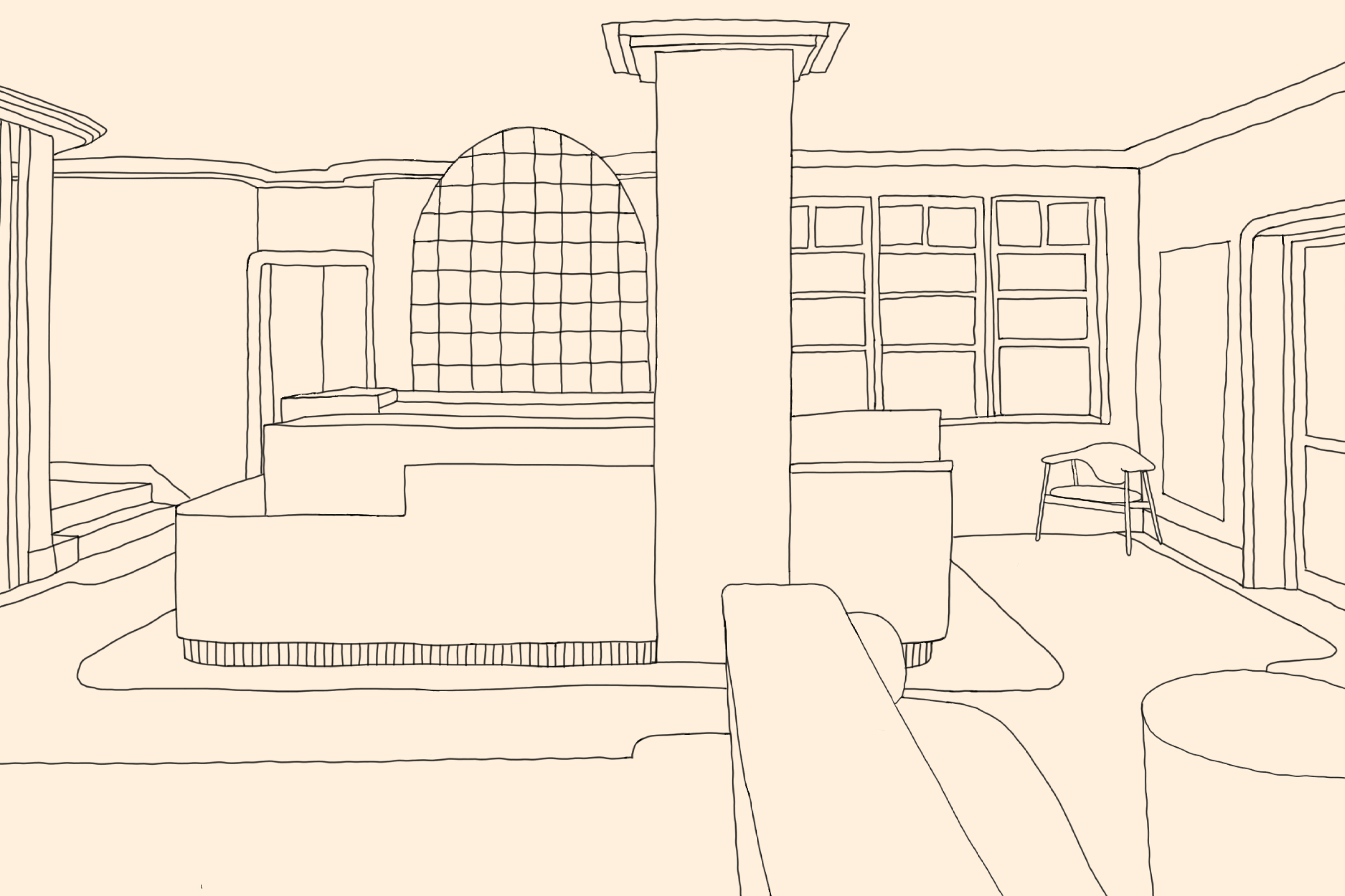

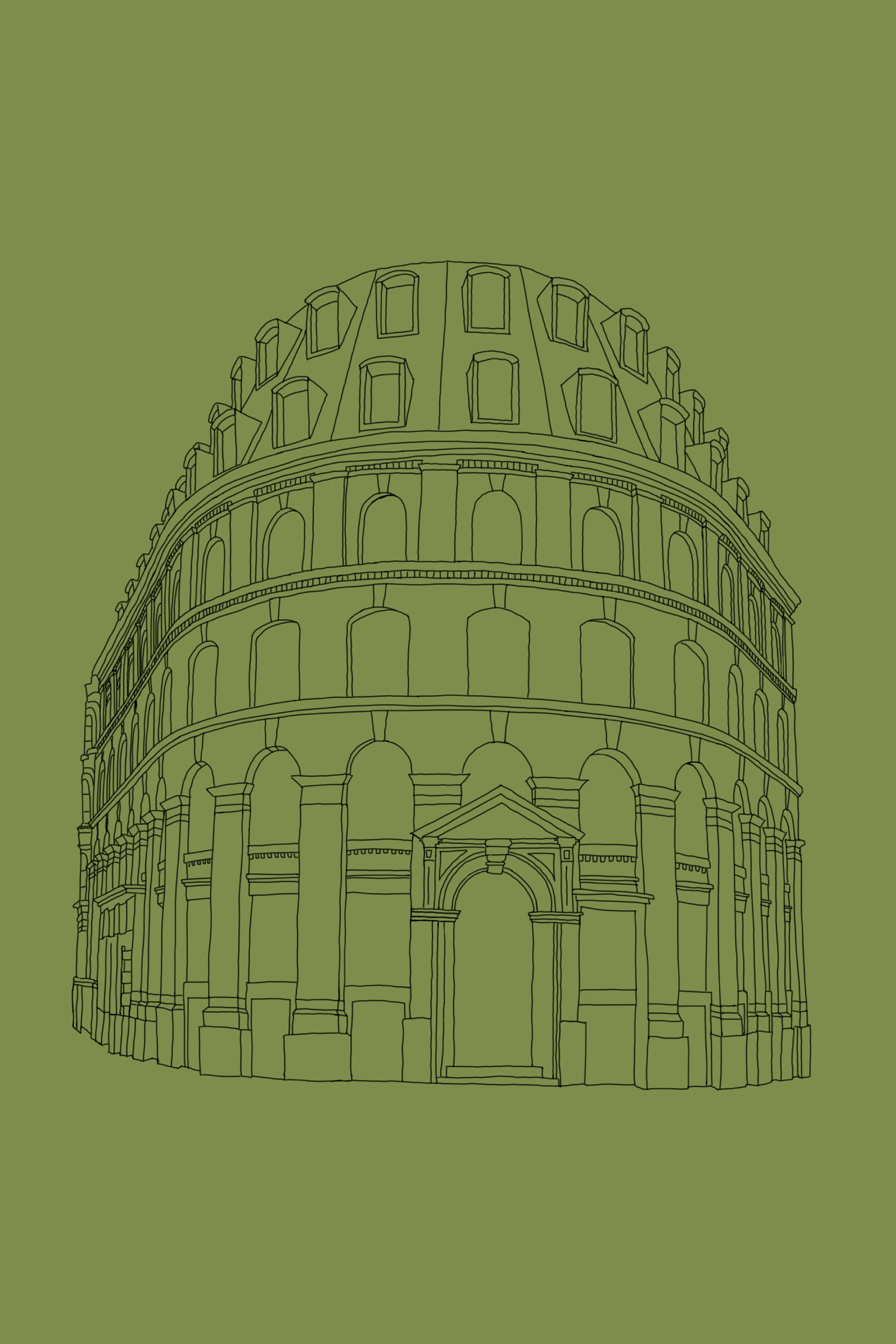
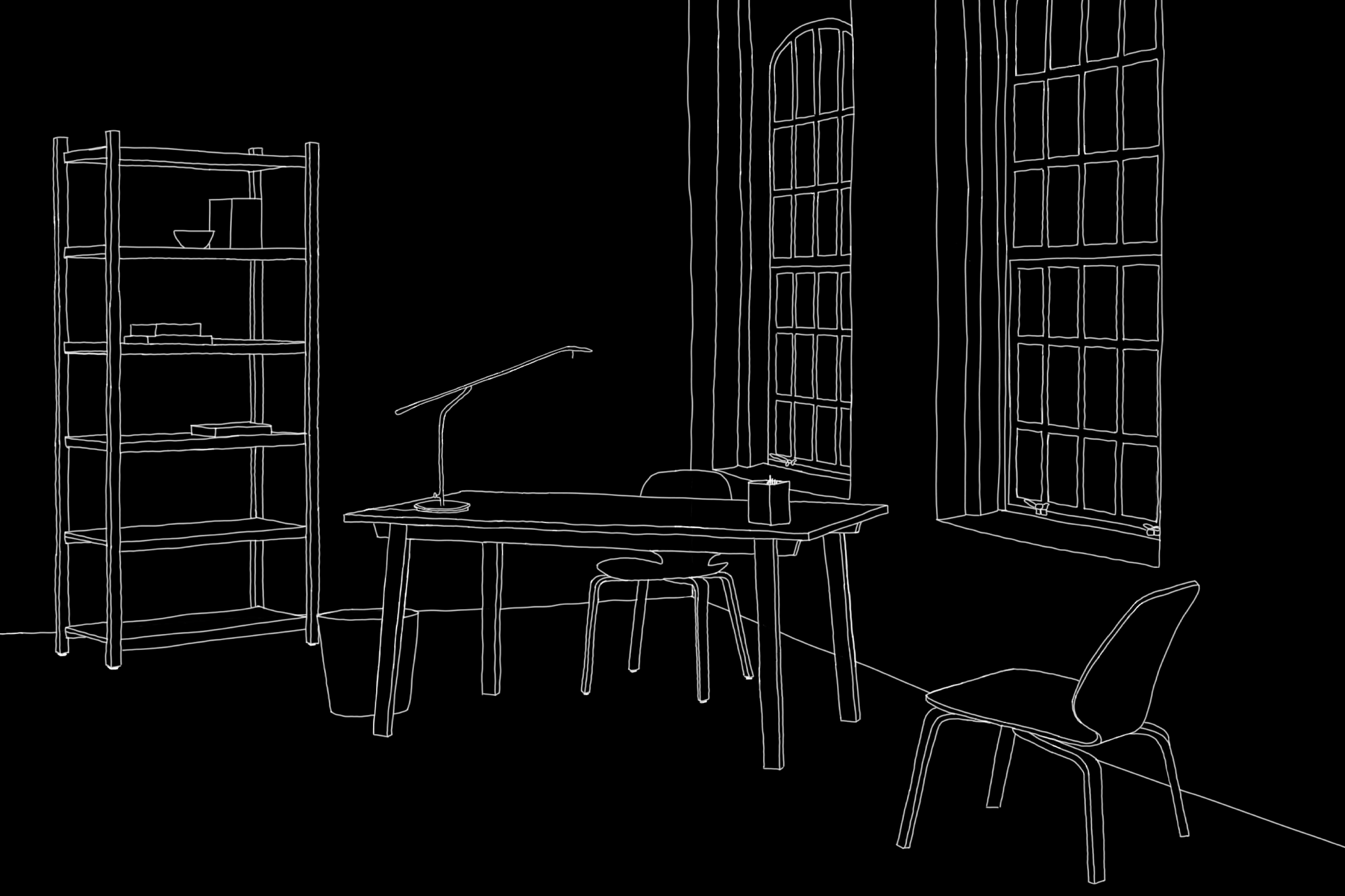
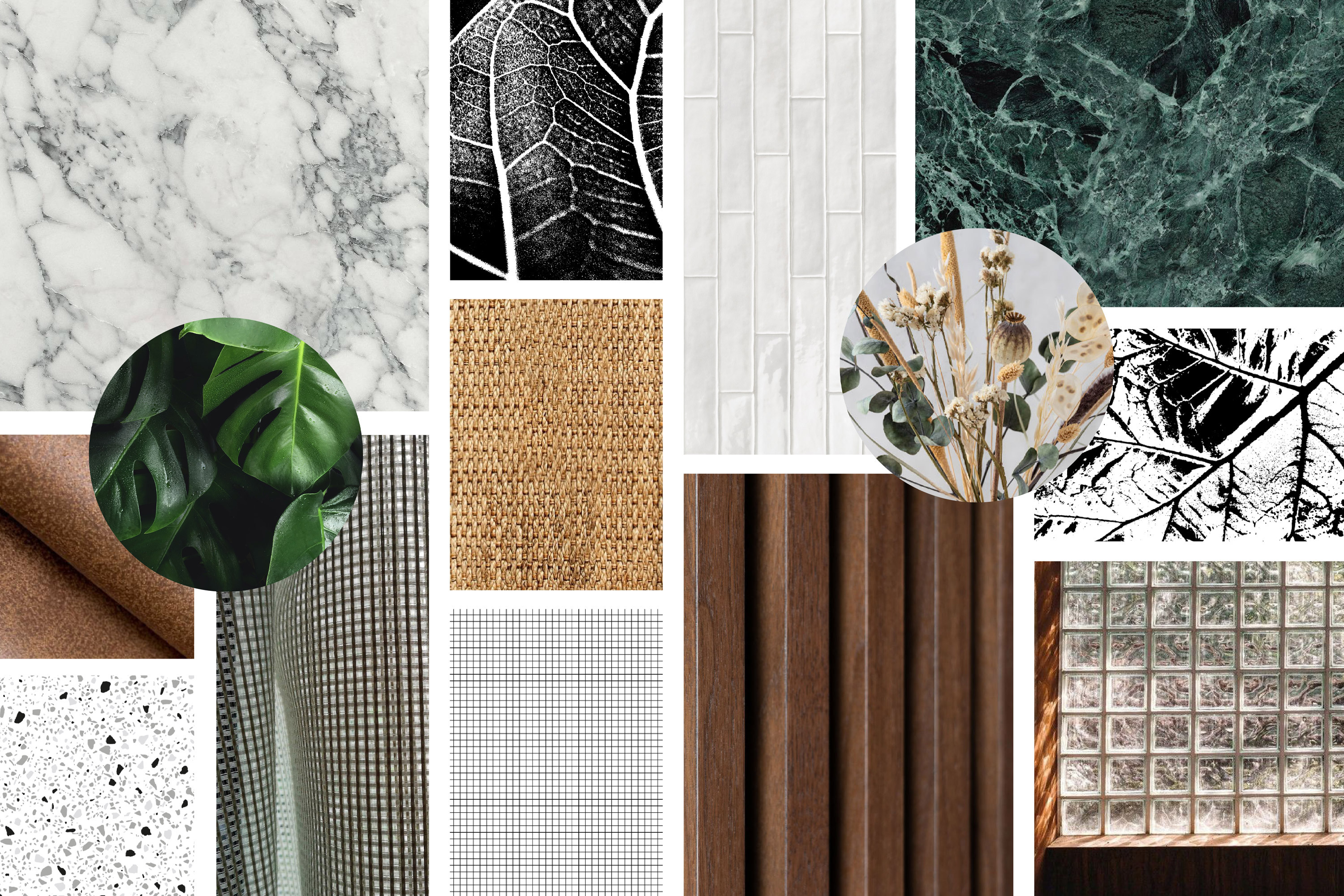
To add one last layer of graphics to combine with our typography, motif and photography, we have also created a set of hand drawn illustrations of the external building, new internal features and a range of textures. These gave a raw natural feel in contrast to the striking typography and range of materials.
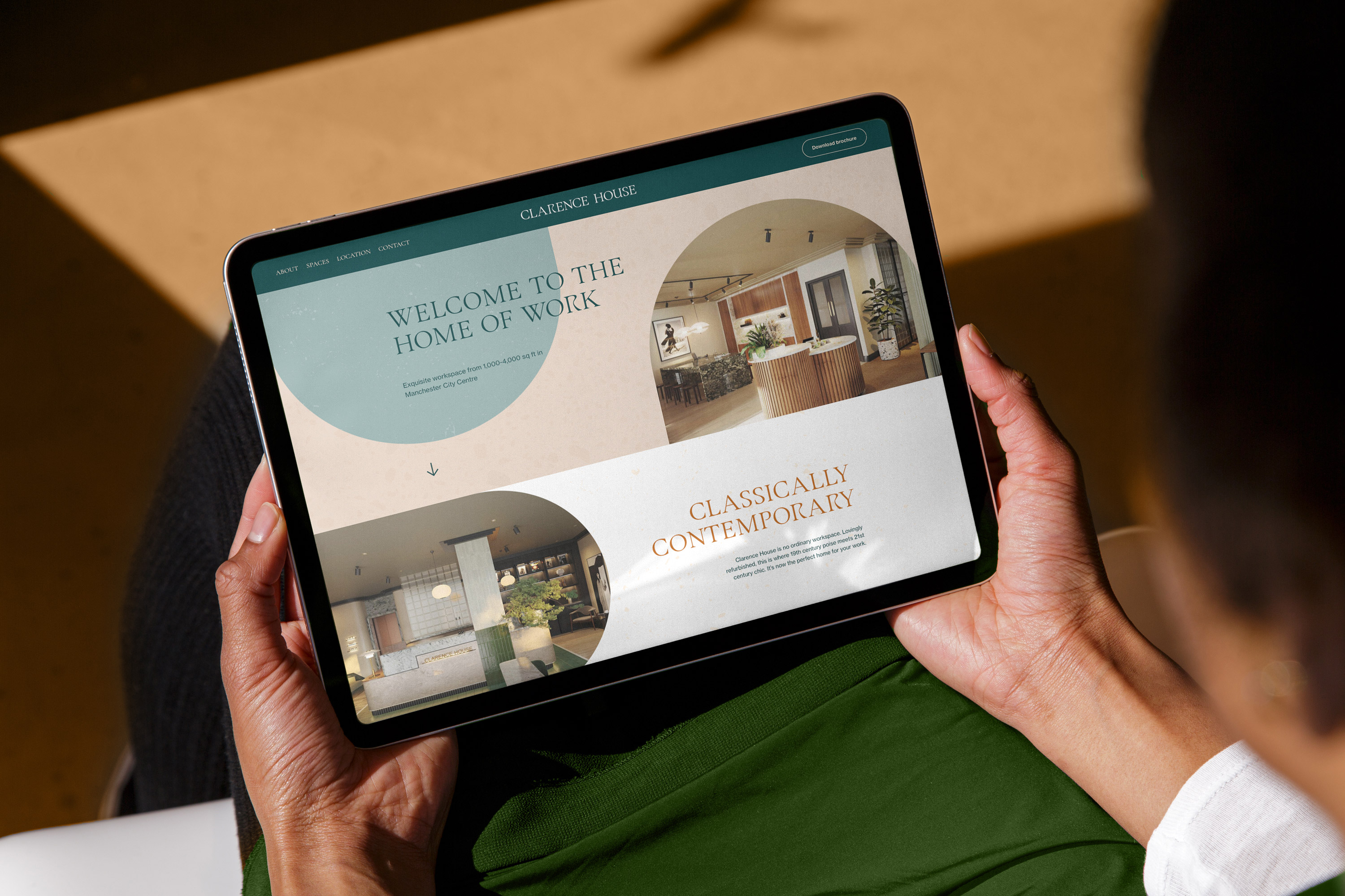
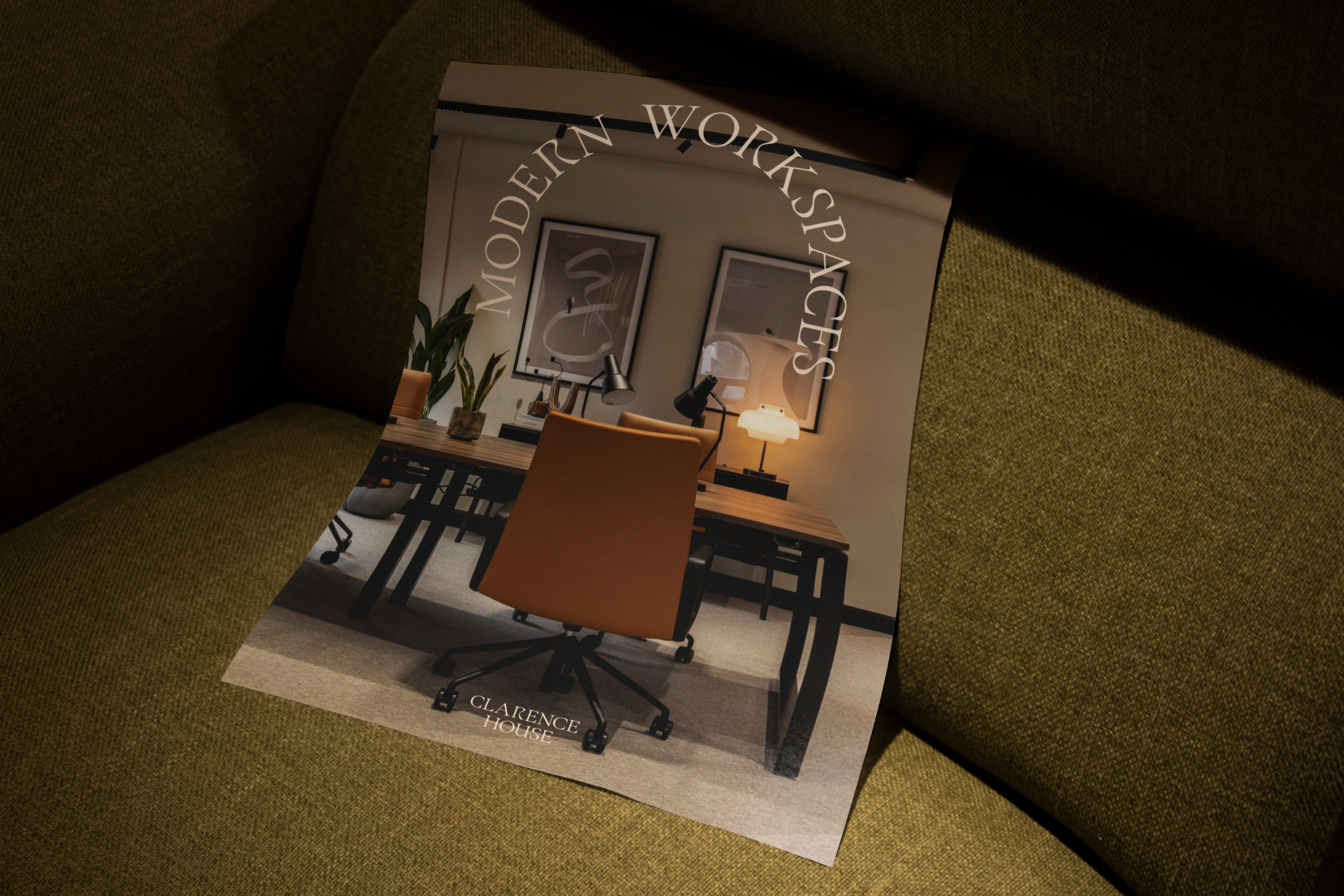
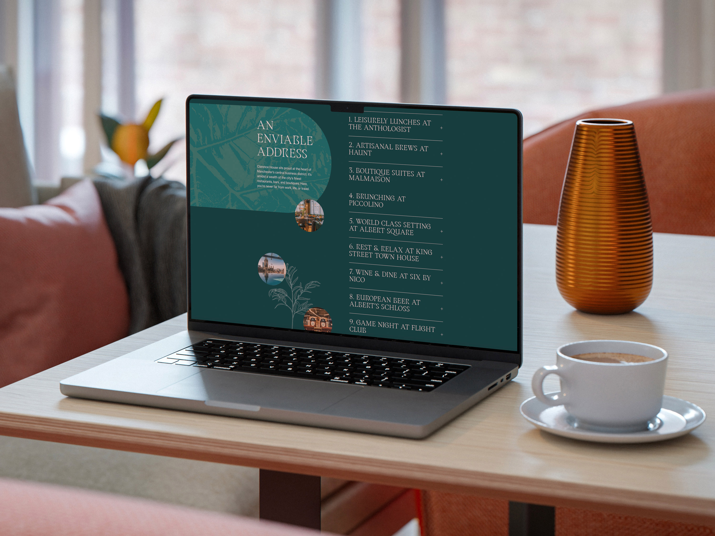
We designed and built Clarence House’s website, ensuring a seamless brand experience both in print, in person and online. The brochure approach to the site allowed us to use large imagery, rich content and subtle interactivity to bring the space to life.
Working closely with the interior design team at Jolie we paired complimentary materials for our signage to the fabrics & textures they were using throughout the building refurbishment. We had also looked at the external signage and how we could incorporate our arch motif into the entrance and directional signs, ensuring every detail channels the new brand.
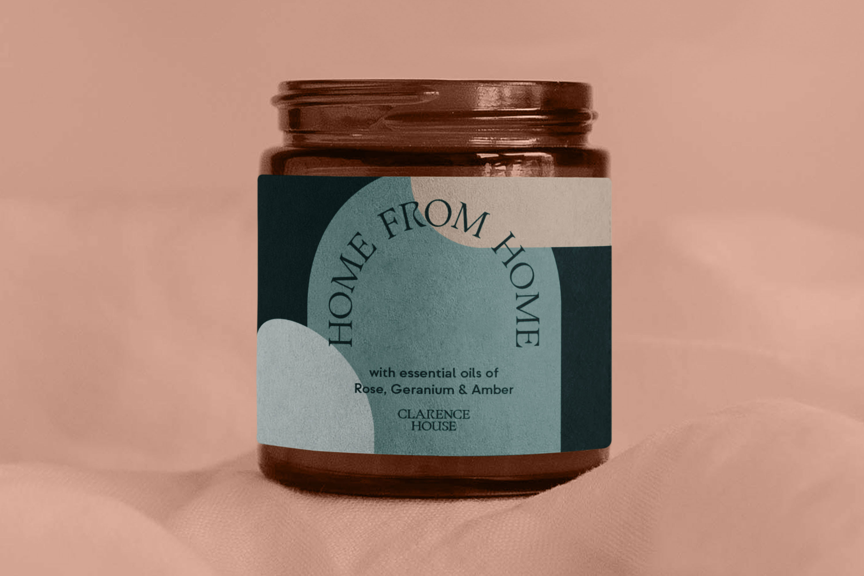
Throughout our brand extension explorations we even looked into personalised candle and diffuser packaging, with the clients dream of creating a unique scene for the building to have in each office, further applying the ‘home of work’ ethos. “Your senses awakened with a considered blend of sounds, scents, and textures. The perfect start to every working day.”
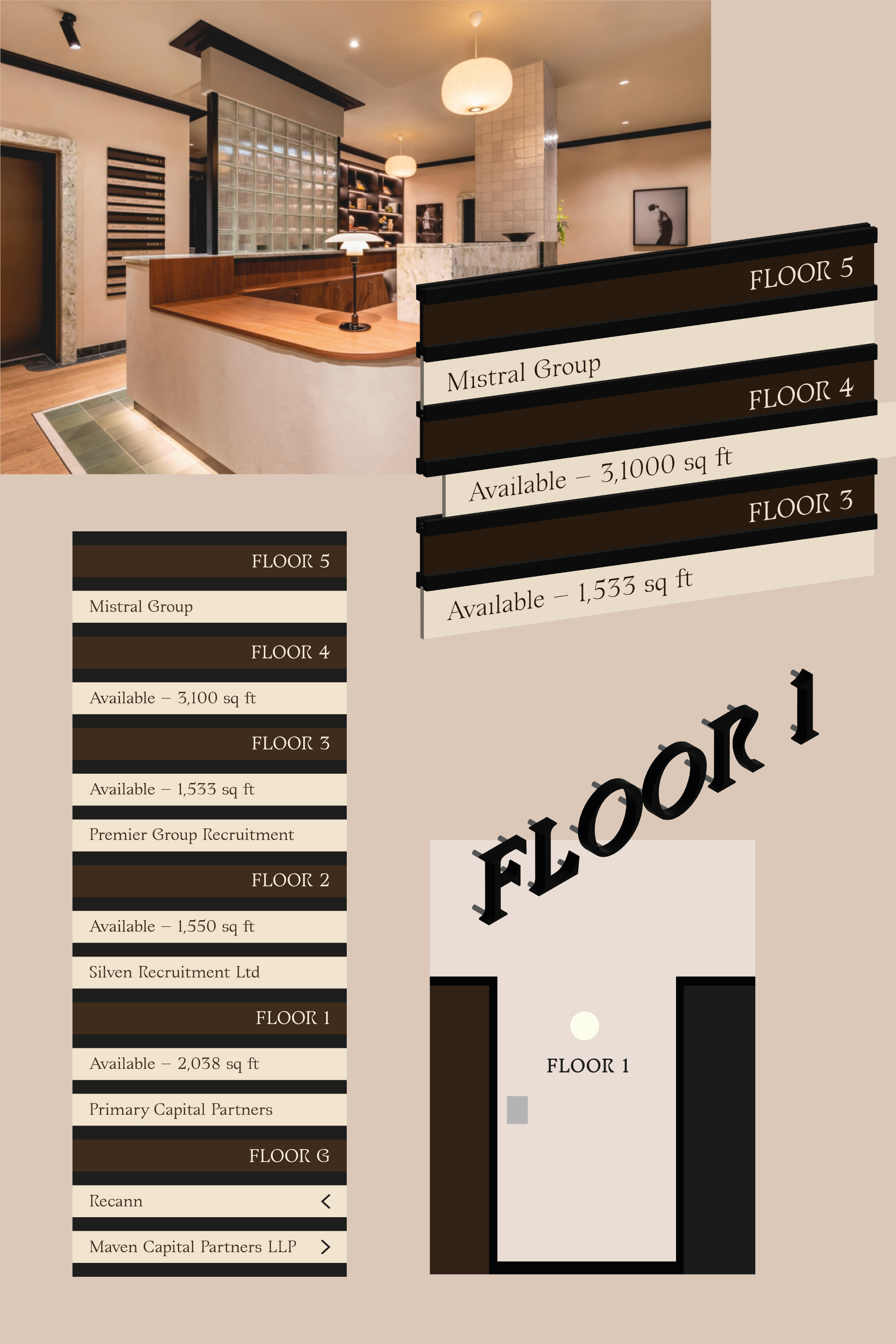
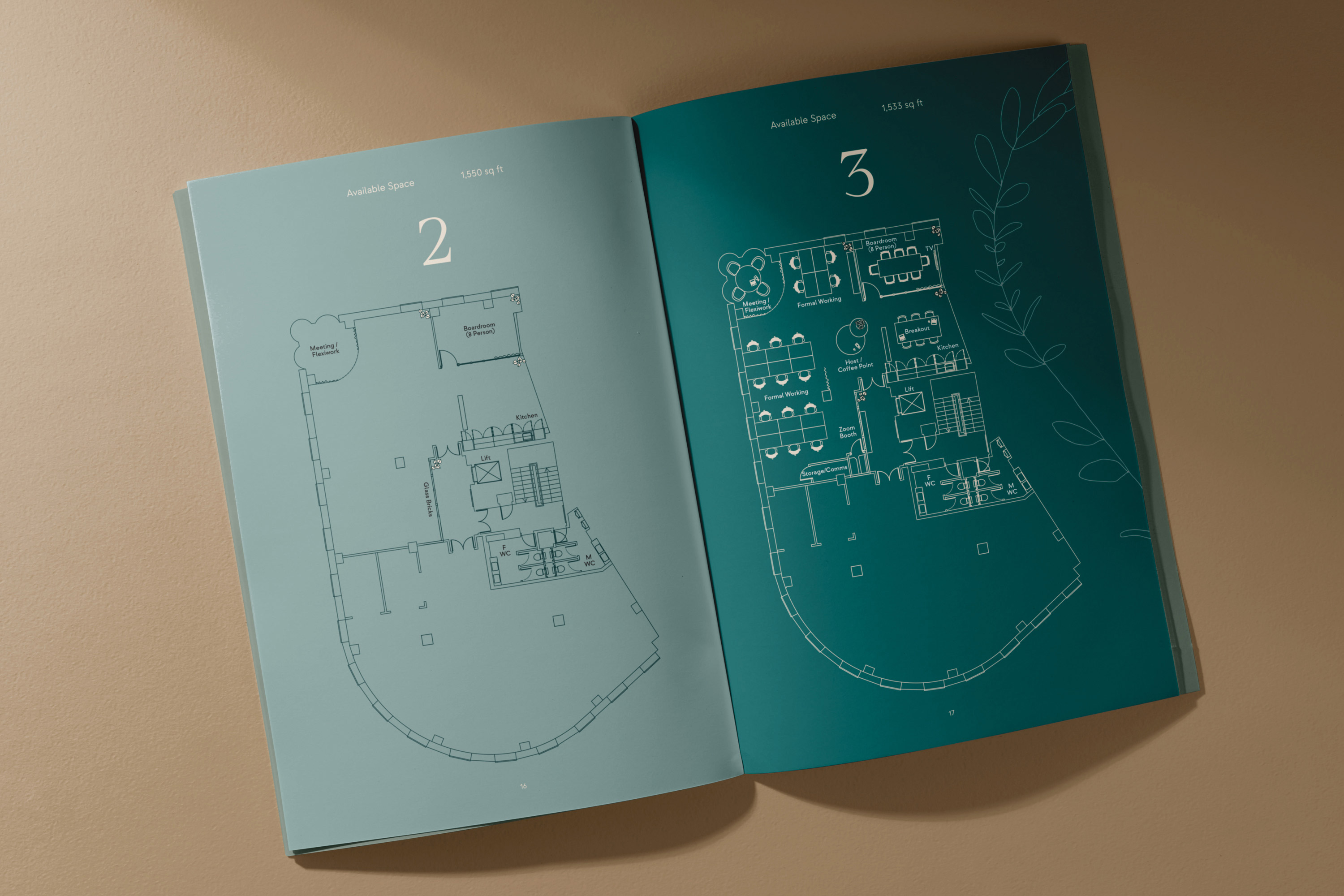
We developed a custom signage style for all the internal signage featured in the reception for the business listings, outside each office and the floor numbers. Creating an interchangeable system that allows the client to easily amend the panels whenever a new tenant moves in.
For the floor numbers we took a more minimal approach to these utilising our type with a subtle lift off the wall, and as a finishing touch to our internal signage we created a set of icons for all communal spaces inspired by the unique features in our brand typeface.