Band on the Wall
Where the world comes to play
Band on the Wall
Brand Strategy
Brand Identity
Digital Design
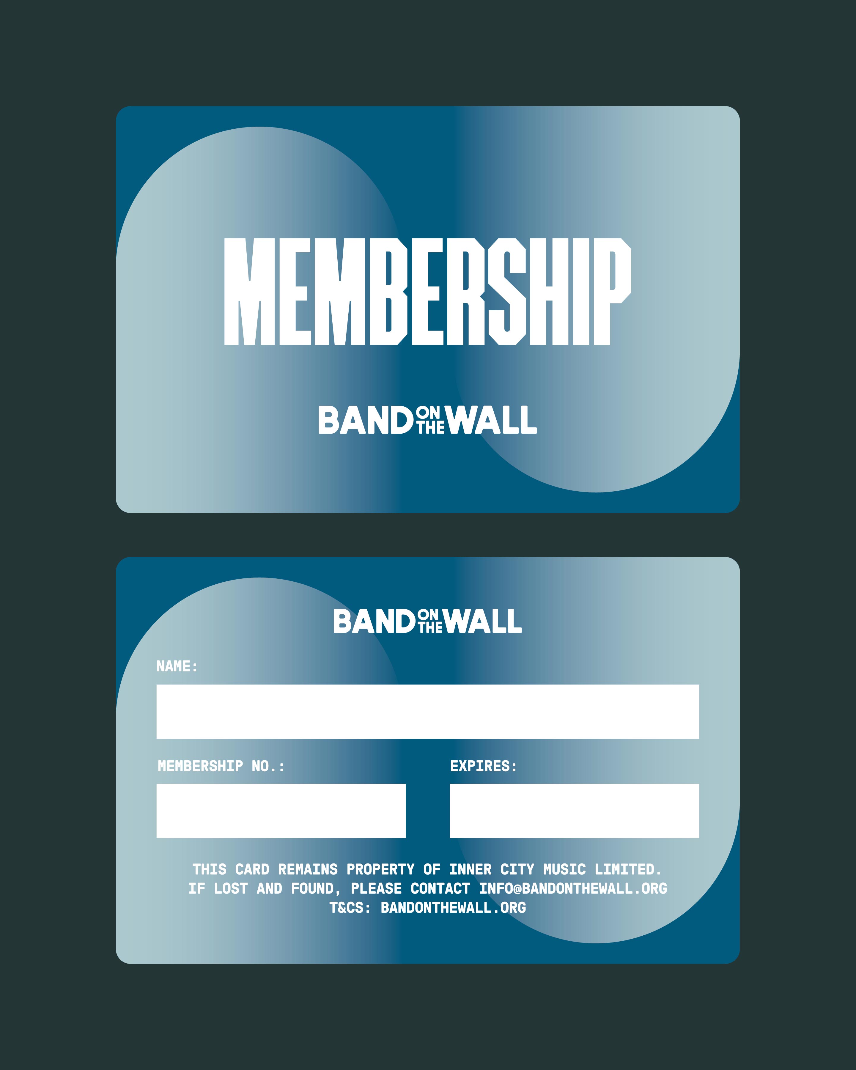
Print Design
Moving Image
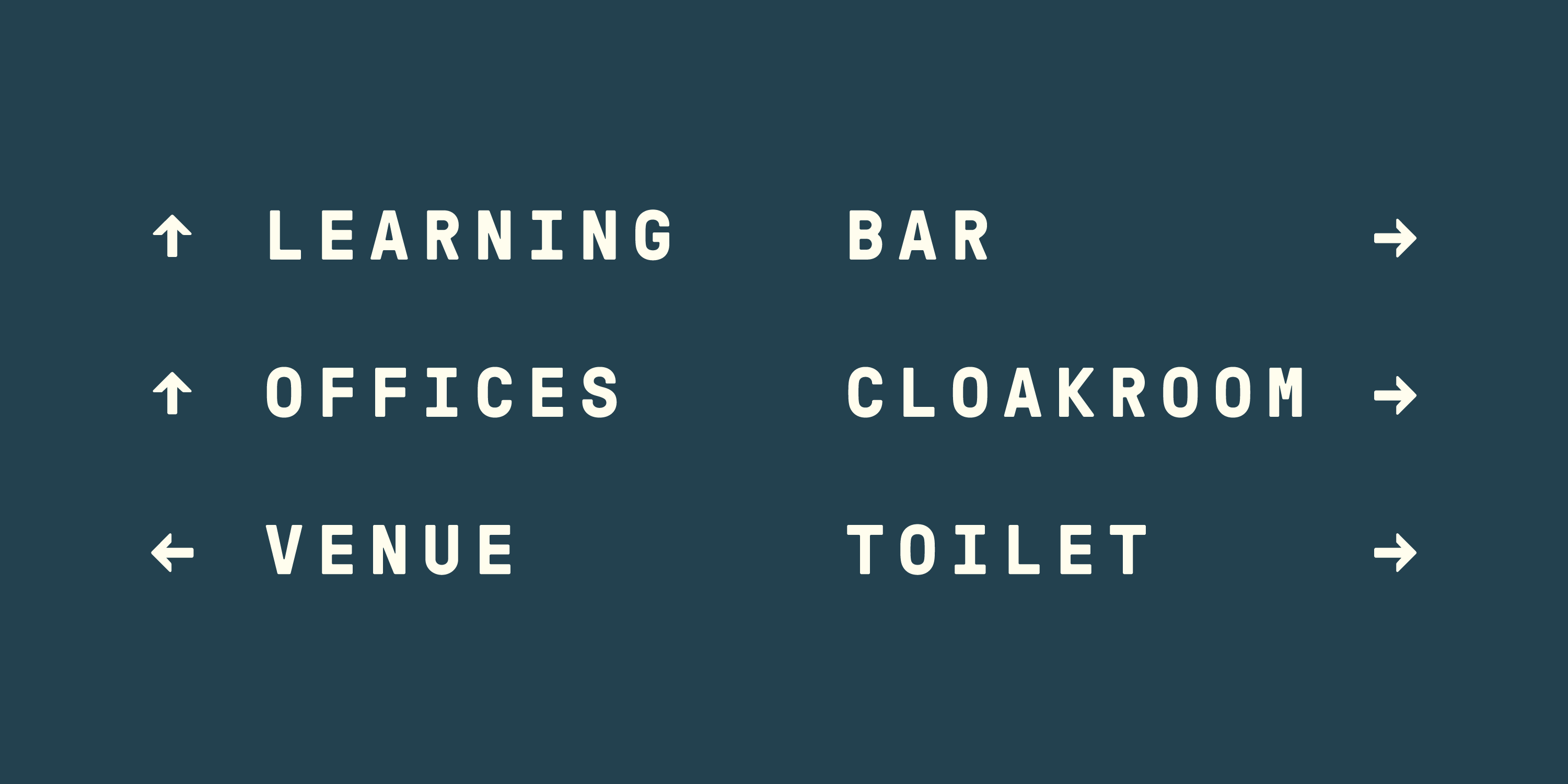
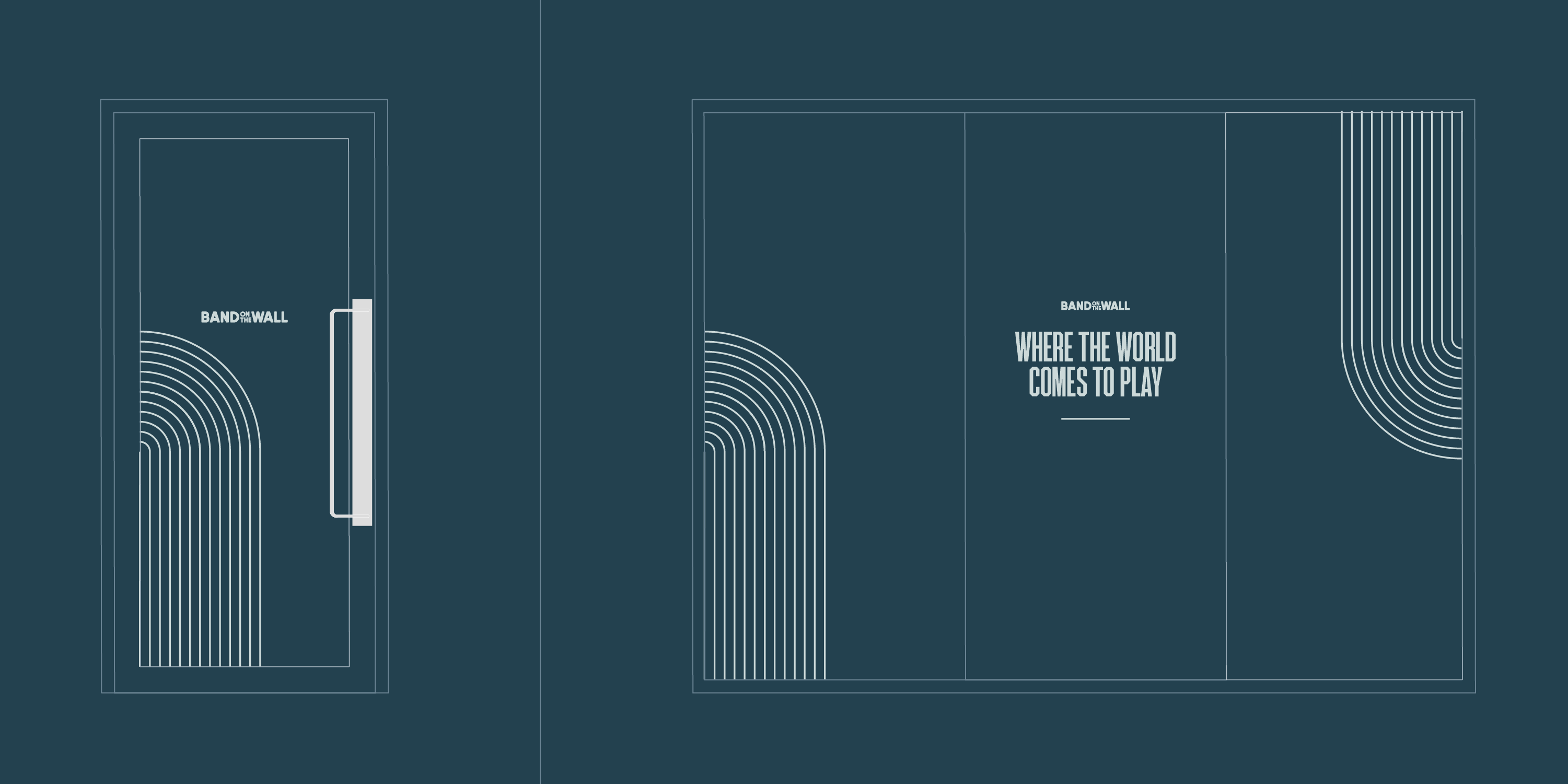
Signage & Wayfinding
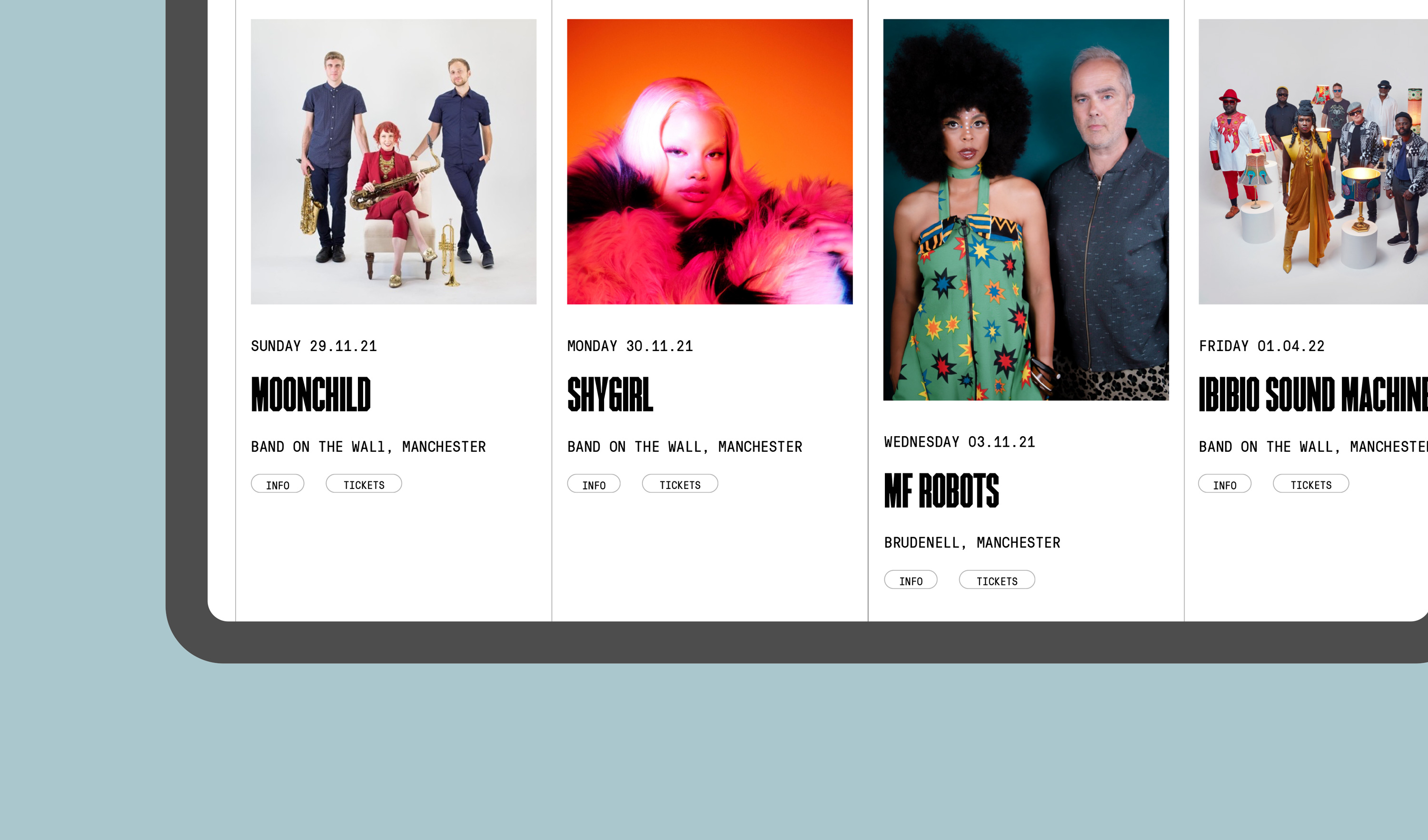
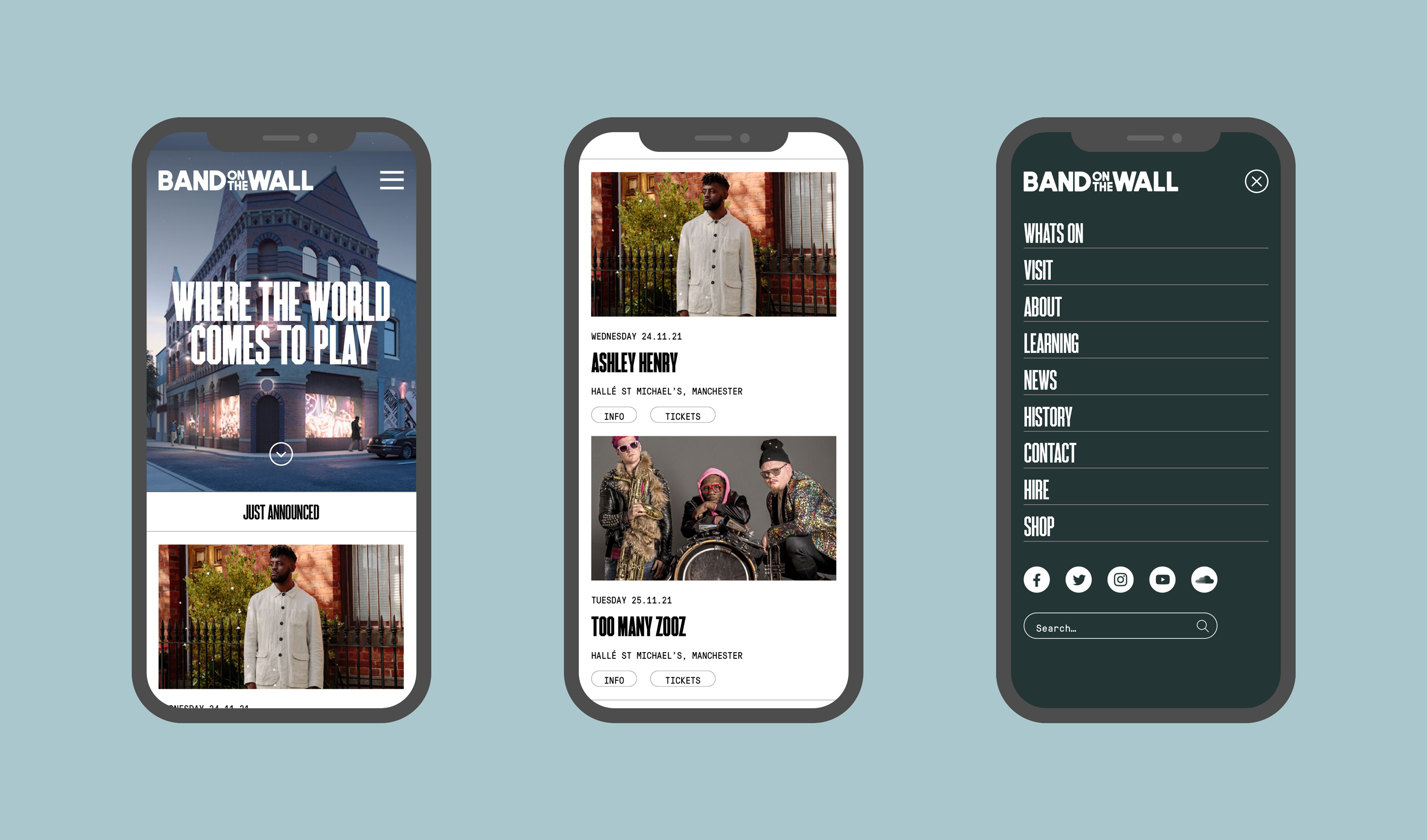
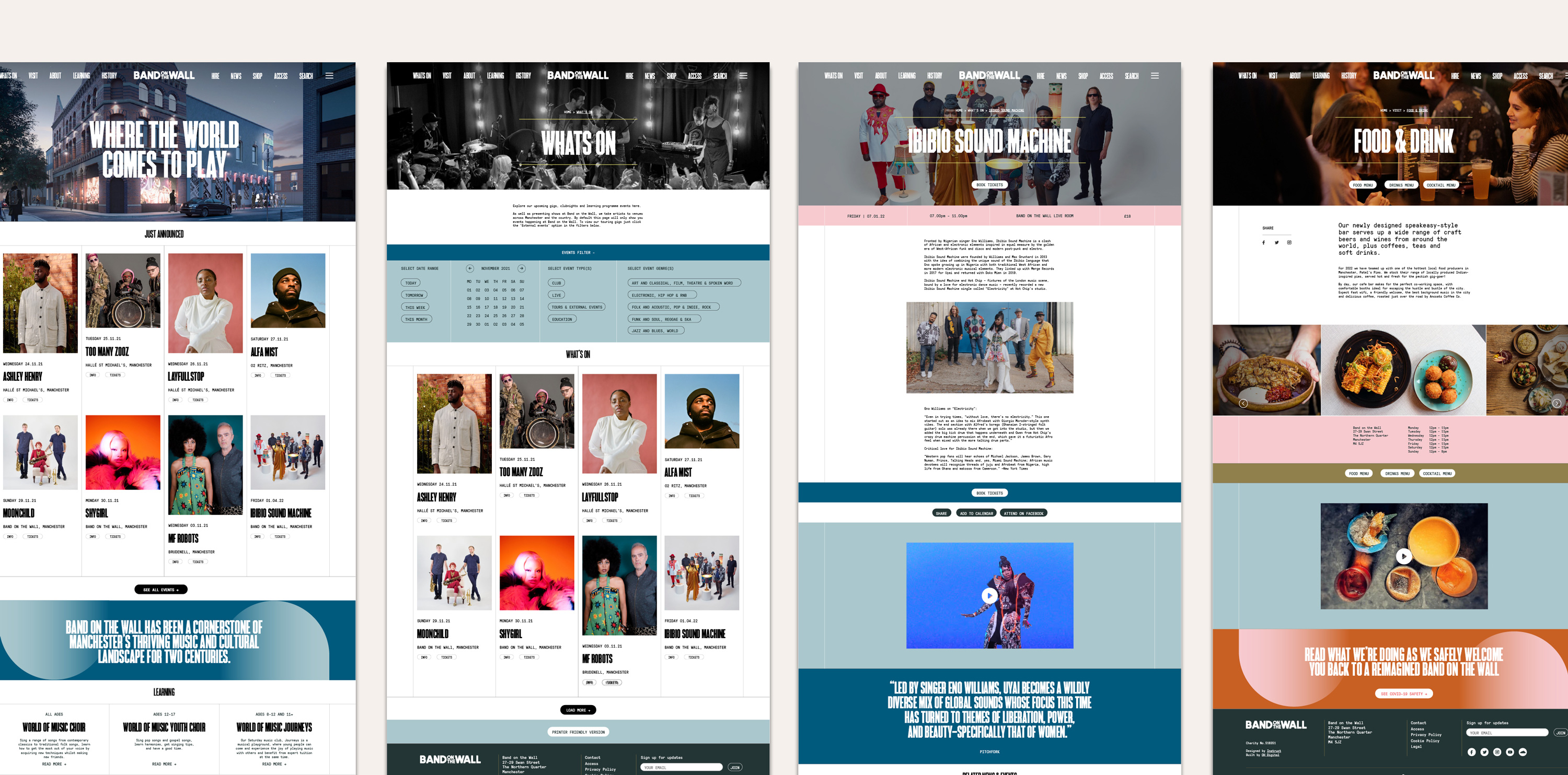
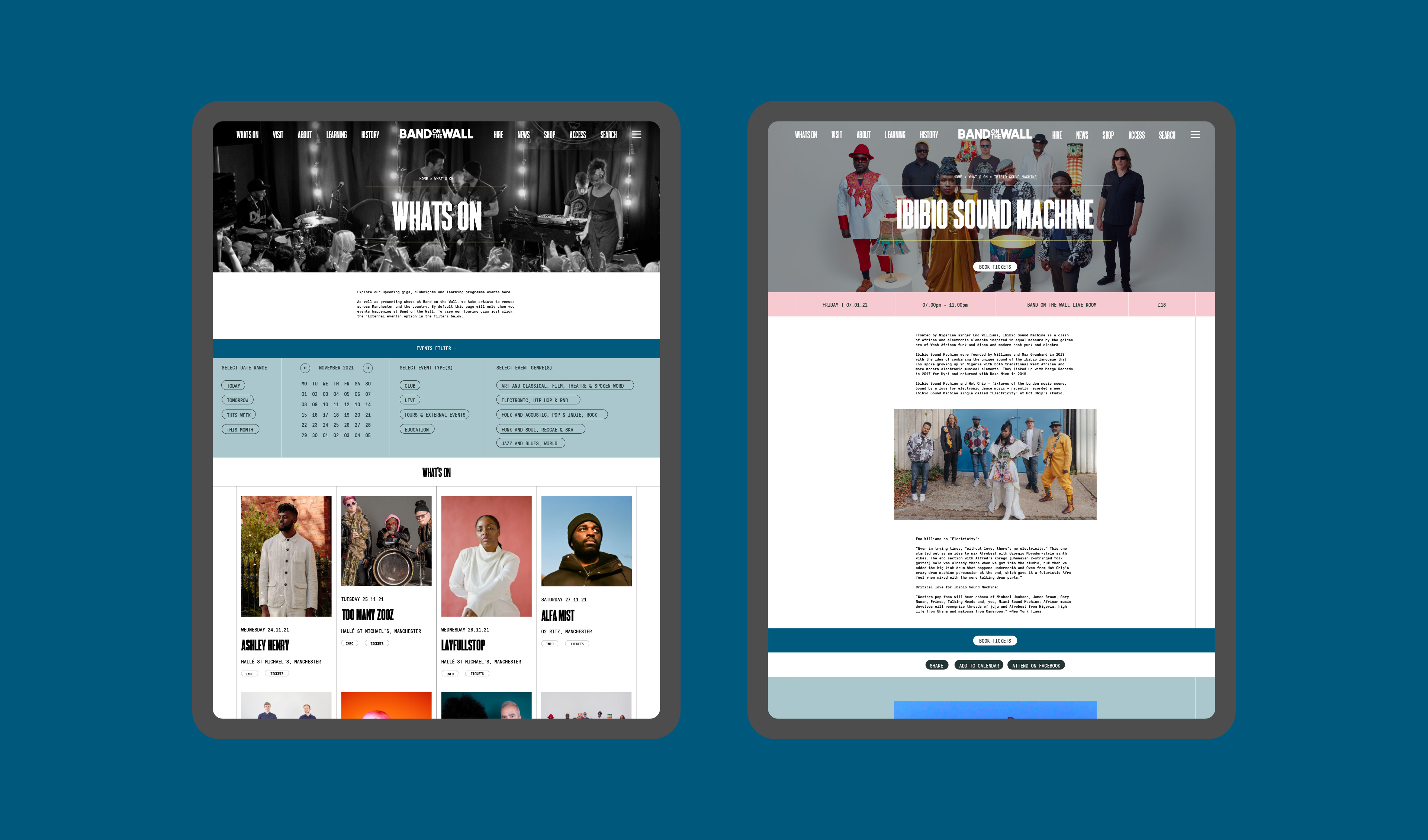
As part of Band on the Wall’s £3.5 million expansion, we worked with the team to create a new visual identity, brand strategy and website to welcome a new chapter in this iconic venue’s story.
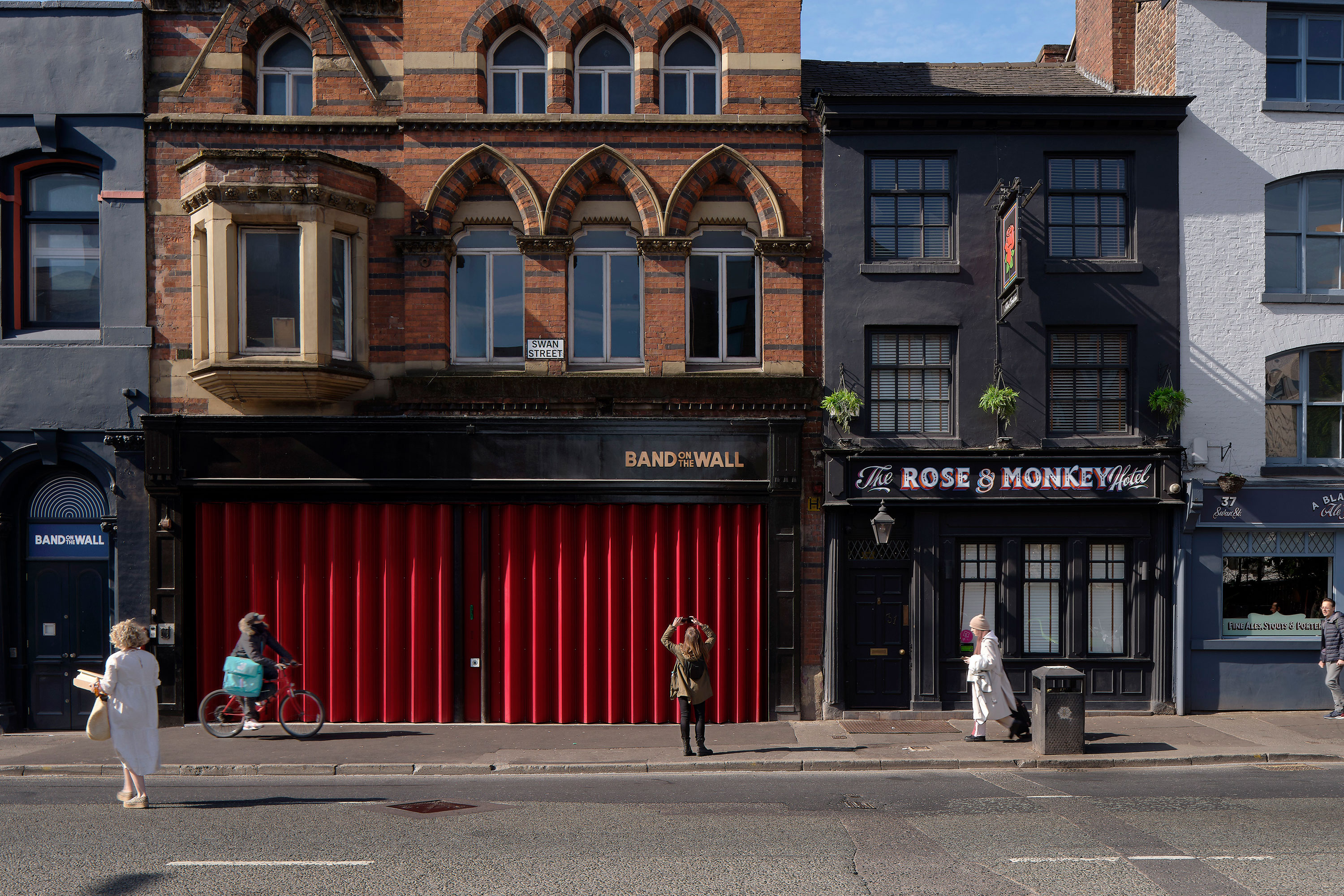
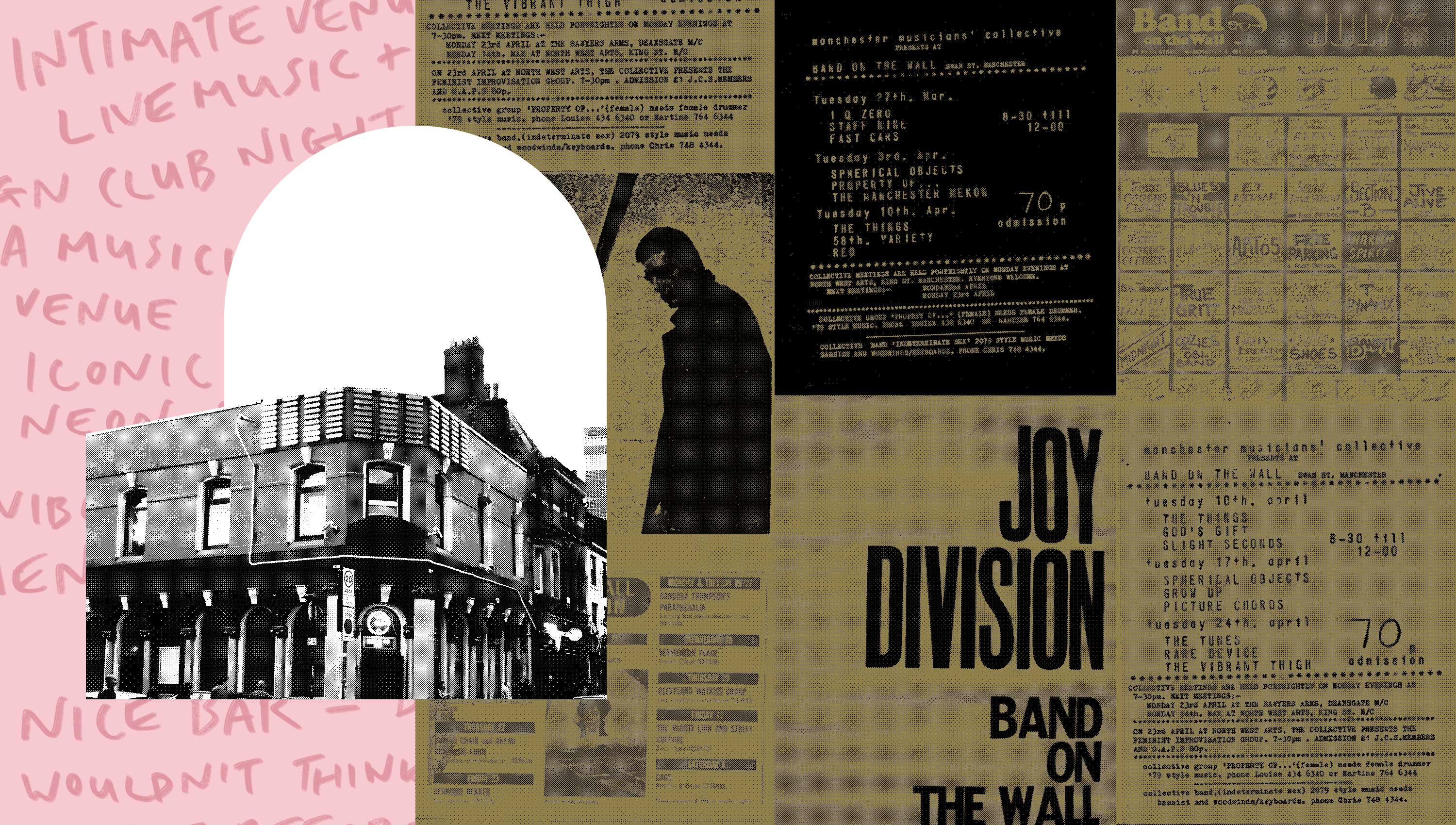
For over 200 years, this renowned venue has been embedded in the heart of the city’s music and cultural DNA. This reimagining of the space gave us a perfect opportunity to show people what we’re about, and set out a vision for the venue’s future. With a passion for the music and cultural scene of our home city, and as avid gig-goers, we’ve spent many a night dancing with pals in the venue. For us, this was a perfect brief to get our teeth into.
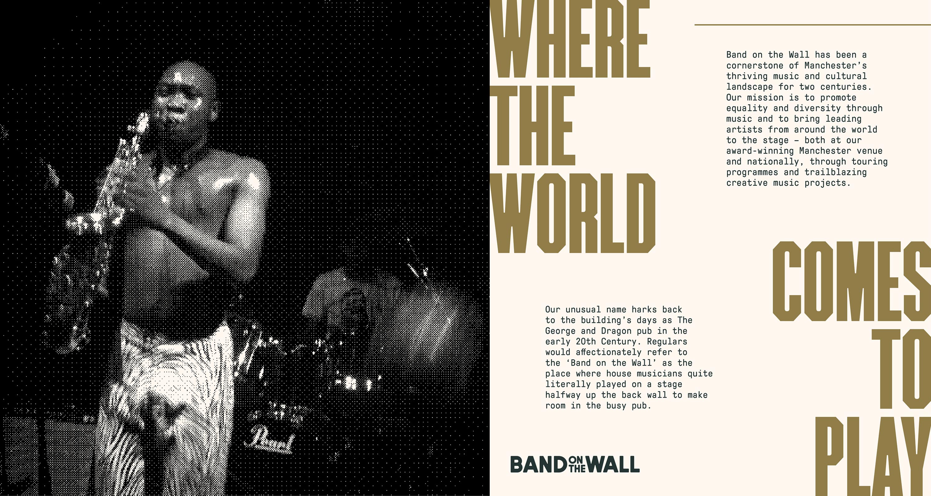
Band on the Wall is much more than a music venue. So, we started by gaining insights from across the organisation on what the venue means to them. This understanding formed the purpose and values that drove our design process.
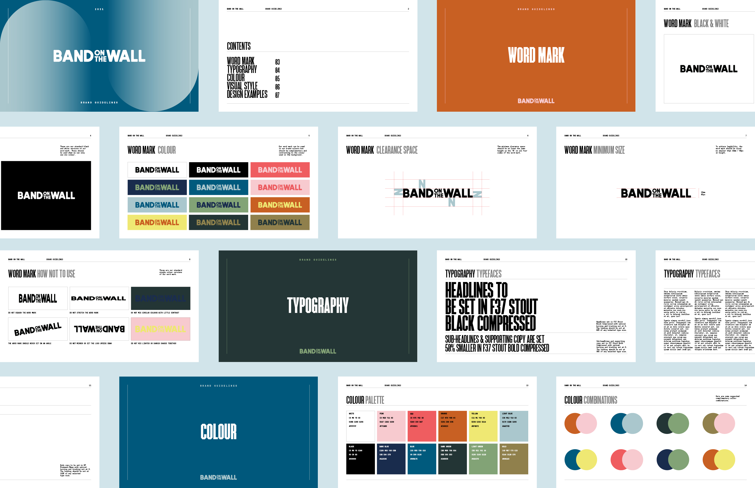
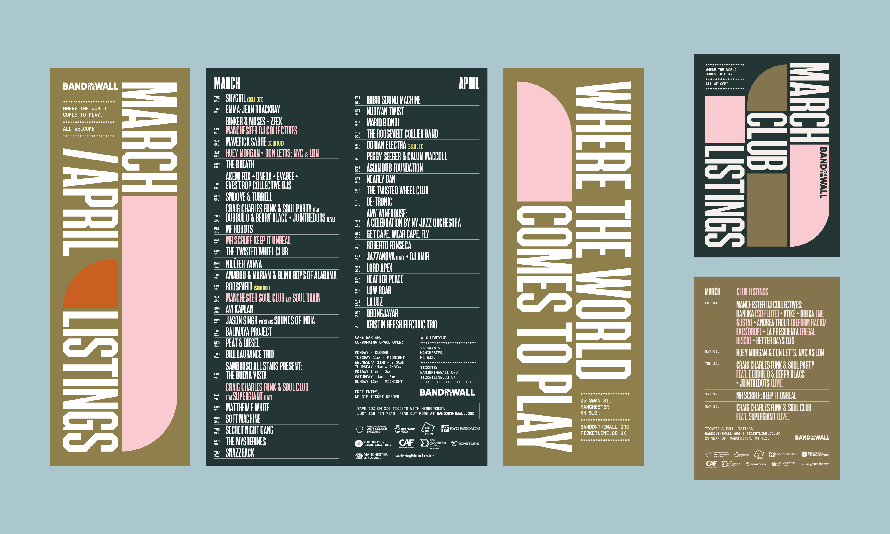
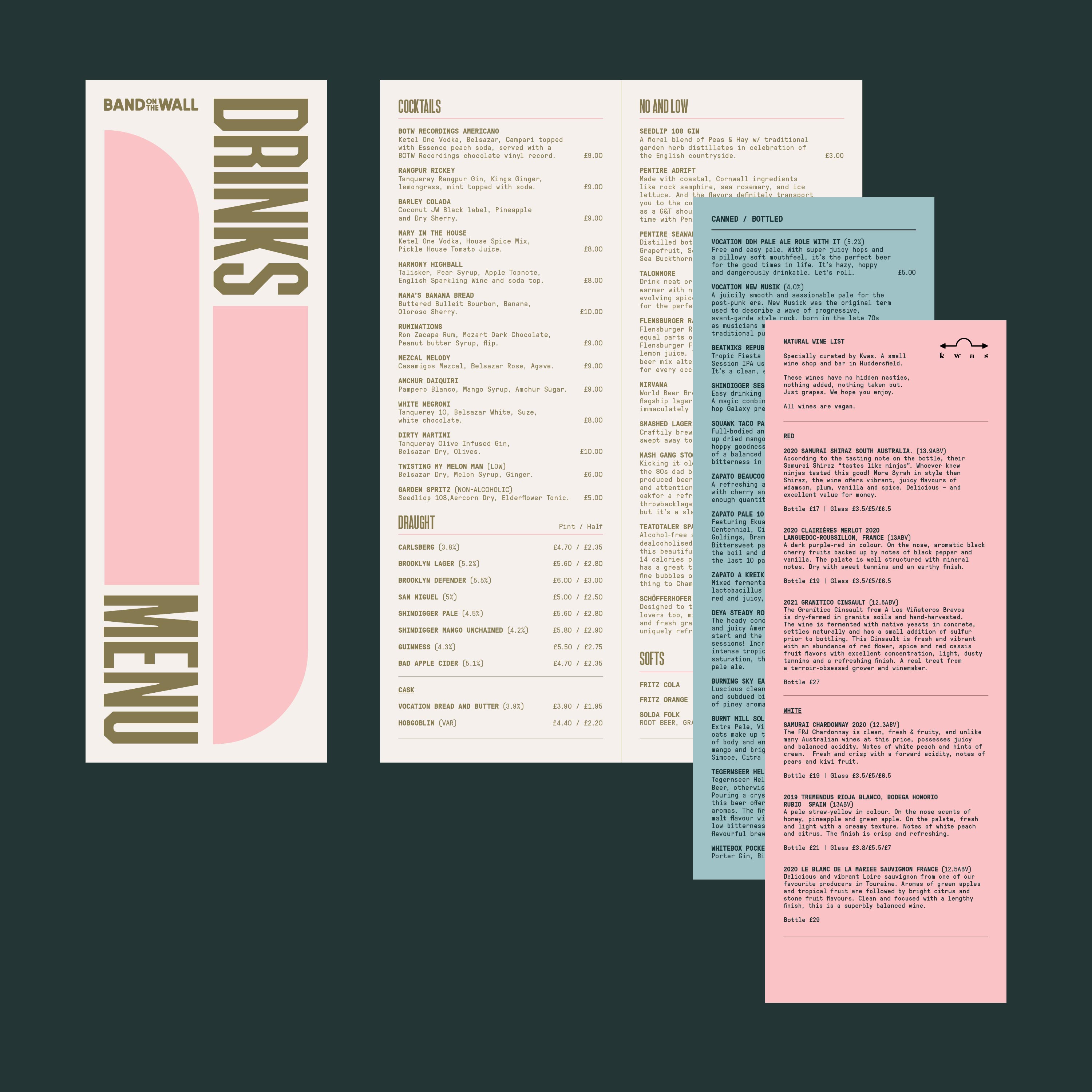
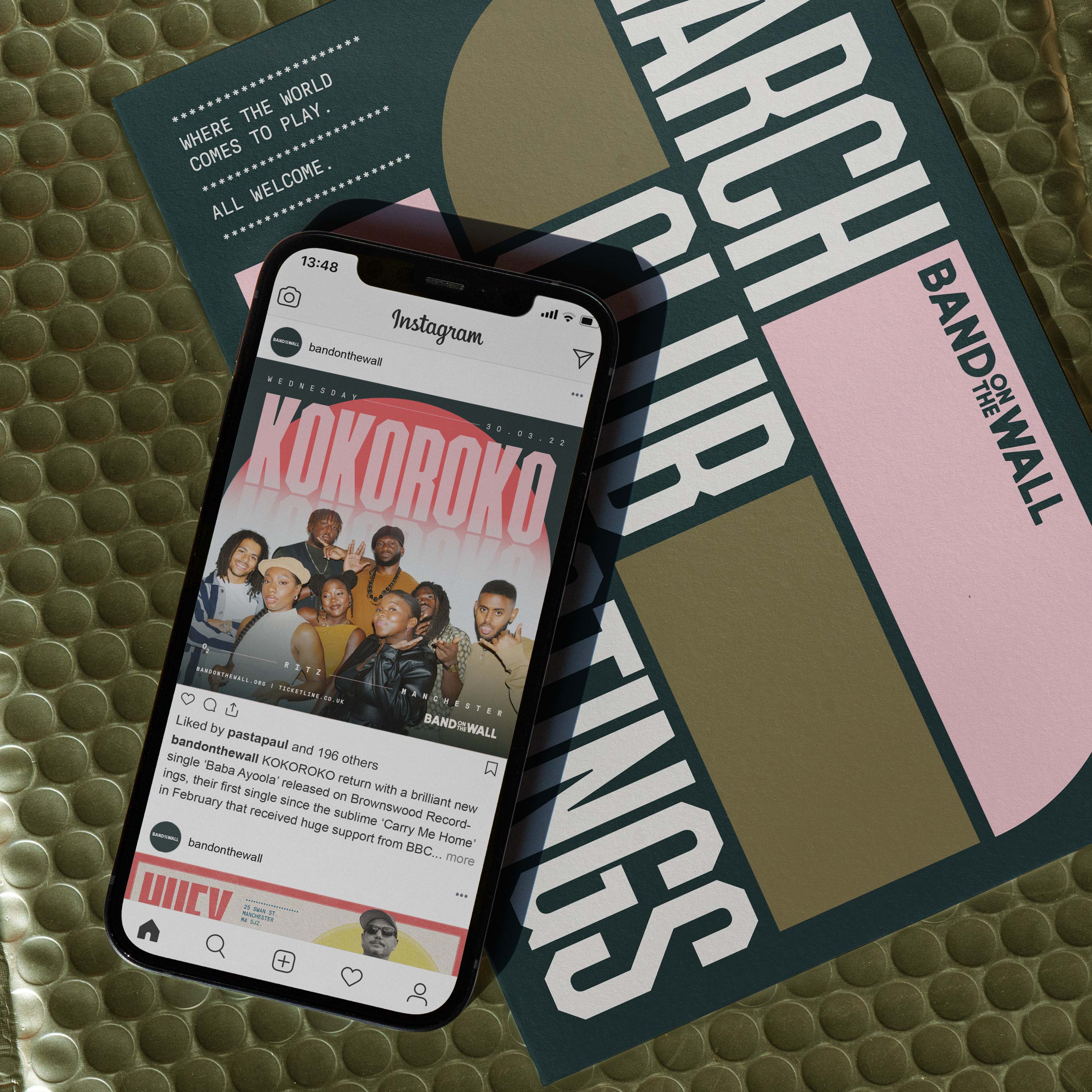
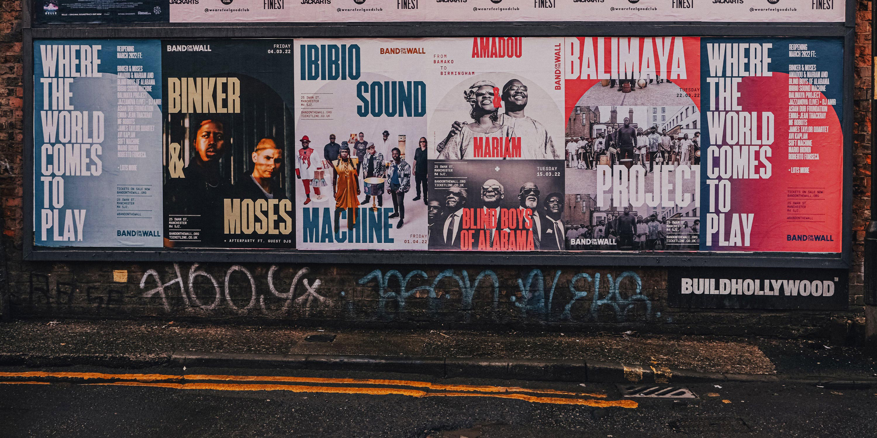
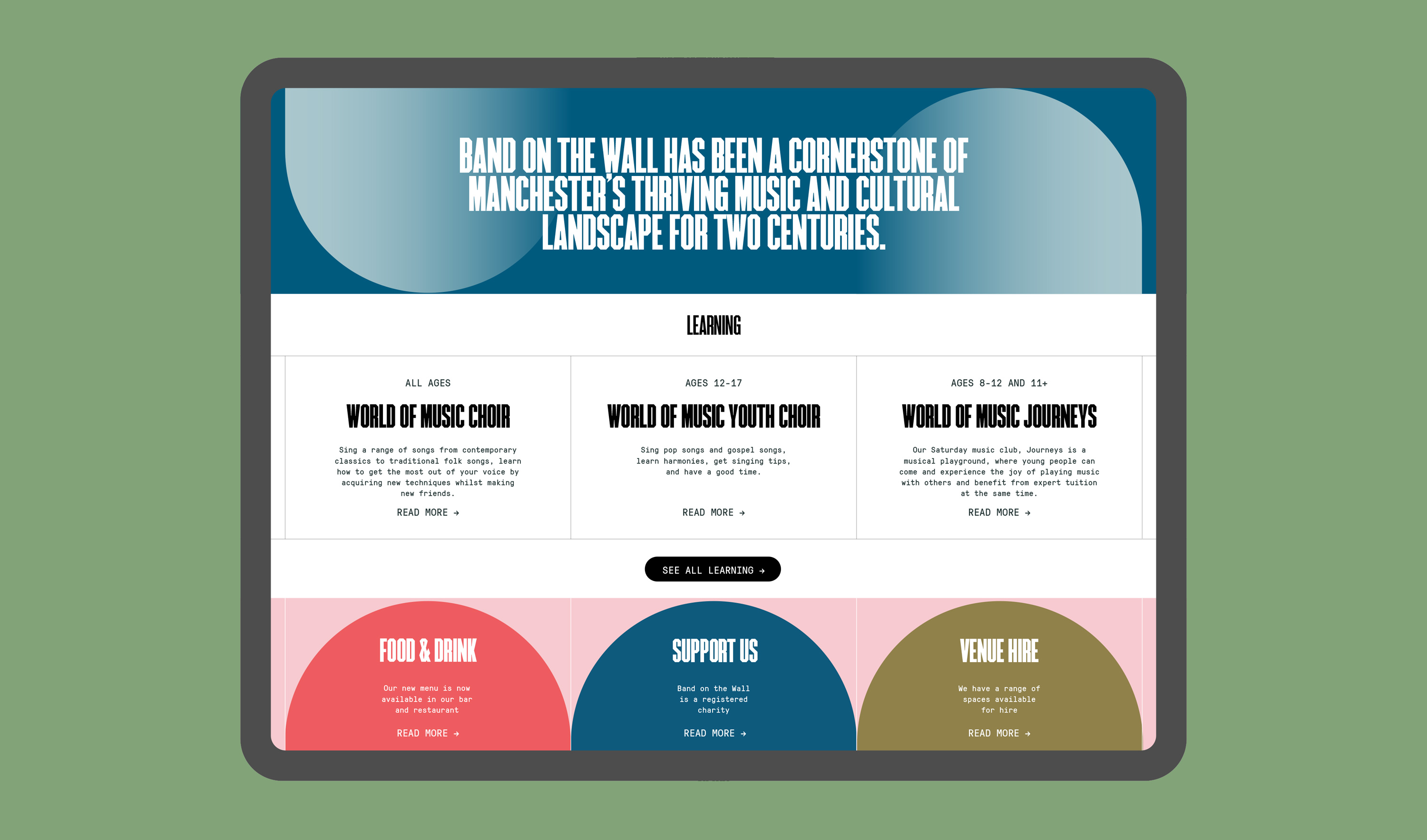
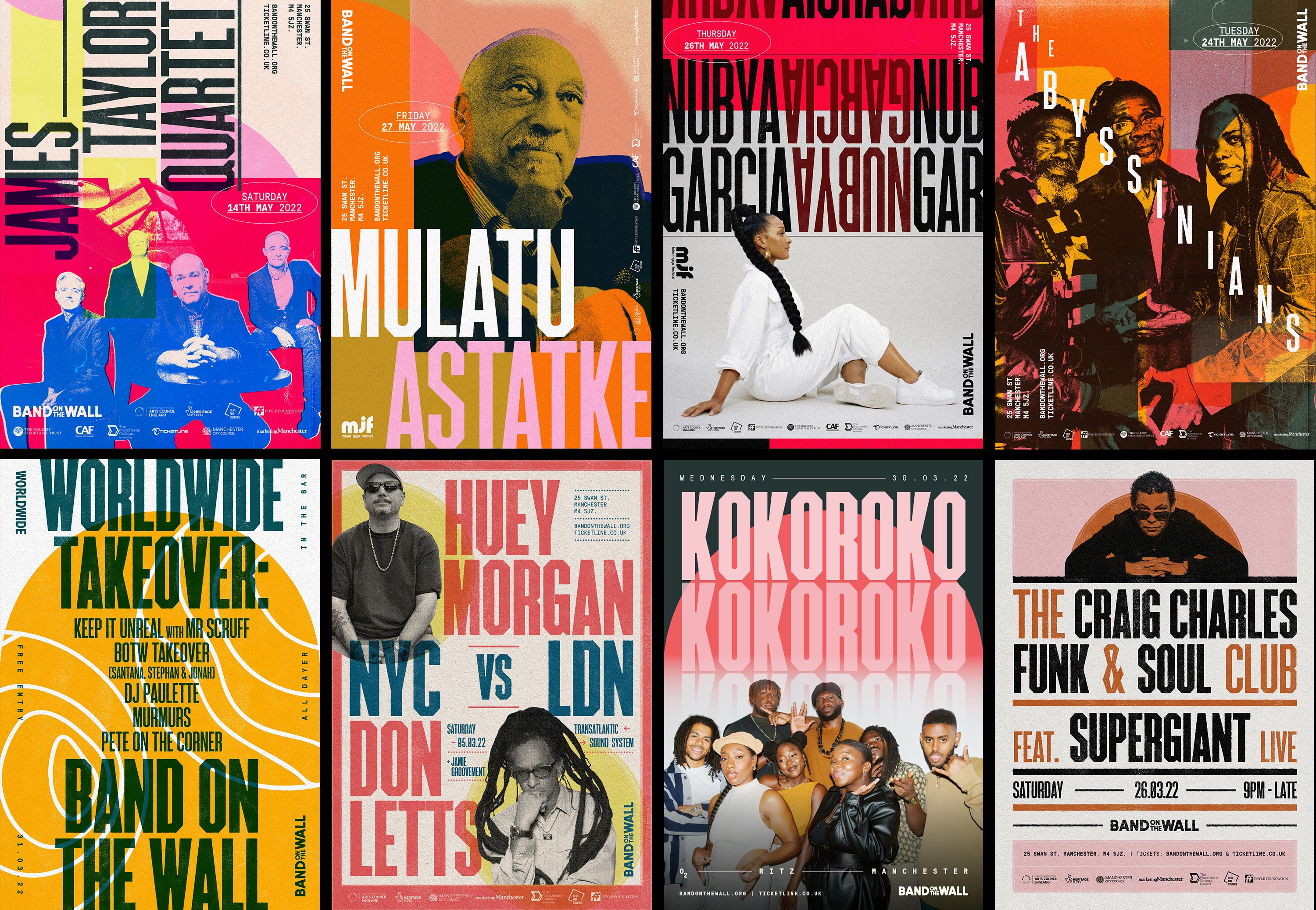
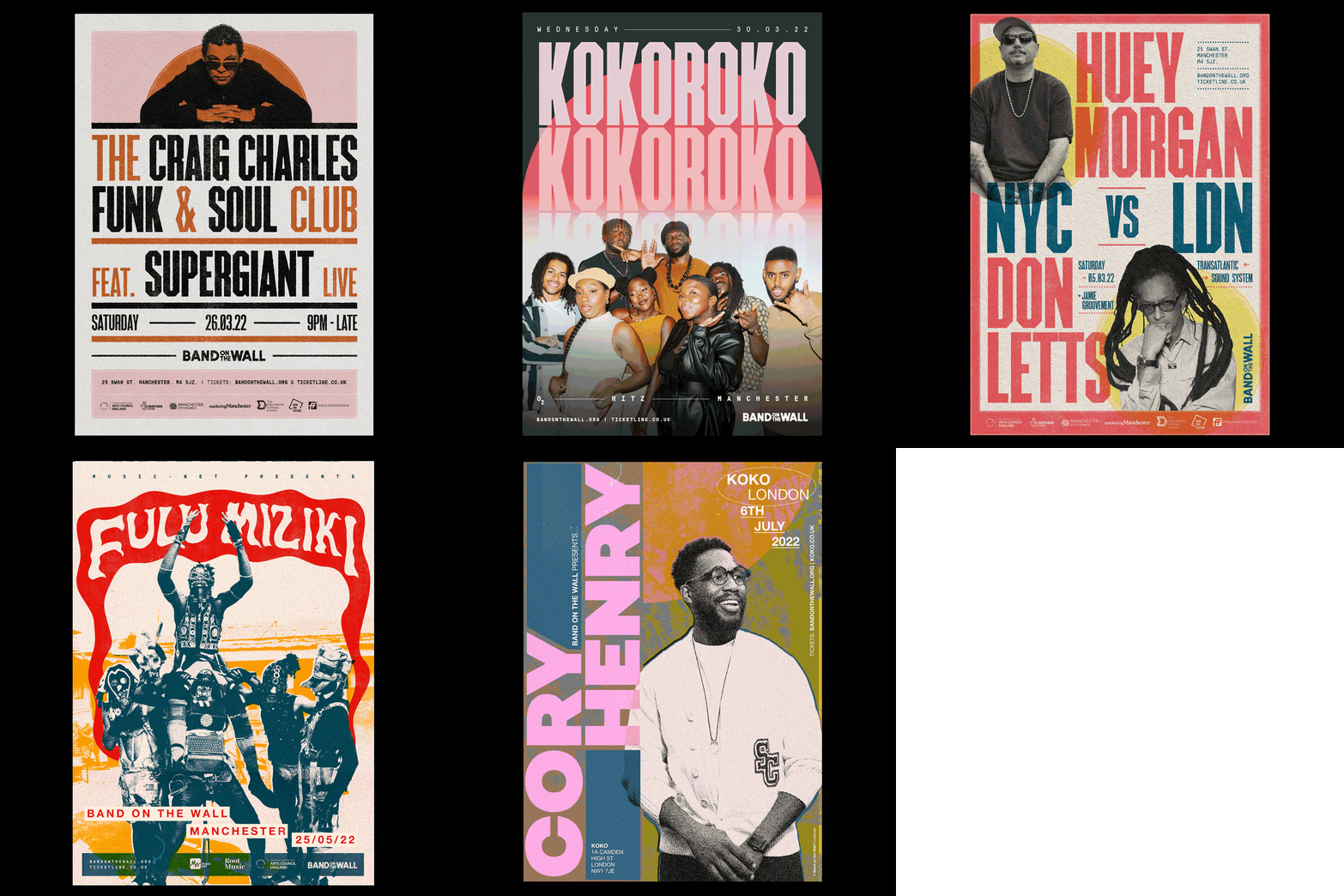
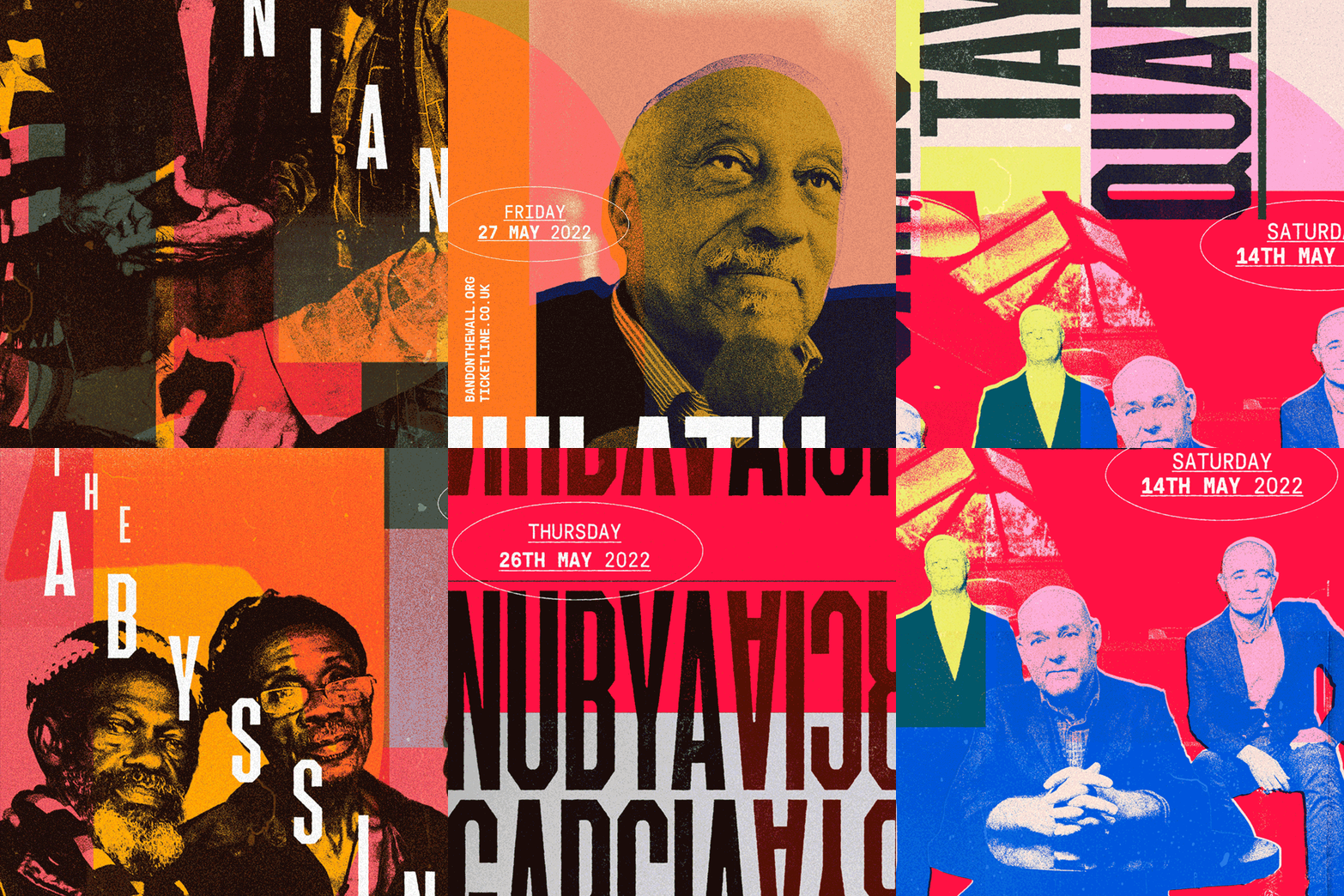
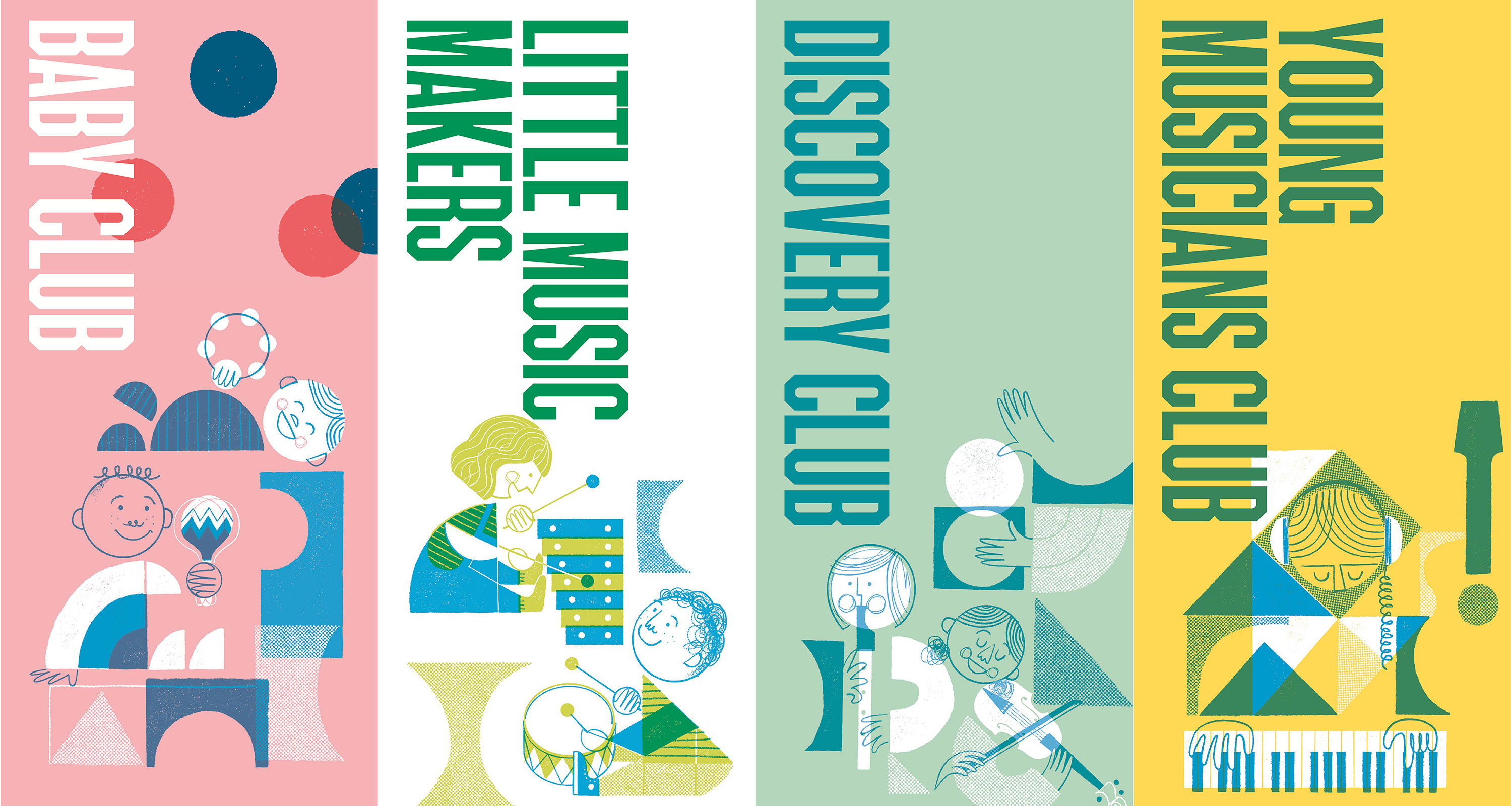
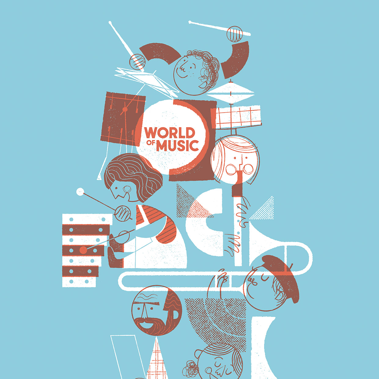
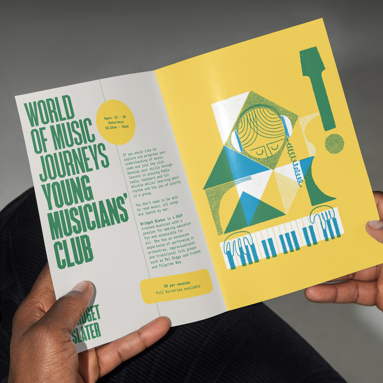
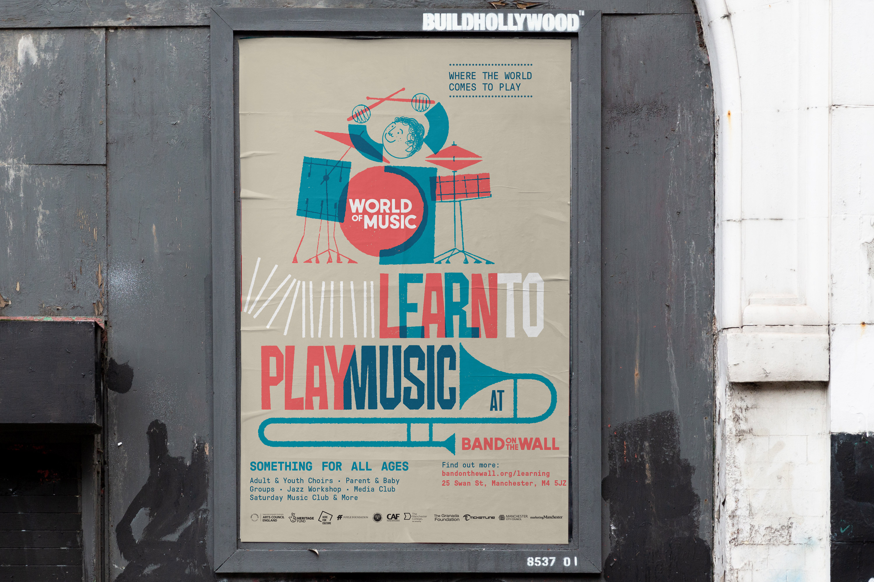
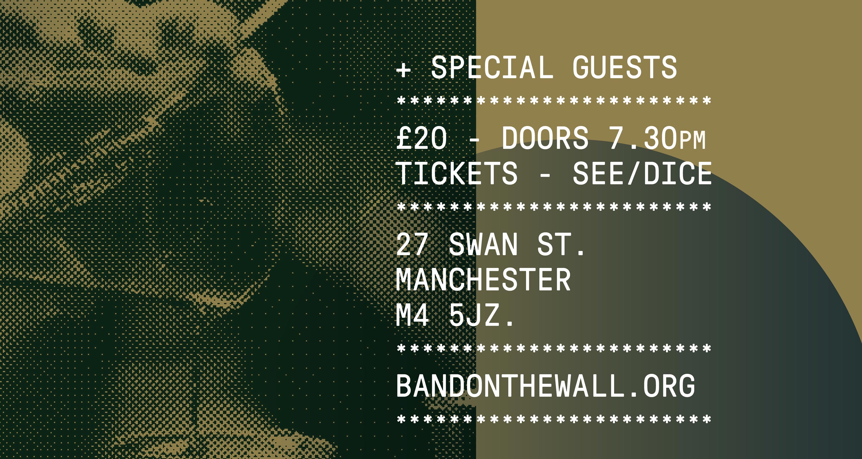
A brand is always much more than a logo; it’s composed of many elements. We aimed to create a flexible visual system that’s able to adapt to various outputs from flyposters to animation.
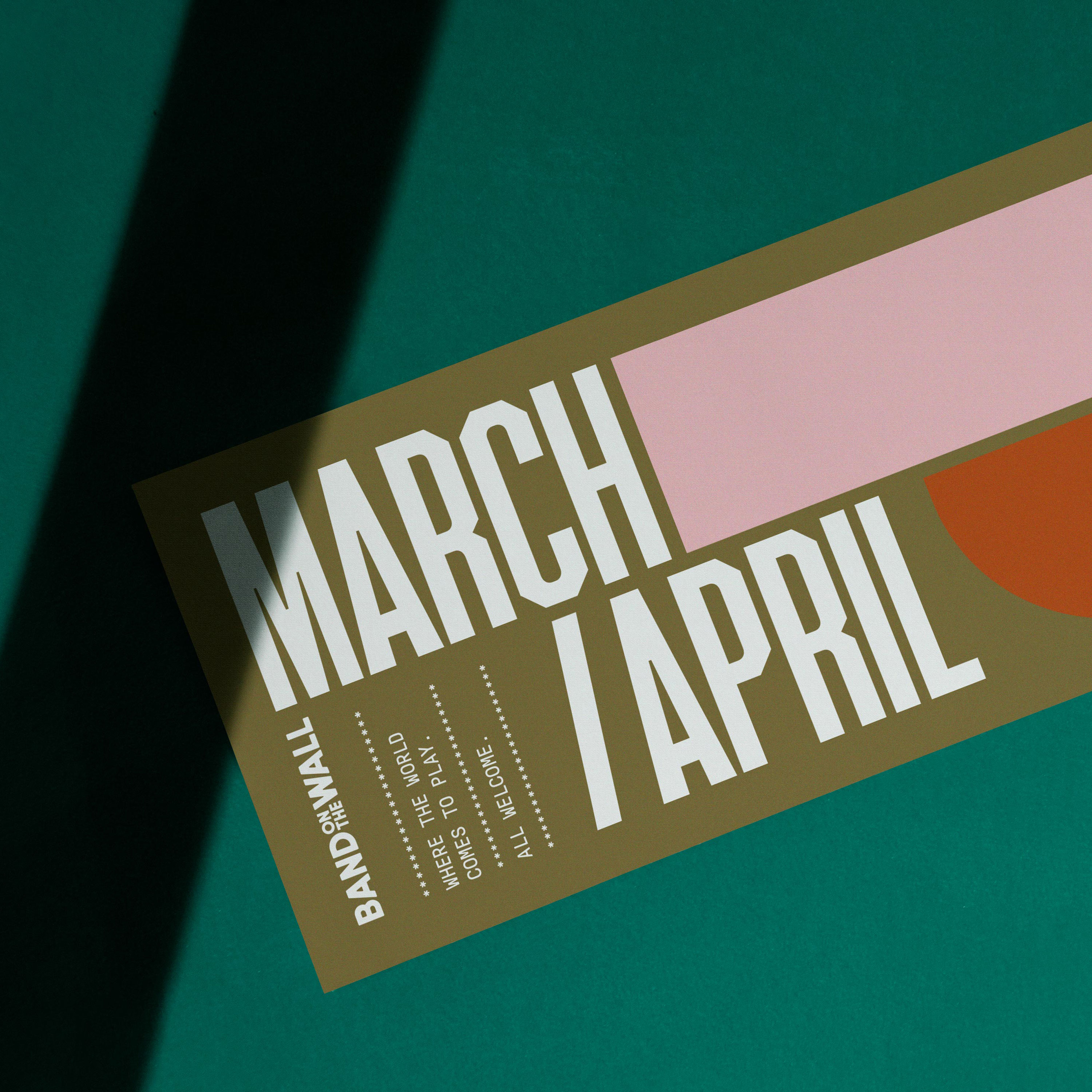
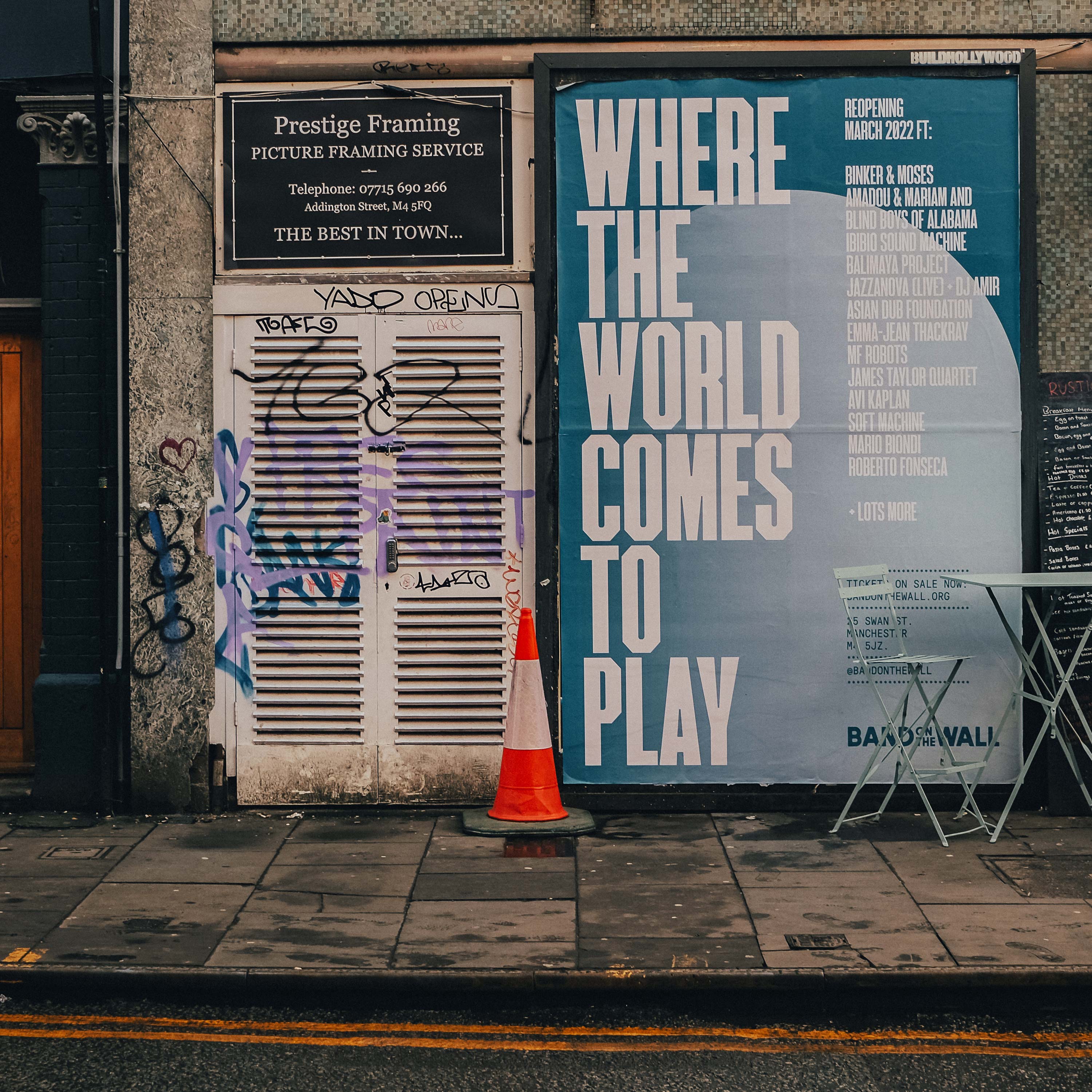
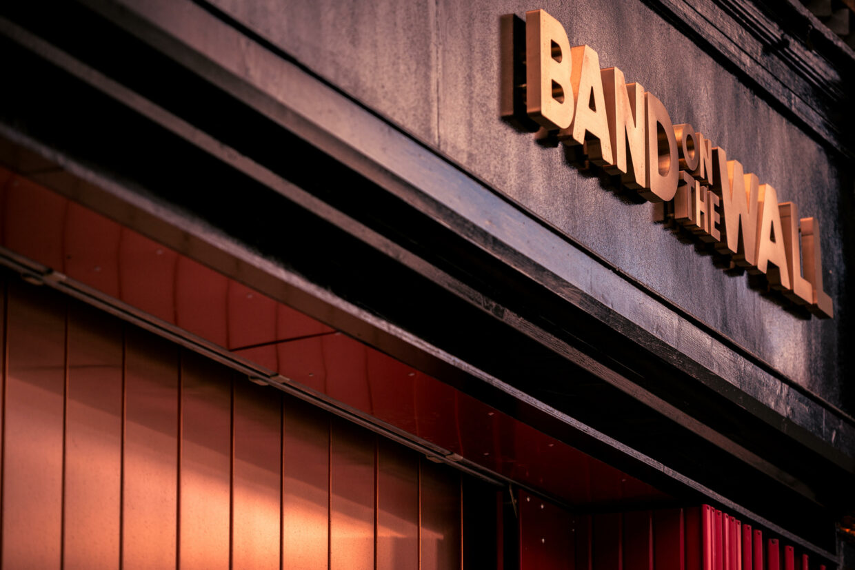
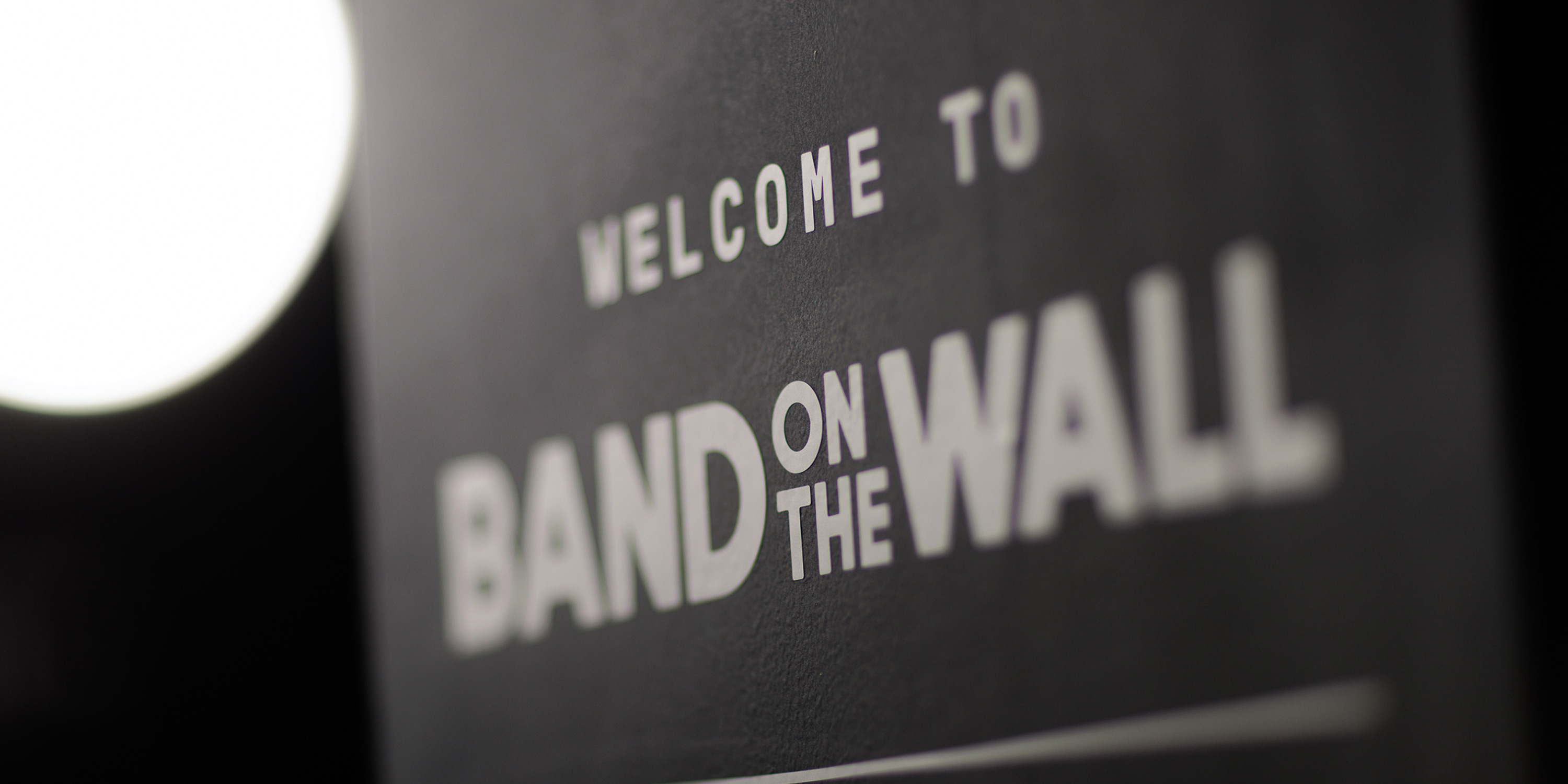
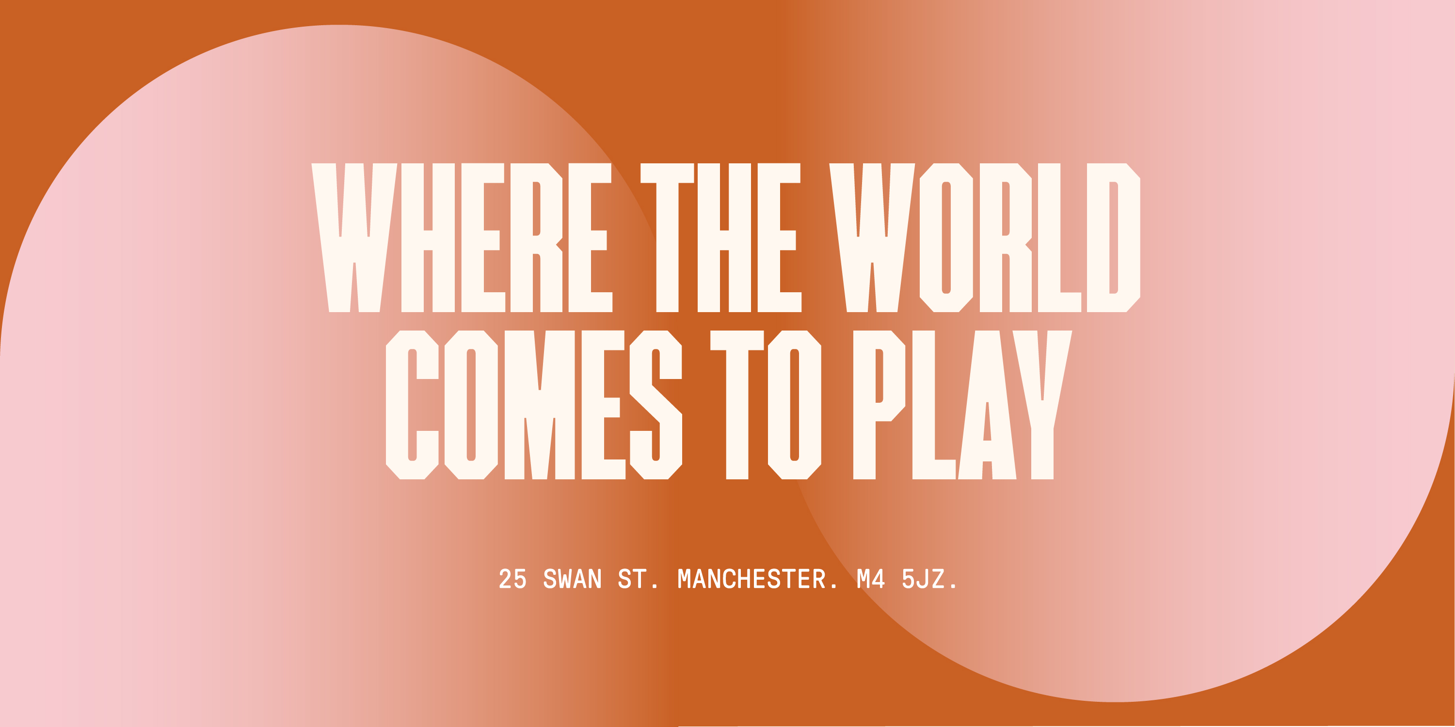
A strong, dynamic typeface is essential for communicating our story. We felt F37’s Stout – based on an old American letterpress font – with it’s unusual letterforms that have been lovingly digitised and crafted by the foundry, was a perfect fit. Using Stout as our headline type felt like a little nod to some of the legendary posters in the venue’s archive, as well as being able to pack a punch across multiple formats.
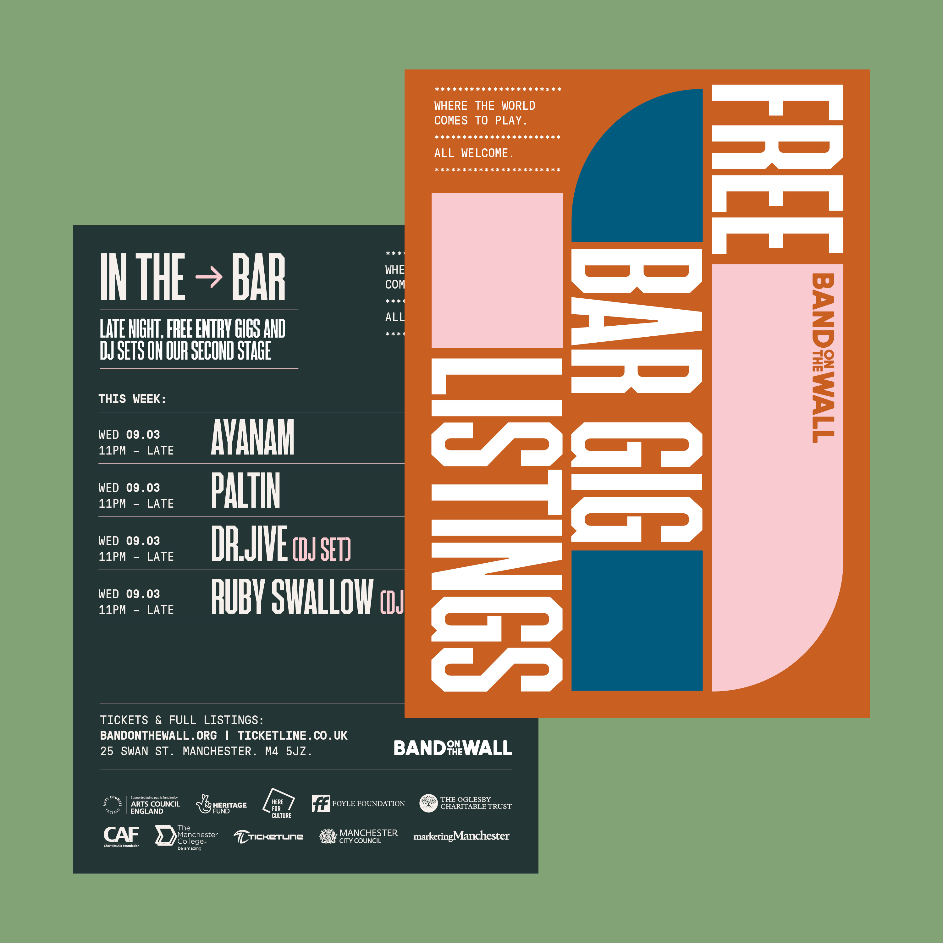
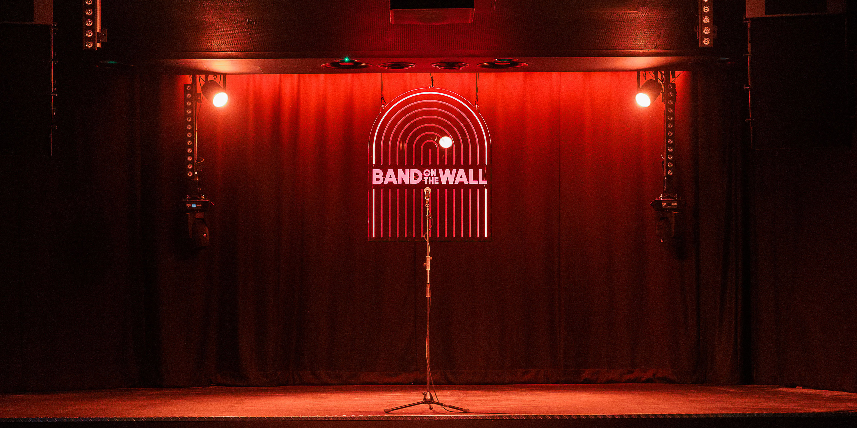
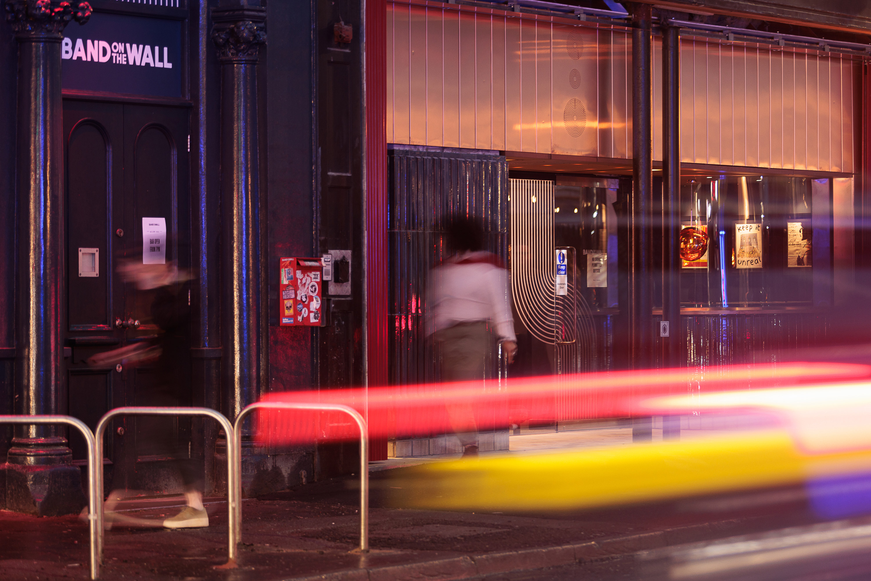
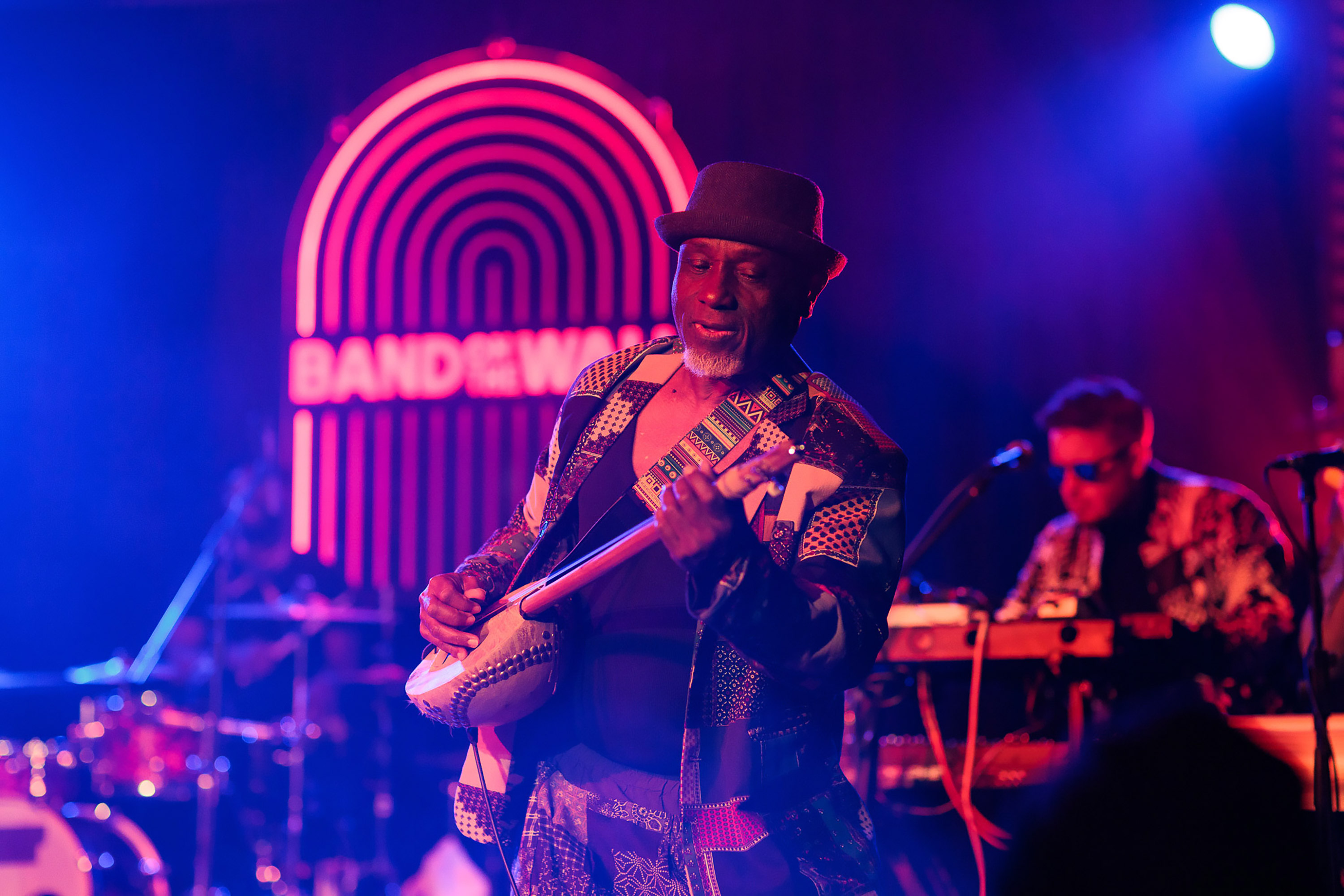
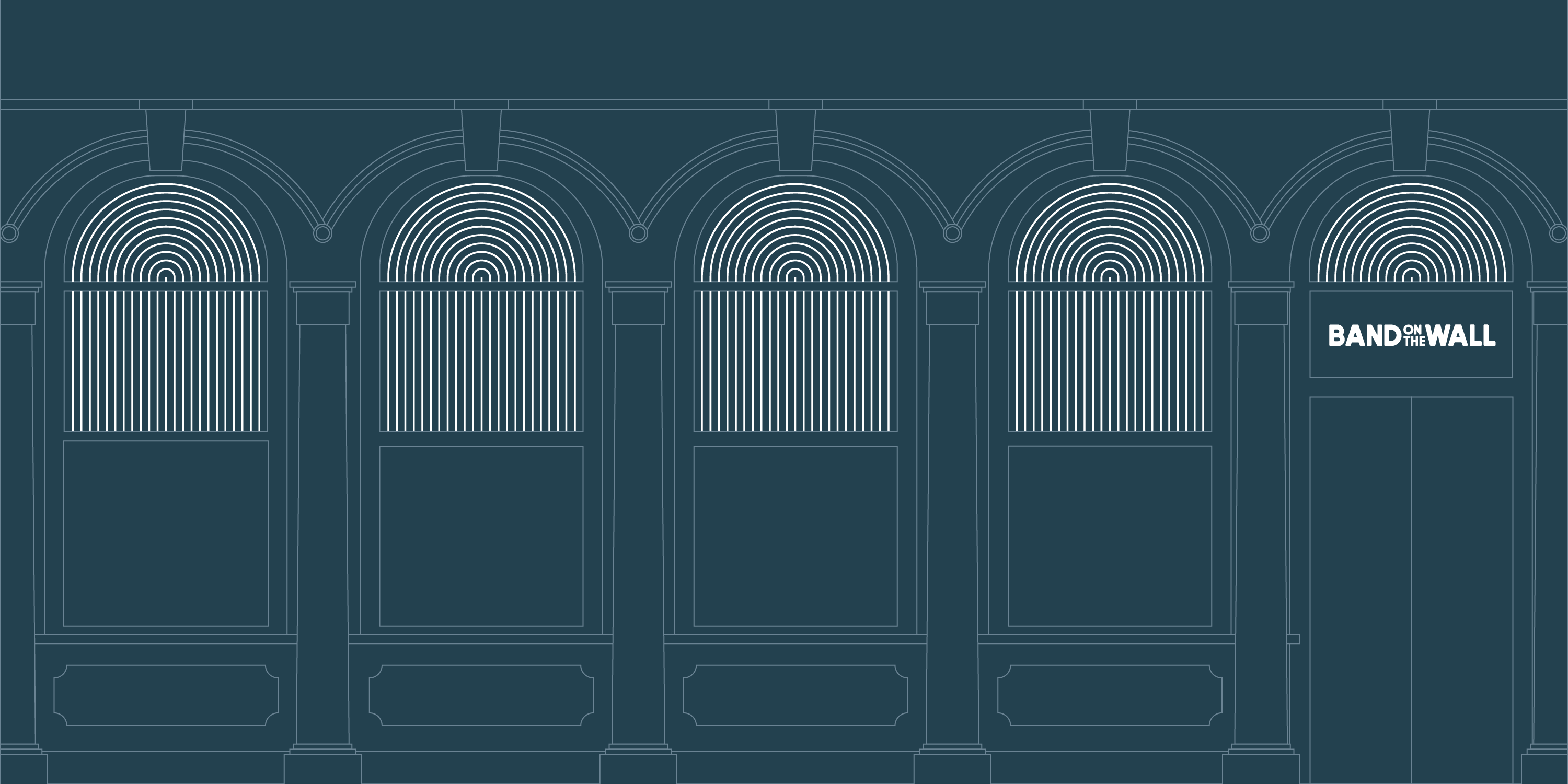
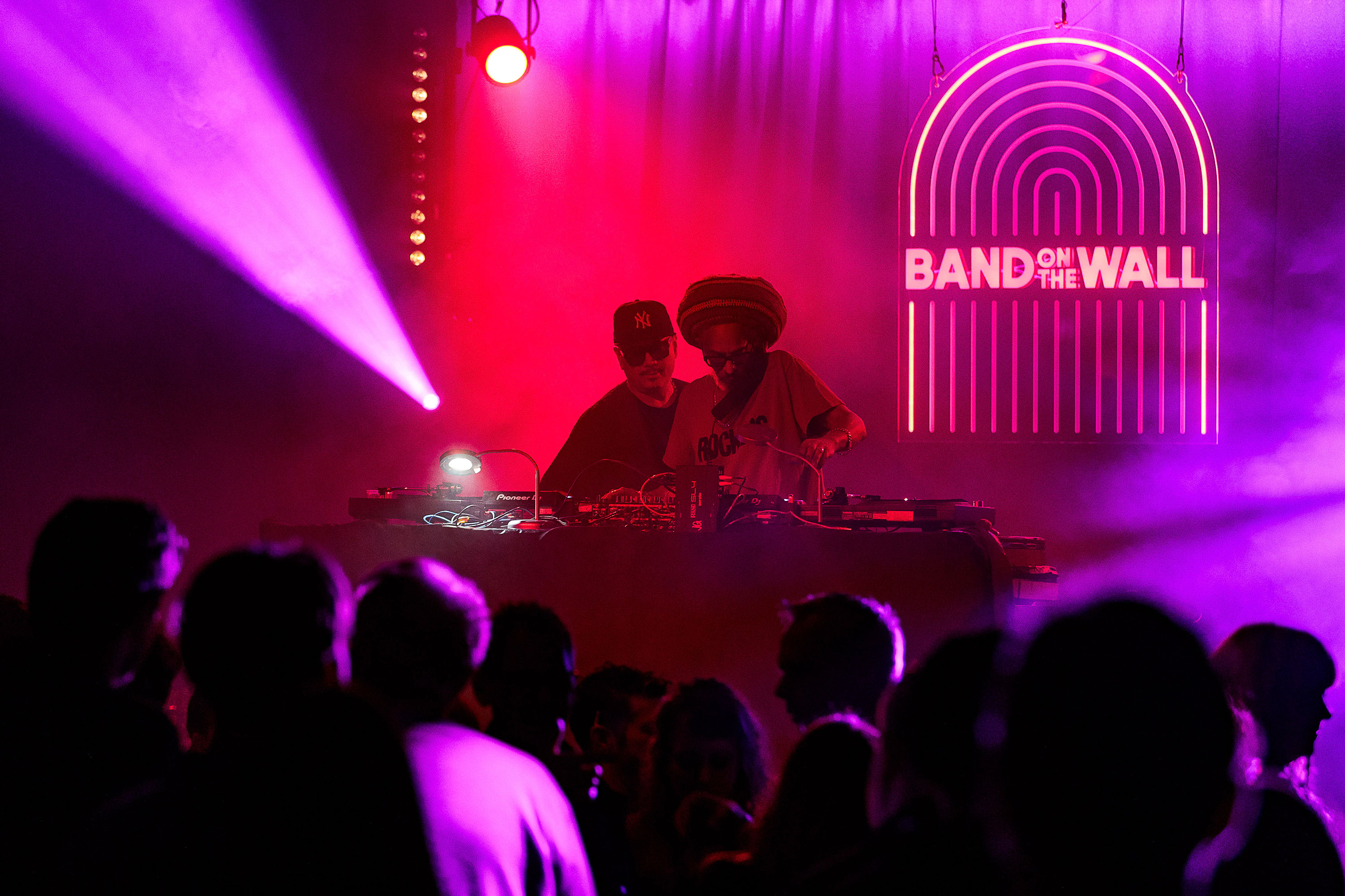
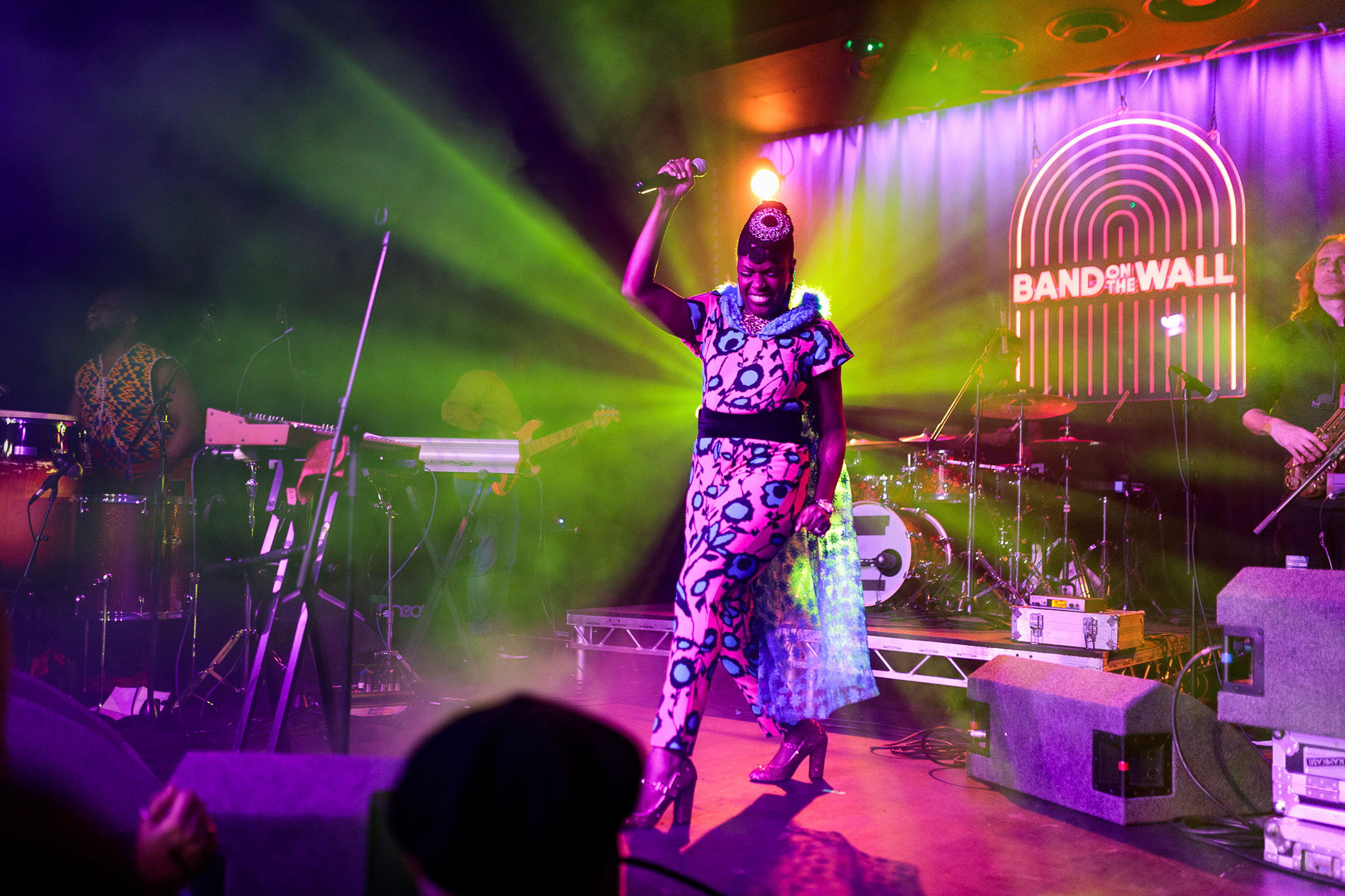
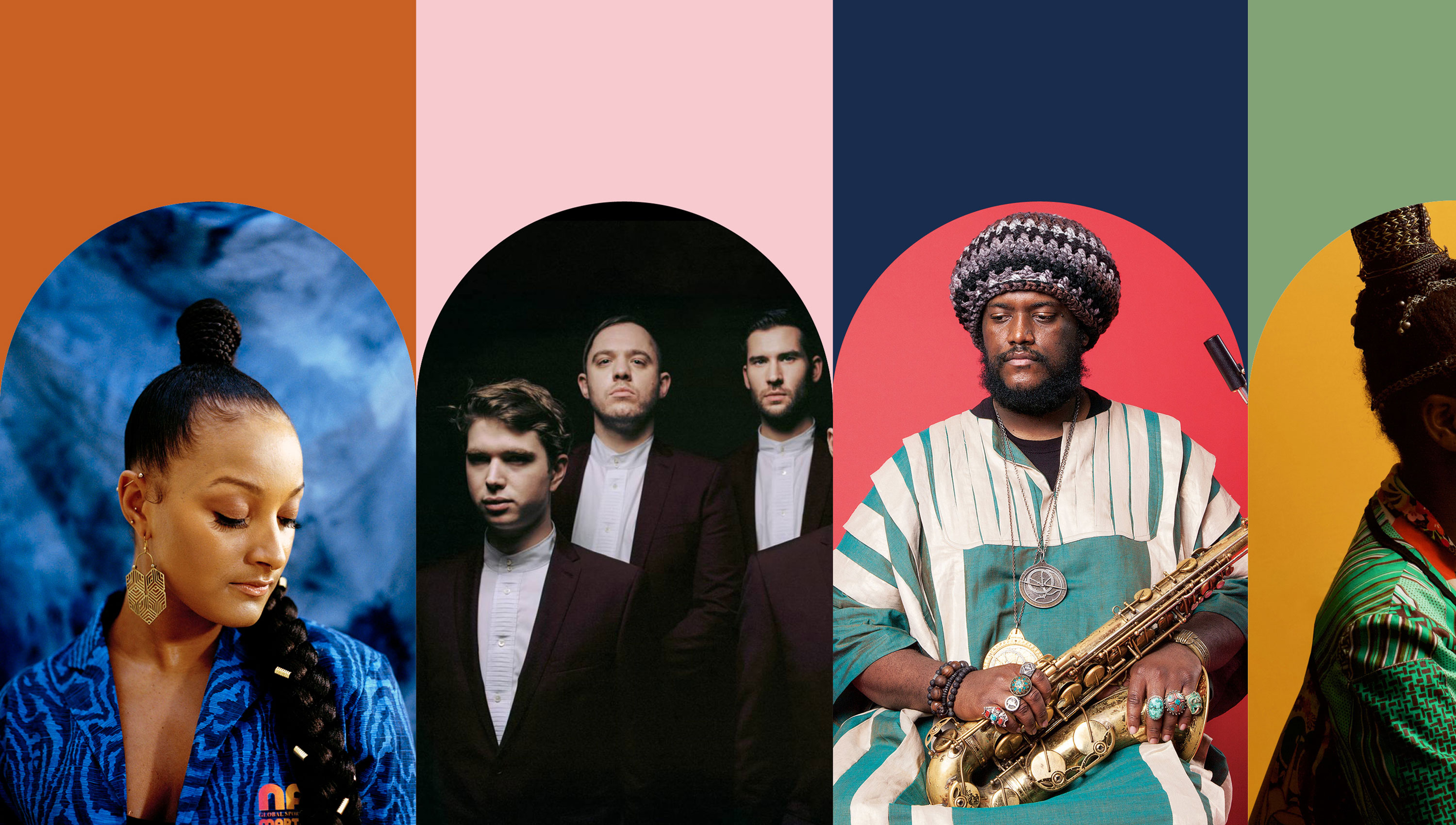
We also developed an arch framing device inspired by the multiple archways that appear across the building’s facade. The arch, whilst representing an opening, invites the audience to experience and explore artists from all over the world. This allowed us to frame imagery and graphics within.
