Ashton Sixth Form College
Think differently, see differently
Ashton Sixth Form College
Campaign Creation
Illustration
Copywriting
Editorial
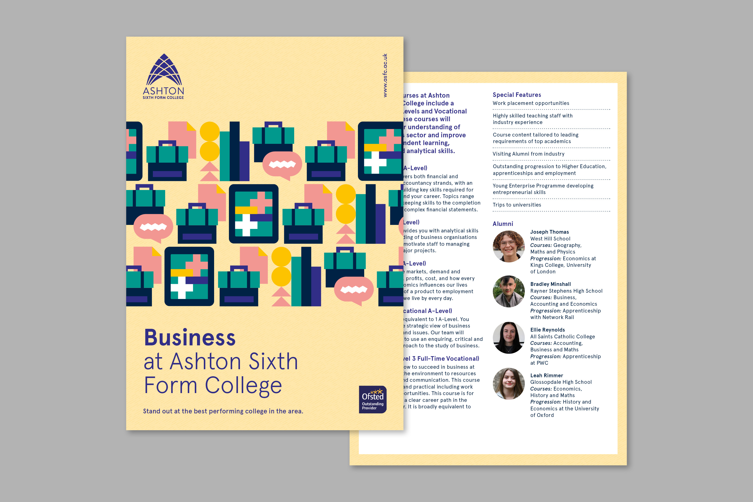
Print Design
Moving Image
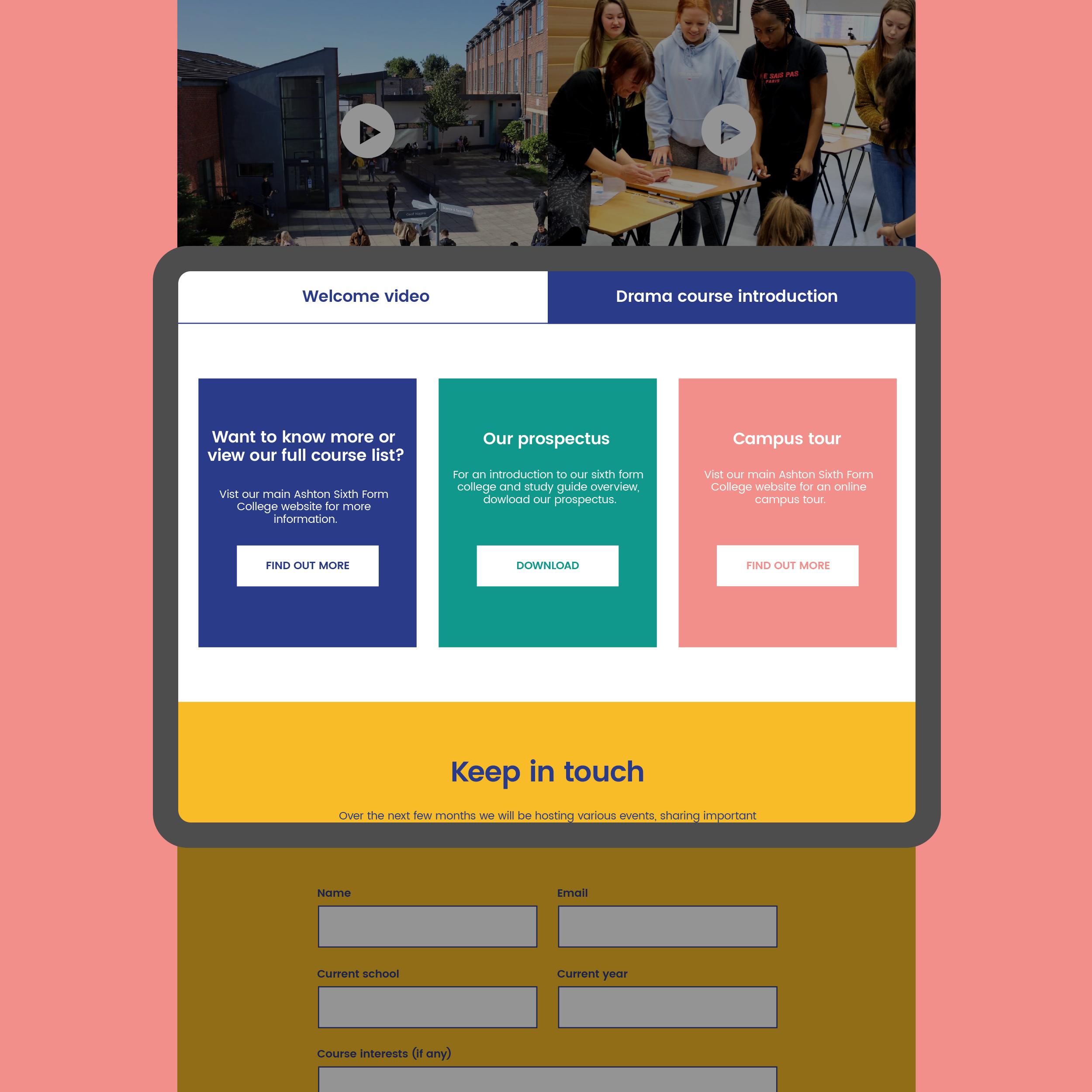
Microsite
Client: Ashton Sixth Form College
Ashton Sixth Form College based in greater Manchester, a college that prides themselves on putting students at the heart of everything they do, nurturing talents and igniting your passions.
We have worked with Ashton Sixth Form over the last 6 years and together have built their brand, purpose, values, variety of campaign and most recently working with them to create a wider network of schools within their community.
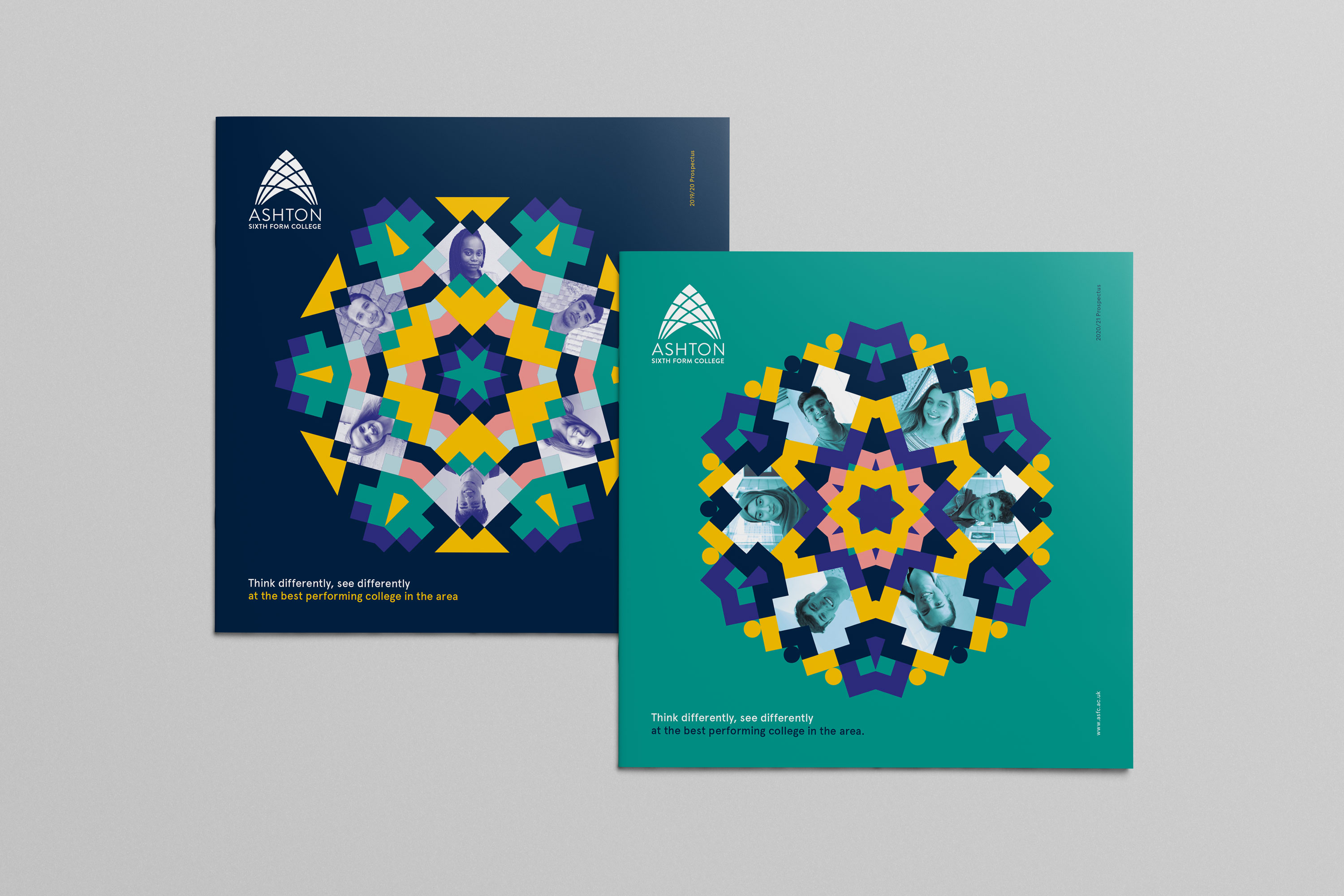
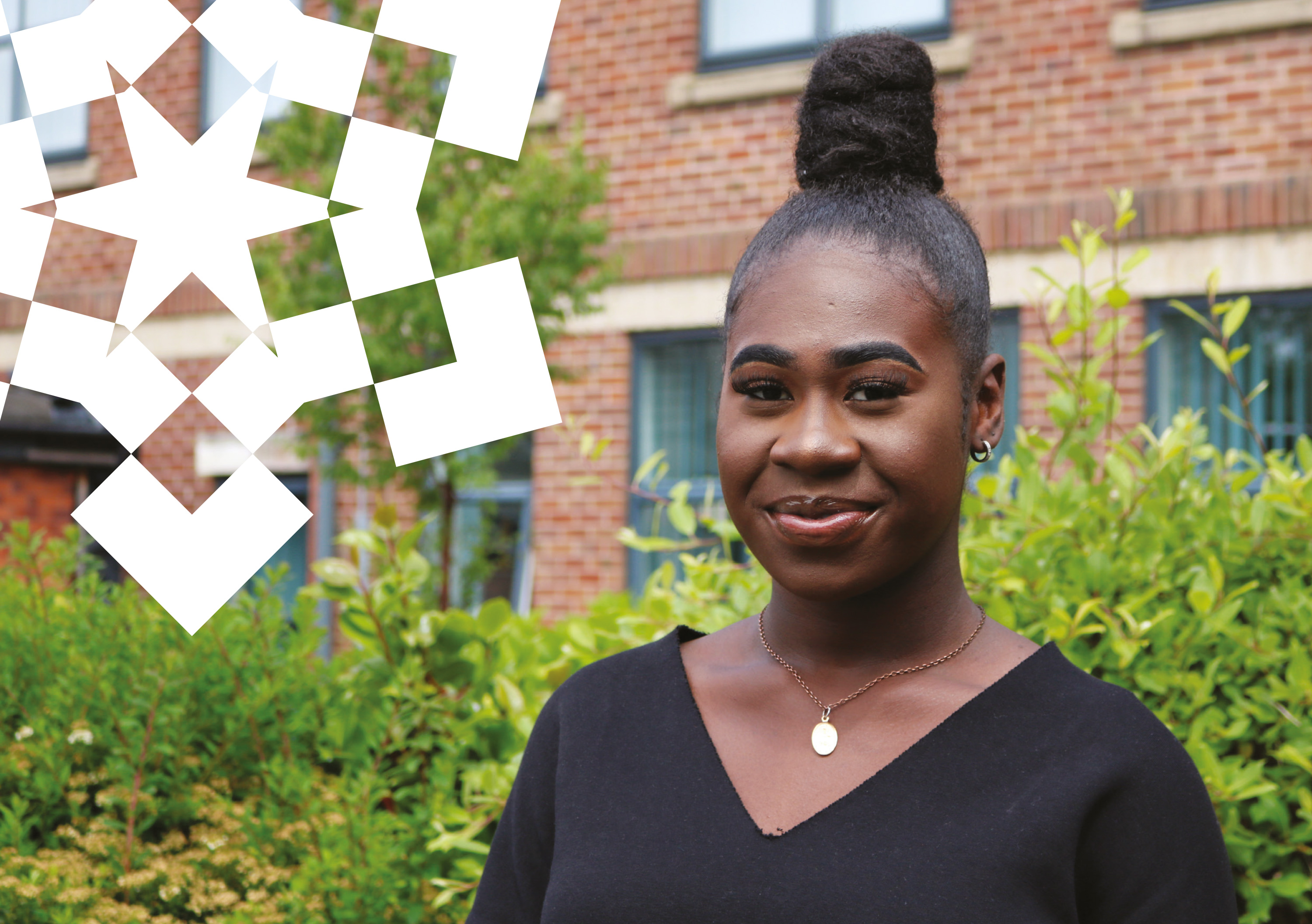
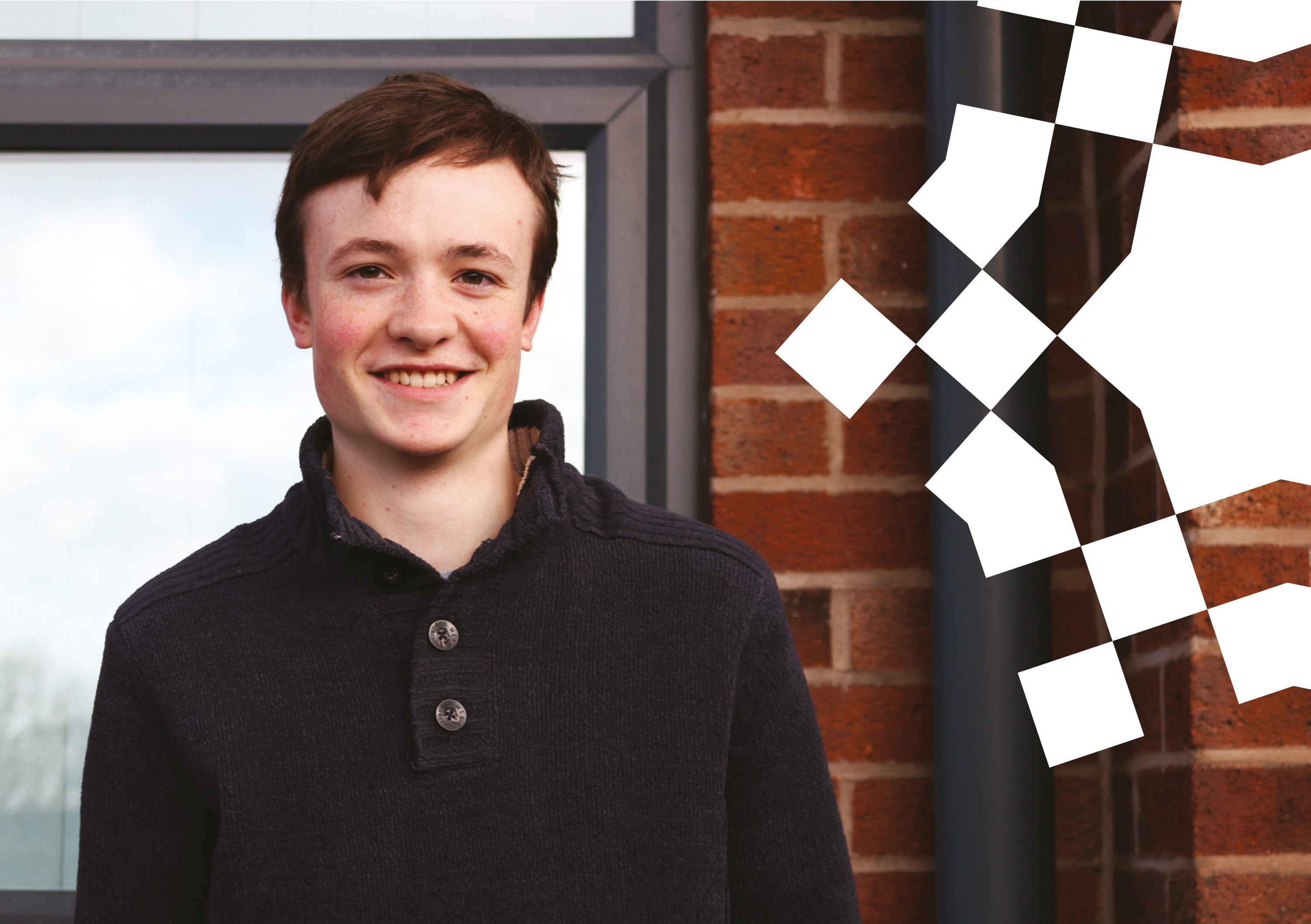
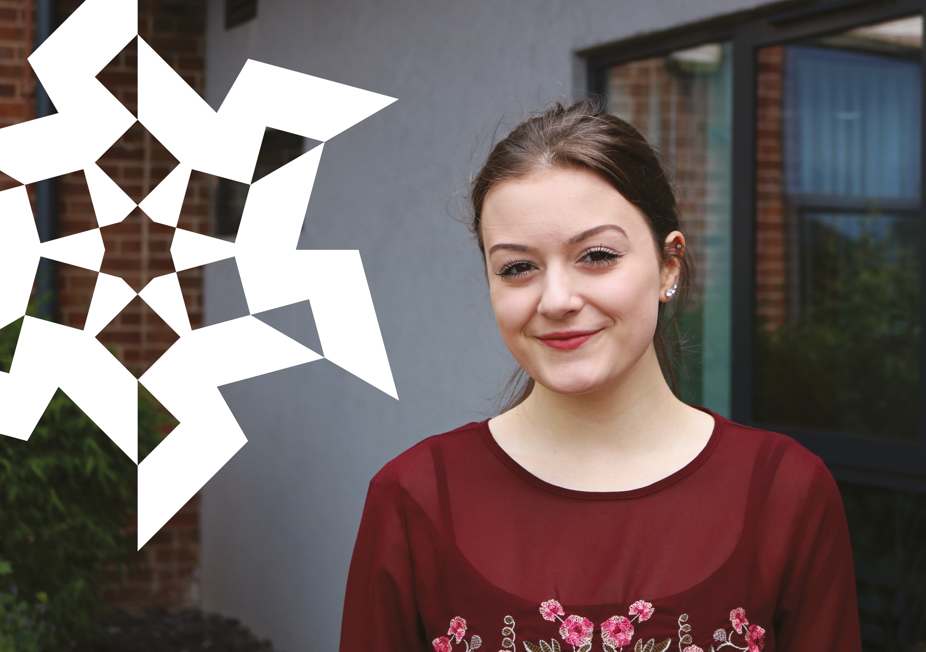


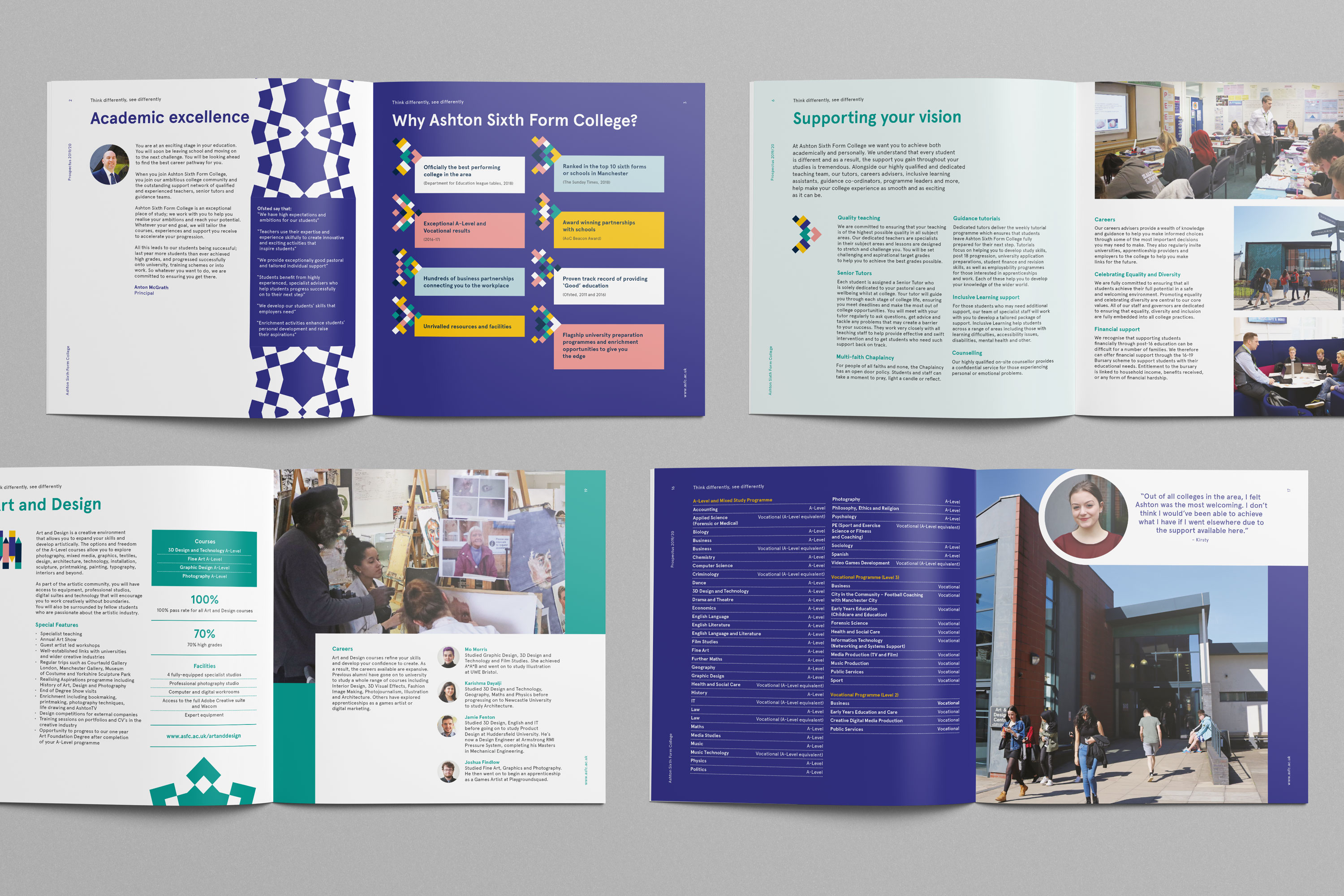
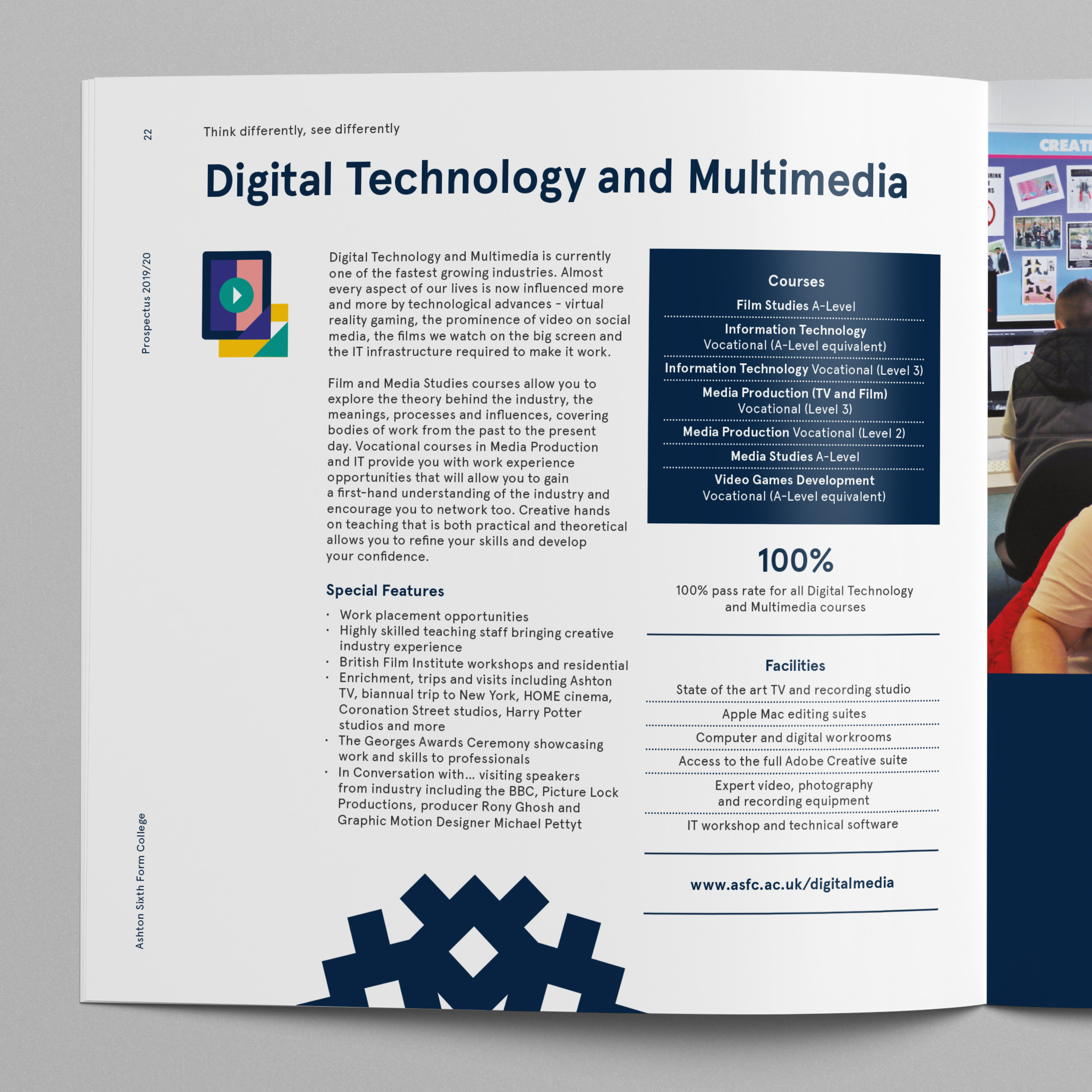
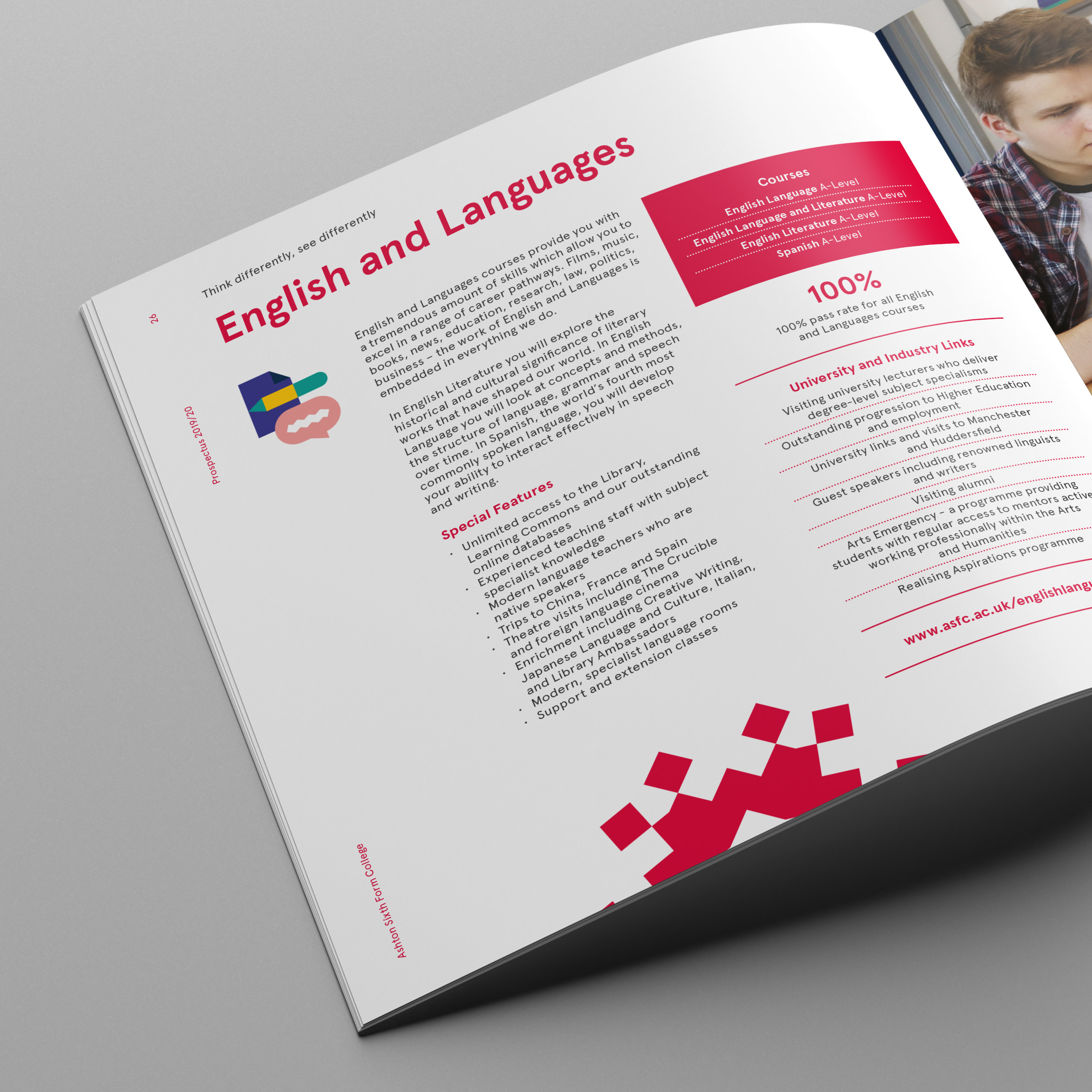

Over 2018 we worked closely with the team at Ashton to create their new branding. Creating a refreshed look to typical college branding, we developed a kaleidoscope device representing the wide and ever changing variety of courses the college has to offer and range of students from all over the country, inspiring the tag line ‘Think differently, see differently.’
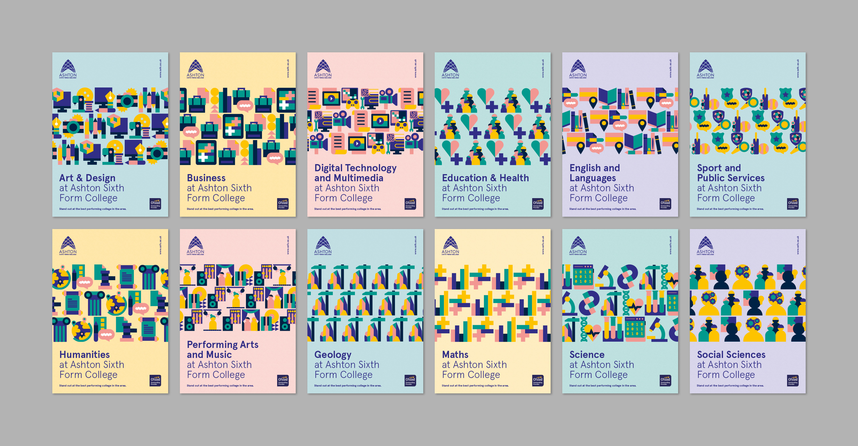
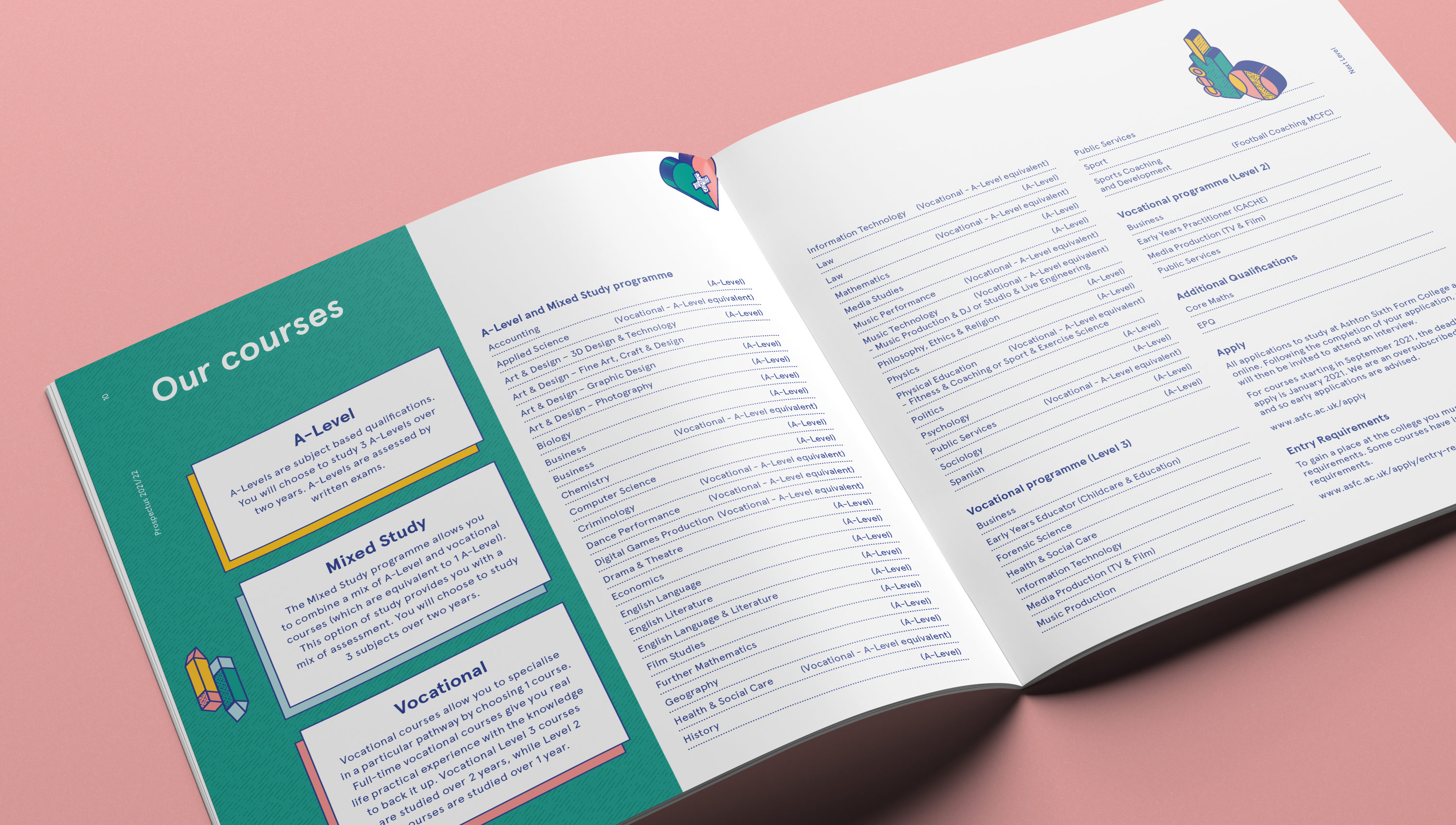
Each year producing an evolved version of the kaleidoscope to refresh the new prospectuses, animations and social assets. The shapes our kaleidoscope device created also inspired our iconography style, using a variety of blocks and shapes in a range of colours to create an icon for each course.
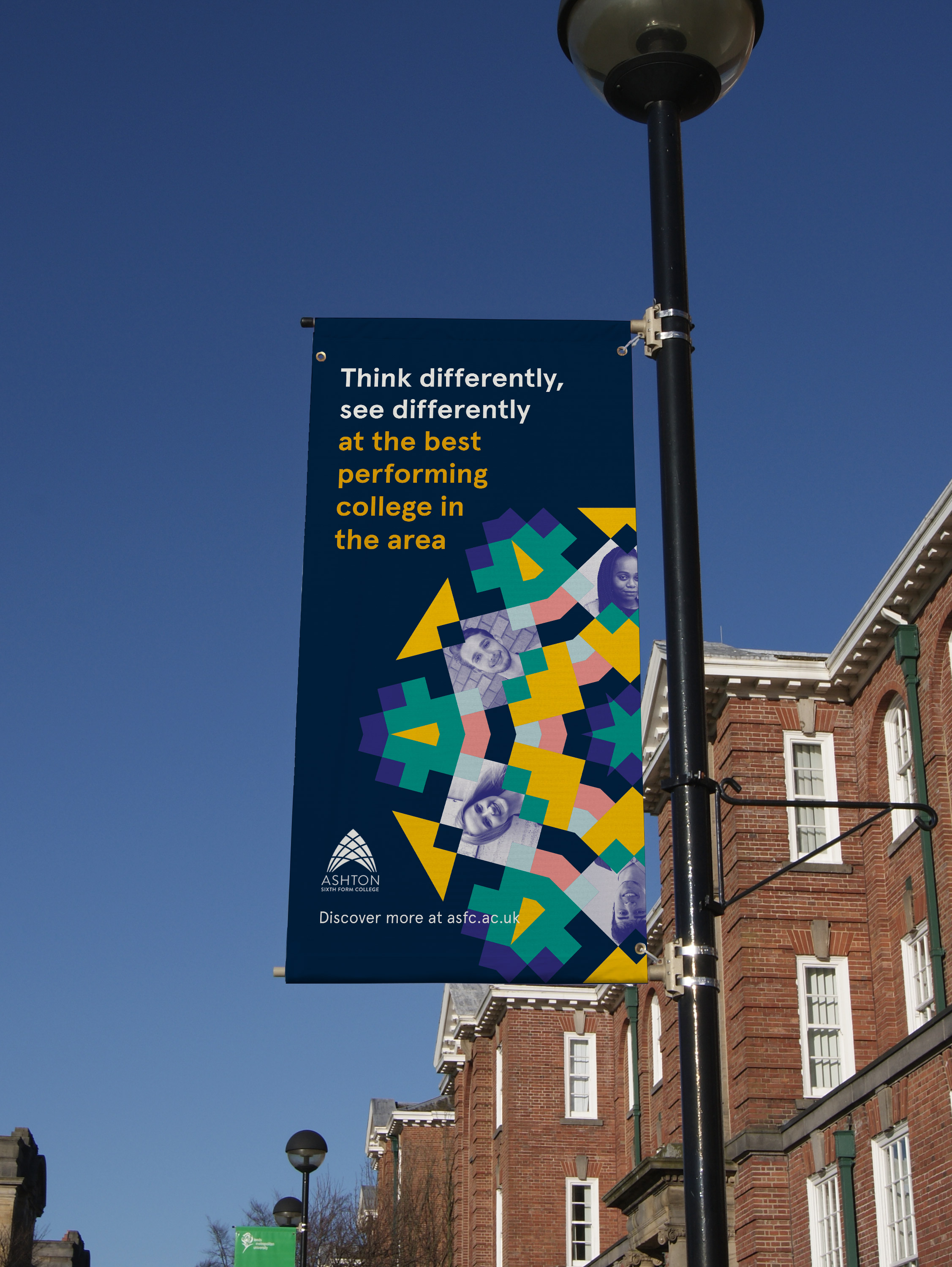
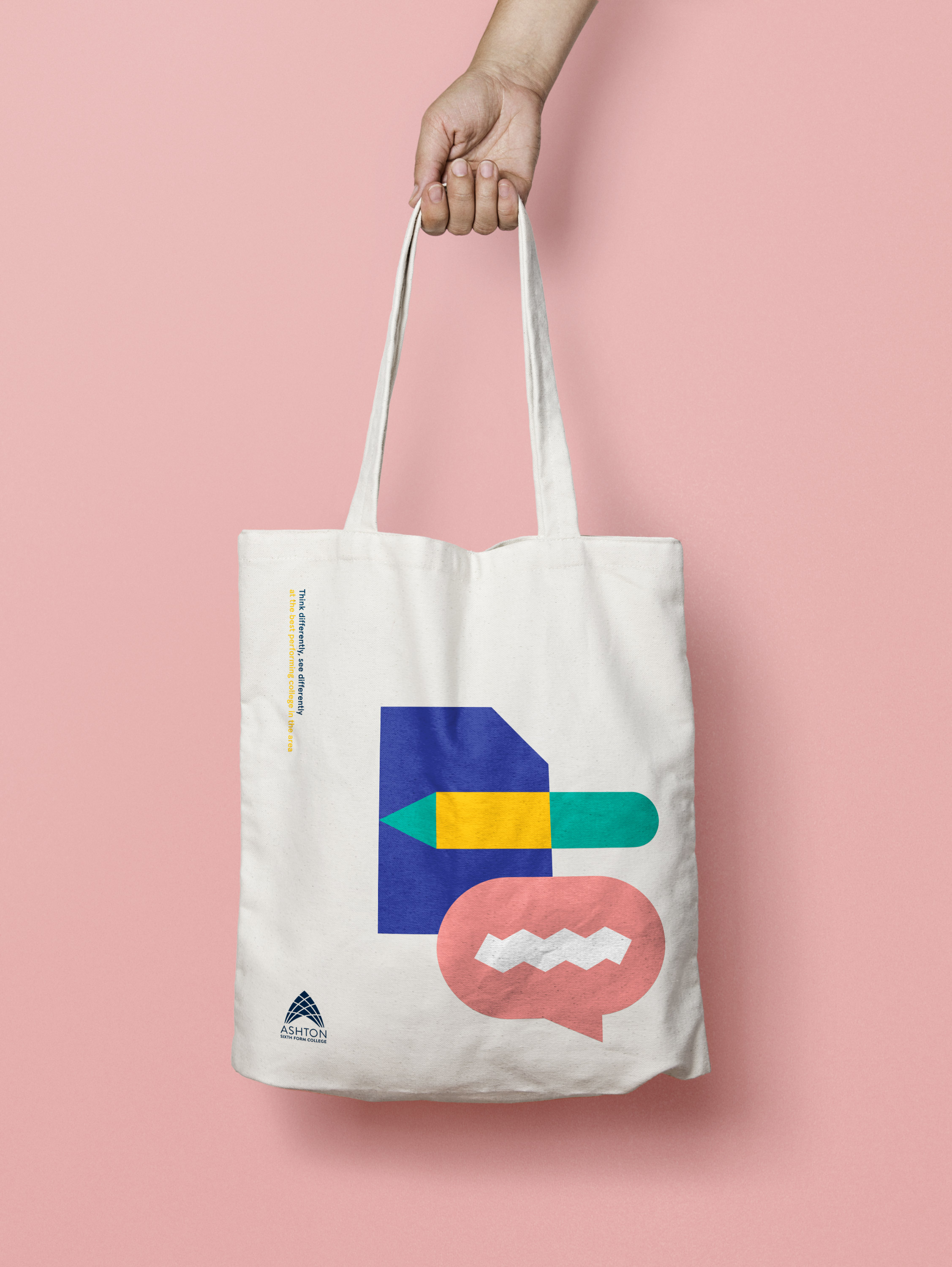
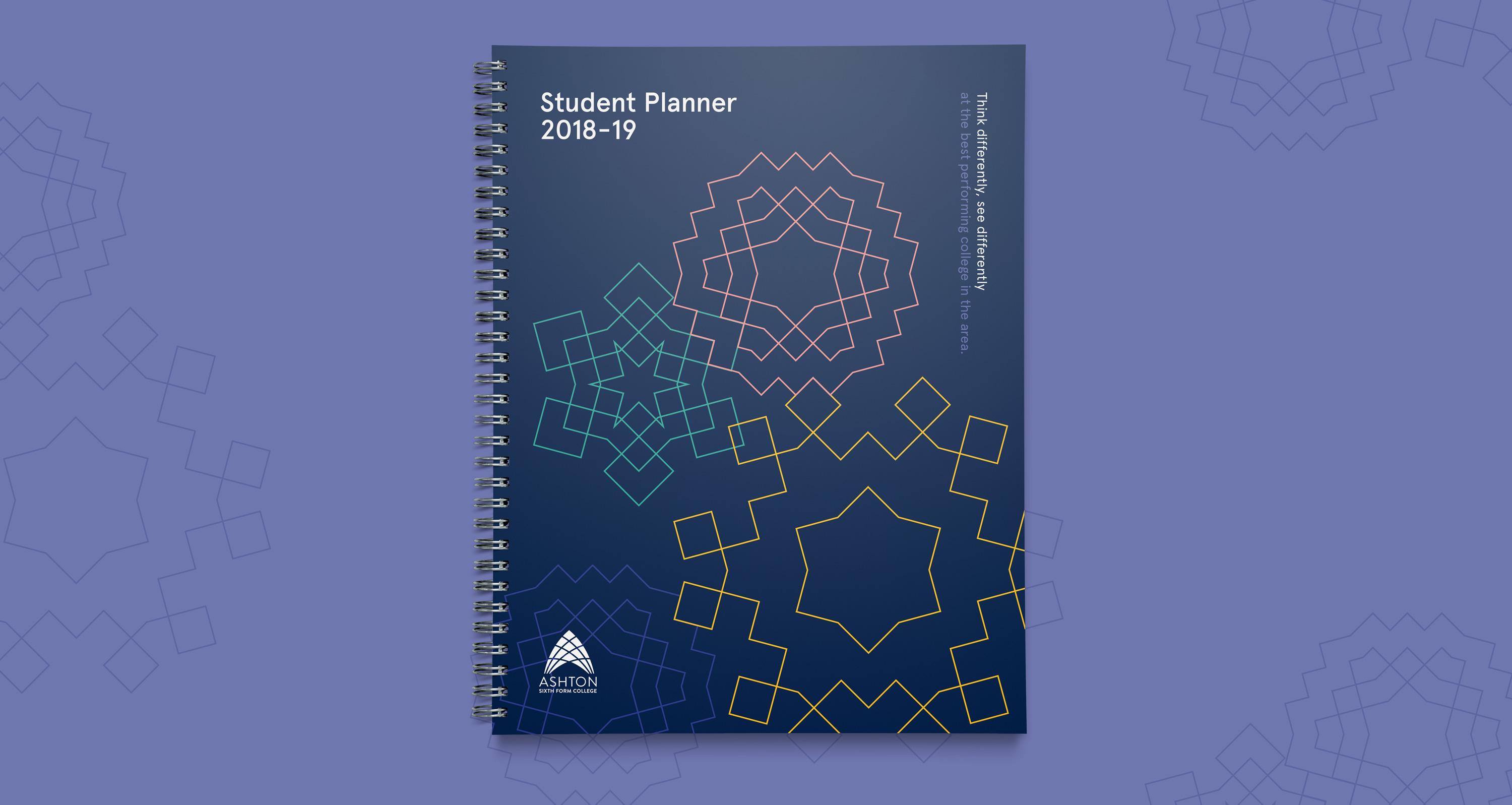
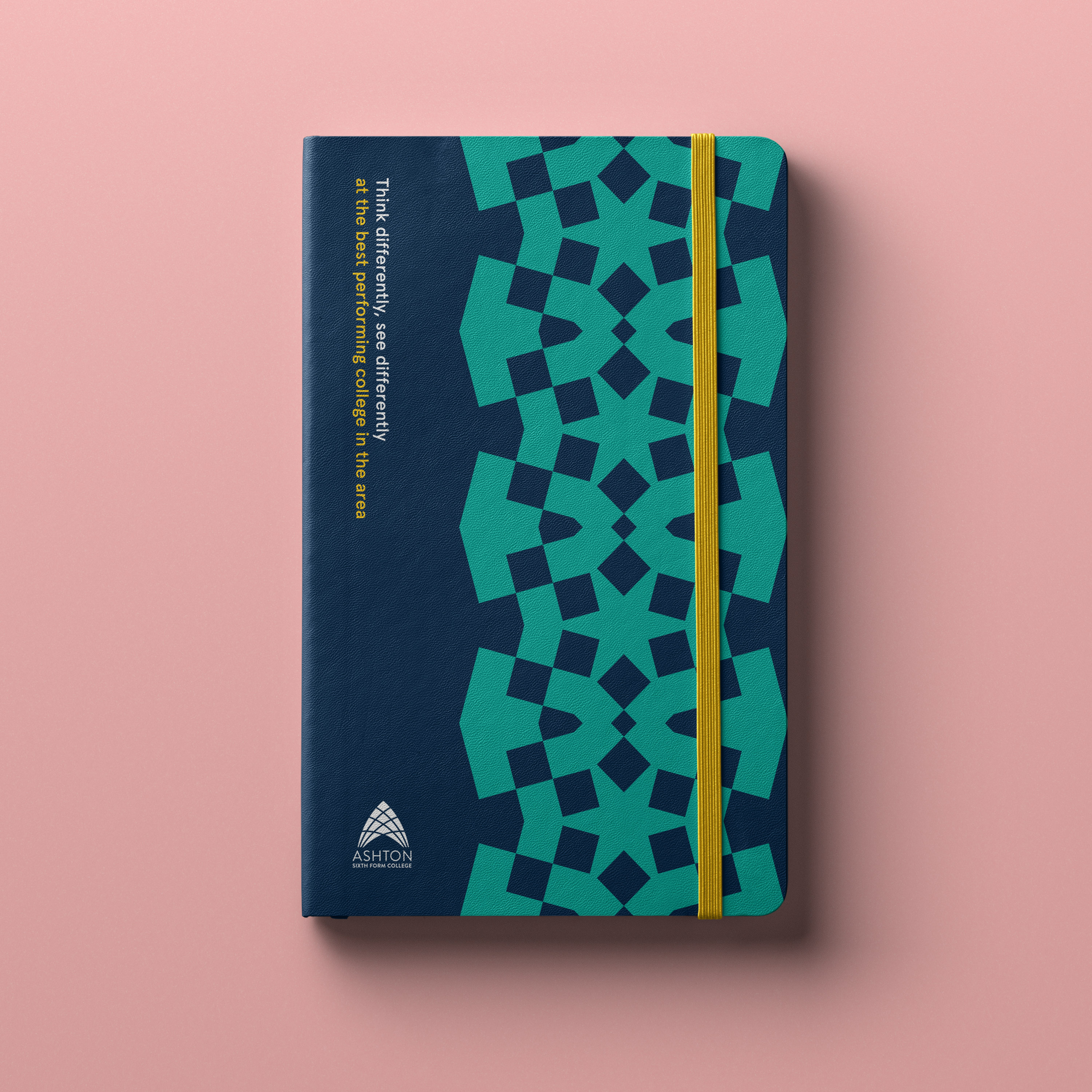
With this device we were able to create an endless amount of patterns, icons, image containers and animations, which we then applied across the prospectuses, website, banners, stationary and postcards.

In 2020 we were briefed to develop a campaign promoting the colleges highly ‘Outstanding’ Ofsted rating and market the college to prospective new students.
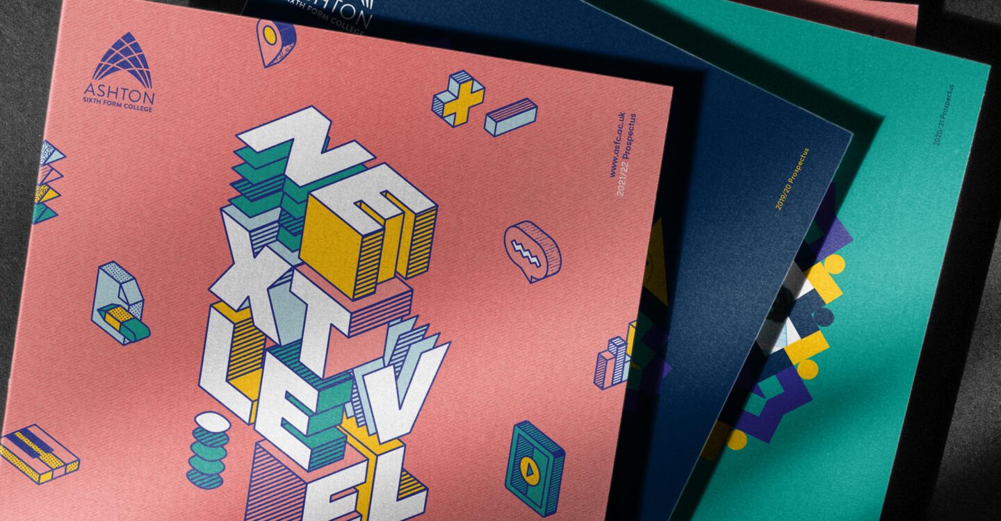
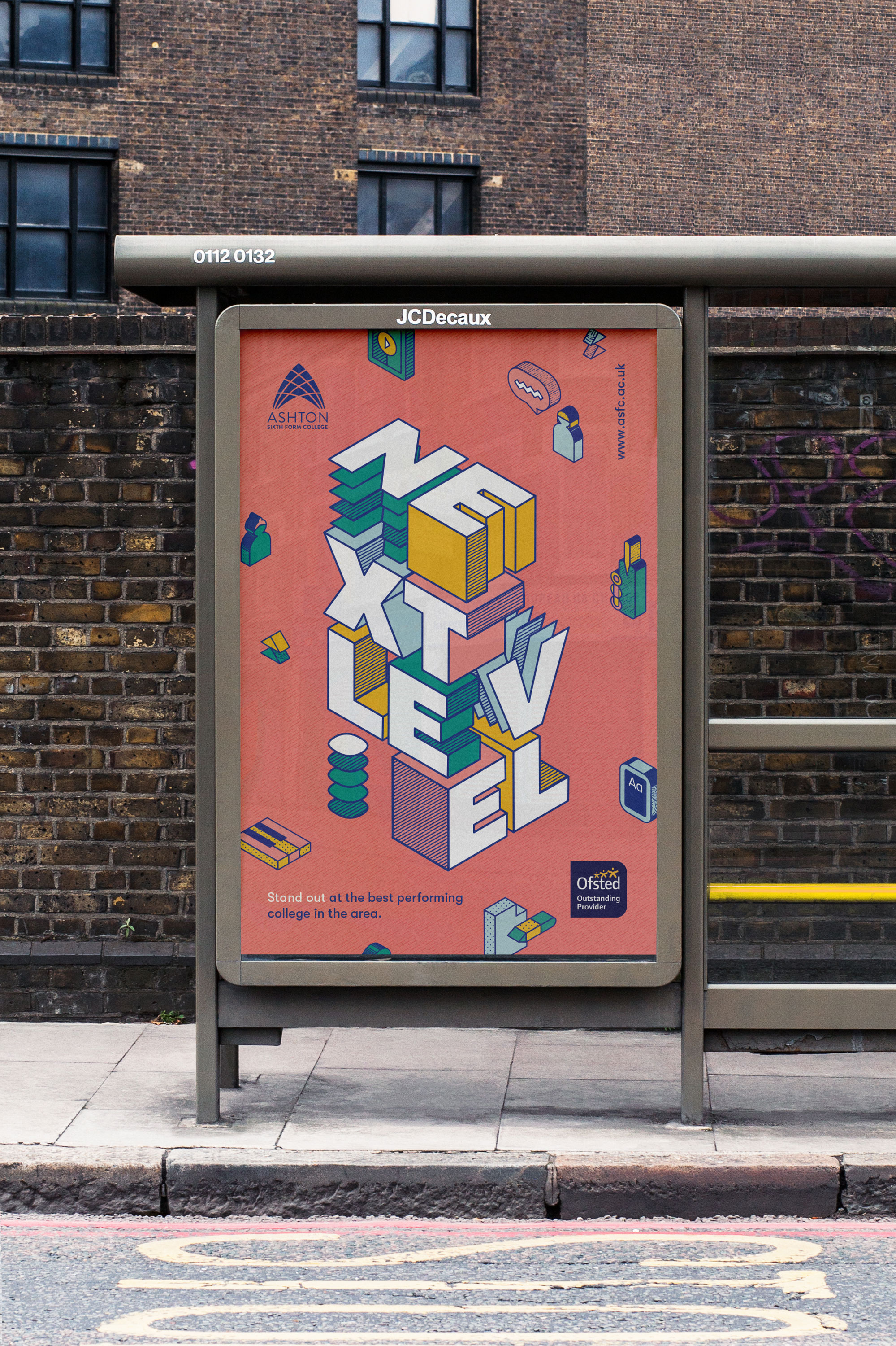
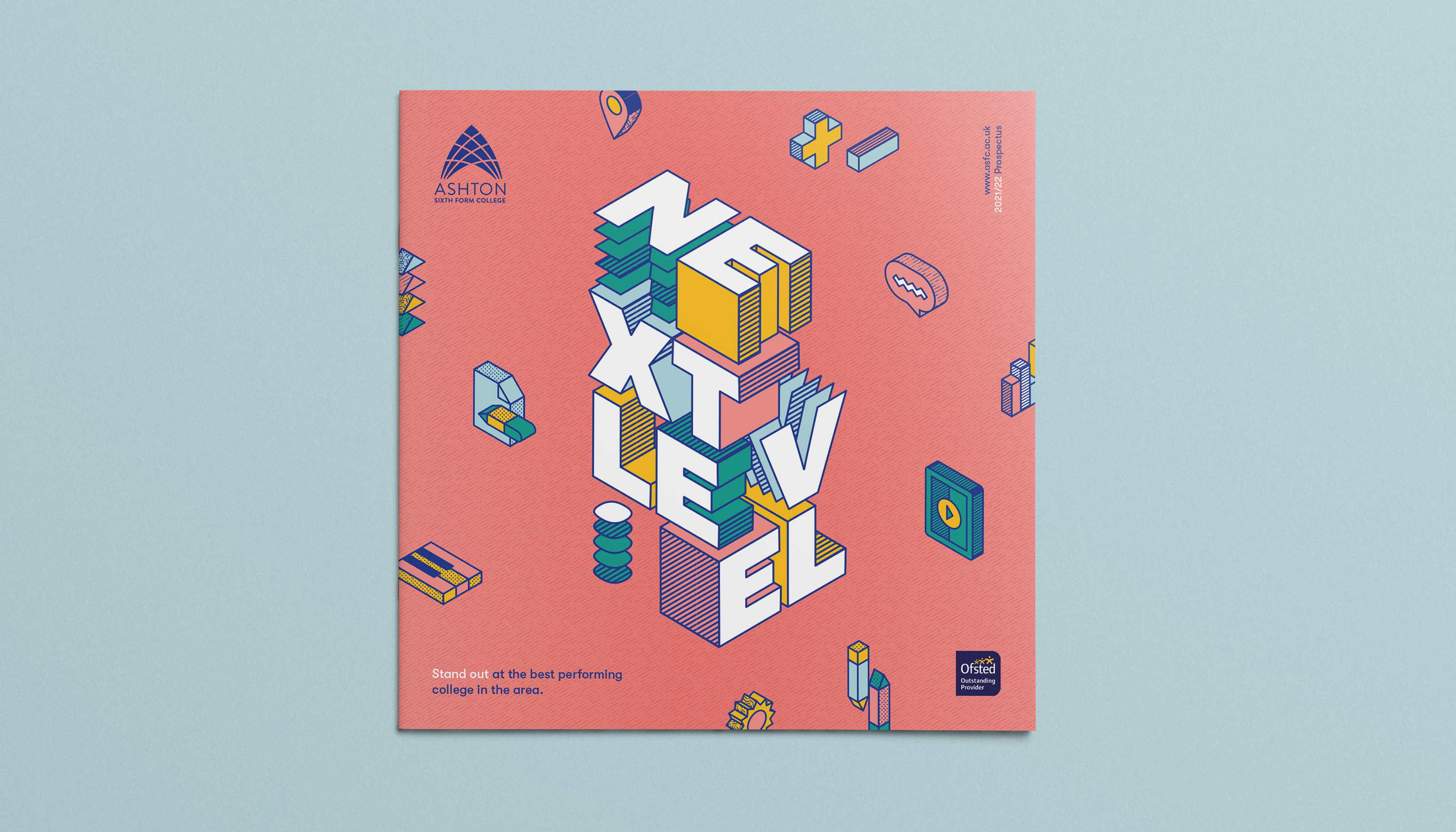
Aiming this towards the students themselves, we came up with the ‘Next Level’ theme allowing us to create a fun and dynamic 3D look & feel, and creating a tagline to suit both the graphics and overall message of the campaign: ‘Stand out at the best performing college in the area’.
Building the text in a block 3D style, which also lended itself to stacking differently format depending, then influenced us to refresh the existing iconography to the same 3D style for these campaigns.




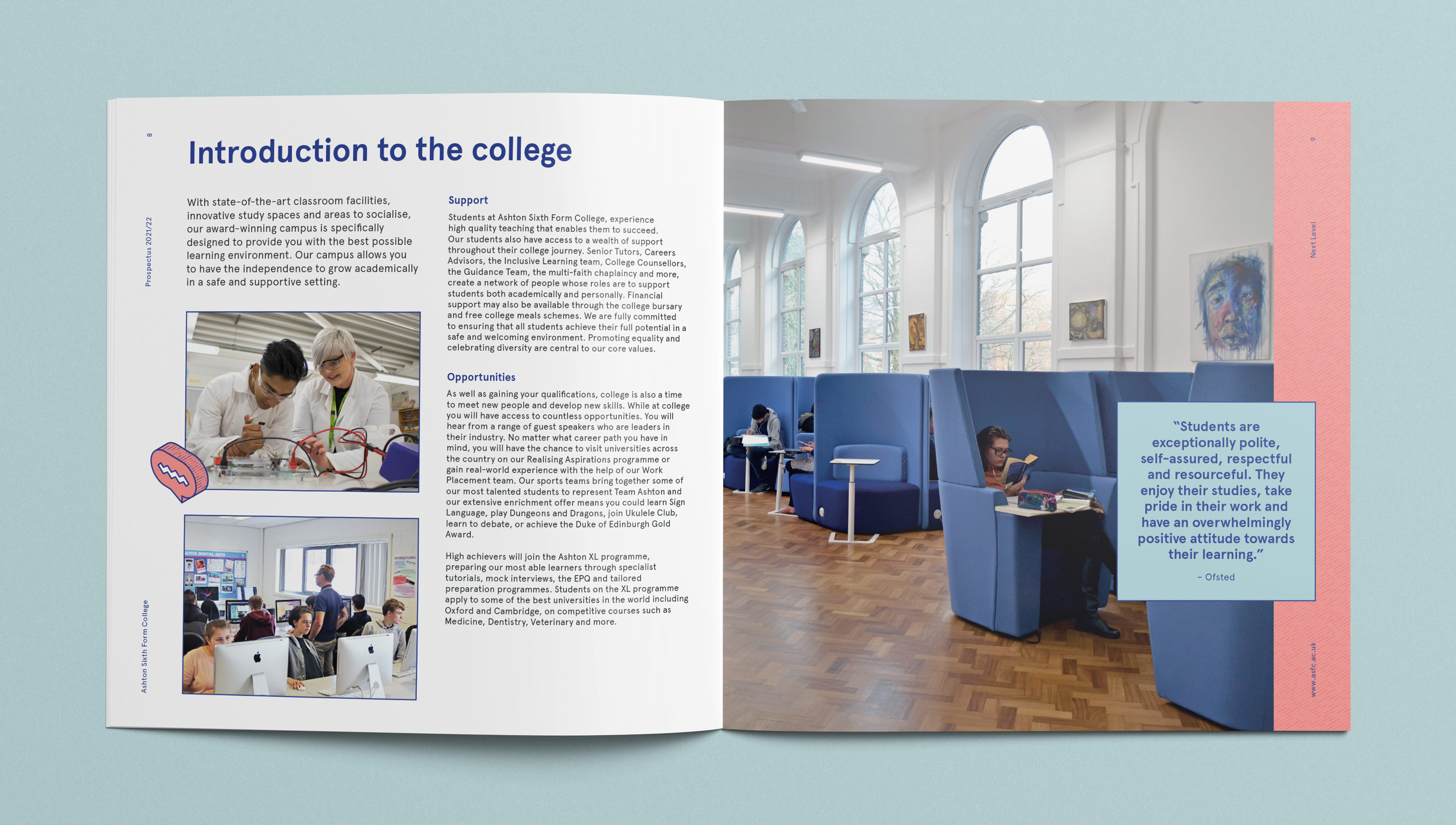
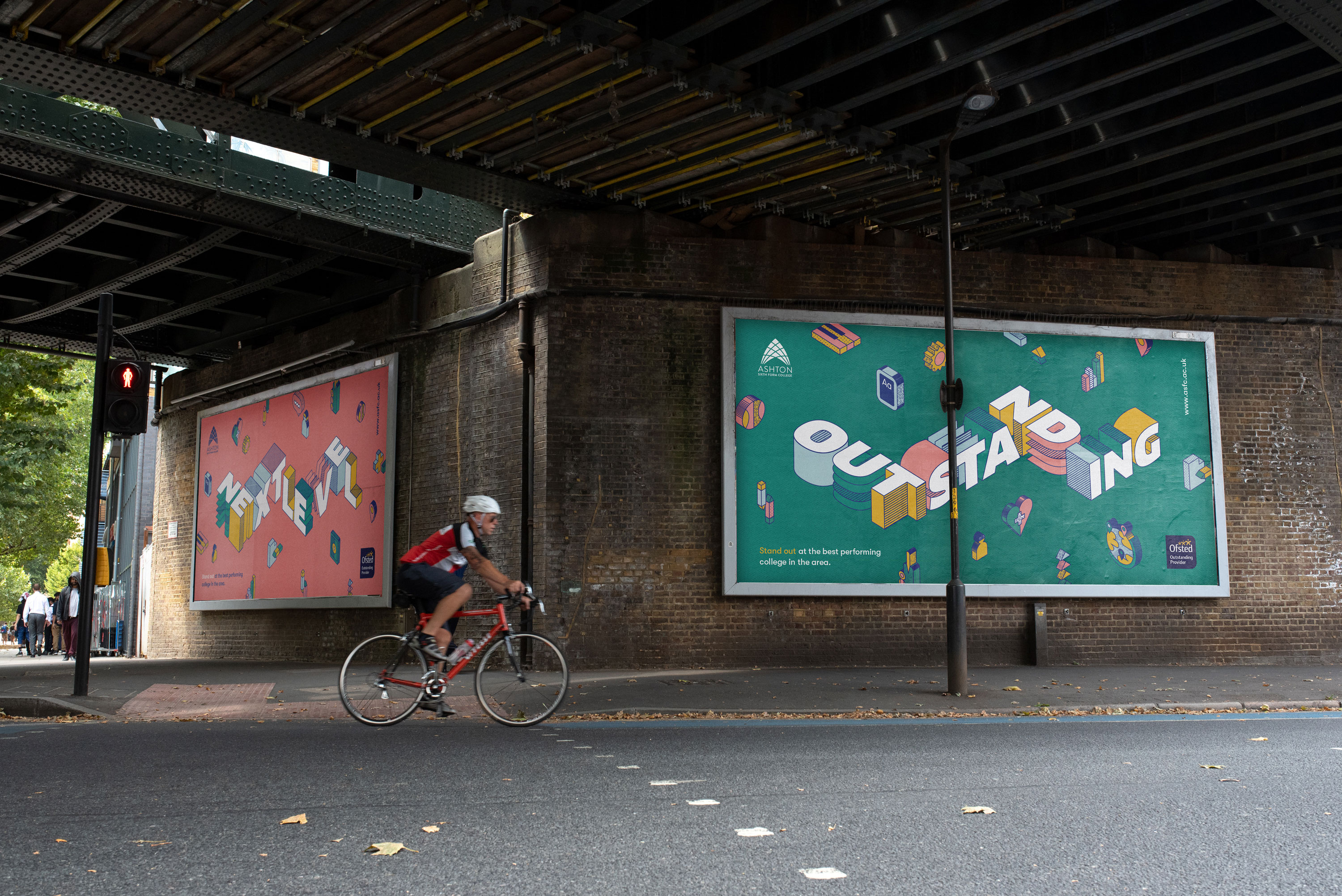
Over the next few years we continued this campaign style and language, using ‘Outstanding’ and ‘Step Up’. With the most recent ’Step Up’ campaign we also introduced UI inspired popup text blocks to promote key selling points.
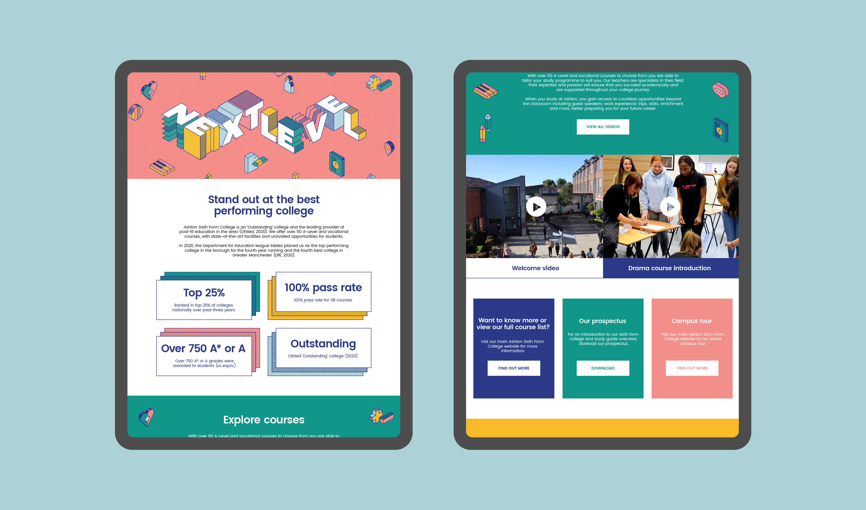
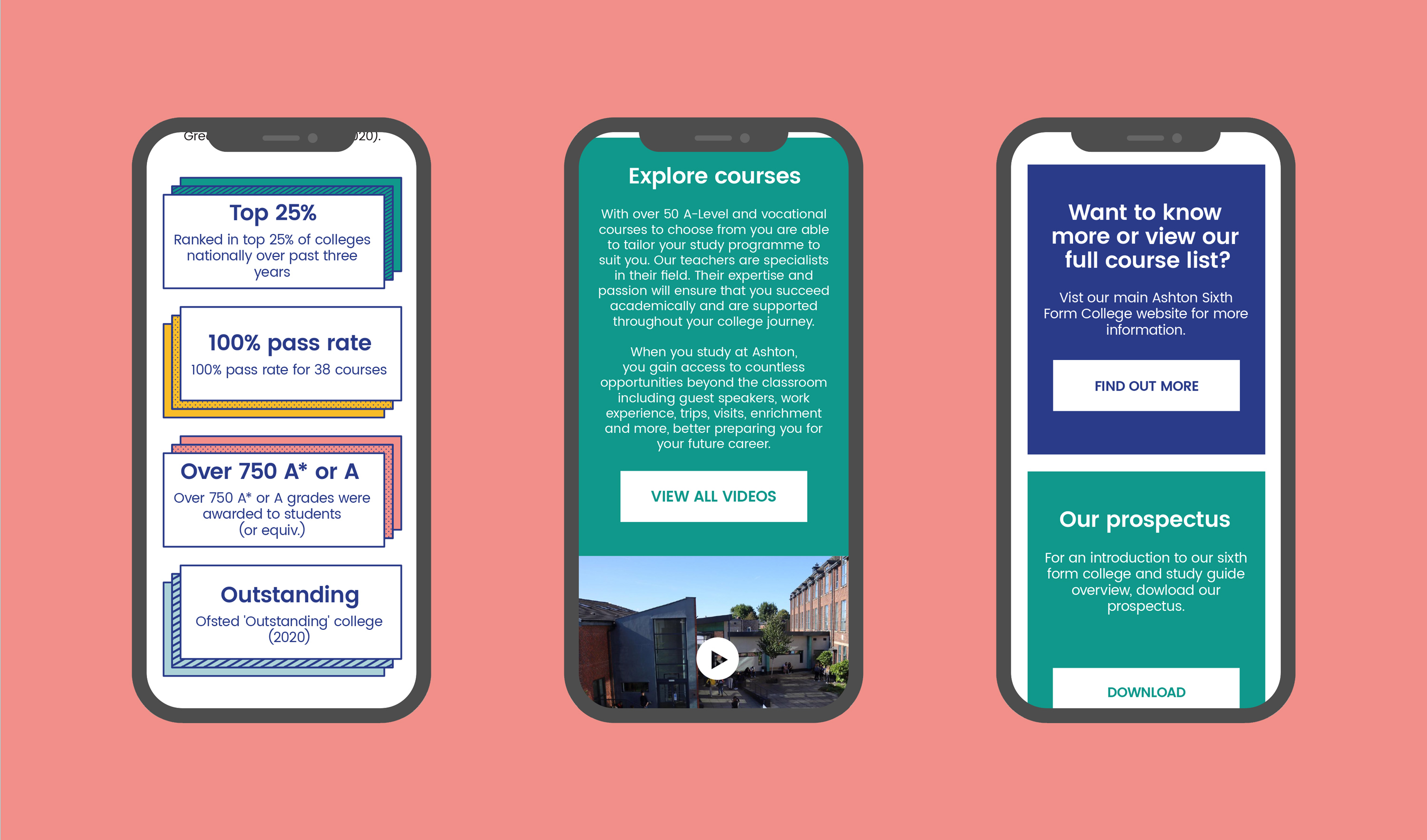
With these assets we then built a micro site for the campaign, to host all information new students + parents would need to know about the Ofsted ratings, courses and everything else the college has to offer.
