The Met Bury
Weaving creativity and community into a historic venue
The Met Bury
Brand Strategy
Brand Identity
Website Design
Print Design
Signage & Wayfinding
Client: The Met
Website: themet.org.uk
Photography: Sebastian Matthes
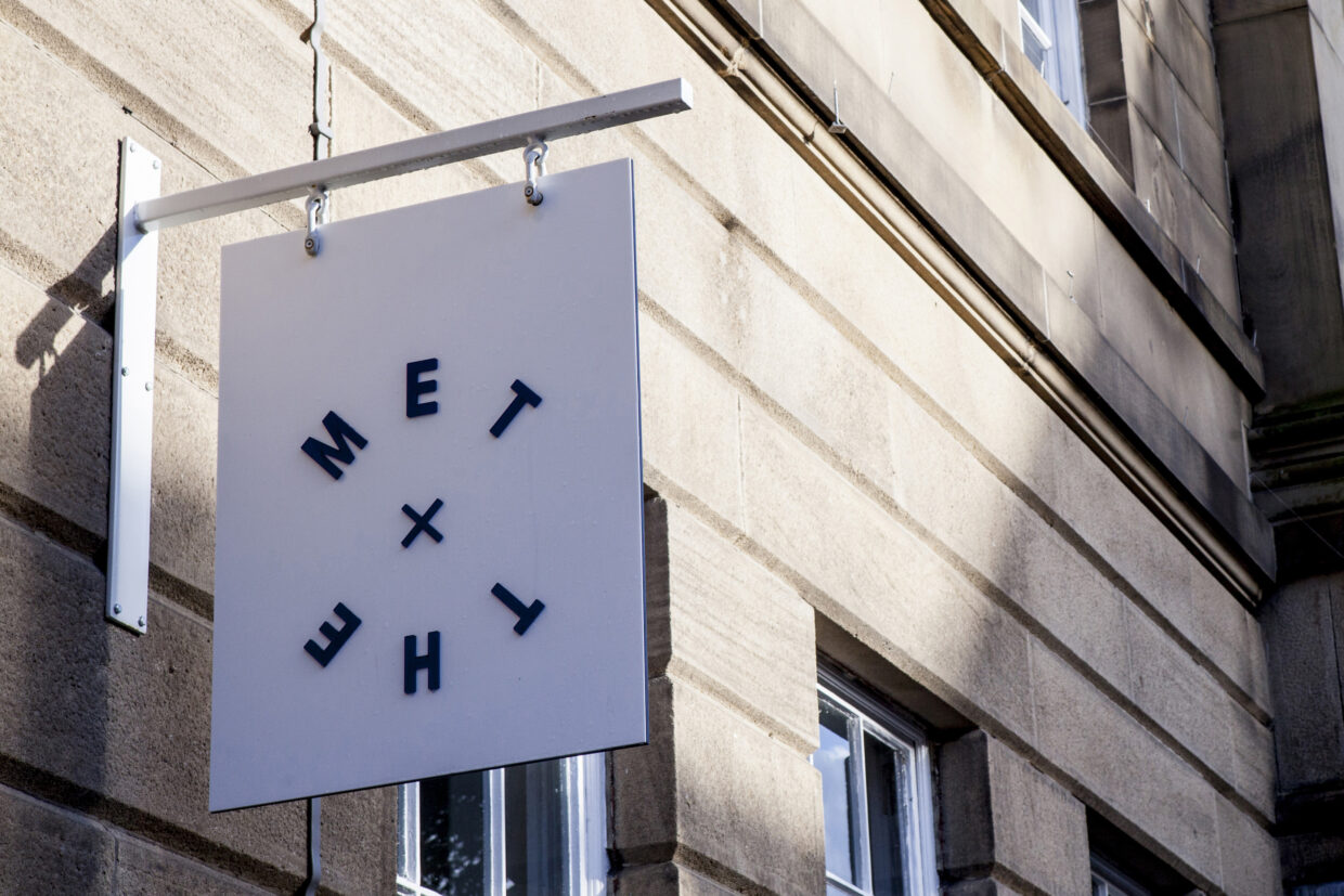
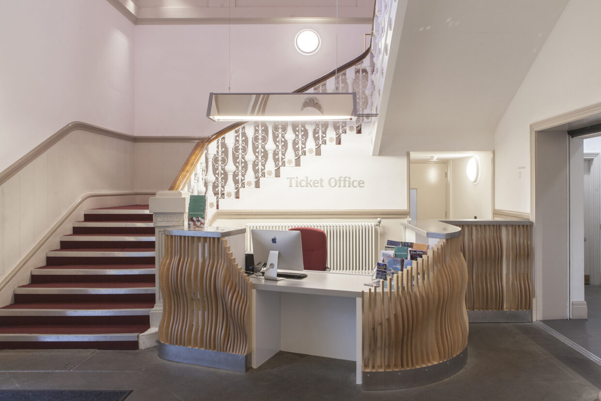
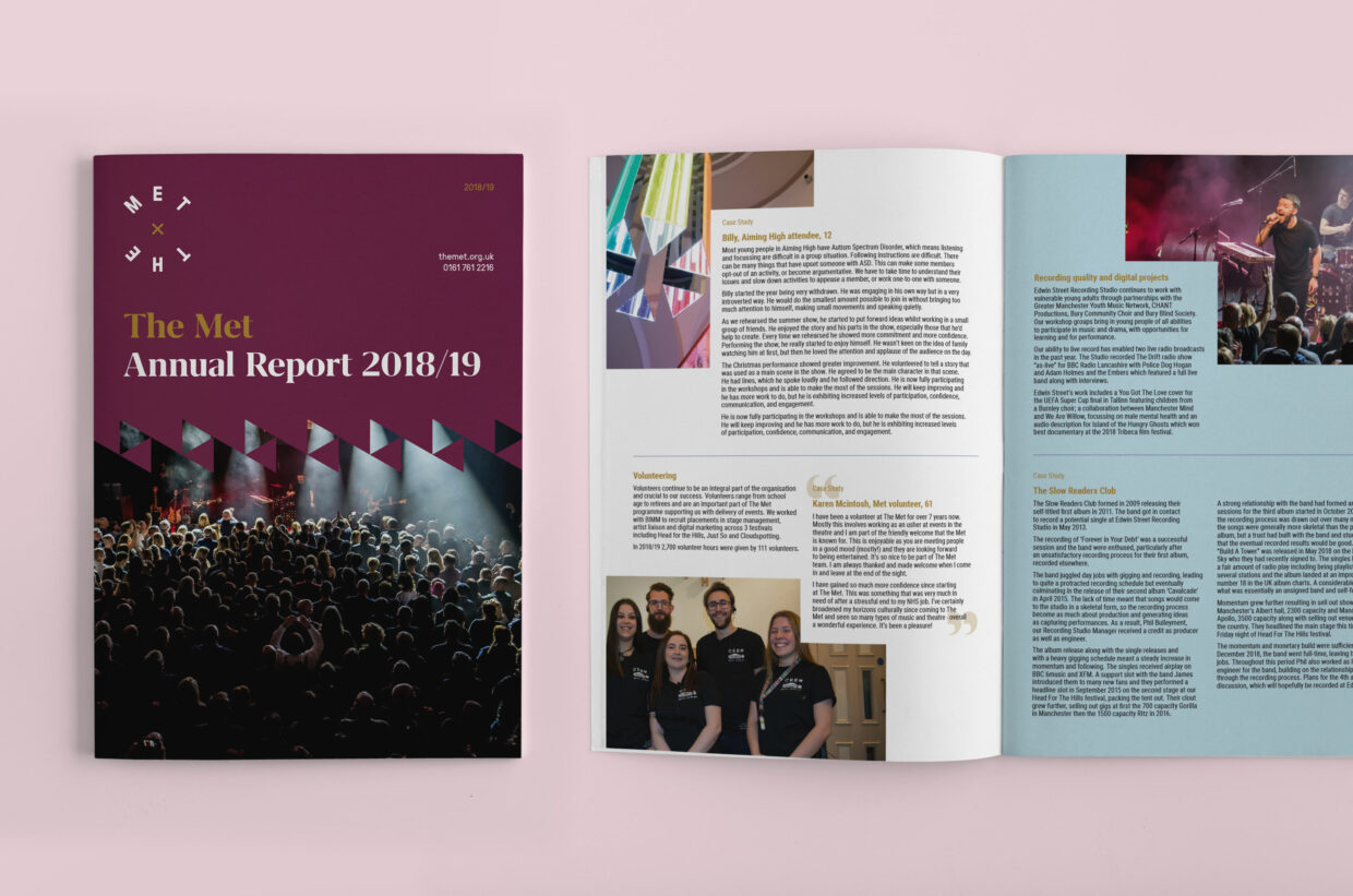
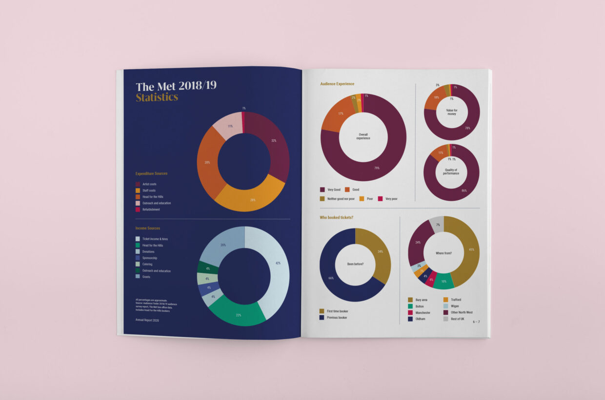
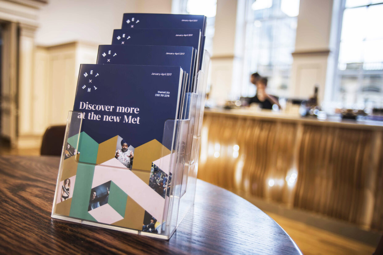
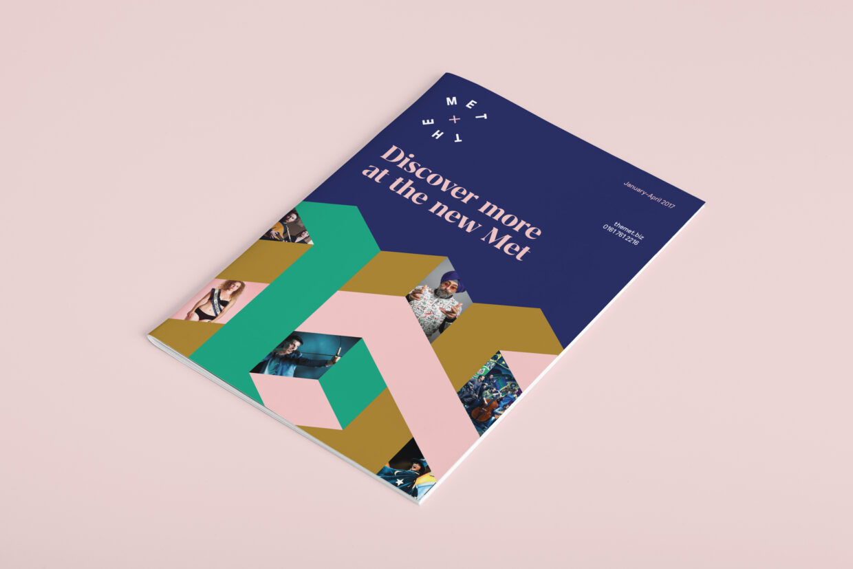
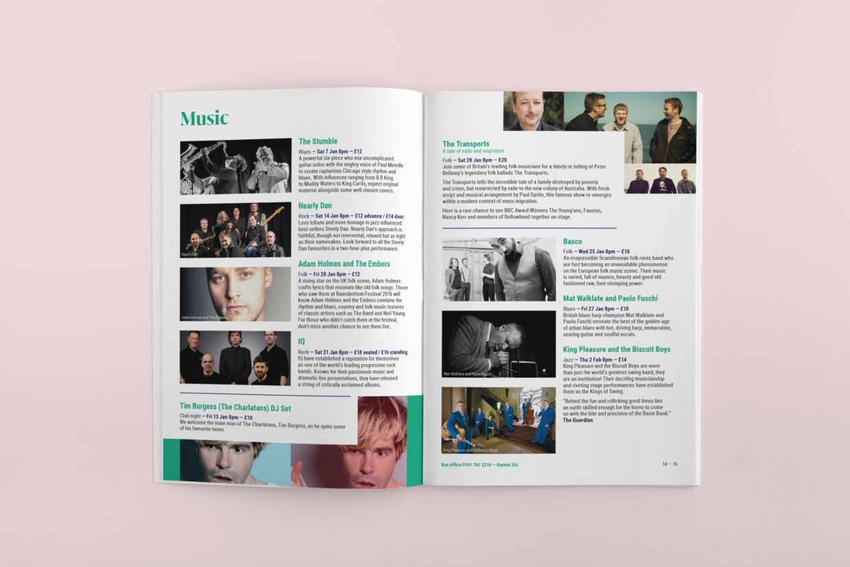
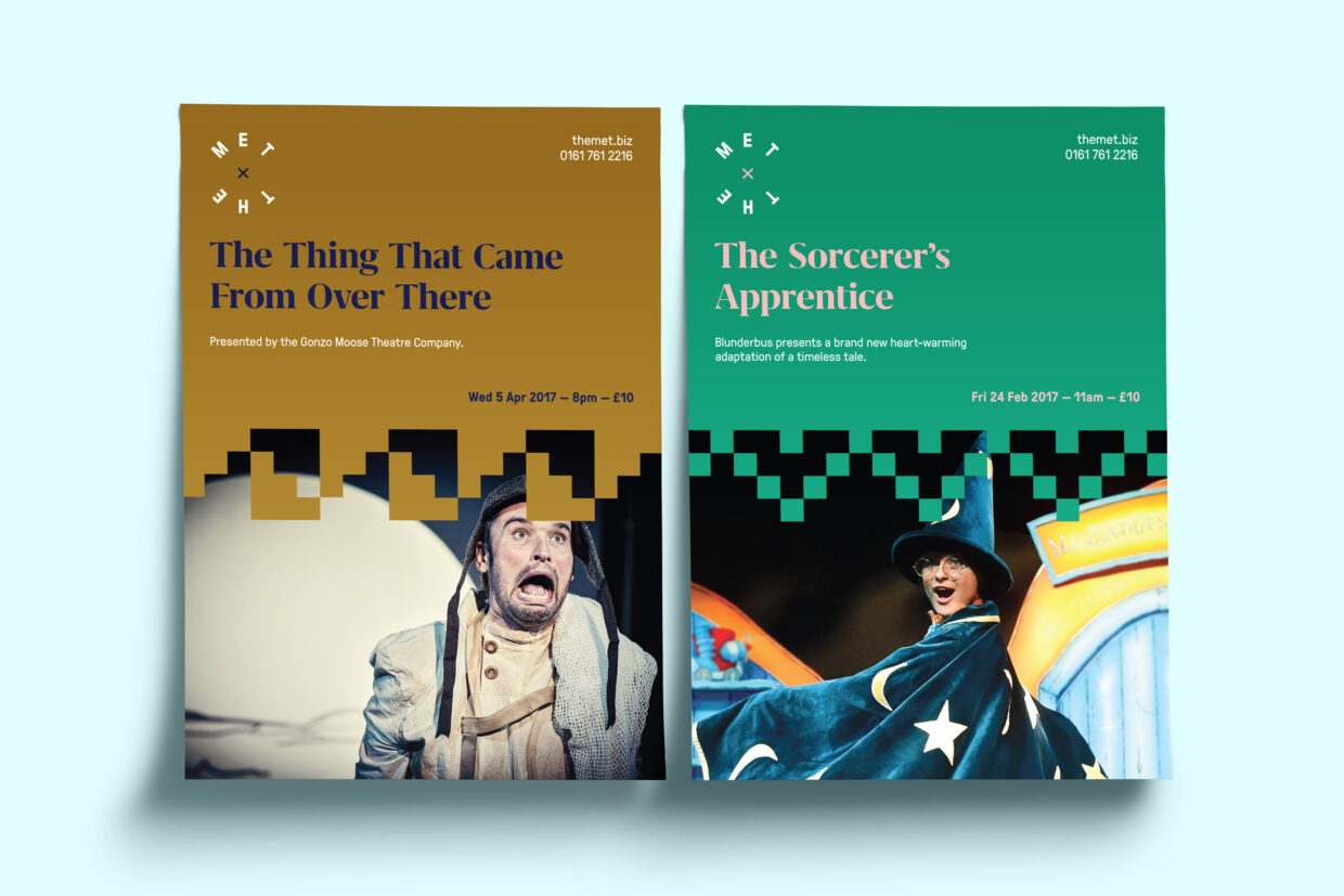
As part of The Met’s £4.6 million refurbishment, we worked with the team to rebrand the venue and develop a new brand strategy. Along with the need to update the look and feel, The Met needed to appeal to a wide and younger audience, connecting with the whole of the Bury community and encourage visits from the rest of the region.
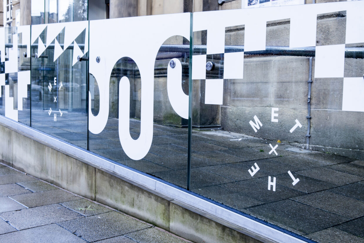
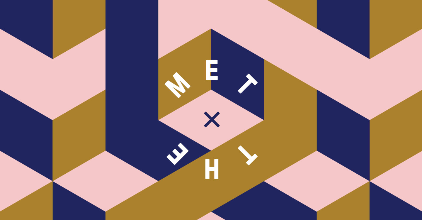
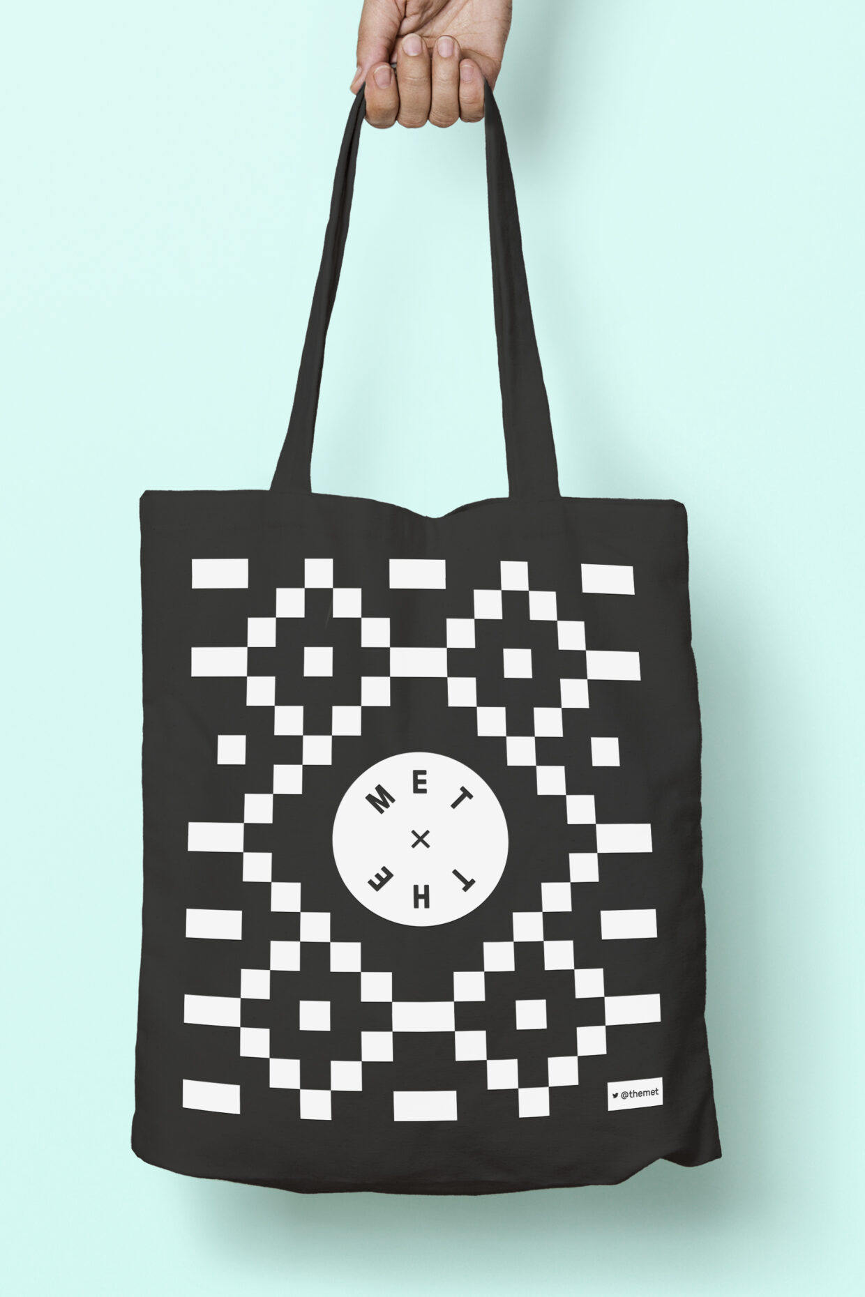
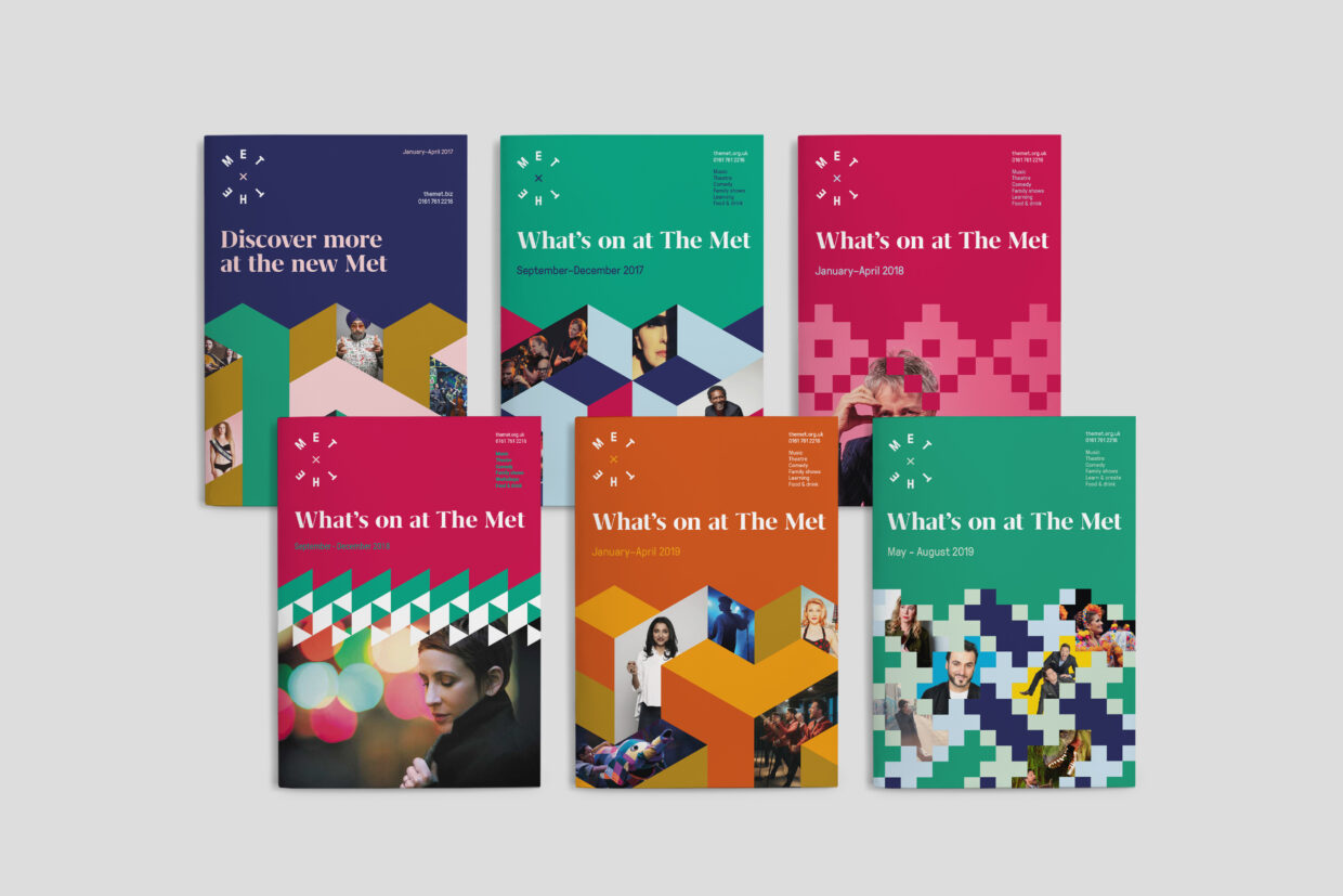
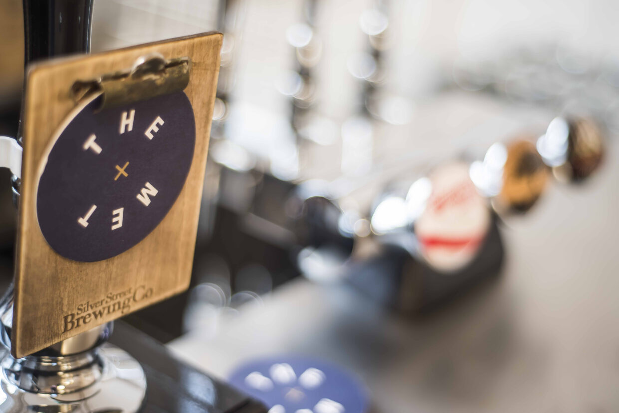
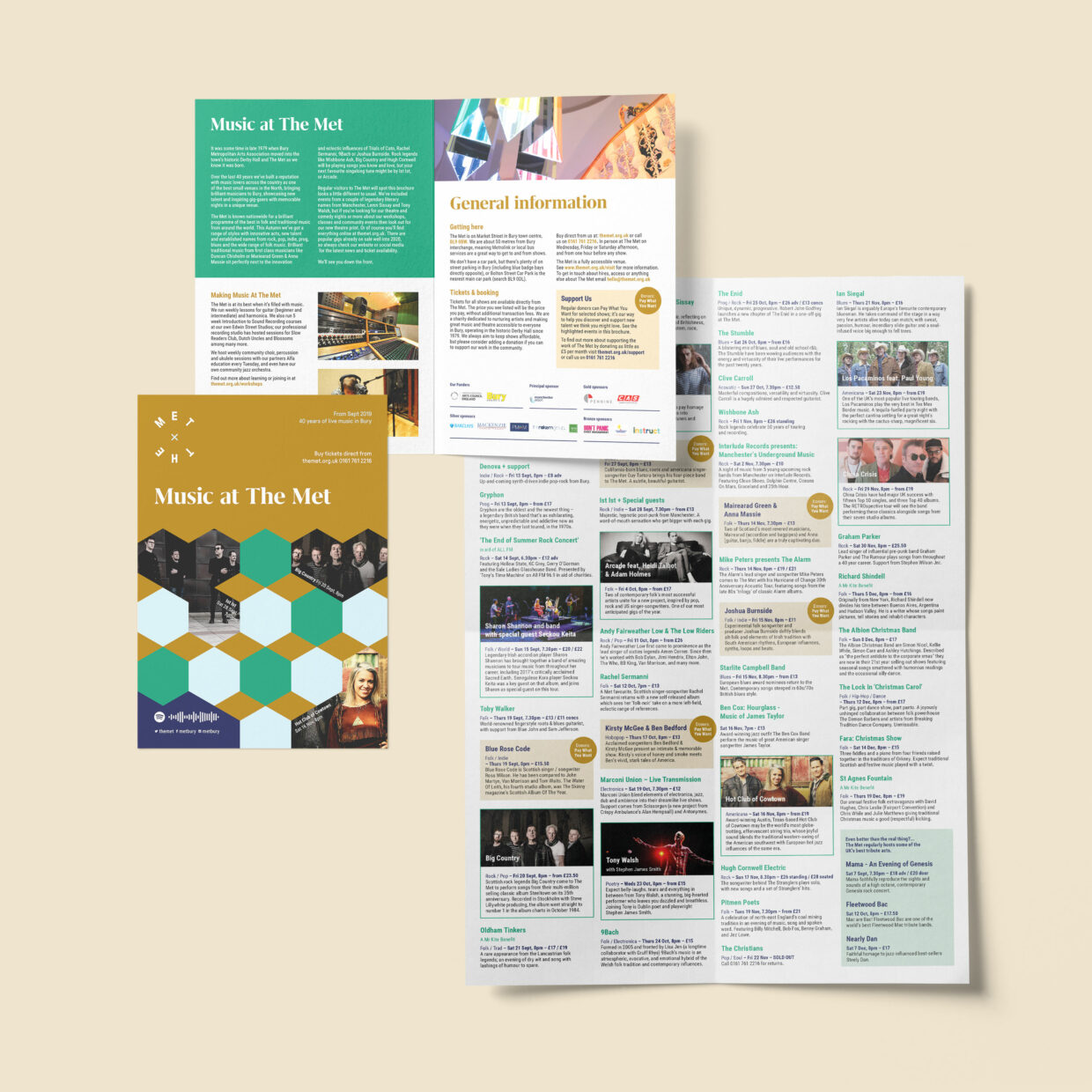
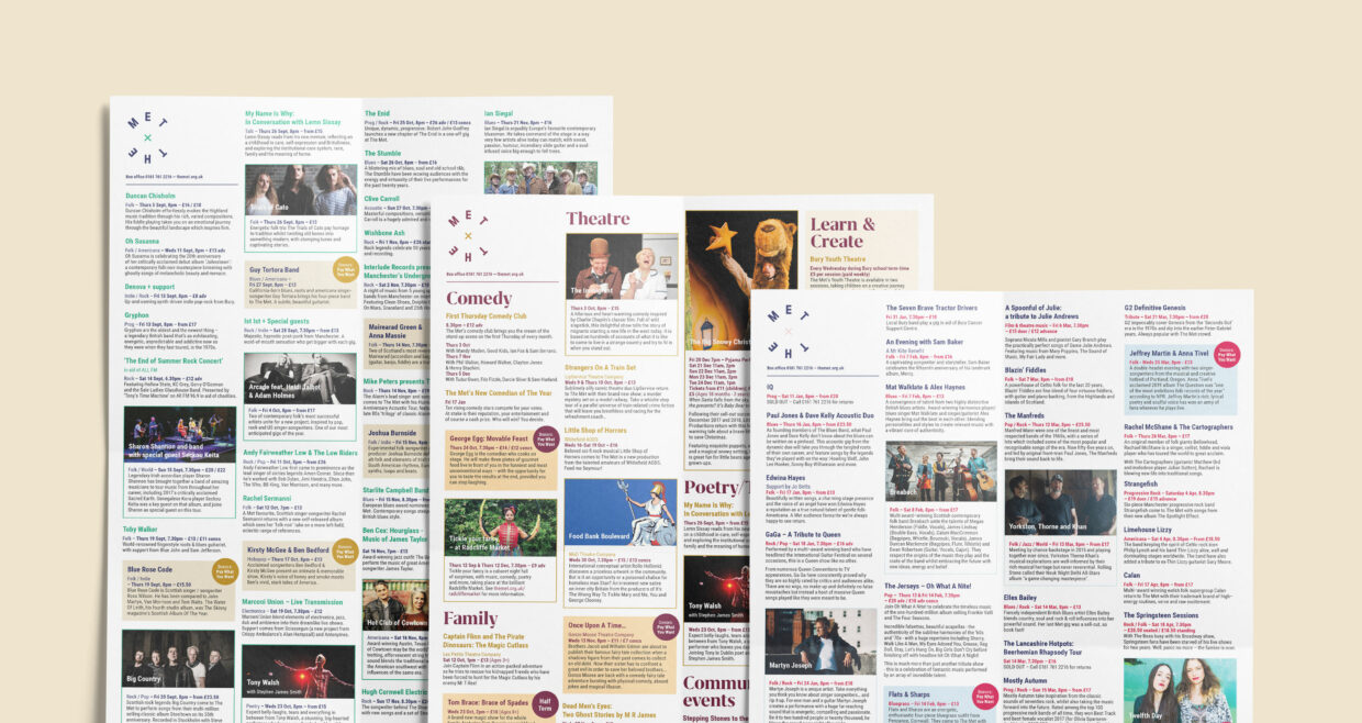
Built on the core concept that “community is the fabric that binds us” and drawing on the local heritage of the 19th century cotton industry, we developed a visual style based on weaving patterns. These abstract patterns became the heart of the brand, acting as containers for imagery and allowing for unexpected combinations. These unexpected combinations continue in The Met’s relaunch messaging, reinforcing the idea that The Met is a place where the unexpected comes together.
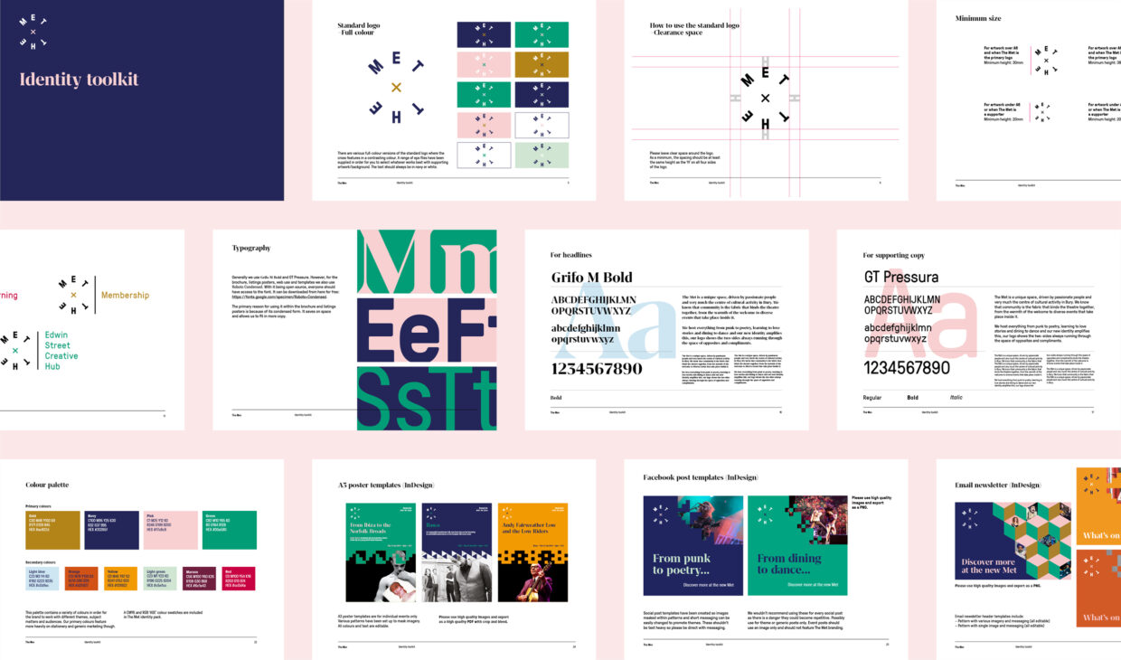
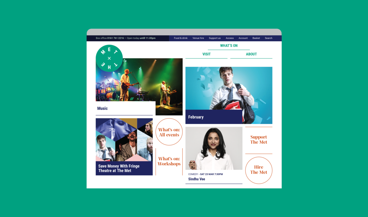
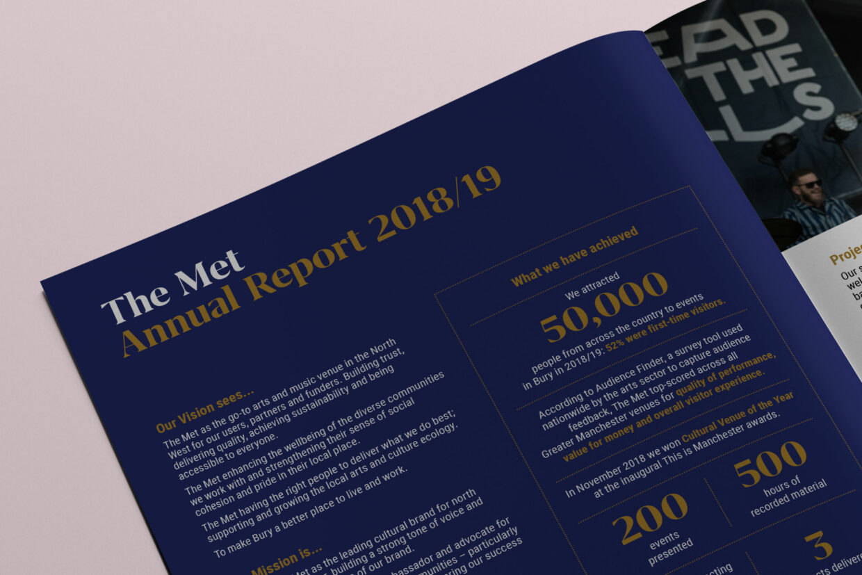
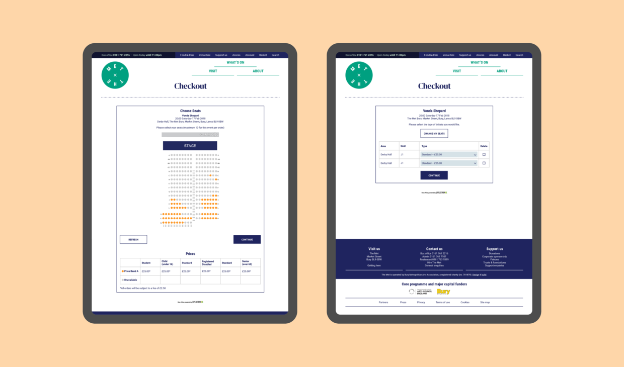
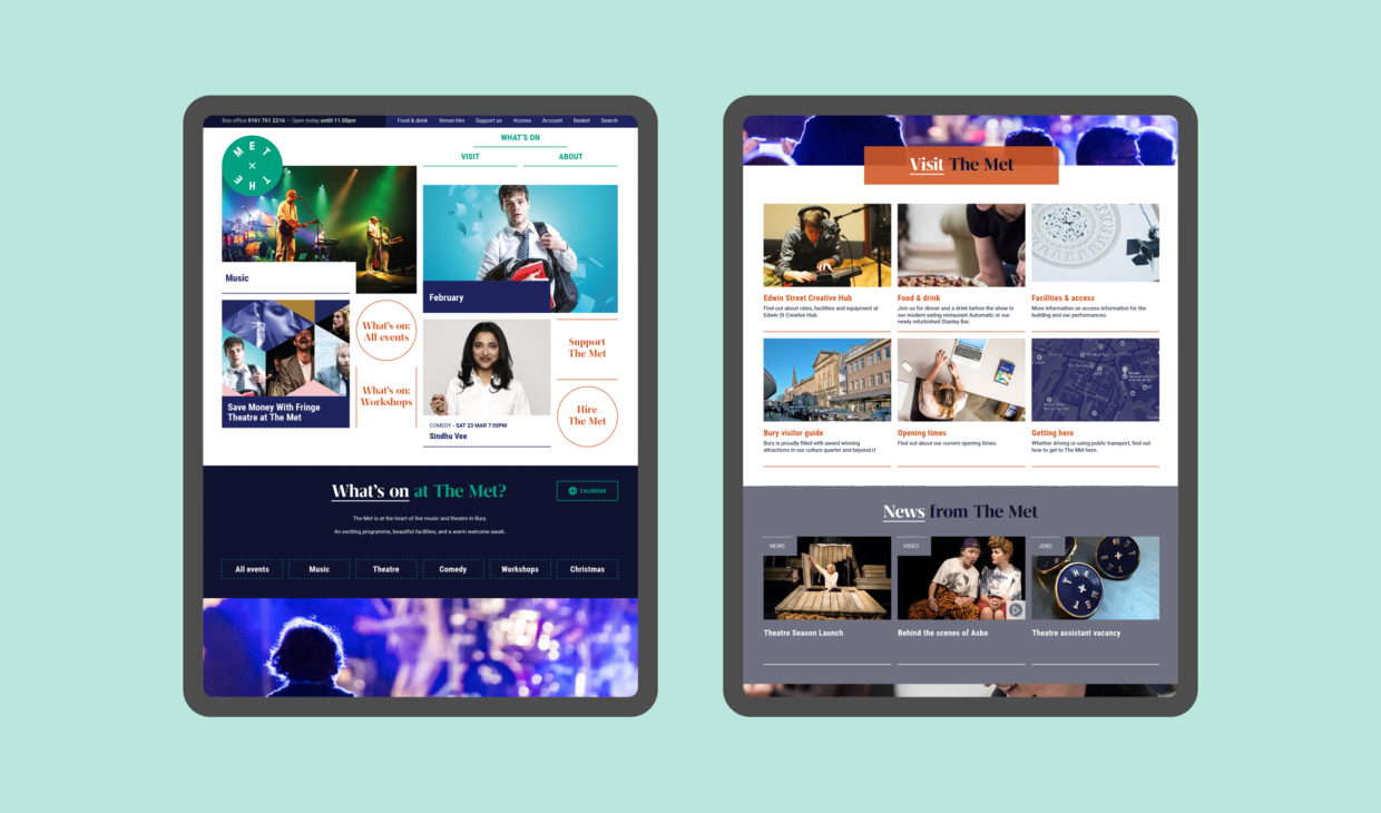
The visual identity extends to The Met’s online presence with a modern, fully responsive website designed by us, working with Needle and OH Digital. The new highly dynamic site allows the small team to manage its content and sell tickets. The venue’s ticketing system (Spektrix) is fully integrated into the website meaning event data is now only uploaded once, saving the team valuable time and effort, and also ensuring consistency across the box office system and the outward facing site.
The use of simple navigation – distilled down to What’s On, Visit and About – plus edible guide pages (eg. ‘What’s On Today’, ‘Events just added’, February half-term’) provides visitors with clear routes to the site’s key content. The site also promotes key calls-to-action such as ‘Donate’ and ‘Follow us’, as well as highlighting The Met’s facilities including recording studios and food and drink offerings, both of which were previously lost within the site.

“Instruct became a big part of our capital project and relaunch. They understood the history of our venue and helped us turn this brand into a strong visual identity that we can use consistently and creatively across all our marketing activity. Their work permeates through the building and all our communications. Three years after our relaunch they continue to adapt, innovate and evolve with us as the venue builds on its successes. We’re delighted that Instruct have also become supporters of The Met as a charity; they value our work and make it clear they will be part of our future.”
Adam Comstive
Marketing Manager, The Met
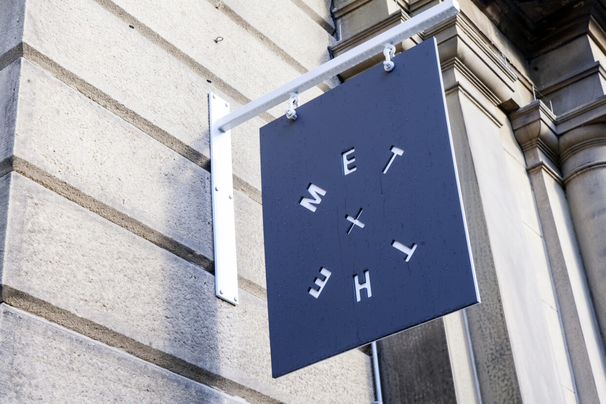
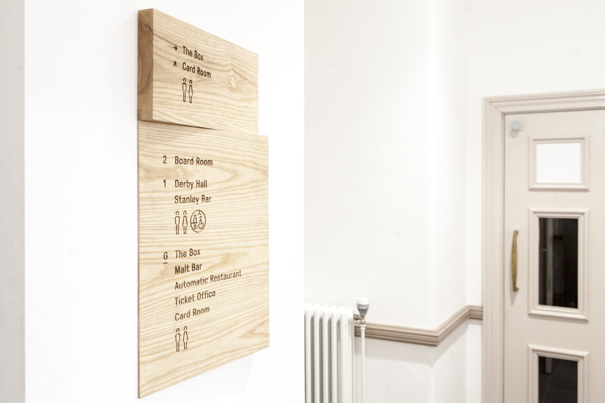
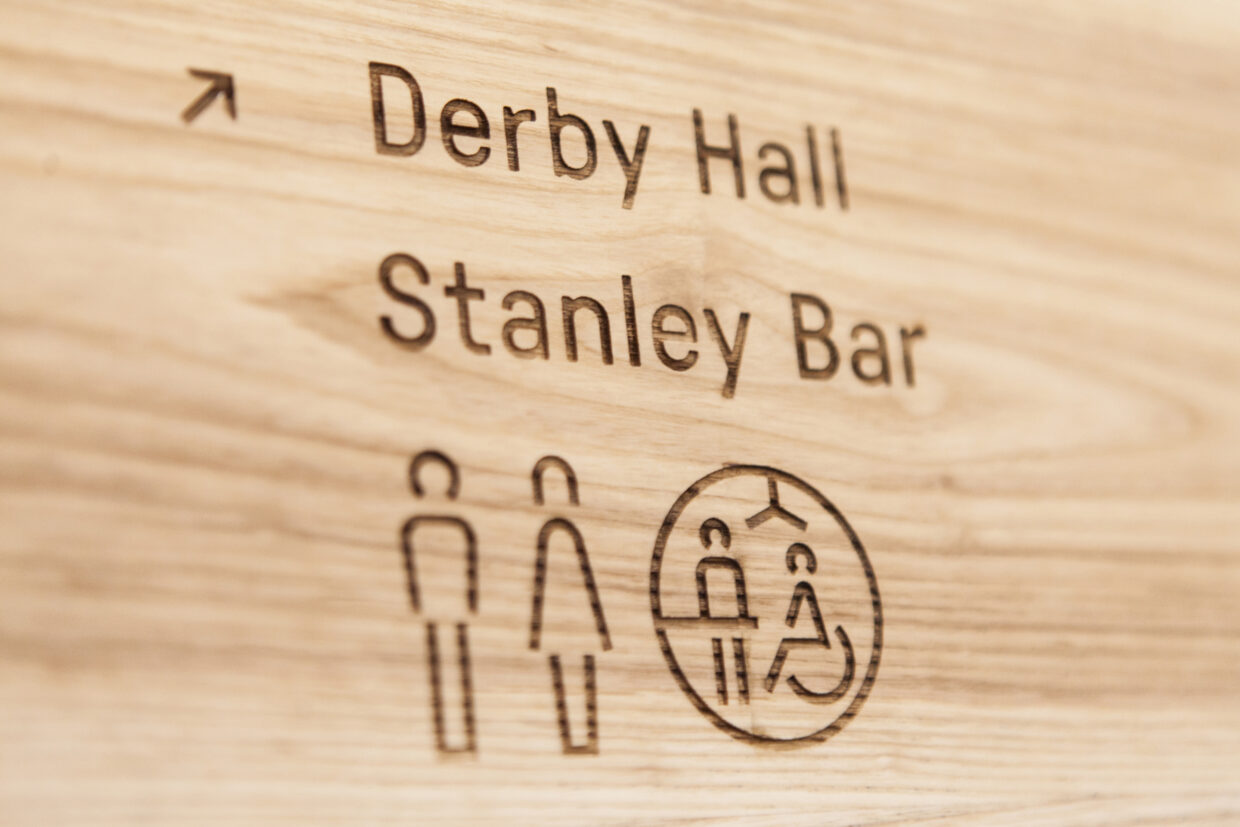
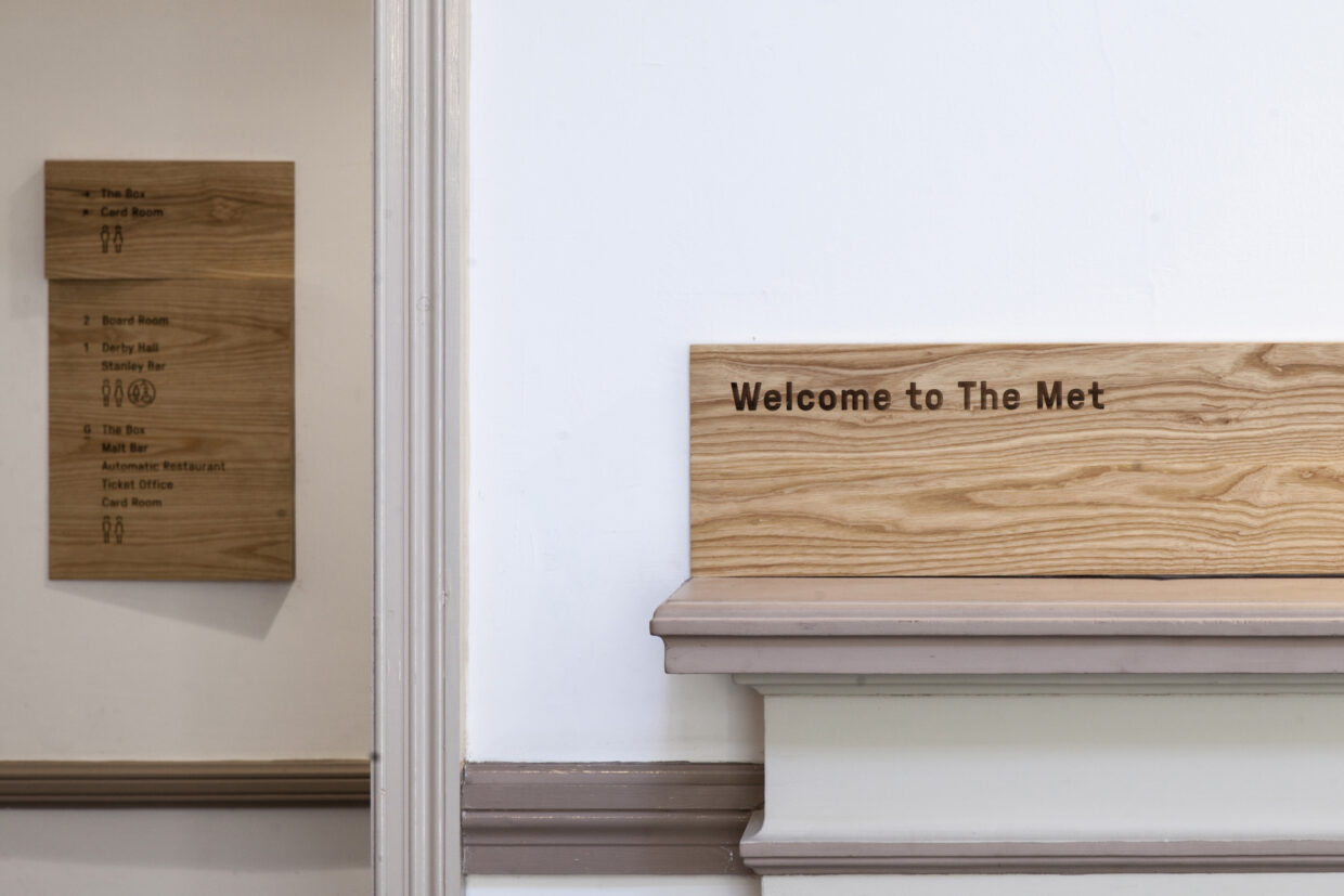
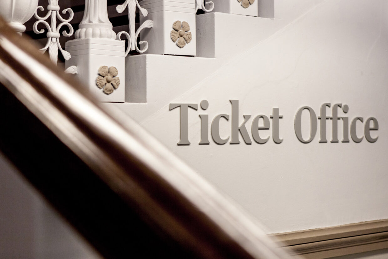
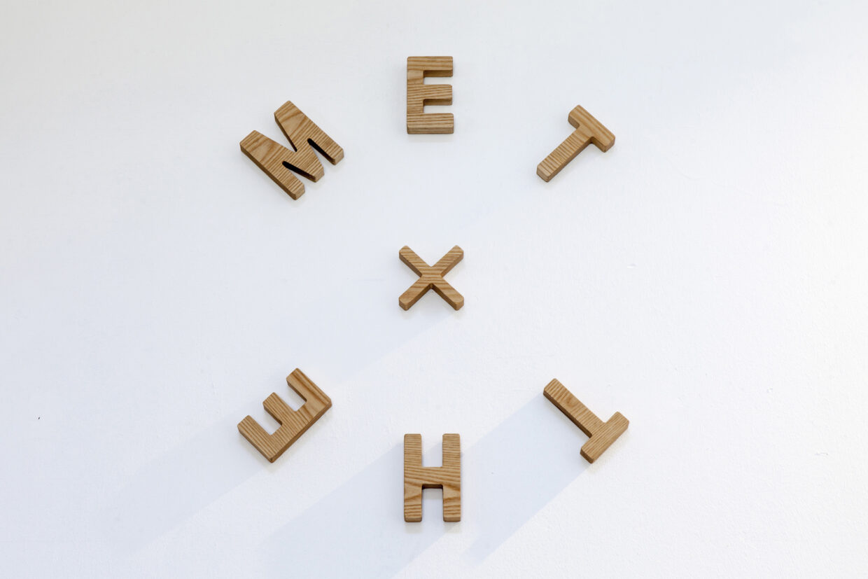
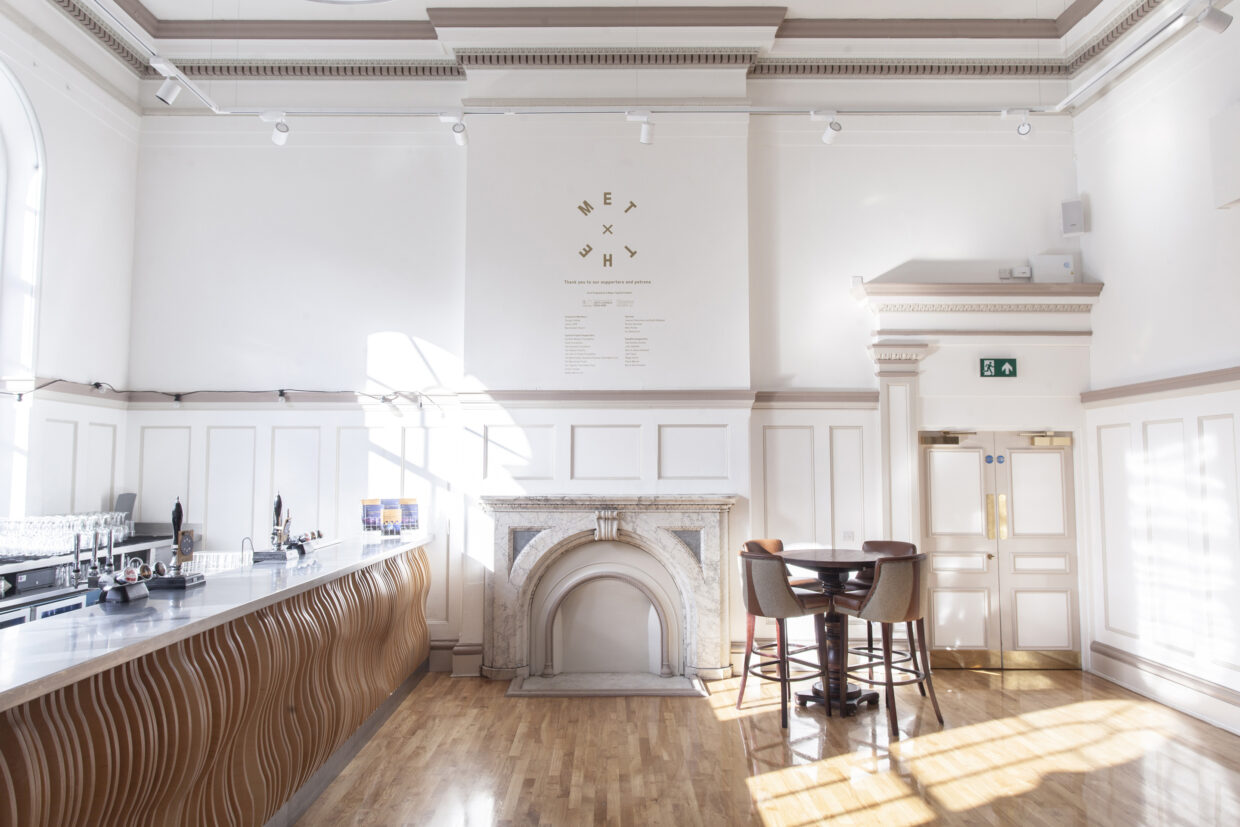
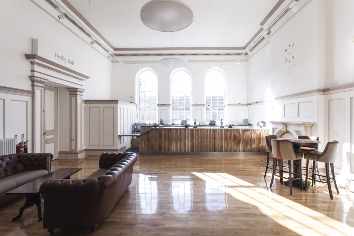
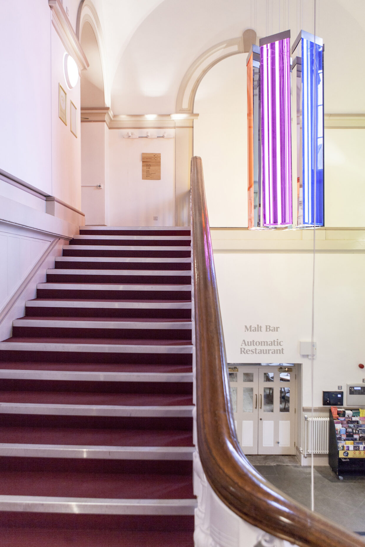
Extending the brand into the physical space, we devised a full wayfinding system for the building. Balancing the need for clear signage with the desire to be sympathetic to the original features in the building, we developed a system of subtle CNC routed ash signs for directional signage. Alongside this we used grey perspex lettering to signal different areas of the building and ensuring that all signage is on brand. These signs were lovely crafted and installed by local creative studio Lazarian to our designs and specifications.
